October 23

My Tour Poster

In this task we had to create a tour poster for a performer using this brief:

‘A client has come to you with an image of themselves as a performer. Their style of music will belong to a particular genre. They want you to design a poster for an A4 page in a magazine, advertising and promoting their forthcoming tour. You must include the following:

  • Name of artist
  • Name of the Tour
  • Dates and Venues
  • Other information like: where the album can be bought/downloaded, tickets available from and prices etc.’


From this task I am able to take away the knowledge and ability to create a atmospheric and engaging poster that will attract the audience I am looking for. I now feel comfortable using InDesign and Photoshop.

October 12

My Copy Of Professional Magazine Front Page

for this task I had to copy the design of a magazine front cover, an try and get as similar to the magazine cover as I could. this was the first time using InDesign and had Serena come into our classroom to teach us the basics on how to use InDesign, I will now analyse the magazine cover and give 3 pros and cons.

Pros: 

  • I believe the positioning of my text is indistinguishable from the original cover. composition is important as people read left to right therefore we are attracted to the masthead as it has the most purpose, this is the name of the magazine so requires a lot of attention. I also had to use “VA” tool that allowed me to spread my letters across a wider area, this allows the text to look more clear and also is a technique to accumulate more room.
  • another pro would be that I have used the correct colours, this is important to the conventions of this poster as the colour red connotes love, this associates with the loss of Joe Strummer and how he is still in the audiences hearts. The white suggests purity this implies that his life lives ion in his music. for this reason the colour pallet was crucial. To do this i had touse the colour tool and had to form certain colours that may of not been on the colour pallet.
  • my final pro would be that I managed to design the plug to a good standard, this enables the audience to attend the festival that celebrates Joe Strummers music. I could of easily rushed it and result in having a blurry and cheap plug that wouldn’t attract the audience as much.

Cons: 

  • one con would be that my main cover star is pixelated this could be seen as an economical media platform and could result in a loss of repeat purchase, therefore will lose profit to the magazine company; “NME”, as the audience would not believe the article is of a high standard.
  • another con would be that I was not the most comfortable in this sector of work as it was the first time using InDesign, therefore my circle was not as round as it could of been, as an effect of this some people may assume that the company producing the covers were lazy and inattentive towards the work they were creating.
  • my final con is that some of the text was not positioned exactly the same as the original version therefore was covering some of the main star image, as a result this would be distracting for the audience and will take their eyes off of the main cover star and will confuse the reader and may scare of the consumers resulting in a loss of profit. 

this clip will enable be to create a better circle when using Indesign

this clip will allow me to make my images less pixelated when designing my magazine front cover.

in conclusion when coming to creating my own magazine from cover I now have the information and the ability to use InDesign and create a magazine front cover that will attract a wider audience that I am looking for, i have also enhanced the ability to place my text and images in the frame correctly that will allow the reader to read and view the cover without easily getting confused.


October 1

The Camera Talks

For this task we had to choose 9 of the best photos from our contact sheet and label them with 3 hashtags; technical term, denotation and connotation. Each of these images connotes a different meaning of and uses a different angle/shot, for example: the canted angle shows struggle and failure on the other hand the long shot walking towards the camera conveys a sense of happiness and charm.

As a group we took the photos to give us an insight into how to use a camera to create meaning but to also create the emotions we wanted. We tried to create some high and low key lighting to further that idea of creating emotions.

From this task I now know how to portray a meaning that links to the genre or media platform I am presenting to.

October 1

Technical Camera Terms

We were set an assignment to take 9 different photos creating a diverse amount of angles to create emotion and to incorporate all the conventions used in images, we also had to consider: Framing and Composition. The 9 angles we used were:

  • Mid shot, low angle, focused on figure
  • Extreme close up, focused eye, level
  • Long shot, depth of field focused on person, high angle
  • Canted, medium close up, focused on background
  • Two shot, long shot, focused on one person
  • Medium long shot, person in background in focus, high angle
  • Close up, low angle, focused.
  • Point of view, medium close up, eye level
  • High angle, extreme long shot, deep focus.

these angles all convey different meanings and give the audience a different feeling. The reason for taking the photos was to recognise the emotions created just by taking different photos from different angles, for example: a high angled shot is used to make the central character feel vulnerable and weak, whereas a low angled shot makes the central character look dominant.

I now know how to create different emotions using images and will be able to include a particular angle in my magazine cover to portray a certain emotion, I will also be able to create different apertures to create depth of field so that the main focus in on the central image.

In images 9855 there is to much light exposure, so we should of decreased the aperture to ensure the image was not as bright this would enable the audience to see the central character. we also had to focus on shutter speed was low so that our images didn’t come across as blurry. shutter speed is controlled by a mechanism that times how long it will take the camera to take a photo.


September 18

My Image That uses Mise-En-Scene For Meaning

Our mood-board was based on the Pop genre, the pop genre has specific conventions that allow people to recognize the genre, for example pop has a tendency to use vibrant colours, the pop stars are usually constructed around a materialistic and fake persona.

The main elements of Mise-En-Scene used within the pop era are:

  • colour and lighting
  • facial expression and body language
  • costume,hair and makeup

Colour and lighting gives the pop stars a sense of importance, to present them as unique, for example in the photo of Ariana Grande she’s wearing a pink dress, this presents her as innocent and natural. Whereas the photo of Bruno Mars in his black shirt connotes a bold and serious person with a formal persona.

Facial expression and body language can portray the stars in many diverse ways, for example: the older pop stars such as Tom Jones are seen as mature sophisticated stars whereas stars such as: One Direction are seen as young, free cheeky boys.

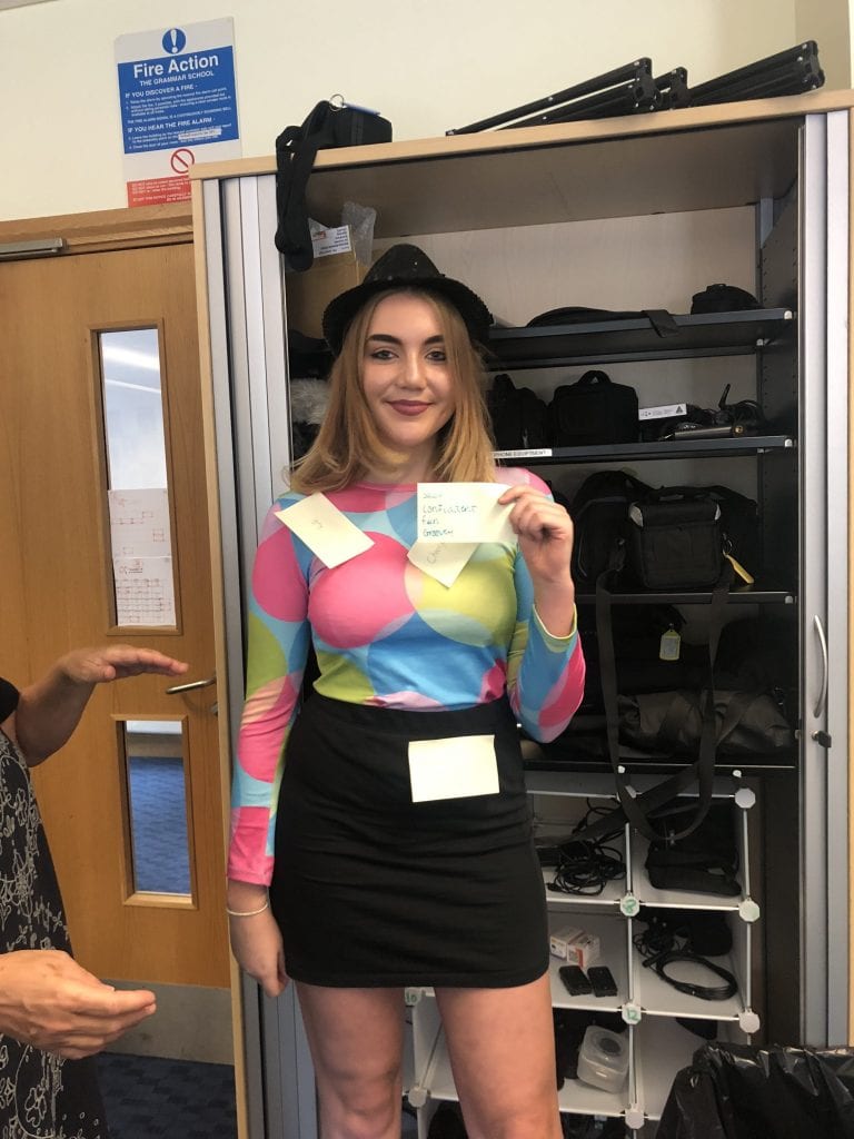
After creating the Mood boards we were equip with the intelligence and skill to try and create our own pop star using the conventions of a Pop singer, so we decided to dress Emilia in a bright adventurous and outstanding costume. The students then decoded her and the connotations Emilia was given were:

  • Fun
  • Colorful
  • Cheerful
  • Sassy
  • Confident
  • Quirky
  • Superficial
  • Materialistic
  • Girly
  • Obnoxious


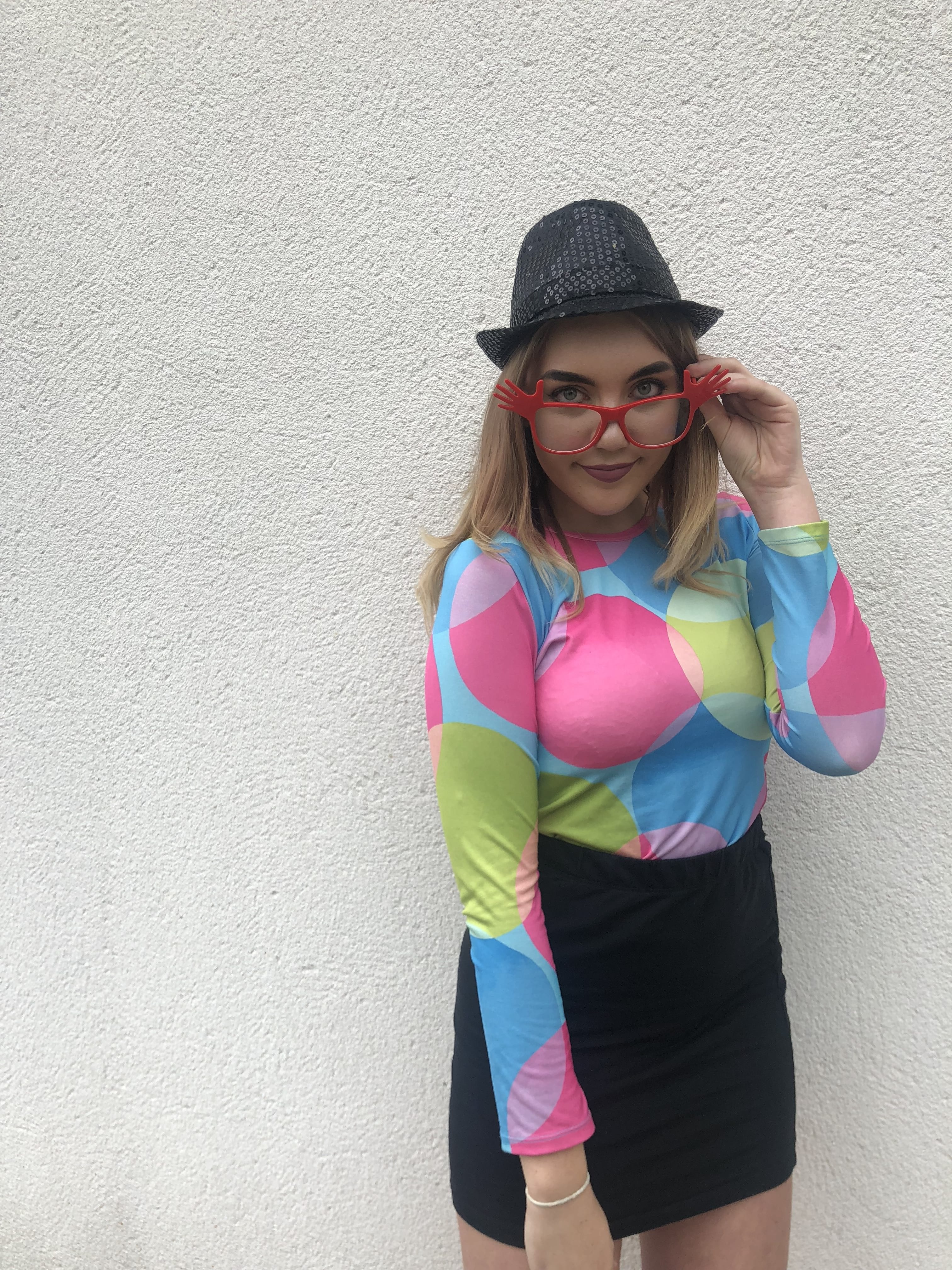
This was the final photo that I decided to annotate, in this photo Emilia is portrayed as a glamorous, confident, materialistic pop star. The ideology of a pop star is that they are: young, fun, free people, in this image Emilia looks sassy.

The Mise-En-Scene used within this still is mainly focused around Colour, body language and facial expression. The colour shows that Emilia’s individualistic. Each colour has a connotation; pink suggesting she’s innocent where as the green implying she could be jealous and the blue portraying she’s somewhat sad. The tilt of the glasses connote she’s cheeky and disobedient.

This image is more significant then the others as it captures all the aspects of being a pop star from: cheekiness, to sophistication. The camera angle is a medium close-up this enables the audience to capture the pop stars emotions.

overall Mise-En-Scene is a vital part to a still image and can create many meanings and representations, it all depends on where everything is placed in the frame and how it is seen by the target audience.


September 14

Print Media That Communicates Meaning

My assignment was to annotate an album poster for a band/solo artist, the reason for this task was to reflect on how to design a poster that captures the correct target audience, the way this is done is by using the corresponding font that matches the genre of poster, colour also plays a big role in engaging the correct audience. 

We analysed all elements of Mise-En-Scene, these are:

  • Colour and lighting
  • setting
  • props
  • Facial Expression and Body Language
  • Costume, Hair and Makeup

From this I am able to safely say that I am able to design and attractive magazine cover that uses the correct: codes, signs and symbols to convey meaning, so all the elements of Mise-En-Scene are crucial.