October 26

My Audience Profile

In this task we had to create a dating profile for a completely fictional person, it had to include their demographics, a bit about them, their passions and their typical weekend.

– as a result of this I now gain the ability to successfully attract the corresponding Target audience to my genre of music.

In doing this task I had to be creative and research into the type of audience I would be looking at for my magazine.

When coming to creating my magazine cover I now have the ability to attract the correct Target audience and do know what I’m going to need to put on my magazine to attract the correct audience.

October 26

Communicating My Brand


click on the image to see full mood board 


In this task I had to create a mood board relating to the genre of music I had chosen, in this case hip-hop. it had to revolve around the genre and include:

  • stars
  • colours
  • props
  • costumes

In doing this task it gives me the inspiration to think deeper in my magazine. I then had to describe all the images in 1-3 adjectives that I thought best suited that specific image.

I was extremely pleased with how wide the hip-hop genre is and how easy it was to find the images to create my mood board, I also believe that I was able to  describe the images in good detail and was able to analyse the images in good depth.

As a result of doing this task I have a better understanding in the underlying connotations behind images and gained more experience in this area of work and will be able to take this away and include it in my final magazine cover.

October 24

So…I’m Ready To Make Some Media

So…where do I start, at the beginning of term I began by learning all the elements of Mise-En-scene and how the elements can emphasise a stories narrative in a clip, whether it’s ‘Downton Abbey’ or ‘Dovtor Who’; two clips which we have analysed and written essays about. proceeding through the term we then started to look at how to use a camera to achieve what we are looking for, we talked about and experimented with: appiture, light exposure and manual and automatic viability of the image. We then went on to learn some basic skills on two pieces of editing software; Photoshop and InDesign, we had help from Serena, we learnt how to edit backgrounds using the magic wand and how to add text. this will help when coming to create my magazine.  We have learnt about things such as masthead, plug, pug cover star and star image all conventions on a poster. We also learnt about the use of colour in a magazine cover and how each colour has its own connotation, for example the denotation of the colour red is simply it’s red whereas the connotation behind it would be:

  • blood
  • anger
  • fire
  • romance
  • love
  • passion
October 23

Branding Ideas + Mission Statement

For my chosen genre I am going to be doing hip-hop, I have chosen hip-hop as I enjoy the hip-hop music and it’s showy and prstine colours. The conventions of the hip-hop genre are:

  • showy
  • fresh
  • bling
  • exaggerated
  • inorganic
  • superficial
  • bold
  • materialistic
  • fun

The name of my magazine is ‘Burst’ this is because its an onomatopoeia and sounds vibrant and energetic. You can also associate the word ‘Burst’ with festivals with bright colours. It is also short and snappy and gains a lot of attention.

‘Burst’ is a magazine that will help promote the hip-hop genre. ‘Burst’ is the ideal music magazine for you it will contain all the latest news revolving around the latest music drama and will advertise upcoming bands and bands that have already made it to the top, on top of that it indulges into the solo artists career and will display the latest songs from a variety of bands.


October 23

My Tour Poster

In this task we had to create a tour poster for a performer using this brief:

‘A client has come to you with an image of themselves as a performer. Their style of music will belong to a particular genre. They want you to design a poster for an A4 page in a magazine, advertising and promoting their forthcoming tour. You must include the following:

  • Name of artist
  • Name of the Tour
  • Dates and Venues
  • Other information like: where the album can be bought/downloaded, tickets available from and prices etc.’


From this task I am able to take away the knowledge and ability to create a atmospheric and engaging poster that will attract the audience I am looking for. I now feel comfortable using InDesign and Photoshop.

October 19

Previous Students Work


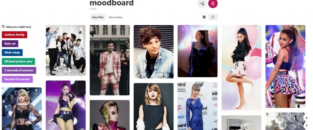
In this task I had to evaluate a few previous students 3 piece magazine packs, this involved analysing the camera work & Photoshop, Mise-En-Scene, language and the creative use of DTP and describe the pros and cons of the work and decide whether it meets the assessment criteria.

Camera work and Photoshop:

The camera shots used in the three pages are as follows:

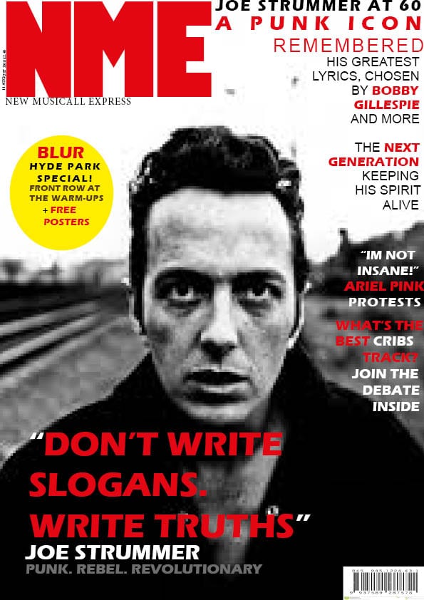
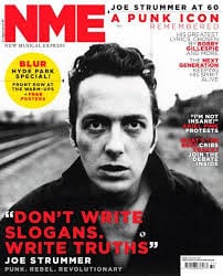
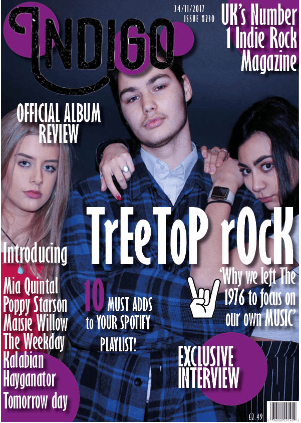
  • front cover: is a group mid shot
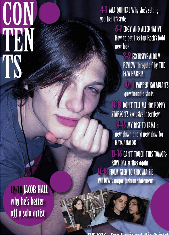
  • contents page: is a close up
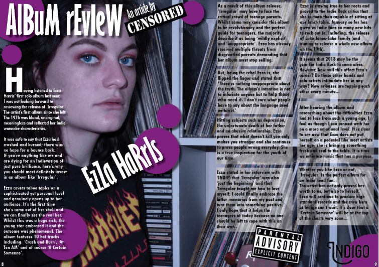
  • album review:  is a medium close up

The use of the group shot used in the front cover suggests the three stars are a union and are dominating the media platform, the fact that the male is central with two girls by his side could be considered sexist and implies that men have more authority then women. The camera angle is a slight low angle this suggests that they three stars are more dominant than the audience who are looking up at them.

The close up of the star on the contents page is to allow the audience to see the star’s facial expression and emotion, in this case the star looks quite smug and obnoxious. In the album review the star looks pale this suggests she’s purified.

the use of Photoshop in the front cover is good although I wouldn’t have placed some of the text central of the frame as it takes away our eyes from the image. The typeface for the contents page is clear and legible and doesn’t cover the star so we still can see his emotion. Finally in the album review the text slightly covers the face which is rather eye catching and takes our eyes away, although the overlapping of shapes and text contrast and compliment each other very well.

Mise-En-Scene and what it communicates: 

Mise-En-Scene was used very well throughout the magazine especially when it came to:

  • facial expression and body language
  • costume

Considering that the shots used in the press pack ranged from medium close up to close up limits the connotations behind body language however the use of the contents star with his hand on his chin conveys his smug persona.

The use of the front cover having the three stars juxtaposed next to each other creates the rock feeling and shows dominance.

The dull and glum colours used in the press pack suggest a deep and dark feeling which we associate with rock as it’s iconographic to the rock genre.

The choice of words that engage a specific audience:

I believe that the text that the students used was very captivating and energetic. The use of the plugs and pugs are a clever device that they used to attract the readers attention and capture the audiences eyes.

The brief and quick use of text engaged the readers as it wasn’t long and boring, audiences don’t like reading long paragraphs and prefer small confined pieces of text with more compact text as it gives the reader a sense of freedom.

The grammar and structure of the text was legible and understanding this also attracts the audience as they know the students would have taken time and care in making sure their press pack was of a good standard.

The creative use of DTP: 

The use of InDesign in this press pack was well constructed, from overlapping text with images to incorporating snappy and audacious cropped images such as ‘censored’ to create a sense of risk and menace. The students also had to ensure that the colours didn’t clash and destroy the value of the press pack.

The typeface in the press pack also linked to the genre and were the correct size so didn’t make the image too cluttered.


October 15

A Front Cover Analysed

For this task we had to decode all the underlying messages given to us through the design conventions on a professional magazine cover; these being:

  • Font
  • Colour Palette
  • Images
  • language

by analysing all these conventions it allowed us to understand the specific meaning that the cover was trying to portray.

After analysing the cover we also had to identify the demographics and psycho graphics that suited this typical cover. furthermore we had to research a mission statement that tells us what the cover is trying to achieve.

when coming to create my cover I now have the ability to use the correct elements of Mise-En-Scene to attract a specific Target audience.

from this task is have learnt that in order for a company to advertise it’s specific cover it has to engage the reader by using the correct elements of Mise-En-Scene that suits their chosen culture of people.

October 12

My Copy Of Professional Magazine Front Page

for this task I had to copy the design of a magazine front cover, an try and get as similar to the magazine cover as I could. this was the first time using InDesign and had Serena come into our classroom to teach us the basics on how to use InDesign, I will now analyse the magazine cover and give 3 pros and cons.

Pros: 

  • I believe the positioning of my text is indistinguishable from the original cover. composition is important as people read left to right therefore we are attracted to the masthead as it has the most purpose, this is the name of the magazine so requires a lot of attention. I also had to use “VA” tool that allowed me to spread my letters across a wider area, this allows the text to look more clear and also is a technique to accumulate more room.
  • another pro would be that I have used the correct colours, this is important to the conventions of this poster as the colour red connotes love, this associates with the loss of Joe Strummer and how he is still in the audiences hearts. The white suggests purity this implies that his life lives ion in his music. for this reason the colour pallet was crucial. To do this i had touse the colour tool and had to form certain colours that may of not been on the colour pallet.
  • my final pro would be that I managed to design the plug to a good standard, this enables the audience to attend the festival that celebrates Joe Strummers music. I could of easily rushed it and result in having a blurry and cheap plug that wouldn’t attract the audience as much.

Cons: 

  • one con would be that my main cover star is pixelated this could be seen as an economical media platform and could result in a loss of repeat purchase, therefore will lose profit to the magazine company; “NME”, as the audience would not believe the article is of a high standard.
  • another con would be that I was not the most comfortable in this sector of work as it was the first time using InDesign, therefore my circle was not as round as it could of been, as an effect of this some people may assume that the company producing the covers were lazy and inattentive towards the work they were creating.
  • my final con is that some of the text was not positioned exactly the same as the original version therefore was covering some of the main star image, as a result this would be distracting for the audience and will take their eyes off of the main cover star and will confuse the reader and may scare of the consumers resulting in a loss of profit. 

this clip will enable be to create a better circle when using Indesign

this clip will allow me to make my images less pixelated when designing my magazine front cover.

in conclusion when coming to creating my own magazine from cover I now have the information and the ability to use InDesign and create a magazine front cover that will attract a wider audience that I am looking for, i have also enhanced the ability to place my text and images in the frame correctly that will allow the reader to read and view the cover without easily getting confused.


October 11

So…How Can An Image Communicate Meaning

There are many ways in which an image can communicate meaning through Mise-En-Scene and framing, for example characters are used in a vast way, for example: in ‘Donwton Abbey’ there is a clear binary opposition between the servants and the house owners, this is shown in the 5 elements of Mise-En-Scene. The costume for example shows a clear clarification between the social classes as the servants are wearing old dilapidated economical cotton, whereas the Lord’s costume is much more sophisticated and pristine.

The servants hair is all untidy and messy to show hardwork and determination on the other hand the mistresses hair is neat and styled. That only two elements of Mise-En-Scene that communicates meaning through characters. Framing does exactly the same, this is shown when the butler is juxtaposed next to the Lord to give a sense of friendship and equality however when two young ladies enter the frame the butler is no longer centre but rather angled into the corner, this suggests that he knows his place and limits.

It represents places in a variety of ways, a main feature would be lighting and colour. A stereotypical location would be a haunted castle, as an audience we can recognise this location from the dull, Stygian colours and the framing of the house is well tends to be rather bleak and non atmospheric.


October 2

Audience Profiling

The task we were set was to annotate the conventions of a music magazine and then research the pyschographics and demographics of a specific music magazine; we were given “Classic Rock”.

This task enabled us to research how different media magazine platforms attract different audiences, in this example the demographic of “Classic Rock” tends to be:

  • male
  • aged 40-54 
  • a low social class (C2DE) 
  • based around central Scotland

The psycho graphics that go with this audience are that they are: individualistic and home soldiers. we also had to research the magazine’s sole purpose; otherwise known as a mission statement, this magazine’s sole purpose is to“focus on key bands from the 1960’s through to early 1990’s”

from this task I have gathered that to gain a specific audience you have to use a specific design for all the conventions, whether it’s the:

  • masthead
  • colour
  • design 
  • images

When I come to design my magazine I will now include a specific genre of conventions that attract the audience I am looking for.