February 26

So how did it go?

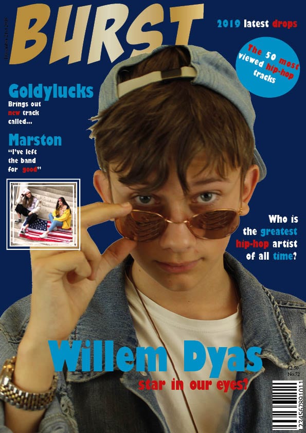
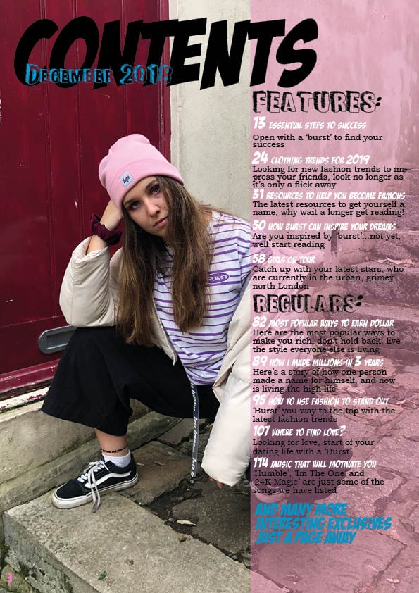
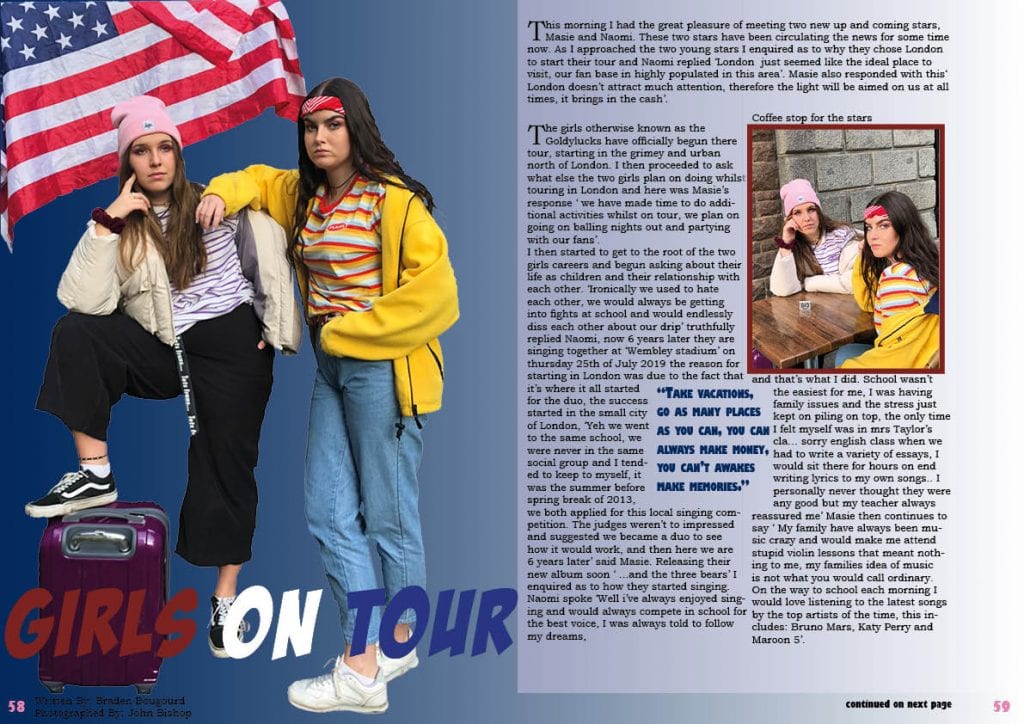
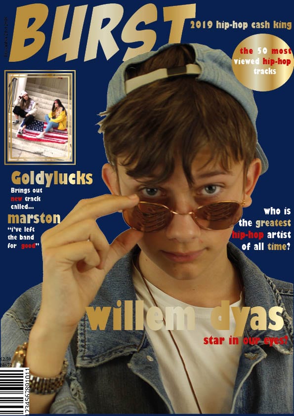
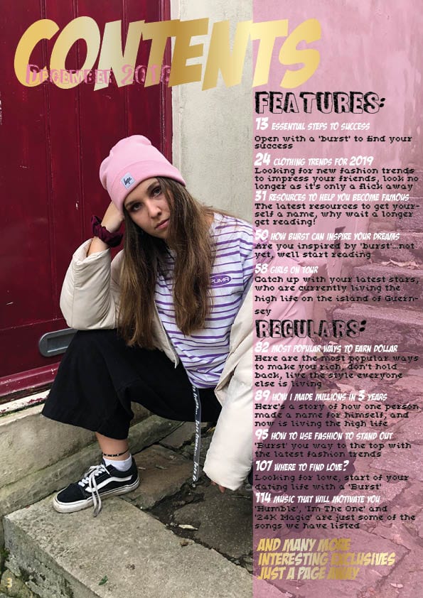
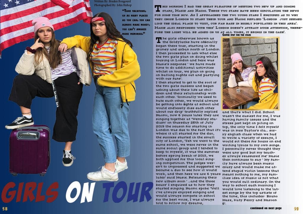
Component 1 was a fun and intriguing course, we researched, designed and then produced our very own magazine, it all started by researching and identifying what’s iconographic of a music magazine, we then decided on the genre we wanted to analyse and then mask. When coming to choosing my genre, I thought very carefully and came to the decision that I wanted to study the hip-hop genre, this enabled me to label my magazine ‘Burst’ and create 3 pages: a front cover, contents page and double page spread, after endless amounts of editing, correcting and finalising I have finally completed my magazine and have uploaded it to Issuu.com to get an insight as to how it would look.

The latest skills I have gained from doing this course is how to use websites such as: Emaze, Lucid charts and premier pro, I had to mainly use these websites when doing my CCR’s. Many more skills have been obtained from InDesign, for example I now have the ability to create a gold gradient for other purposes. Moreover, I now know how to wrap text around images and other text, this helped massively when placing my pulling quote in the middle of my DPS article.

The transferable skills I have gained whilst doing this course are: how to be much more organised, I gained this skill while organising my photoshoots, both the front cover photoshoot and the town photoshoot, whether this was messaging the models and telling them what to wear, or pre planning a date to use either the white room studio. I also had to do a lot of researching and planning, an example of this would be my production meeting agenda, where I had to pre-plan my costumes and decide what I believe would best stereotype a hip-hop star(s). Other ways research and planning has significantly helped me would be researching the demographic and psychographic for a particular genre of music; I was given ‘classic rock’.

This course has opened many new skills that will greatly benefit me in the future, whether it is the researching side of things or the producing itself. I am more than happy with my magazine and can safely say I’ve done my best.

February 13

Draft 6 25/01/19

Targets from Miss Hales: 

Front cover: 

  • Line up cover lines and images
  • Capital letters
  • Masthead should be unique
  • Cover line further away from edge
  • Pug text should be more central and angle it
  • Not to sure about ‘2019 hip-hop cash kings’
  • crop inset image

Contents page:

  • Fonts hard to read
  • Simpler font for subheadings
  • Writings to close to edge
  • No hyphenated words – leave on one line
  • Gold to hard to read at bottom
  • Contents different font

Double page spread:

  • Image looks stretched
  • Move byline
  • Big pull quote
  • Image bigger with headline over
  • Outline heads
  • Crop image
  • Line up article

After reading the alterations, I went back to my pages and changed all that needed to be changed however some of the comments Miss Hales made I kept as I believe once I changed some of the other things that the rest that I didn’t change worked quite well.

February 8

Advert

Both these adverts are not my own work, and therefore will not be assessed as my own work. In this task I had to choose two adverts in which I believe my target audience will be intrigued by, it has to relate to my audience in a way that entices them.

Image result for asos advert

My first advert is marketing the fashion side of things, I decided on this specific advert as it includes vibrant and contrasting colours that people associate more kindly to, it also enhances the use of bling, this could be considered as a marketing tool as they will have to keep getting my magazine in order to see what the stars latest bling is so that they themselves can buy a replica of websites such as: Asos.  The colour scheme is also exuberant and fun, and shows how a variety of colours can work together.

My next advert is going to be publicizing a Drake tour, the reason for choosing this specific cover is because it relates to the hip-hop genre more than most, it most certainly links with my magazine front cover as it indulges in the use of a bronze/gold frame behind drake this emphasises his success and wealth and will attract an audience. It also includes other hip-hop artists on the page such as: Kendrick Lamar and ASAP Rocky. The colours in this advert are not as bright as my first but obtain an old fashioned style.  The colours might not look bright, however on the contrary it looks rich and affluent.

January 29

Draft 4 Feedback and targets

This is my Draft 4 for my music magazine, I have watched the screencastify that Miss Hales so kindly created and edited my: front cover, contents page and double page spread in order to maximise the success of my magazine. Below is a list of bullet points as to what I altered in all three pages.

Front Cover:

  • For my front cover I have decided to keep the original background colour as blue as the black didn’t look as good.
  • I then deleted the images at the top of the page as I didn’t have enough time to gather more images, although this has allowed me to lift the masthead higher creating more space.
  • I have then added in an issue, date and price.
  • following on from this I have deleted the plug saying ‘ Bring us hip-hops next big star’ as it was taking up space and wasn’t really needed.
  • Moreover I have added in more colour to the text adding in red and a gold gradient. The masthead is now gold and the box around the image is gold.
  • not to mention I have also changed the inset and plug images to picture of my own.
  • At the start of each plug I have increased the size of the first word and thee rest of the text is decreased in size this captures the audiences eyes more.
  • The stars name ‘Willem Dyas’ is now larger than the ‘A star in our eyes’ as it looked out of place in the original front cover.
  • I have also replaced the plugs with my own stars instead of existing stars.
  • Miss said that my typeface shouldn’t look the same as the masthead and have decided to change that to a ‘ Gill Sans Ultra Bold Condensed’ font.
  • Finally I have deleted the ‘teaser Pics’ as it had no relevance to my cover.

Contents Page: 

  • The headline ‘contents’ for this page is now gold instead of black
  • the shape behind the text and the date is now in a light pink, this adds more exuberance to the page and makes the text easier to read.
  • Furthermore I have edited the fonts typeface as it was considered ‘Essay like’ as a result of this comment it is no longer a sans serif and in fact is now just a serif font, in doing this tho I have had to rethink my colour choice and it now incorporates white and black in the text.
  • I had to correct the word ‘exclusives’ as I spelt it like this: ‘exvlusives’.
  • I then had to add a page number to the page to make it look professional.
  • Finally I have deleted some of the page numbers to create more room between the page number and the text saying ‘regular’

Double Page Spread:

  • For my double page spread the first thing I altered was layout of my columns and stand first, the stand first has now been swapped with the headline so that the text is easier to read.
  • Following on from this I resized my image so that it didn’t look stretched.
  • The shapes behind the columns had a gap between them that didn’t look right so I filled in the gap in order for the page top look smart.
  • I then added in who the article was written by and who it was photographed by.
  • I also replaced the text with my actual article.

After finishing these changes I believe my pages were looking much better and added a sense of passion to my work, I was most impressed with the gold gradient that had a personal relationship to my genre; hip-hop.

January 23

Feedback on Article

Targets For Improvement: 

This was my initial article I wrote before Miss Hales gave me some feedback. From my feedback:

  • I have realised that Guernsey may not be the correct location for a hip hop tour, the reasons being that Guernsey is seen as a retirement home for the elderly and not a hyped and crazy place that hosts tours.
  • I also need to be more clear as to who’s talking as it could be miss leading for the viewer.
  • Moreover the article didn’t really flow and seemed rather jumbled, in order to fix this I will have to alter the way I write the article.
  • It has been said that I haven’t really given the stars their own personalities, to do this I could give more intense detail into their back stories and how they’ve come so far from school.
  • I have also made minor errors in spelling which I will correct.
  • Furthermore I occasionally would use the wrong ‘their/there’ in order to achieve maximum success these changes are vital otherwise my article could be seen as unprofessional.
  • Finally I talked about the stars being hung over, this may be considered inappropriate for a school magazine and therefore changed it to something more suitable.

I had Alex Tapp proof read my finalised article, this allowed me to see if it all made sense and flowed nicely. After hearing Alex read my article I  believe I could alter some of my punctuation so that the article is easy to read and understand.

Alex has said that not all the words I used made sense, in addition to this I have decided to alter some of the language used to make it clear for the audience to read.

some of my sentences go on for to long in order to fix this I will proof read it and place in full stops and commas where need be.


January 18

Draft 5 Work in Progress

For this draft I had to upload my most up to date pages and was assigned a partner who was marking my work, in doing this it has allowed me to see the pros and cons of my pages in the eyes of my target audience, this trial has helped me develop my pages and really consider many factors that have helped me create the pages I have today.

For these pages I have moved the plugs on the front cover so that they are not so close to the edge. I also edited the font of the text to make it different from the masthead, furthermore have added in a pug instead of having loads of plugs to give the page a sense of individuality. On my contents page I had already corrected the spelling mistake on ‘exclusive’ My feedback was more positives then negatives meaning there wasn’t much to change, however I can discuss the skills I have learnt from allowing someone else to view my work. Just the simple changes such as moving the plugs away from the edge really entices the readers more as the plugs are more visible and easy to read. A big skill I have managed to accomplish whilst drafting my pages is simply knowing the best composition of my text and images in a way that wouldn’t disrupt the viewers eyes. Going back to my first draft to my most recent has most definitely made me realise that the skills I have obtained along the way have been extremely beneficial.