
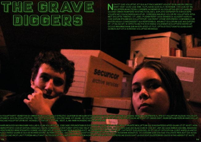
On the top is my first draft of my DPS and on the bottom is my second draft. I made some clear changes but first the things I wanted to change were:
- My image as many people had said that it was too dark and you could see the models well, and also there was too much focus on the window instead of the models.
- The font needed some work to make sure it was clear
- I wanted to change the layout to fit the new photo
- Finally I needed to add some page numbers
I managed to achieve these things and in my opinion my new draft looks much cleaner and more professional. Although once again I am using placeholder text I think you can clearly understand what it would look like when the real article has been put in.