January 13

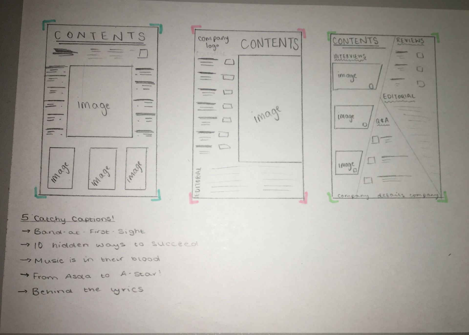
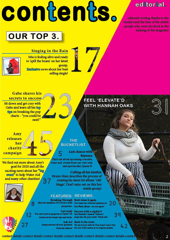
Draft of Content Page

Here is a draft of my contents page.

Click on image to view PDF

In my contents page I have tried to:

  • Include the theme of shapes that is in my front page and double-page spread
  • Make the images/article heading intresting so that readers are intrigued to read the articles through the use of catchy captions
  • Use the same/simlilar fonts to my other pages
  • Use a colour scheme that fits in with the pop genre
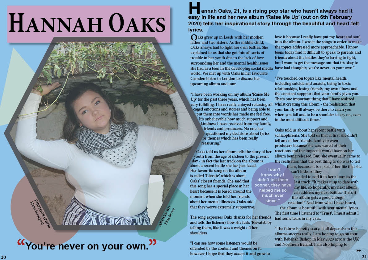
What I like:

  • My main model has direct eye contact with the reader, which helps them connect to the reader. She also has a sassy aura about her, creating a story through my image which is key in pop music.
  • The layout of my contents page is conventional to the pop genre as it has headings (e.g. The Bucketlist.) and a section dedicated to the editorial.
  • The page numbers on the ‘Our top 3.’ section have images of the featured artist inside of them which is quirky. The small polaroid images of the featured artist also give an extra sneak peek of what’s inside the article if the reader chooses to read on.
  • I have added my logo in the bottom left corner.
  • My bold title ‘contents.’ follows the theme of my title on my front page with the blue letters and fullstop. It is also in lower case letters to appeal to the younger target audience.
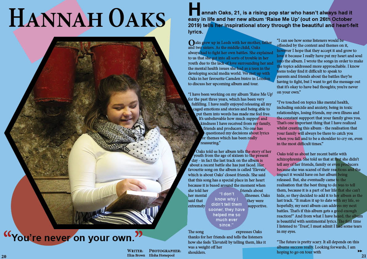
Improvements:

  • Change the colours so that they fit with the rest of the magazine – a clear colour scheme has not yet been stated
  • Write the editorial and add contact details of the magazine to create a complete page
  • Make the blue section easier to read – larger line spacing between the different pages
  • Change the font of the page numbers in the blue section – they aren’t obvious or bold enough to fit in with the genre
  • Edit the main image so that there is nothing out of order in the background (e.g. make the bars all black) and also fiddle with the image to make it stand out a bit more (add some brighter colours)
  • Change ‘Last chance with Beyonce’ to ‘Last chance: Beyonce’
  • The blue highlighted words in the ‘Our top 3.’ section letters need to be spaced out – they aren’t very easy to read
January 8

What is a Contents Page?

A contents page serves a very important role within a magazine: it acts as a menu for the reader so they can see what is in the magazine and where they can locate it if it takes their interest. Due to this, it is important for the contents page to be: clear, easy-to-read, and eye-catching – the reader doesn’t want to have to read an essay before getting to the articles.

The conventions of a contents page are:

  • a title (e.g. ‘Contents’ or ‘What’s Inside’)
  • page numbers
  • catchy headlines to draw in your reader (include hyperboles and superlatives)
  • interesting and relevant photos or graphic images/designs
  • the colour scheme that will reappear throughout the magazine
  • one page long, on the right hand side
  • near the start of the magazine
  • editors hello
  • reminder of the magazine’s name and mission statement

Below are some layout ideas that I have drawn out for my potential contents page. My favourite design in the third one as it follows the conventions but it is also unique and continues the shape theme that I have going through my magazine. I have also brainstormed some catchy headlines: my favourite being ‘From Asda to A-Star!’ as it is intriguing and is also relatable, making it seem like it could be anyone (linking in to Richard Dyer’s theory of ‘The Paradox of the Star’).

December 20

A New Improved DPS

Click on image to view PDF

What I changed:

  • changed the main photo so there was eye contact with the audience
  • moved the right hand side text so it wasn’t so close to the edge
  • centred the bottom quote
  • added another image of my artist behind the text so it links both sides of the page together
  • lowered transparency of images and shapes
  • changed text to ‘Article By:’

What I need to do next:

  • change the transparency of the ” to fit in with the theme
  • change the headline font to make it stand out more or change the wording to make it more interesting
  • experiment with the images to make different aspects stand out
  • get rid of second drop capital
  • add another pull quote
December 18

Feedback & Reflection on Draft DPS

I asked for some feedback on my first draft of my double-page spread from my peers and my teacher.

Here is the feedback from my peers:

Here is my teacher’s feedback:

  • move the photo in more and find one with eyes looking up
  • move the text on the right in – very close to edge
  • centre bottom quote
  • change to ‘Article By:’
  • add another pull quote in a shape
  • lower transparency of shapes
  • get rid of second drop capital
  • make headline different – change font?
  • change transparency of photo to fit with shape theme?

What I need to do now:

  • change the photo
  • move the text
  • centre bottom quote
  • lower transparency of shapes and image
  • change headline font
December 18

Draft of The Double Page Spread

Here is my first draft of my double-page spread. I think that it is conventional because it includes:

  • an image on the left
  • a stand first
  • some drop capitals
  • a pull-quote
  • a headline (quote)
  • the by-line and name of the photographer
  • columns
  • page numbers
  • arrows to indicate that the article continues on the next page

Click on the image to view PDF

December 13

Design Skills 1

When creating my magazine, I have learnt and used many new skills in Photoshop and InDesign. These skills have helped the pop genre to effectively come through in my magazine as they help create the conventional aspects of the pop genre. Here is a presentation on the skills I have learnt and what I used them to do:

Overall, my design skills have significantly improved. It is really useful to know these skills because it has allowed me to change my images to suit my genre and to adapt my text to also suit my genre and to attract my audience. I think my front cover and double-page spread is now also starting to convey my message and narrative as well as my genre.

December 11

Second Shoot Contact Sheet(s)

Here are my contact sheets from my location shoot at Castle Cornet:

Below are some images that are my favourite which I am likely to use in my magazine, not only because they are in focus and have a narrative behind them but also because my models are using different facial expressions and are in interesting positions. I like these photos because they show emotion and the props that my models are using make a statement, helping me to make interesting cover lines.

As stated in my aims, I have taken images that are: in focus, have different backgrounds and I can use them for my contents page and double-page spread. I have also been able to tell a narrative through them which is crucial in my double-page spread to get my reader hooked.

The location shoot itself went well, despite the wind and rain, and we were successful in capturing photos to use for my music magazine. We were at Castle Cornet which provided some brilliant backgrounds and setting, allowig our models to really pop in the images due to the bright clothing on dull backgrounds and also creating narratives for our front cover and double-page spreads.

December 5

A New Improved Feature Article

What I changed: 

  • the age of my artist
  • the description of the bistro
  • added some reported speech
  • added information about one of her songs
  • added some personal opinions from the journalist

Click on image to see full article

What will my changes bring to the article?

  • social interaction and personal identity for the reader
  • allow the reader to connect and relate to the artist

Targets:

  • change the language so it has a more formal tone
December 5

Production Meeting Agenda For 2nd Photo Shoot and Risk Assessment

My aims for my location shoot are:

  • get clear photos
  • take photos in diffferent locations with interesting backgrounds
  • get photos that I can use for my contents page and double page spread

Here is my plan for my star image for my location shoot:

Below is my Production meeting agenda for my location shoot:

Click on image to see full agenda

It is really important to plan for any risks when out on a location shoot so below is my risk assessment for my location shoot: