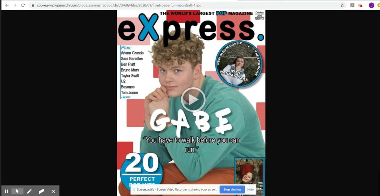
January 23

Adverts

To complete my magazine, I will need to adverts that will appeal to my target audience and fit in to my magazine successfully.

Here is a selection of adverts I think could fit in my magazine:

Here are my two favourites:

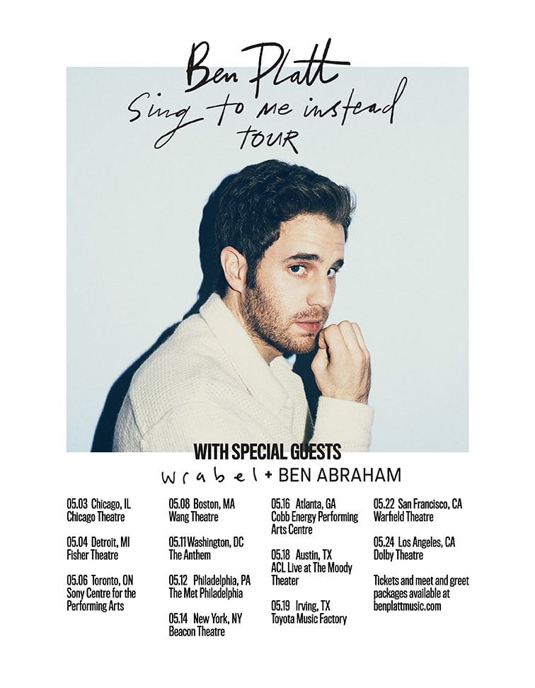
I have chosen this advert because it advertizes an artist that my target audience would be interested in: Ben Platt. His target audience is similar to mine and my audience are at an age where his songs are relatable: they have experienced what he is singing about. I decided to use this advert as my back cover because it has a different colour scheme to mine which reinforces it as an advert. I have also chosen this advert because it links back to my dating profile for someone who like pop music – Ben Platt is one of their chosen artists and they look for someone who is kind and considerate – a bit like Platt’s music. 

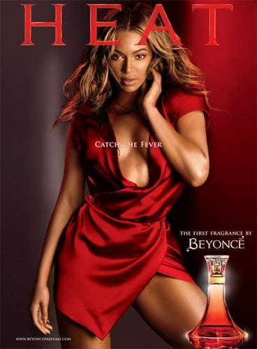
I have chosen this advert because Beyonce has a similar target audience to mine and she is recognisable to my target audience. I am sure my target audience will enjoy seeing the poster as it features a current pop artist. The advert is also simplistic, which refrains it from over powering and taking the readers attention away from my magazine. The advert doesn’t overload the audience with information which is useful because it will be next to my contents page.  A simple page also links into my dating profile for someone who likes pop music because they like to relax and take things easy, so a busy advert would be overpowering.

Overall, I am happy with the two adverts I have chosen for my magazine because they:

  • fit the pop genre
  • feature an artist my target audience would be interested in
  • they’re not too overpowering
January 20

A New Improved Complete Magazine Draft

Here is my second draft of my magazine:

Click on image to view PDF

Click on image to view PDF

Click image to view PDF

Above is my full draft of my final magazine. I think that the improvements that I have made have been successful in conveying the pop genre. Improvements I have made include:

  • Front page:
    • moved the headline ‘Gabe’ and the pug with ‘Mia’ in down
    • moved ‘Mia’ to the left and flip image changing places with ’20 perfect pop hits’
    • added colour to the pugs that fit with the colour schemes
  • Contents page:
    • centred the text under ‘The Bucketlist’
    • made polaroid insets bigger
    • added colour to the main image
  • Double-page spread:
    • made one headline bigger than the other to clarify which one is the main headline
    • made headline more catchy
    • moved ‘Hannah Oaks’ to the bottom of the left page
    • put drop capital at the start of the article not the standfirst
    • changed the background colour – too much blue
      • added pink box behind article
      • added blue corners on pink box
    • put my main image in a polaroid picture allowing the article headline to go at the top and ‘Hannah Oaks xox’ to go at the bottom as if she was signing off
    • added ‘sssshhh!’ around the edge of the page to link in with the idea of secrets
    • put song titles in blue instead of white in article
    • added another pull quote bottom left and moved original pull quote up to the right
    • added three insets of polaroid pictures
January 16

A New Improved Contents Page

Click on image to view PDF

What has changed:

  • removed any imperfections on my main image
  • added an editorial and contact details to complete the page
  • added larger line specing in between the articles on the blue section
  • changed ‘Last chance: Beyonce’
  • made the blue words letters further apart to increase readability

What remains:

  • add colour to the main image to fit with the genre and stand out on the page
  • decide on a final colour scheme and change on here and the rest of the mag so it all links in

I asked for some feedback from my friends on my new contents page, and asked them these questions:

  • How does the contents page work in tandem with the front cover?
    • Is the font/typeface consistent with the front cover?
    • What genre of music is the contents page featuring?
  • Describe the images of the stars using adjectives.
  • Which cover-lines tempt the audience to read on and which ones stand out and why?
  • How do the cover-lines reflect a music magazine? If they don’t,  which ones need to be adapted?
  • Which areas, aspects have distracting areas of integration of copy and images?
  • What aspects do you consider conventional or unconventional? (page numbers, inserts, captions, catchy cover lines, editors comment)

Feedback and targets:

  • the same fonts are used – can tell the two pages are linked together
  • change the colours on the front page to link it to contents page
  • the colours used on contents page are very bright and reflect the pop genre
  • my star looks: confident, intelligent, knows what she’s doing, a very up-lifting person
  • ‘Charity campaign’ – very wholesome, reflects the modern day audience, young people want to make a change – appealing to a teenage audience
  • like the highlighted words – brings attention to the articles
  • ‘gossip’ – trendy vocab, modern, reflects target audience
  • the blue box with the black writing – could make the writing a bit bigger or change the font or change the colour to white – then highlight section headers to make them stand out again
  • make the images inside the numbers more obvious – can’t really tell who is inside them
  • the shapes and layout is conventional to the pop genre
  • confused where to look first – lots of information
January 13

Draft of Content Page

Here is a draft of my contents page.

Click on image to view PDF

In my contents page I have tried to:

  • Include the theme of shapes that is in my front page and double-page spread
  • Make the images/article heading intresting so that readers are intrigued to read the articles through the use of catchy captions
  • Use the same/simlilar fonts to my other pages
  • Use a colour scheme that fits in with the pop genre

What I like:

  • My main model has direct eye contact with the reader, which helps them connect to the reader. She also has a sassy aura about her, creating a story through my image which is key in pop music.
  • The layout of my contents page is conventional to the pop genre as it has headings (e.g. The Bucketlist.) and a section dedicated to the editorial.
  • The page numbers on the ‘Our top 3.’ section have images of the featured artist inside of them which is quirky. The small polaroid images of the featured artist also give an extra sneak peek of what’s inside the article if the reader chooses to read on.
  • I have added my logo in the bottom left corner.
  • My bold title ‘contents.’ follows the theme of my title on my front page with the blue letters and fullstop. It is also in lower case letters to appeal to the younger target audience.

Improvements:

  • Change the colours so that they fit with the rest of the magazine – a clear colour scheme has not yet been stated
  • Write the editorial and add contact details of the magazine to create a complete page
  • Make the blue section easier to read – larger line spacing between the different pages
  • Change the font of the page numbers in the blue section – they aren’t obvious or bold enough to fit in with the genre
  • Edit the main image so that there is nothing out of order in the background (e.g. make the bars all black) and also fiddle with the image to make it stand out a bit more (add some brighter colours)
  • Change ‘Last chance with Beyonce’ to ‘Last chance: Beyonce’
  • The blue highlighted words in the ‘Our top 3.’ section letters need to be spaced out – they aren’t very easy to read
January 8

What is a Contents Page?

A contents page serves a very important role within a magazine: it acts as a menu for the reader so they can see what is in the magazine and where they can locate it if it takes their interest. Due to this, it is important for the contents page to be: clear, easy-to-read, and eye-catching – the reader doesn’t want to have to read an essay before getting to the articles.

The conventions of a contents page are:

  • a title (e.g. ‘Contents’ or ‘What’s Inside’)
  • page numbers
  • catchy headlines to draw in your reader (include hyperboles and superlatives)
  • interesting and relevant photos or graphic images/designs
  • the colour scheme that will reappear throughout the magazine
  • one page long, on the right hand side
  • near the start of the magazine
  • editors hello
  • reminder of the magazine’s name and mission statement

Below are some layout ideas that I have drawn out for my potential contents page. My favourite design in the third one as it follows the conventions but it is also unique and continues the shape theme that I have going through my magazine. I have also brainstormed some catchy headlines: my favourite being ‘From Asda to A-Star!’ as it is intriguing and is also relatable, making it seem like it could be anyone (linking in to Richard Dyer’s theory of ‘The Paradox of the Star’).

December 20

A New Improved DPS

Click on image to view PDF

What I changed:

  • changed the main photo so there was eye contact with the audience
  • moved the right hand side text so it wasn’t so close to the edge
  • centred the bottom quote
  • added another image of my artist behind the text so it links both sides of the page together
  • lowered transparency of images and shapes
  • changed text to ‘Article By:’

What I need to do next:

  • change the transparency of the ” to fit in with the theme
  • change the headline font to make it stand out more or change the wording to make it more interesting
  • experiment with the images to make different aspects stand out
  • get rid of second drop capital
  • add another pull quote
December 18

Feedback & Reflection on Draft DPS

I asked for some feedback on my first draft of my double-page spread from my peers and my teacher.

Here is the feedback from my peers:

Here is my teacher’s feedback:

  • move the photo in more and find one with eyes looking up
  • move the text on the right in – very close to edge
  • centre bottom quote
  • change to ‘Article By:’
  • add another pull quote in a shape
  • lower transparency of shapes
  • get rid of second drop capital
  • make headline different – change font?
  • change transparency of photo to fit with shape theme?

What I need to do now:

  • change the photo
  • move the text
  • centre bottom quote
  • lower transparency of shapes and image
  • change headline font
December 18

Draft of The Double Page Spread

Here is my first draft of my double-page spread. I think that it is conventional because it includes:

  • an image on the left
  • a stand first
  • some drop capitals
  • a pull-quote
  • a headline (quote)
  • the by-line and name of the photographer
  • columns
  • page numbers
  • arrows to indicate that the article continues on the next page

Click on the image to view PDF

December 11

Second Shoot Contact Sheet(s)

Here are my contact sheets from my location shoot at Castle Cornet:

Below are some images that are my favourite which I am likely to use in my magazine, not only because they are in focus and have a narrative behind them but also because my models are using different facial expressions and are in interesting positions. I like these photos because they show emotion and the props that my models are using make a statement, helping me to make interesting cover lines.

As stated in my aims, I have taken images that are: in focus, have different backgrounds and I can use them for my contents page and double-page spread. I have also been able to tell a narrative through them which is crucial in my double-page spread to get my reader hooked.

The location shoot itself went well, despite the wind and rain, and we were successful in capturing photos to use for my music magazine. We were at Castle Cornet which provided some brilliant backgrounds and setting, allowig our models to really pop in the images due to the bright clothing on dull backgrounds and also creating narratives for our front cover and double-page spreads.