November 6

Star Image – theirs and mine

Below I have made a presentation on a star from the genre that I think best suits my ideas for my music magazine. I chose Ben Platt because I think he captures the ideal image for my magazine and has a similar target audience. This is because, through Richard Dyer’s theory of ‘The Paradox of the Star’, Ben Platt is presented as extraordinary through his talent but also ordinary through his humble appearances on chat shows, being spotted shopping in Los Angeles and New York. He is both present on social media, constantly updating his feed and appearing on chat shows and absent in his concerts, interviews and the Netflix series that he features in. His metanarrative is portrayed through all the below topics:

  • music – lyrics from songs
  • performance – concerts, albums and music videos
  • appearance – presence at events and chat shows
  • articles – images on magazines
  • social media – presence on social media platforms like Instagram and Facebook

Please click here to view my presentation

Below is my images and ideas for my star image. I will have two cover stars – one male and one female. My stars will pose with a neutral and thoutful facial expression with a relaxed body language in order to fit in with the metanarrative of genuine, down-to-earth and authentic, also allowing the audience to relate to the artists because they are ordinary. I would want my stars to come across as friendly, caring and humble in order for my target audience to be as engaged as possible with my artists.

October 24

Communicating my Brand

Please click on the image to view my full moodboard

Above, I have created a moodboard on Pinterest about the pop genre which can help me in times when I have a mental block; it will help provide ideas for my magazine. Whilst researching, I considered my audience demographic.

In my moodboard I have included:

  • colour schemes, artists and fonts that are relevant to the genre pop
  • layout and typography that is used in conventional pop music magazines
  • mise-en-scene (lighting, costume and make-up)
  • typical magazine front covers so that I can keep my magazine as conventional as possible, whilst also keeping it unique
  • artists surrounding the genre

I also carried out further research into:

  • music artists from 2000’s to present day
  • pop music album covers and tour posters
  • pop music magazines
  • a suitable colour palette
  • suitable fonts

October 22

My Audience Profile

Audience Demographic and Further Research:

I have researched a typical audience of the pop genre. To do this I looked on YouGov to find the demographic of bands from the pop genre (like Adele and U2). I have also researched my target audiences psychograpics.

From my research, I learnt that my audiences demographics are:

  • are mainly female
  • their ages are mainly based from teens (13) to adults (35) but there is an older generation that I should also address when producing my magazine
  • are in the social grades A, B and C1

This means that I need to:

  • think about the sorts of colours and images I will use that are appropriate for females
  • make sure my magazine is easy to understand for a range of more intellectually bound audience to less intellectually bound audience
  • look at the recommended artists and entertainment for my target audience in order to include the most appropriate artists

Dating Profile:

I have created a dating profile on a site that I have named ‘PopDating’. I have used my knowledge from my YouGov research to create a profile based on the demographics of my target audience. These are the kind of people who will be my target audience for my magazine ‘Express’:

Recpetion Theory:

I learnt about Stuart Hall’s Reception Theory which tells us how producers can encode information into the magazine, which the audience then decodes the magazine. The audience’s reception of the magazine can then be split into 3 different readings:

  • Preferred Reading – audience accepts the values/ideas encoded in the text, they understand the text and agrees with the ideologies
  • Negotiated Reading – audience accepts some of the values/ideas encoded in the text (conditionally)
  • Oppositional Reading – audience rejects the values/ideas encoded in the text, they don’t understand the text
October 21

Branding Ideas + Mission Statement

My music magazine is going to be called ‘Express’.  The word itself  means to convey a message or meaning which I think that music from the Pop genre does a lot. You can often find that the artist uses their music to express their opinion and their feelings and they create a certain message through their songs; I think it is a unique and suitable name for my magazine.

I have chosen to do the Pop genre for my magazine as it is a genre that I listen to on a regular basis and I have a passion for it. I like that style and the mood surrounding the music. I have come up with some of the connotations that surround the Pop genre and made a word cloud to help with my mission statement:

My Mission Statement:

Express’ is one of the top ten magazines for those that love Pop music. We cover your favourite Pop artists as well as upcoming stars, giving you exclusive interviews, top stories from your most-loved artists, new album releases and new tour dates from artists topping our charts daily. Express magazine inspires young people to fall back in love with Pop as the new-age of Pop drives the magazine forwards, allowing our readers to express themselves and become the best individuals they can be. 

The aspects that I have chosen to include in my mission statement satisfy Blumler and Katz’s Theory. My audience will be able to identify with the magazine, interact with their peers about it, be entertained by it, whilst also learning information about the Pop genre and their favourite artists.

October 20

So… I’m ready to make some media!

After learning about all the different components I will need to create successful media, I can now put my knowledge into practice. I have listed the aspects I will need to consider below:

Blumler and Katz’s Theory: Their theory about the uses and gratification in media are going to be very important aspects of my magazine. This includes the aspects of entertainment, social interaction, personal identity and information. I will need to keep this in mind when creating my media in order for my audience to be informed and entertained as well as including aspects for them to identify and interact with.

Mise-en-scene: When thinking about costume for my model and taking photos of them I need to consider all the aspects of MES in order to convey the correct narrative to my audience. (Costume, Lighting, Acting/ Proxemics, Make-up/ Hair, Props, Setting)

Camera Techniques: I will need to consider the angle of the camera, the proxemics between the camera and the model and the lighting of the space when taking photos for my media in order to communicate a clear meaning to my audience.

AIDA: I need to make sure that my magazine attracts the target audience, interests them, creates desire and gives them tools to take action on (e.g. information about where they can buy tickets from).

Target Audience: I will need to research the target audience and find out their demographics and psychographics in order to make my magazine appropriate to them.

Layout: I will need to include all the conventions of a magazine – e.g. masthead, pugs, captions –  and they will need to be spaced out so that they are legible.

Typography: I will need to research and include conventional fonts of the genre and I will also experiment with the stroke, alignment and size of the text. As well as this I will need to consider how easy the fonts are to use, whether to use sans-serif or serif fonts and what is actually written, thinking about the type of language being used – e.g. using slang for an audience of baby boomers wouldn’t be very appealing to them.

Colour Scheme: After researching the conventional colours of my genre, I will apply them to my magazine.

By considering these factors, it will help my magazine successful. This is because all of the aspects above will suit the target audience and address what they would be interested in, in a magazine. By researching my genre’s conventions, it will also make my magazine recognisable to the target audience, helping my magazine to become successful. I can use my skills that I have learnt on InDesign and Photoshop to make my magazine conventional and suitable to the target audience.

October 15

My Tour Poster

I have researched punk tour posters and I have learnt that they have the conventions of:

  • a black background
  • have a splash of colour (pink, orange, red)
  • a drawn or animated image of the artist/ what they’re associated with/ no image at all
  • the artist (if any) is looking anarchic and rebellious
  • the main cover line is on an angle
  • the font is blocky, distressed, scratchy and hand written
  • there are aspects of Serif font in captions
  • there are images of skulls or skeletons

As well as my tour poster being conventional, I also want it to be unique and different in order to create attraction and interest for my artist from my target audience also ensuring that they will not be disappointed.

Below is my tour poster.

Click on the image to see a clearer PDF

By using Adobe InDesign and Photoshop I have been able to create my punk tour poster by cutting and developing my image in order to make it appealing to my target audience. Below is my reflection on my tour poster:

My poster is conventional of the punk genre because:

  • there is a colour palette of black and white with splashes of colour
  • my model is wearing leather and bold make up
  • the font is blocky and distressed
  • the model looks disobedient

However, as well as being conventional, my poster is also unique because:

  • despite not having the main cover line on a diagonal, the cover line and the captions are on an angle, making my tour poster unique
  • I have used an image of my artist but there are aspects of animated drawings

My poster addresses AIDA (Attention, Interest, Desire, Action) by featuring:

  • a large image of the artist
  • large fonts for the artists name and the tour name

Reflection

As a whole, I really like the way that my poster has pieced together with the image and the colour scheme. The different fonts direct where your eyes go and the large image of the artist informs the audience who the poster is about. However, I would change the direction of the models eyes in order to help the audience focus on the information about the tour, rather than beind drawn to the left side of the poster where there is no information. But otherwise, I think that my tour poster is very successful at portraying the genre of punk and promoting the tour.

October 9

My Magazine Front Page Swede

Original Version of NME magazine cover

My version of the NME magazine cover

Please click on the image to see the clearer PDF

This week we have been using Adobe InDesign and I now know the basic skills of how to use it. To put my skills to the test, I created a replica of an NME magazine front cover. From creating my front cover, I have been able to include different magazine conventions like the Masthead, Main Cover Star, and Main Cover Line, all piecing together to create a convincing replica.

What was successful in creating my cover?

  • I wasn’t able to find the same image but I was able to find a photo of Rihanna from the same photo shoot.
  • I was able to match the colours of the fonts.
  • I was able to use the correct proportions with the size of my fonts and images.

What could be improved?

  • My magazine would look better if the image of Rihanna didn’t come out so pixelated – as a smaller image it has good quality, but every time I tried to enlarge it, the image got blurry.
  • I struggled with the text “4 of 10 SPECIAL EDITION COVERS” because it was originally covered by Rihanna’s hair, so I had to move Rihanna down in order for the black font to be seen. This then meant that I had a white gap at the top of my magazine so I had to cut the top part of the magazine and add it to the top in order to cover up the white gap.
  • I struggled finding the correct fonts for each bit of text because some of them have Serif font and others have Sans-Serif font, making it difficult to find the correct fonts for each different text.

These youtube videos are great tutorials on how to use Adobe InDesign. They all give detailed instructions and advice on how to use it and will help me in the future to create the best piece possible.

October 2

A Front Cover Analysed

After looking at audience profiles, this task has helped me to understand how every aspect of a music magazine cover contributes to the overall look of the magazine and the appeal for to a target audience.

Combining the skills of audience profiling and textual analysis will be extremely useful when creating my music magazine because I will be able to successfully be able to target my music magazine to the intended audience, making my music magazine as successful as possible.

For the magazine below, I was able to analyse that the target audience was middle-aged men. Once I had the basic information about the magazine from the audience demographic, I was then able to textually analyse the font, colour palette, images and language that were chosen to suit the target audience.

October 1

Audience Profiling

I deconstructed a rock music magazine cover which has helped me to work out its target audience, demographics and psychographics. This is going to be very useful for me in the future when producing my music magazine because it is extremely important to know your target audience in order to increase sales and for your magazine to be successful. You can use mise-en-scene to create the most appealing and effective magazine for your target audience to look at.

The demographics of an audience include:

  • Gender
  • Age
  • Socio-economic group
  • Disposable Income
  • Ethnicity

An audiences psychographic includes their:

  • Interests
  • Personality Traits
  • Values, Attributes and Beliefs

Completeing this task will benefit me when producing my own music magazine as I know that I will have the knowledge and understanding of my target audience to portray my intended narrative in the most effective way.

September 30

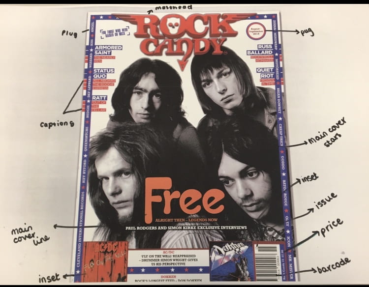
Conventional design features of a magazine

technical convention is something that’s typical on the front page of a magazine and would be expected to be seen when looking at that magazine.

Conventions of a magazine are:

  • Plug – something that advertises the magazine
  • Masthead – the name of the magazine
  • Pug – little bubbles of information, typically at the top of the magazine
  • Captions – pieces of text that tell the audience extra information, for example, who is in the inset
  • Main Cover Star – the artist who is captured in the magazine, is typically a close up
  • Cover Lines – information about what else is in the magazine
  • Inset – a smaller image of another artist, album cover, movie etc.
  • Main Cover Line – the title describing who the main cover artist is
  • Issue/Date – typically in the bottom right hand corner, tells you how often the magazine is released
  • Price – how much the magazine is, located in the bottom right hand corner
  • Barcode – located in the bottom right hand corner, used to scan the item in order to buy the magazine

After labelling the conventions of my magazine, I am now aware of what I need to include on my music magazine’s front cover to follow the conventions.