Category Archives: Digipak

Digipak Draft 3

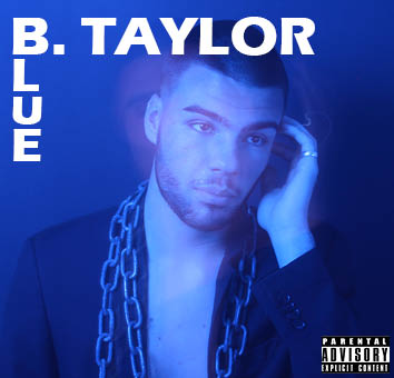
Below is my draft 3 of my digipak. I also decided to take pictures of it in a CD case. I did this so that I could see that I could see what my digipak looked liked as a real album and if it is conventional to other albums of my genre. Using feedback that my teacher gave me from her screencastify I made many changes which make my digipak look much more professional and conventional. For example I changed the fonts I was using throughout my digipak, I made the disco ball look much brighter using photoshop and I tidied up a few mistakes that I had made along the way. Overall I am really happy with how my digipak has turned out but for my final draft I will need to make a few more touch ups, for example I need to work on the lettering further.
 

Feedback From Peers – What Genre Does It Represent?

To help myself to understand if my digipak aligns with my chosen genre (hip hop) , I wanted to see of my peers around me could decode, the branding, star image and metanarrative and choose my chosen genre. I gave them a piece of paper which had seven different genres on it and asked them to tick which genre they thought suited my digipak.

    • Pop –  /
    • Hip Hop – /////////
    • Indie Rock –
    • Alt Rock –
    • Rock –
    • EDM –
    • Folk –

Receiving feedback from my peers has helped massively because it was clear that most people identified the correct genre. This was extremely helpful because I now know that I am going in the correct genre and with a few more edits I will be done.

Digipak Draft 2

This is the second draft of my digipak. I have added two additional panes, changed the font used, added additional colour and edited my photos in photoshop.

This is the Screen Castify that my teacher created where she tells me what she likes about my second draft and what I could do to make it better.

Feedback For My Next Draft –

  • I need to change the font I have used throughout the digipak
  • Make the chains sharper and brighter using photoshop
  • Add speech marks around lyrics and make them smaller
  • Add more lyrics on my inside pane
  • Make the disco ball pop in photoshop
  • Replace the name on the spines

After watching the digipak it is clear that I can develop my digipak further so that I can achieve a higher grade. I agree with all of my teacher’s points and I will use them going forward onto my third draft.

Digipak Draft 1

This is the first draft of the front and back cover of my digipak. Below I have assessed my first draft, considering camera, photoshop, mise en scene and the creative use of DTP. I have also considered targets for improvement for my next draft.

Targets for improvement –

  • Use photoshop further to play around with filters and positioning of my photos
  • Change the font of my text to something considered more conventional for the rap and R&B genre.
  • Add more colour and contrast to make it more interesting for audience.
  • Make the cover look less poppy and more conventional of the rap and R&B genre.

Evaluation Of Shoot Of Graphic Design

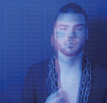
Following my shoot on Tuesday, I have began editing the first draft of my digipak.  Whilst shooting, I considered star image, the genre of my artist and brand image. Although, I am extremely happy with the  photos I took, it is clear that I could have taken more pictures so that I could decide from more options. Some things that I am happy about in my photos is the use of mise en scene. I think that his costume (shirtless with a suit jacket) fits very well with the R&B genre. I also really like the lighting and the use of blue film I placed in front of my camera which created tension and added a modern feel to my photographs. However, my favourite part of my photos was my use of high shutter speed. This created a wavy and almost euphoric effect which I think works very effectively.

Contact Sheet

These are my  contact sheets for my digipak shoot.

This is my favorite photo because I think that the lighting is very good and euphoric and mysterious looking. I also like the use of facial expression in this photo and I think the placement of his hand and body fits well with the star image and genre.


Photo Shoot / Design Production Meeting And Risk Assessment

Click image to view full PDF

To help plan out my photoshoot for my digipak I made a production meeting agenda and risk assessment. These documents outline location, camera shots, costume, props, equipment, risk and actions taken to prevent them. These are extremely helpful documents to have made because they are very good for referring back to throughout  shoots and help to plan before hand so that we bring everything that we need. For example planning costumes before hand is extremely good because it means that we won’t be rushing for a costume before our shoot.

DP Mocckup

This is the mockup of the digipak that I made after researching the typical conventions of the hip hop and R&B genre. Within this mockup my focus was to design an album that was instantly recognizable as rap or R&B whilst being unique and standing out to a large audience.  I also considered typical conventions of all digipaks, star image and the brand package.

Firstly, I decided that I wanted my artist to be photographed in dark, mysterious lighting using a thin blue plastic sheet to colour the artist and the background. I decided to do this because I have seen this done by many other artists using different colours and it is very modern and trendy. It also links in with the name of my album.

Secondly, I knew that I wanted my artist to be sitting down whether that be on a table or chair because then the focus can be on the artists face which I believe allows the audience to connect with the artist.

I decided to put an empty table with rubbish on it on the back cover. This is because I wanted the covers to look similar so that the album wasn’t to busy but I also wanted to create a grungy and dark theme at the same time which I think the blue light and and rubbish do.

However, even though I really like my initial design I will not be able to execute it because covid has made it extremely hard for me to use my model in my chosen venue. Therefore, instead I will be shooting my digipak in school using the darkroom. Although this is quite a drastic difference I will still be using some elements from the initial plan. These include the blue lighting, the use of a table or chair and I will be using the same costume as planned.

Digipak Conventions Analysis

In this post I have analysed the conventions of a digipak. I considered photography, colours, track lists and many other conventions whilst creating this presentation.  I also reviewed how the artist highlights his star image and how the genre of his music is portrayed through the album art. One element that particularly stood out to me was the name of the album placed in the centre of the digipak. This connotes a feeling of power and mystery which I really like and intend to do in my digipak. Overall, it is clear that Bryson Tiller’s album represents strength and passion and this is conveyed using many different conventions.

The Look Book – The Branding Package

To gather information and to develop inspiration for our digipak and SMP we decided to create a padlet where we collected photos of other artists, album covers, desired colour schemes and other graphics that we felt linked in well with our chosen artists and how we want our designs to look.

This helped us a lot because it helped us to consider our target audience and target market and what they want to see and desire. It is also a piece of work that we can refer back to throughout our design process whenever we feel we need more inspiration and are struggling slightly with our digipak and SMP.

Ultimately, this allowed us to create a picture of what our designs look like. For example I want my designs to create tension and mystery. I also want it to have typical conventions of hip-hop and R&B. I also like the idea of using LED lights similar to some of the albums on my mood-board because I think it creates a dark and grungy feeling.

Made with Padlet

Our Mission Statement – The Package Brand

This is a slideshow I created on my mission statement and marketing strategy for my digipak and SMP. It focuses on the brand, vibe of the whole package and integrated advertising methods. Within the slideshow it contains lots of information on my target audience,  where and how I would like to market and promote my artist, who my artists competition are, their unique selling point and their mission statement.

This task is extremely important because it helps me to think critically about who my targeting my target audience are and what things they are interested in. This helps to create a picture in my mind of what I want my digipak to look like and it is something that I will be able to refer back to throughout the design process whenever I may be struggling.