Before actually making our tour poster, we had to research different ideas and gain inspiration from past real-life tour posters of actual artists from our genre, mine being folk. After browsing around, we made a moodboard of all the posters we found and we saw a correlation in the design features, below is my moodboard:
Some of the distinct similarities were:
- All photos of the model were in black and white or drawings/portraits of the artist
- Text was all in capitals
- The colour scheme was not too complex – most only consisted of 2-3 colours
- All the fonts were basic and legible
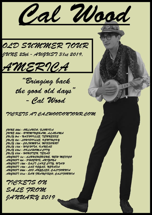
After making the moodboard and brainstorming ideas on how I can make my tour poster look authentic and fit the theme and design I wanted, i put my ideas straight onto the indesign page and this was my outcome.
This finish product was exactly what I was going for and, in my eyes, fit the genre and colour scheme of the Folk genre. The black and white image on top of the sandy-yellow background gave the poster an authentic, ‘olden days’ feel, even though the tour is set to start in the modern days. The font looked as if all the words were hand written. Targets I might have for any future tour posters could be to make the information less wordy and make it more brief and punchy.
