
Loading…
Loading…
Below is my letter to a new media student. This new paragraphs are split from slide to slide.
From the production and execution of my music magazine, I have learnt a lot of new and useful transferable skills. All from the practical work that I will be able to use in later projects and also outside of the classroom in my own personal life. Skills I learnt were:
These features allowed me to make my magazine to as high a standard as possible, but it wasn’t perfect. My goals for next time I use these are:
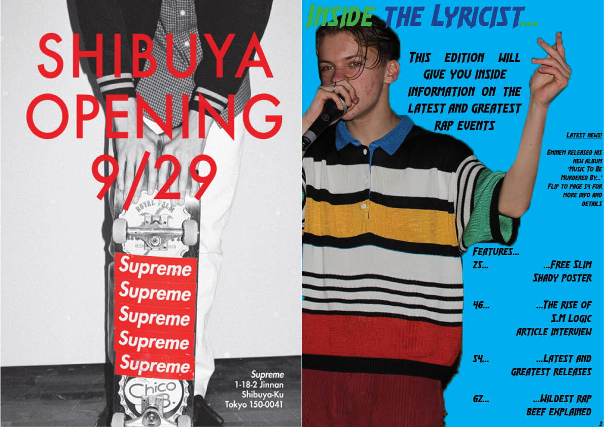
Below are the adverts I chose for my magazine. I chose both of the adverts because they were related to rap but both have deeper meanings. For the first one on the left – Eminem Recovery – I chose it because in my article, my artist spoke about how Eminem was his inspiration to music and how he was the reason the S.M Logic was got into rap in the first place, so it seemed quite fitting to advertise my stars idol. To the right of that is an advert for a popular clothing brand among artists. It has reshaped the fashion choice among rap artists. The artists that wear these brands don’t usually intend this to happen, but it is a very subtle and accidental advertising method as fans will want to wear similar clothes to their favourite artists.
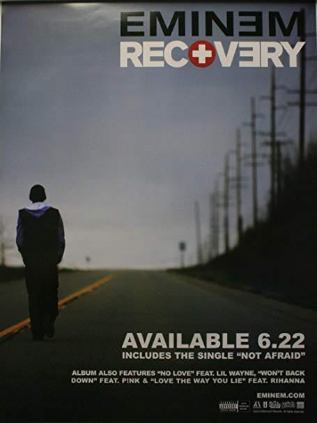

These adverts suit my audience as they are both linked to the hip hop genre. Eminem is one of the greatest and most popular hip hop artists of all time so it seemed fitting to put an album release advert in my magazine. Supreme is a very popular and high quality clothing brand which make a lot of their money from selling hoodies. A lot of current hip hop artists wear Supreme branded stuff as it is their style and is good quality lasting produce.
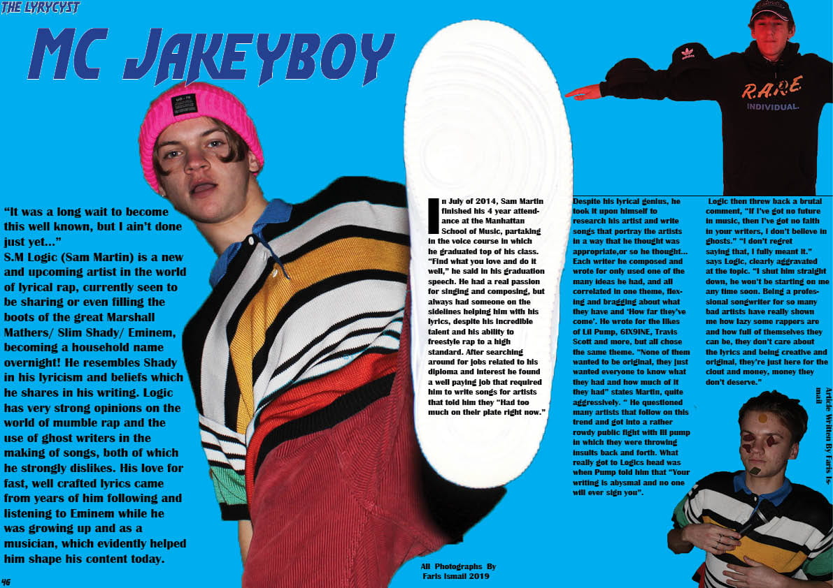
Below are my final magazine drafts.


The feedback given from my teacher was:
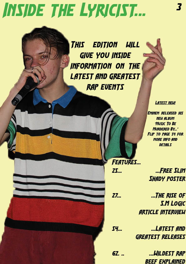
Front cover
Contents
DPS
This feedback will help me edit my magazine and make it look more authentic. The feedback is very specific so I will be able to see exactly what I need to edit to improve the overall quality of it.
From the making of my magazine, draft to draft, I learnt a lot more skills from the software we were using, both of which allowed me to create a finished product that has an authentic and presentable look. It allowed me t give my overall finished product a more professional feel. Below are some of the skills and tools I developed:
 The stroke tool – This tool allowed me to give different texts and shapes boldness and definition. This gave my magazine a better design and added more graphical design features to show the the creator (me) cared about the product in hand. This gave the end product a more professional feel and it gave anchors to texts and images that were just floating in their spots on the page.
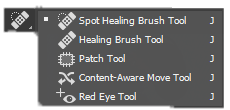 The spot healing brush tool – This Photoshop feature was essentially an airbrushing tool, replacing blemishes on pictures and replace them with a more consistent overall colour. This helped give my magazine a well produced look and showed that the small; features were edited and moderated with care and precision to help make them look authentic.
 The arrange tool – This tool allowed me to arrange the order – front to back – of the content on the page. It allowed me to move graphic design features behind pictures and text to give a 3 dimensional look to the pages in the magazine, making it look like a magazine which was worked on a lot and cared about.
 The eyedropper tool – This tool was in both indesign and Photoshop, and it allowed me to select a part of an images colour that I wanted to use elsewhere – in text or in any graphical design features. This allowed me to keep a consistent colour scheme for each page as colours from my pictures match or worked well with colours that I copied or chose for the text and graphical design features.
Below is my redesigned contents page:

Peer assesment:
I made a lot of changes from the previous version, those changes were:
These changes helped develop my contents page from looking like a bland, unconventional blue page to a contents page that looks more conventional and authentic, presenting the Hip Hop genre better as it is still simple but it is bold and catches potential readers eyes.