Please click on the image to view our advert in more detail.
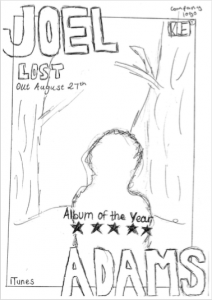
For this task, we had to sketch a rough draft of what we hope our advert will look like. We took inspiration from our digipak and therefore it is evident that we have used the same lay our for our advert. This will ensure that the audience are aware it is part of the same project and therefore all sections of the task will easily be connected wit one another visually. We have also been sure to include the general conventions of an advert, for example elements like the image, artist name, album title, star rating, company logo and release date are all displayed clearly on our advert. Moreover, we have also ensured that we have remained conventional to our artists star image and genre. We did this by keeping an authentic, simplistic feel to the appearance of the advert.
From this, we leant just how important it is to have a clear plan of what our product should look like before we have entered the production stage. This enabled us to see what things worked well and what perhaps didn’t work so well. Therefore, ultimately, this aided us to save time and create our product effectively without wasting so much time.