Digipak Draft 2

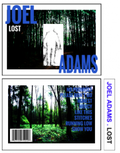
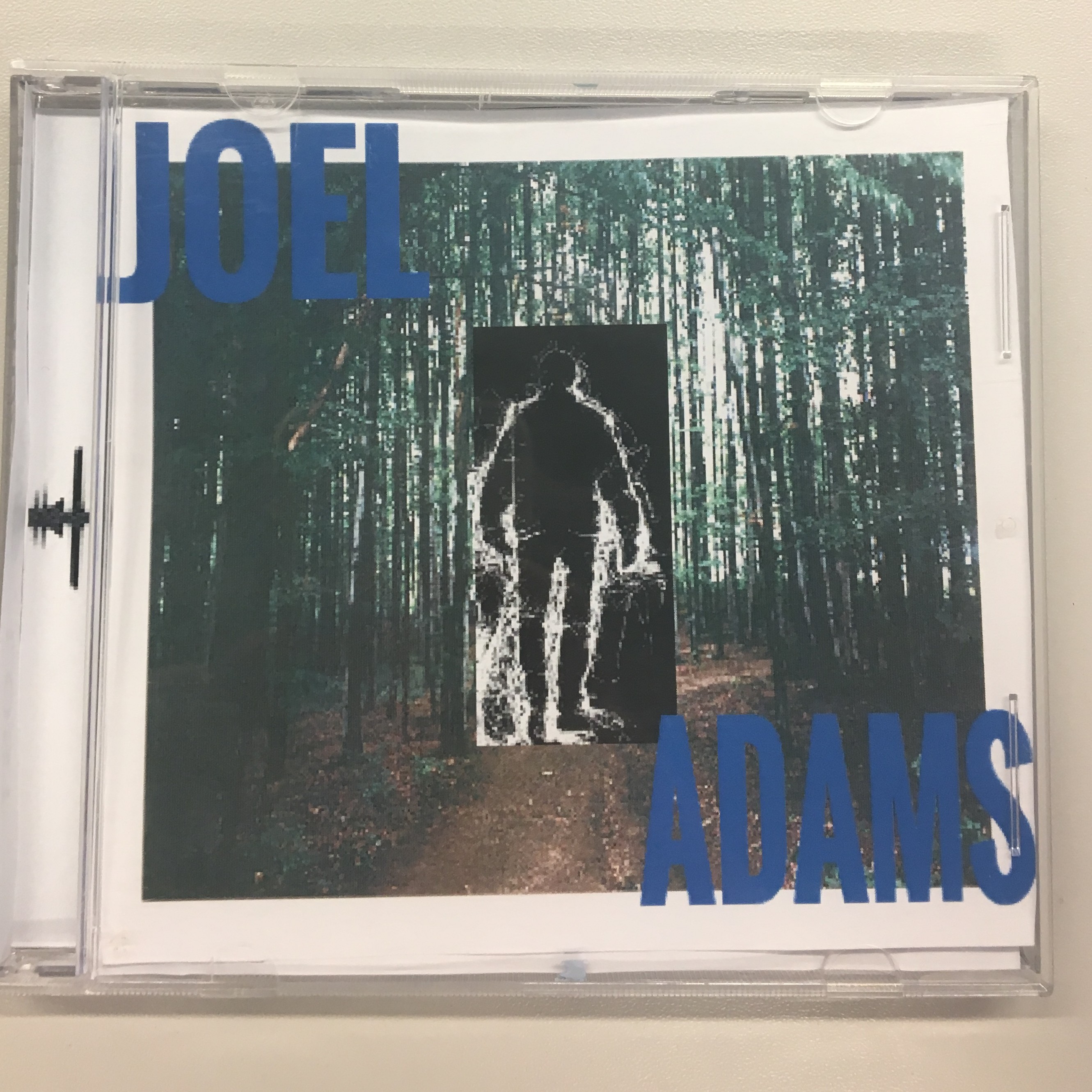
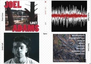
Please click on the above image to view the digipak in more detail.

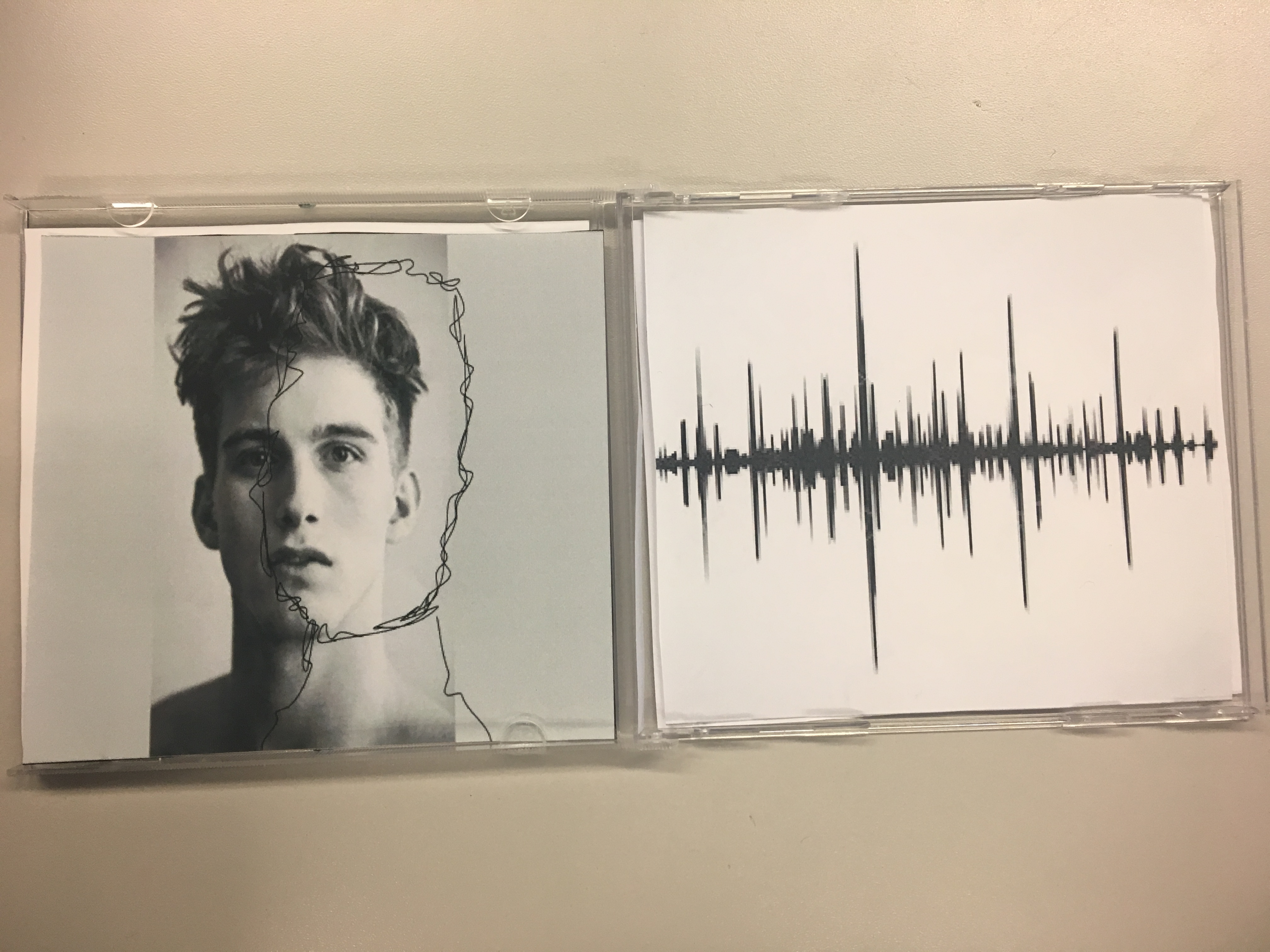
Here, we further improved our creation of the digipak. We ensured that the targets following draft one were completed and therefore we were able to really link our artist to the design a lot more professionally. This enabled us to really improve on our work, meaning we were able to complete the second stage of our project appropriately and efficiently. Some of the targets from draft one were elements like to finish the actual front and sided cover as these did not yet include the sketched outline of our star. Another target, was to actually add an element of the colour red to our sound wave on the inside panel. Many of the people who completed feedback felt there needed to be more connection between this panel and the rest of the digipak and therefore they believed this would be the best way to do so.

From this task, we learnt just how important it is to actually take on the feedback of our audience. This enables us to really appeal to the target audience and moreover create a product that is suitable for them. Due to this, we are able to create a product where we can predict the overall pleasure, meaning we can almost estimate how well how product will do. Once again we have also learnt what elements of the digipak work well when printed physically and so this taught us that we must be able to create a product that works perfectly digitally and physically.


Digipak Feedback and Targets Draft 1

screenshot-2017-01-05-at-09-37-18

Please click on the image to view all of the forms.

Here, we thought it would be best to gather written feedback from our peers. This is due to the fact that we thought this would be an efficient way to gather constructive criticism that we could continuously refer back to. Therefore, here, we asked our peers to complete the sheet to the best of their ability in order for us to gain the appropriate feedback we needed. The questions that were asked were elements like; whether or not it looked like a professional digipak,  if the mise-en-scene illustrates the genre and if the music video and digipak are mutually reflective of one another.

From this task, we have been taught how essential it is to gather feedback throughout the entirety of the production stage. This will make sure we are aware of the elements that do no really work and therefore improve them before we finalise our product.

Targets:

  • Experiment with a wider range of fonts.
  • Make a stronger connection between all the panels, perhaps add a pop of red to the inside right panel.
  • Make sure all of the sketched drawings are drawn as best as they can be.

Digipak Draft 1

Please click on the image above to view the digipak in more detail.

We went on to begin creating our very own version of our digipak here. We did this by making sure that we really referred to our pre-planned mock up and therefore this enabled us to create our digipak with ease.. This aided us to complete our work effectively, resulting in us including all the necessary conventions for our specific genre and the product we were creating. After completing this draft, we hope to receive the construction critics necessary to further improve our product and really link it to the music video we previously completed.

Here, we were taught just how necessary it is to actually make effective use of our previous mock up. It ensured that we did not miss any details our during the production stage and therefore we were able to really attract our target audience. By continuously referring back to our initial design, we were able to make a digipak that was conventional and therefore really represented the artists we are tying to portray. Therefore, we have learnt what elements of the digipak are appropriate when physically printed, teaching us that our product must work both on/ offline.

Digipak- Evaluation of Shoot

This shoot was very easy and simple to complete. We only really needed three simple images in order to complete our digipak. We started by going to the reservoir, here we discovered our location (after previously going to decipher where would be best to shoot our images) which was close to the water and in between two trees. Furthermore, we began shooting a couple of simple shots that pictured the two trees with the water as the background. After defecting the shot for the front of our digipak, we then decoded that the roots on the ground also appeared to look quite interesting. Here, we decided that this could be the image that we used on the back of the digipak. Furthermore, we took part in a second shoot for the inside panel of our digipak. Here, we took our star into the black studio at our school and completed a range of different shots. However, we eventually decided that we preferred to have a simple, straight- forward portraiture image of our performer that we could easily sketch over.

Overall, we were very happy with how both shoots went and therefore we could quickly and easily begin to edit our images as soon as we had shot them. This led to a very calm production process for the digipak section of our project. Below are a few of our experimental shots, before we decided where exactly we wanted to shoot our images.

Digipak- Graphic Designs/ Illustrations


We carried out a couple of graphic illustrations throughout the production of our digipak. The first one we did was the construction of the right inside panel. This simply involves a sound wave which we cut from our song and then adjusted the colour so the wave was white and the background was black. After doing this, we then copied the sound wave and decreased the size to about 50%, upon doing this we placed the new red sound wave into the middle of the original completing the right inside panel of our digipak. Above displays a few images of the process that we went through in this production.

The next graphic illustration we completed was the sketched outline of our performer on the digipak front cover and left inside panel. We took pictures of our performer and then used tracing paper to copy his general outline. This allowed us to transfer his image onto our products and therefore complete a very realistic image that finalised our product. Below are a few pictures of this process:

Digipak- Contact Sheet

Please click on the image to see our images in more detail.

Upon completing the shoot for our digipak, we were left with a range of photos to review. This enabled us to have a selection of images in which we could choose the best and most suited picture that would compliment the rest of our product. We were able to pick the best image from all of those we had taken and therefore this allowed us to create the most conventional work for our product. Moreover, this enabled us to have the best foundations for our work and a suitable background for the image we planned to sketch of our star.

Here, we learnt just how important it is to make sure a range of images are compiled after every shoot. This allows the best photos to be identified and therefore the very best product can be made once the right image has been found.


Digipak- Risk Assessment

screen-shot-2016-11-14-at-13-54-57

Please click on the document above to view the risk assessment in more detail.

The risk assessment involved us reading through the above criteria and acknowledging all of the possible risks we may face shooting our images at the reservoir. We thought about things like transport risks and heights/ edges, ensuring that we made ourselves aware of all the possible dangers that we may face while shooting the required images. Once we had ensured that we covered all of the risks, we each printed and signed our names. After doing this, we then made sure that we also received the confirmation and therefore  the signature of our teacher.

Here, we learnt just how necessary and important it is to make sure we fully understand and recognise all of the risks we may face while shooting our images. By doing this, we will ensure that we do not waste any of our time and therefore this will entail that we complete our digipak quickly and efficiently. Moreover, by recognising the risks now, we will be able to avoid them while shooting our images.

Digipak- Production Meeting Agenda

screen-shot-2016-11-22-at-14-25-59

Please click on the document above to view the full production meeting agenda.

Here, we had to complete the above document in order to be prepared/ organised enough to shoot the images for our digipak. As a group, we filled in all the necessary details. These included things like an outline of the performance, the performers, costumes, props and finally who would actually be shooting the images. As you can see from the documentation, a lot of these sections doesn’t actually apply to the pictures we are hoping to take/ achieve.

Due to this task, we learnt just how important it is to organise what exactly we are doing before we go out and shoot our images. This will ensure that we use our time efficiently and effectively, moreover this will enable us to achieve the images we envision. Furthermore, this document will also help to make sure nothing goes wrong and that we are fully prepared to go to our location and take the images.

Digipak- Feedback and Targets


For this feedback, we decided to gather a series of vines from a few of our peers. We believed that it would be much more effective to receive some short, revise advice that we could really concentrate on to make a draft two fro our digipak. We asked our peers to list one element they believed worked rather well and then two factors that could be improved, changed or perhaps added to the digipak. These clips last about 3-5 seconds each and explicitly inform us of the above criteria and therefore will help us to take our product to the next stage.

From this task, we have learnt just how important it is to receive feedback throughout the whole stage of production. This will ensure that we changed elements that do not work a  work on it, rather than having to take a mass amount of factors at the very end. This will ultimately help us save time and create an appropriate product.

Targets:

  • Experiment with adjusting the text, perhaps changing the colour and texture would be more conventional.
  • The images seem a little dark, so when it comes to the digipak make sure to brighten them.
  • Also try flipping the colours on the sound wave image, this would make it correspond a lot more with the other images thus seeming more connected.

Digipak Photo Mock-Up

screen-shot-2017-01-02-at-14-35-00

Please click on the image to view the full digipak mock up.

img_1465 img_1466 img_1467

Here, we had to create a digital version of what we hope our digipak will eventually look like. We took images from online to make a rough drafted idea of our future digipak. On our front cover, you can see we pictured a scenic forest background with a sketched outline of a male figure in the centre, we then have our artists name and album cover here too. Again, the back of our album is also fairly similar, with a forest background and the same font used for the song names. However, we have also included some of the conventional features, such as; the barcode and album copyrights. As you can see, we have a running theme of an almost sketched authentic look, we included this on our inside panels too. We hope to shoot a portraiture image of our artist then sketch his outline over the top.Furthermore, for the right hand side we will have the sound wave of our song. Moreover, we have kept our spine simple to compete the digipak’s overall style, it simply inflates the artist name and album title.

This task enabled us to see what would work well in our digipak and what we perhaps need to make slight alterations to. We decided that the running ‘sketched’ theme worked very well with our album and artist star image, due to the fact it simply completed the authentic simplistic image that we were aiming for. However, after completing this task we are now not too sure about the colour of our artists name on our album cover, we feel it looks a little random and therefore we plan to change this in the production stage.