First Magazine Draft
Assessment
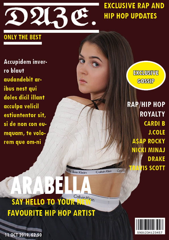
I am happy with my first draft as I have never done anything like this before, and I believe this is a successful first attempt at a front cover. Aspects I consider went well…
- The size of my masthead is large and bold.
- Cover lines font and size is clear and easy to read.
- The vibrant yellow goes well against the dark background (although I don’t like of the red tone).
- The models pose and outfit portrays the effect I was aiming for.
Peer assessment
Feedback on what cloud I improve…
- Change masthead typeface to a more legible style.
- Enlarge the cover star image.
- Replace background colour to complement other cover line colours.
- Work on the photoshopping to get a cleaner cut line.
After looking over the feedback I was given by my peers, I’ve created a few targets for myself. Make my star image bigger; choose a different font for my masthead; edit magazine colours to compliment each other and finally build up my editing skills to get a clean cut image. When enlarging the star image, I think it would be ideal to crop it from the waist upwards to celebrate the face. Also when changing my colour scheme I think it’ll be best to stick with primary colours + black and white to strengthen the look of my front cover.