Branding Ideas + Mission Statement

My Music Magazine name and about it…

I am going to call my music magazine ‘DAZE.’ I decided this name would be good as it is short and sharp, also I would like for my audience to be dazed by my magazine content and the genre of music within it, therefore I though this would be a fitting name.

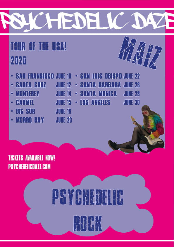
I have chosen the genre Rap/Hip Hop.

I listen to rap and hip hop often so I thought it would be a good music genre for me to focus on in my magazine. I enjoy listening to rap/hip hop as I like the fast beat and base of the music with the fast rhyming lyrics that blend well with the up-beat tones. I think presenting a model and photoshoot in the style of this genre won’t be difficult as I believe I’ve got enough knowledge on rap/hip hop to convey it through an image.

Word Cloud…

Here is a word cloud I have made full of words that I believe connect to the rap and hip hop genre. For example I used words like energetic, fast, bold, expressive and unique as they all link to the music genre.

Mission Statement…

DAZE. is the biggest rap/hip hop magazine in the world, it’s filled to the brim with the latest up-coming rap/hip hop artist; news on celebrities; information about celebrity lifestyle; and the hottest rap/hip hop gossip. DAZE. is always packed with the best info on rap/hip hop right now, they also have the best images of celebrities on their covers, which makes me buy it every month. This magazine will bring the community together with its up to date trends and features, drawing in the audience and making them want more. You can’t miss this magazine with its bright text and bold images! It’s made only for the best of audiences, it exclusively contains rap/hip hop royalty. If you’re featured in DAZE. you should be proud, you mean something.

My Tour Poster

My Psychedelic Rock Mood board

I have found some psychedelic rock album art and created a mood board to help me with my own tour poster. From this research I have learnt that psychedelic album art has many features to it, but there are some main aspects that have stood out more than others…

  • Colours-There are many different contracting colours used in this album art, they are all bright and vibrant shades to catch your attention. The bold work is very ‘in your face’, yet it still has a pleasing look to it.
  • Imagery-The images normally used are wacky and striking to catch your attention. Most of the pictures are distorted in some sort of way, giving it an eccentric look.
  • Fonts-The typeface used on psychedelic art is mainly bubbly and dramatic with an alternative kind of style. The writing is also normally quite fitted to the poster or album.

My Tour Poster

If I was to do this again there are a few changes I would make, for example I would make the image of the model a lot bigger and bolder to make more of a statement. I think I could of made better use of the negative space by using a different or larger image to attract the audience, also if I had used an upward eye line from the model it would have drawn the attention of the audience to the call and action.

My Evaluation 

Click on ‘My Evaluation’ for the full document.

So… How can an image communicate meaning?

There are many different aspects to think about when creating media, a lot more than you think.

I have learnt many things over the past couple of weeks, including how to use a DSLR and the techniques of how to take an effective photo; adding Mise-en-scene into work to create successful media; making sure your media fits the target audience; and how to make media appealing to the consumers.

Mise-en-scene is the placement and arrangement of things in the photo, to create a story through only visible aspects within a picture. One way to remember the features of Mise-en-scene is “CLAMPS” to take a successful image:

  • Costume
  • Lighting
  • Acting
  • Makeup/hair
  • Props
  • Setting

When using aspects of the camera to tell a story you need to think about the focus, angle and distance of your image, this will help your media to progress. When making my own music magazine I will remember each aspect to successfully create a magazine that is interesting and entertaining for my target audience. Both Mise-en-scene and photography work well together to create meaningful media, for example normally a low angle of a character indicates power, but if its a low shot of a sad child this would not represent control. This is why it’s important for the photography to link with the Mise-en-scene to work successfully.

The Camera Talks

This is a mood board I created using 9 of my favourite photos we took, I have labeled them with three hashtags each. The hashtags explain camera terms that were used to take the photo and other aspects within the images.

Made with Padlet

By doing this photo shoot both my partner and I have learnt how to work with a camera and how to take effective images. However, it wasn’t so easy, we had a few difficulties with focusing the lens and getting the right ratio between lighting and shading on the pictures, this is due to the positioning of the model when she was stood in front of a window it would create a darker silhouette against her. After solving these problems we started to focus on getting different angles to create a more powerful image, being able to tell a story through a single photo.

My Magazine Front Page Swede

We were asked to recreate an existing NME magazine front cover with the help of Adobe InDesign. We could pick from a variety of different NME magazines, I chose to remake the cover with Rihanna on the front, as I liked the bold hot pink writing along with the slightly moody image of her. I had never used Adobe InDesign before so we were taught the ins and outs of how the tools and applications work. For example, to add an image onto the page you must select the tool to draw a box so you can insert your photo. I have also learnt how insert a pug too, by selecting the circle icon and dragging it over your desired placement and filling with colour or text. By putting this magazine front cover together it gave us practice for when we come to create our own music magazines and have to use the InDesign features. I feel comfortable and able to use Adobe inDesign and create good magazine covers with the correct features they require.

Below is the original NME magazine cover I chose of Rhianna and just underneath that is my recreation.

Looking back on my work I am proud of what I have created as I’ve added all the elements that were used on the original cover. However, I do feel as though I could improve on getting the quality of the image more crisp and clear for the audience, also I’d like the better my placement skills to really represent the original front cover.

Here are 3 youtube tutorials about how to create a successful magazine with Adobe InDesign. I found the information within each video useful and will be using them in the future to perfect my own music magazine. I believe they will help improve my skills when using InDesign.

A Front Cover Analysed

Below is a MOJO music magazine cover that I have analysed, I looked into the audience demographics/psychographics, mission statement and how they’ve made it an appealing front cover by using…

  • Images
  • Language
  • Font
  • Colour pallet

This magazine has a very confident aura, considering themselves the best magazine with only the best content. I have learnt that all elements are important when creating a magazine cover to entice the audience, even the small details like font, colour pallet and plugs. For example, if you have a magazine with a dull grey colour pallet not as many people would buy it, yet if colours where bold and vibrant people would be attracted to they eye catching features.

Audience Profiling

This is a magazine cover for Mojo, I have annotated it by profiling what kind of audience would read/enjoy it.

I feel they have done a decent job of creating their front cover, they have included all the main elements (masthead, main cover line/star, plug, pug, captions, etc.)

Their audience is mainly Generation X and above, therefore the readers are normally well educated and like informative content about music they’re interested in. I found that most of the artists and bands in this magazine are amid at Baby Boomers which is slightly older than the target audience, yet there are also a few bands who are mainly listened to by Millennials. I think the dark gradient background blends well with the bold white, red and yellow writing, creating an eye capturing front cover. Overall I think this is a good first impression on the magazine, as I believe the appearance will motivate people to buy it.

Conventional design features of a magazine

The main features on a typical magazine are:

  • Masthead
  • Captions
  • Main cover line
  • Main cover star
  • Pug
  • Plug
  • Issue/date
  • Price/barcode
  • Inserts
  • Coverlines

By using these features on the front cover of a magazine it creates a good first impression, as the read will know exactly what they will be consuming and for how much. Magazines normally only use about 3 main colours on their front cover to attract audiences and make it eye popping.

My image that uses mise-en-scene to communicate meaning.

In our group we were given the theme psychedelic rock to focus on. With the time and props we had, we made the decision to do a slightly subtler look in the image of bands like Pink Floyd and The Grateful Dead.

From our research we learnt that psychedelic rock originated in the mid 1960’s in the UK and USA, and the stylistic origins come form many different music types a few are rock, folk and electronic. The typical instruments that are used consist of electric guitars, keyboards, electric organs and synthesizers, we also found that psychedelic rock invokes three core effect of LSD and one of the reasons it was popular among teens in the era.

For our shoot would would need to focus on costumes, props and positioning. For our outfit we decided on a tie dye jumper and a patterned head scarf with some red toned glasses and wrist bangles. We got an electric guitar to hold which presents the kinds of instruments they use in the music, we want a laid back feel so will use a relaxed pose.

Made with Padlet

This is the final photo we have representing psychedelic rock:

I decided this photo explains our genre of psychedelic rock the best, the model looks concentrated yet relaxed. The colourful and mix match costume reveals the kind of mood we were trying to portray, I prefer this image as the model is holding the electric guitar. The way she’s positioned sitting on the floor casually reflects the sort of vibe that followed this genre of music.

Print Media that Communicates Meaning

Here is a Dua Lipa ‘Hotter than Hell’ tour poster, I have analysed and depicted it by adding labels and explaining the colours, writing and other aspects.

I have used mise-en-scene to help my understanding and how to express the format of the tour poster.

  • Costume
  • Lighting
  • Acting
  • Makeup
  • Props
  • Setting

When creating my magazine I must keep ‘CLAMPS’ in mind to create a successful print. My model must be wearing an outfit that suits the genre and connects to the artist or band. Lighting will be important as it presents what kind of mood and tone is being used, for example dull lighting for  a sad scene and bright lighting for a joyful atmosphere.  By putting my model indifferent positions and poses I can tell a story with facial and body language, expressing the mood I would like to portray throughout the magazine. Makeup and hair is very important to telling a story though a photo, by using heavy drastic makeup I will create a statement and focus point on the model. By adding props the audience can understand the genre and what kind of magazine it is with extra evidence. It’s important that the setting fits in with the rest of the image, linking each aspect together and forming the overall mood/tone of the magazine idea.

Skip to toolbar