How do the elements of your production work together to create a sense of ‘branding’?
In order for the audience to be able to recognise the branding, the elements of production need to work flawlessly together. In the artists mission statement, she is described as bringing a youthful relatability to the music industry, being unique but also being a ‘realistic role model’ who comes with a ‘raw sound and unfiltered stories’ in her new album. This complies with what Dyer would call the Paradox of the Star as she has both an ordinary and extraordinary star image. This star image was particularly created in the social media page where Maeve posted her exciting and wildly successful life, but also cas ual everyday activities. This really helped create a sense of branding, however the overarching theme in Maeve was her confidence and femininity. This was only ever juxtaposed in her music video, which explored the darker and more personal spots of her mind. The video complies with De Saussure’s theory as it allows the audience to decode the narrative of her fantasies of wanting to get revengeon her previous lover and is obviously something very personal for her. This allows the audience to feel involved in her life and thought process and she communicates with them by talking about this on her instagram Q&A. However she was still able to stay true to her branding in order to please her target audience by using bright neon lighting and adorning aesthetic makeup and clothes. Her mise en scene throughout the campaign is often similar, with lacey, colourful dresses and bright intense makeup, creating her own branding that fans enjoy and take inspiration from. This was further expressed through the Digipak, wh
 ere Maeve is shown continuously in a self assured manner, posing in trendy, unique ways in bright lighting. The colours alone are enough to attract her target audience as it looks aesthetically pleasing. Overall, media language was used effectively throughout the products to represent her brand. From the fonts on the Digipak to the images on the social media page to the mise en scene in the music video, integrated advertising required everything to work together to deliver the same message for Maeve.
How did your research inform your products and the way they use or challenge conventions?
In my research, I found that there is what Lacey would call, a repertoire of elements that go int o a music video, such as edit to beat, transitions, performance and narrative, etc. I found that I could both use and challenge these conventions to a music video. For example, having a 50/50 narrative and performance is often seen in music videos, however in mine, I found that I enjoyed the mix of performance and amore symbolic narrative. This was done through ways such as subtle shots of the mainstar with hearts projected on her
 , pans of her standing above her ex-lovers dead body, or quick shots of her covered in blood and running from the police. In my research, I found it is conventional to dress the star appropriate to what your theme and genre are. To help convey her narrative of two different personas, one good and one evil, I relied heavily on mise-en-scene. She was dressed in black dresses and leather suits in some scenes, and white lace dresses in others. Her make-up was bold and colourful and bright to show her intense and shocking personality. Other conventional features in music videos that I discovered were lighting and camera movement. I often had still shots of my star, but in some clips, such as ones of her dragging her shovel, the camera follows her or pans up to show she is menacing and dangerous. To demonstrate she was a criminal, red and blue lights were used in some lip syncing performance clips to seem as if she was surrounded by police and this went perfect for editing to the beat.
How do your products represent social groups or issues?
In my Digipak, I wanted the artist to be represented as a euphoric and confident idol. I also wanted to represent the indie pop era in its stylish and colourful way. To do this I took photos of her in bold makeup with bright colourful lighting. The colours helped to convey the eccentric, hyper-femenine star image she came with and the posing reinforced her confidence and power, somet hing that is often shown through her music. The typeface used for the front cover was bright blues and purples and swirled across the page, outlining her body and highlighting the quirkiness of the indie pop genre. Her body language was graceful and exceeded femininity. The star is leaning on a broken TV that displays a purple static, indicating that maybe she is not as perfect as she seems. I wanted to meet with Dyer’s Star Image Theory of having an extraordinary and ordinary artist. I feel as though Maeve is certainly more of an extraordinary artist when it comes to the mise en scene due to her bright bold eye makeup and stylish dresses. The lighting and her poses exhale confidence and she is creating an iconic branding for her audience to enjoy. The cultural code of the photo booth montage implies a young, bubbly, s
 ociable person who has fun messing about. However, according to Hall’s theory on audience decoding, only Maeve’s target audience would decode the reference to photo booths and the silly, immature fun that younger people have in them. Another unconvention and extraordinary part on the front cover is the large blank space above the title. I think this works well as it shows it is different and unique anddraws more attention towards Maeve. The more ordinary parts of the digipak are the features such as the bar code, tracklist, artist name, ect.
How do your products engage with the audience?
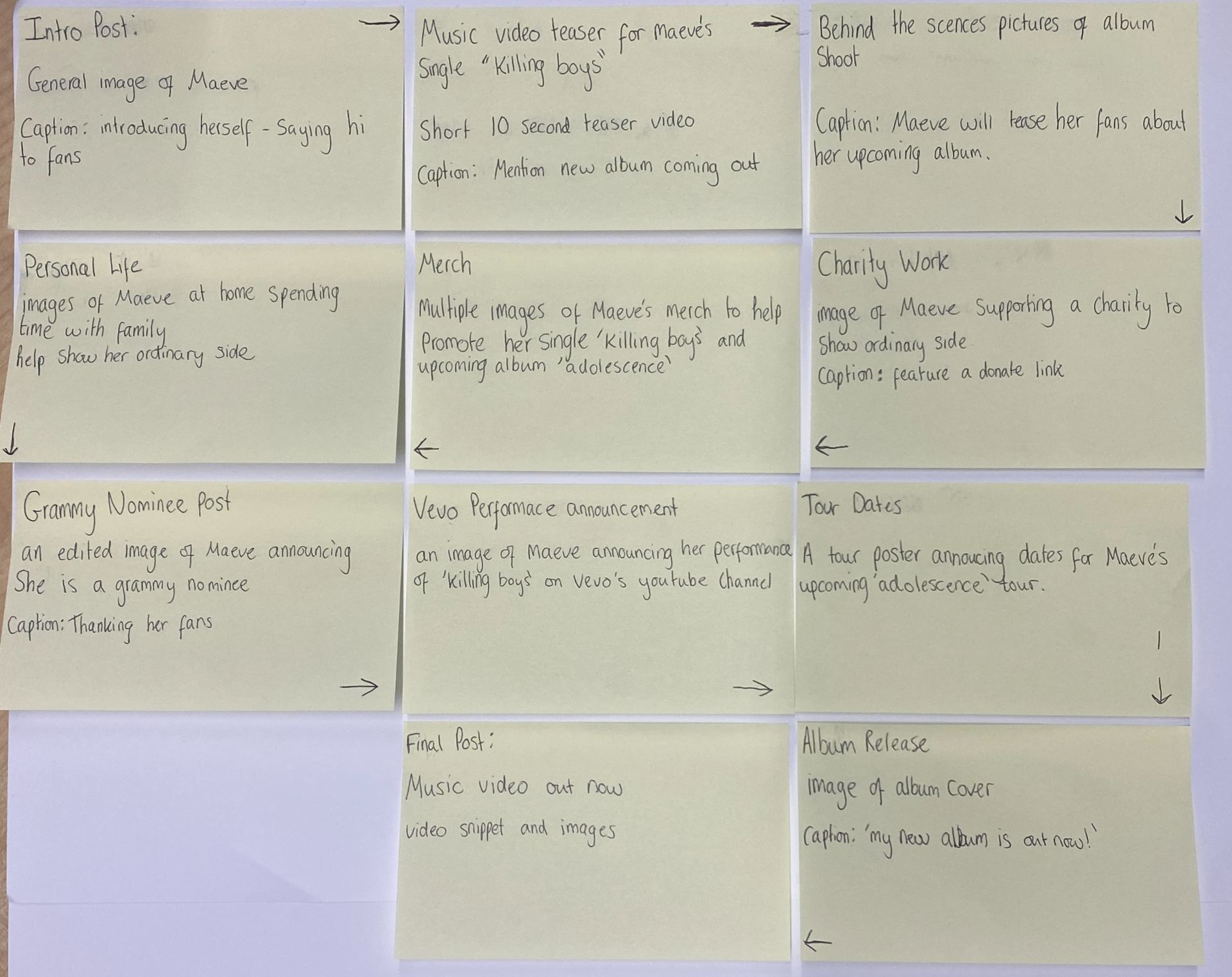
In creating a Social Media page, I decided to use Instagram, as it is an extremely popular platform and easily allows artists to engage with their audience. One example of how Maeve was able to do this was by doing a Q&A with her fans. They were able to leave questions and she could reply to them through posts on her story. This way Maeve was able to keep her audience up to date with her next career moves and could engage them by showing them some of her daily life. This works with Bluml er and Katz’s Uses and Gratification Theory as it provided entertainment for her target audience as well as participation in social interaction. Her mix of posts showed Maeve as being both ordinary and extraordinary. Usually a celebrity’s instagram feed is filled with pictures of them doing wild and exciting things, such as tours and award shows, so their story is really a place for them to show their more relatable and casual side, to give their audience the representation that they are also human.
  Another way in which Maeve interacts with her audience is by releasing tour dates and answering questions in the comments. I made a tour poster in Indesign and then uploaded it to her instagram. This aligns with Blumler and Katz’s theory as it provides the target audience with information and entertains their interest in her as they will be able to see her perform. It also works with the goals of all marketing campaigns; AIDA. It attracts the audience as it is bright and colourful and it allows them to see their favourite artists. It peaks their interest and desire as this is almost a once in a lifetime opportunity that they will never forget. It’s also a call to action, with the instructions of how to get tickets being in the caption. These things all provide audience engagement as they are being given an exciting and wonderful experience by their idol.