Digipak final draft

Here is our final draft. We have made a few minor changes, such as the colours of the front cover. The pink was just too much, so we decided to stick with the vibrant white, which creates a modern and angelic tone, but made the warped title ‘Aolescence’ an erray of pruples to shoiw this is still and indie-pop album. We also changed the font colours on the back to be black and white, so that it is more modern like the front.


DigiPak draft 3

In our third draft, we have just altered the colours to make a similar theme run throughout the album so it is more conventional. We also chnaged the back photo as we loved the colour scheme and the quaslity of the photo.

Targets:

  • try and get some differnt fonts in
  • make the front less pink on the artsit
  • chnage the colour scheme of fonts

CD format and student feedback

After putting our Digipak into a physical CD cover, we were able to recognise what changes had to be made and what we liked. Before making these chnaged though, we needed a fresh perspective of the album, so we created a survey of different genre’s for our peers to guess which ours was; indie pop.

This clearly shows that we have gotten it right so far, with almsot everyone ticking indie-pop. This new perspective is important as in media, we heavily rely on audience engagement and now we know we would be able to attract our desired target audience.


DigiPak draft 2

Here is the second draft of the DigiPak, including all 4 slides. We have changed the front cover complately after our second shoot, as we loved this photo and the use of props. We have placed the text wrapping around her to convey she is the star of the show. I also like how unconcentional the empty space is as it makes the cover look unique. We also chnaged the photo and the colour scheme of the back cover as we just loved how confident she looked. We also used a gradient of warm colours for the spine to show she is fiery and exciting and to add more vibrancy to the DigiPak.

Teacher feedback:

Targets from teacher feedback:

  • Make front cover more vibrant to stand out even more, make less grey
  • Use a differnt font for the artists name as right now all the fonts are the same
  • Make the artist pop more, whiten eyes, features, etc.
  • Make the back cover and front more similar in colour schemes

Moving on, the feedback from our teacher has benefited us as we now know adjusting and editing our photos is important as it allows the album to be more vibrant and intense, which is important for the indie pop genre.

Digipak draft 1

Here are the front and back panes of our first draft for our CD cover.

What went well:

  • We were able to take good, clear photos with appropriate angles that are unique and artsitic
  • Her mise en scene was bold and vibrant, consisting of bright jumpsuits and detailed, jewled eye makeup.
  • Our CD conventions work well with the Digipak and I like the layout of the title and the tracklist.

Even better if:

  • We should take more photos to get more diverse pictures for the CD
  • Get more wide shots and more photos that match the vibe to our inspiration
  • Get a better font and layout for our Title and Tracklist

This draft 1 of the front and back of our digipak has turned out differently to how we imagined, so we will have to go back and take some more photos, but for now I am happy with this being the first draft. It is colourful but not too intense, with the main colours being greens and blues. I find this conveys the indie pop genre rather well, however, we could do with some brighter colours to highlight that it is also pop, not just indie.

evaluation of shoot

Positives:

The shoot went really well, we were able to incorporate good mise en scene, with shining jewelled butterfly make up, and multiple outfits, such as an all white linen look, and a bright fluorescent playsuit look. We were able to incorporate different types of lighting, angles and positions which will be very useful in making the Cd cover as we have lot’s to choose from.

Negatives:

One downside was that we were not able to complete our last shoot idea with the TV as a prop, in a more dark outfit. The darkness of this shoot will give us an even amount of diversity in pictures. I was slightly concerned our shoot would be too similar to our music video, but I think it looks different to the video, but still works with her star image and branding and I am happy with the results.

Contact sheet

Below is the contact sheet for our recent shoot for the digipak:

These photos all turned out perfect, capturing the right mix of playful and confident. The bright colours from the lighting we used really allowed the images to pop and will look especially good when conveying the indie pop genre.

Below is a picture I particularly like as it has so many good details to it. I love the position as she looks confident, and her head looking to the right is unconventional. I also like how her eye makeup is slightly visible through her hair, the jewels shining in the light. The lighting behind her is a beautiful mix of colours that are both eccentric and calm, something quite often seen in the indie pop genre. It really captures the details of her play suit, but doesn’t take away from the bright pink colour.

PHOTOSHOOT PRODUCTION MEETING AND RISK ASSESSMENT

Before we get started on our photoshoot, we have to create a production meeting agenda and risk assesment sheet to make sure we know what we are all bringing. This tells us everything we need to know, from mes to props to positions and angels. That way we won’t even struggle when it comes to the shoot as we already have. everything planned.

Now we can go and take as many photos as possible to try and create a star image and to make a good digipack.

Digipack mockup

Here, my group has created a mock up of what we want our CD cover to look like. This shows how our model will look, what her star image will be and that we will be including a repetoire of elements that give our album a narrative. It will be similar to our music video in the way that it will be a mix of light and dark as well as vibrant colours, but it will be a whole new concept and narrative from the music video.

On the front, she will be leaning on an old TV, which we will possibly edit her onto, which creates an image of self-love and is extraordinary. The colours. will consist of blues, greens, purples, pinks and maybe black as we think that the mix of colours will differentiate the cover from the music video, but still convey and indie pop theme. This will be done either with lighting or in post production. On the back however, we will present the track list next to the artist, who is being presented as angelic and colourful. I was inspired by a Miley Cyrus album to handwrite (maybe a font) the album in a white pen against the vo=vibrant pinks and purples of the lighting. The first spine will have the artists name on it and will be surrounded by an array of colours, The second will be one solid colour so that people can differentiate the front and back. I believe that the narrative of the CD cover will relate to Hall’s theory of preferred reading as the audience will be expecting a colourful and eccentric album that also has a mix of light and dark themes.

These are some some colours i came up with on adobe colour that I think will look really good in our digipack and will create an indie pop star image.

I think that this has given us a really good idea of what we are trying to create and we can soon take photos and begin developing our digipack.

Digipak Conventions Analysis

To create a star image and genre for our artist’s music and album, we have to create a CD cover that accurately represents them them and what their music is about. By doing this will have to have a repertoire of elements that bond together to make the perfect album that would be desired by our target audience. To do this, we as a group all picked albums and decoded it to find all the technical conventions of a CD cover, front and back. I found that the most important. conventions and the blue print of any CD consisted of Titles, barcodes, copyright, and a track list, as well as a picture of the artist.

In the slides below, I have looked at the conventions of a Lana Del Rey CD, Lust for Life. The front is fairly neutral and almost angelic and the photo of her shows she is the main star. It is rather simplistic and not too crowded or detailed, which may be a reflection of the artists persona, being a relaxed, happy woman. The back is also very plain, the track list written above another photo of the artist. The two photos, as well as the fonts are very similar, suggesting the album is not a merge of different themes and is focused on a more happy, joyful tone than a melancholy one which she has recently been known for.

I feel as if this has really helped me discover all the technical conventions of a CD and I will be able to work with my group to make the perfect digipack for our artist that conveys their star image and genre in the best way possible.

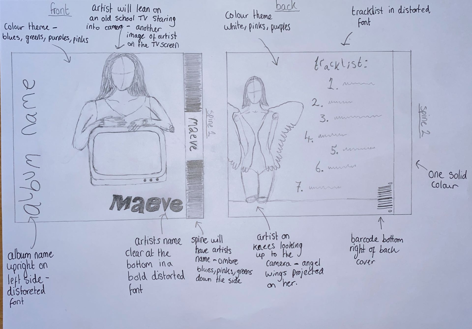
Moving on, we will reflect as a group on what we want to create for. our digipack and start creating a mock up of what we want,

The Look Book – the branding package

In order to create a branding for Maeve, we explored the internet to get some inspiration for her genre and branding. This will help extend her style beyond just her music video. We have collected and analysed some photos that would appeal to our target audience and will give us a blueprint for the brand we are trying to achieve.

Made with Padlet

In conclusion, we have a much more clear idea of what we are trying to achieve in Maeve’s style and genre. We have been inspired by a collection of these photos and I think we will be able to create our own work that will attract our target audience.