
Category Archives: Component 1
CCR2 HOW DOES YOUR PRODUCT ENGAGE WITH AUDIENCES AND HOW WOULD IT BE DISTRIBUTED AS A REAL MEDIA TEXT?
Hello, my magazine is called Orbit and is made for fans that are interested in anything R&B related.
My magazine will be similar to other magazines in the way that it is laid out and presented. For example, every magazine has similar features like a main cover star, barcodes, main cover line and titles. However it can be seen as different from other magazine’s. This is done through things like ways to interact with the readers like giveaways and Q&A’s, the magazine’s own personal editing style such as the tare in the page to present the pug and trying to include the title throughout the magazine to create an iconic branding. My Mission statement is: Orbit focuses on anything R&B, which means any fellow listeners of Rhianna, Beyonce, Drake and many more will adore this magazine. This magazine shall provide you with entertainment and information covering anything from the most famous stars and upcoming artists, fashion and culture, as well as the albums we think you’d love and tour dates from your favourite artists. Orbit will allow you to be one with your idols and the best artists we know who build on to your personal identity. This stylish, easy-going magazine is perfect for any young people wanting to get involved in the blingy, soul-filled life of R&B.
From research such as that from You.gov, I have discovered that my target audience is millennial women, but from personal experience, I believe that I should also be aiming for people around my own age (gen Z). I believe that my target audience will go to my magazine for Information and will look up to my magazine to make up a Personal Identity. I think my target audience would enjoy things such as skating, going to parties and concerts, and listening to artists such as Rihanna and SZA. I would attract them by talking about their favourite artists and places where fantastic concerts are going down.
My audience would buy my magazine for reasons that link to the Uses and Gratification from Blumler and Katz. It provides entertainment by giving its audience detailed and informative inside details on their favourite celebrities and a diversion from everyday life by being able to see the combination of extraordinary and ordinary lives of the people they look up to. This uses AIDA by attracting my audience. For example, in my magazine it says ‘Elly Anslow: He broke my heart, I thought it would end my career forever.’ This attracts the reader into wanting to read more.
Social interaction can be seen through the audience being able to send in their questions for the magazine to publish with the answers from the celebrity. Orbit magazine also does giveaways, for example, winning a free CD. This uses AIDA by having a call to action. ‘Win a free butterfly album CD from Elly Anslow’ is shown on the front cover of my magazine. This calls to my audience to recognise that there is action in my magazine which they can take part in.
One’s personal identity can be sculpted with the magazine by having fashion recommendations from celebrities. Fashion is very important to many people and performs a large role in building up your identity. If someone sees their favourite celebrity recommending the latest trends, it will influence their identity. Another way identity is formed with Orbit magazine is through the music itself. R&B is filled with soul and personal experiences. These are shared through stories told in interviews in the magazine. This allows the readers to identify with the celebrities and compare their personal experiences to theirs. The recommendations of fashions also the informative side of Uses and Gratification. It keeps everyone up to date with what is in and what maybe should be left in the wardrobe. The reports of the readers favourite celebrities also allows them to be informed on a personal level on what is going on with their idols.
I would choose to work with Conde Nast to distribute my magazine as it owns many brands that inspire me and that I look up to. I would want my magazine to be sold alongside the big names such as Vogue and GQ. I also think this would show that my magazine is a serious and well sought out piece of media that is owned by a company that chooses its brands wisely. Also due to the little amount of companies owned by Conde Nast compared to the others, there may be less competition. The other magazine’s in Conde Nast’s region are also very popular with my target audience so I believe that they would gravitate more towards my magazine after seeing it is owned by them.
I would like to attract advertisers that emit wealth, trendiness and above all, diversity and equality. I want to be seen and associated with brands that underline the reasons for Orbit magazine. Orbit is a classy, iconically branded magazine that focuses on diverse and interesting trendy subjects. Rihanna, a very famous R&B singer, has had an advert in the magazine of her brand ‘Fenty Beauty’, a very diverse and relevant brand. Juicy Couture also is advertised in the magazine as it is a very old school, chic brand that has been relevant and iconic for years, just like Orbit magazine should be. I also think that other brands such as Gucci and Nike would pay me to reach their target audience as we have similar audiences and themes. Gucci is all about wealth and glamour which is something my audience would like and see as aesthetically pleasing. Nike is a very trendy brand that lots of millennials and Gen Z people would be interested in. Also, many artists would contact my magazine to distribute advertisements for their concerts such as SZA , Beyonce, Drake and Kehlani.
To allow my magazine to survive in this day and age of the internet, Orbit would have an online magazine that would be advertised on social media. We would post about our top stories with a link to the actual virtual magazine. However, the reader would only be able to read so much before the free trial is over. This would influence them to either sign up for a paid subscription or buy the actual magazine itself. Having an online version of media coverage seems to work out for many. We can see on the hottopics.ht website that since 2011, 300 libraries shut and the mail online received 1.7 million viewers a day. This shows that creating an online version of the magazine would be more beneficial as more people are reading online rather than on physical prints. On this online magazine, we can make it easier and more fun for the viewers to participate and have fun. Online quizzes will be available as well as a place for the fellow viewers to leave comments and interact with each other.
CCR3 – HOW DID YOUR PRODUCTION SKILLS DEVELOP THROUGHOUT THIS PROJECT? – LETTER TO PROSPECTIVE STUDENT
Dear Future A Level Media Student, if you are considering taking Media then there are a few things you need to know before you start. When your making your magazine you should be able to understand the conventions needed to create a successful piece of media . For example, your genre is an important factor when it comes to styling your main cover star and deciding on colour schemes and fonts for your magazine. You will need to know the three production skills: Technical, reactive and transferable.
Furthermore, you will need many technical production skills to make good pieces of media. There are technical production skills like using posting and embedding in edublogs, creating in adobe indesign and photoshop, and using the camera. You will learn to take long shots, mid shots, close ups and different angles to tell a story with each photo. By using Photoshop, I have developed skills such as addings lens flares and other filters, Dodge and Burn, using adjustment layers, changing colours and cutting out things to add in another background (select and mask). The dodge tool is especially helpful as it gives the star a bright, lively and energetic star image that fits with the R&B genre. On Indesign, I have learnt things such as changing fonts as well as the size, colours and layout. I have also learnt how to layout a magazine properly which will help if in the future I would like to go down that path career-wise. For example, I know where to put the masthead, how to position and place the main cover star, where to put headlines and main cover lines, and where to put things like price/date/barcode. It’s important to remember to apply AIDA – Attract, Interest, Desire and Action. I used my model to attract people by dressing her in young, colourful clothing, and editing the photo in photoshop to make her jewelry brighter and flashier. I used my main cover lines to create interest on my front cover, making them big and colourful, or just a colour that would make them stand out more. I uncluded headlines to create a desire of the reader to know more, and I have included a competition of winning a CD and a Q&A which creates action.
When getting into the creative production skills, you will learn a lot about things such as costume and makeup, as well as colour palettes, layouts, lightings and other things. After picking a theme, you have to research what the perfect costume and makeup looks like, before projecting that onto your model. I used AIDA by attracting my audience with solid colours and flashy jewelry, Interesting them by including a direction to a page showing more of the cover star which also creates a feeling of Action and Desire and to know more. When taking the photos, location and lighting is very important. Do you want a bright studio with great flash-photography? or perhaps a more scenic, natural surrounding? For example, I found that the place I had my location shoot for my contents page just did not end up going with the vibe and idea I had built up in my mind. Our location was a castle, and I wanted to convey the narrative of someone living a more luxurious and pampered lifestyle. So, in my spare time I had my own shoot with a friend in a better location with better lighting and the pictures came out great. This had a great impact on my magazine as it went much better with my genre, and opened up more possibilities for the narrative.
Finally, you’ll need to use transferable skills such as being able to work in groups, reading and listening, collaboration, writing, presentation and time management. These are very important for when doing things such as preparing for a shoot. You have to work together with your models to come out with the best looks, props and photos you can get. Communication is very important, talk with people you think you can rely on to model, then create a group chat with all the people involved. Make sure you are prepared way before the shoot so that nobody is confused or lost. When we had to do our location shoots, me and my models all created a group chat on snapchat so that we could show each other outfit ideas and make lists of what to bring. It was really helpful, and we all ended up being very well prepared for each other’s shoots. Styling our models was much easier once we did this and we were all able to bring important props and costumes. For example, I was able to bring some leopard print trousers that were perfect for the photographers genre and my models knew to bring as much dazzling jewelry as possible. This made sure we all got some great pictures for our magazine’s and did not have any struggle in getting them.
Now that you know all these things, you can go create your own media! As long as you use your creative and technical skills well, and communicate well with everyone and keep your blog up to date and managed well, you will do very well. Good luck in the next few years of this course.
CCR4 SO HOW DID YOU INTEGRATE TECHNOLOGIES (ONLINE, HARDWARE AND SOFTWARE) INTO THIS PROJECT?

Loading…
Final drafts
These are my final drafts for my magazine and I am very happy with the results. After spending lots of time on these it is rewarding to see them completed and in their final form and it has been interesting seeing how I developed them from the first drafts and also how I have developed in skill.
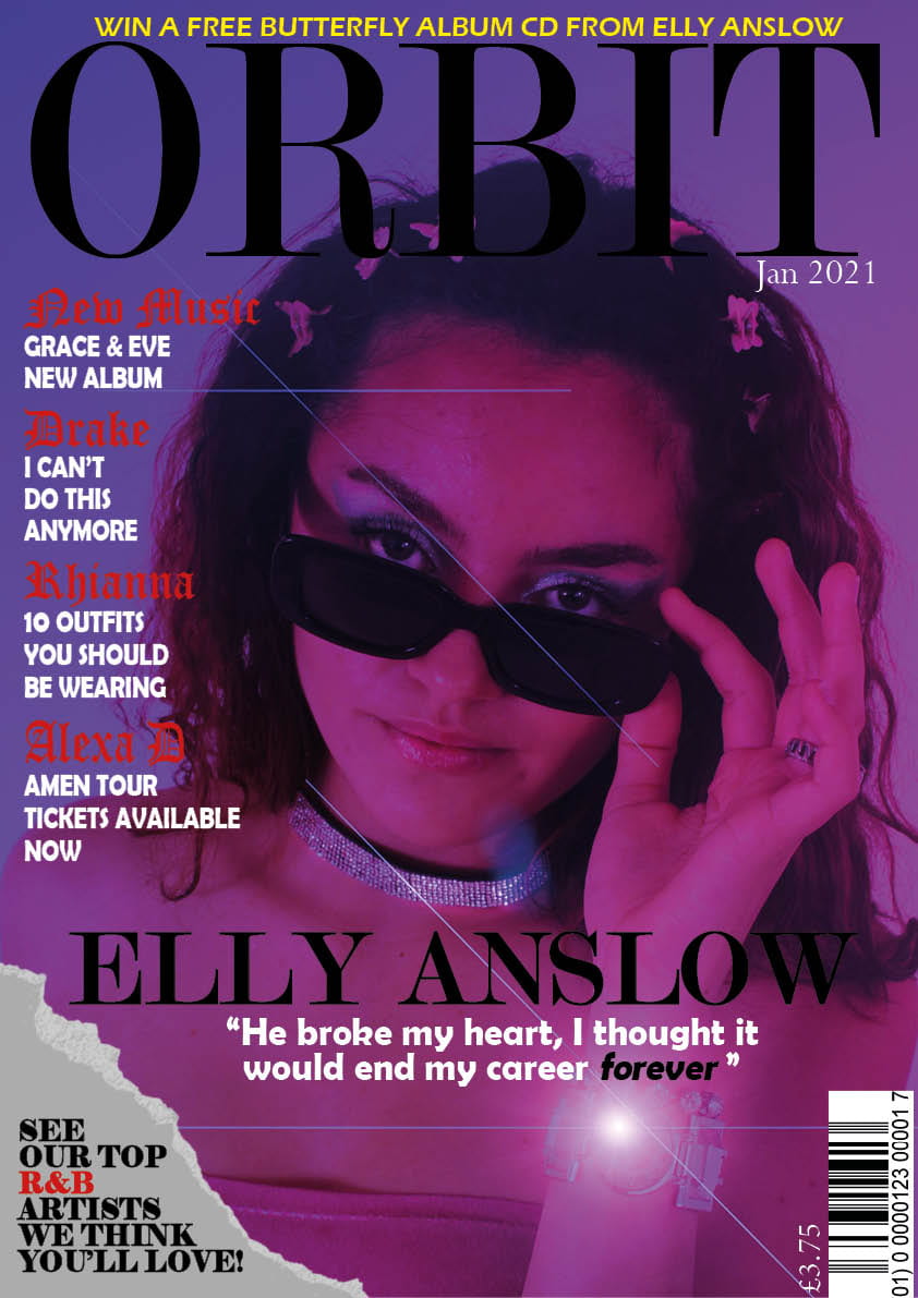
I have a made a few small changes to my front cover such as centring the main cover line, squeezing in another cover line while fitting them around the models hair and taking away the grainy filter as I wanted to show off the quality of the image.
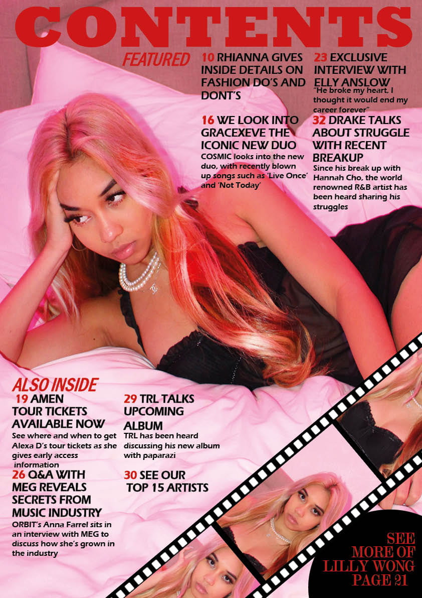
I made some changes to my contents page by moving the film closer to the pug so that my readers would understand that the two are linked. I also changed ‘On the Cover’ to ‘Featured’ as it sounds more professional and I sorted out the line spacing.

I made a few slight changes to my double page spread, like making my model larger and putting the intro before the main article and putting it in bold.
Adverts
These are my chosen adverts for my magazine. These will make my magazine look a lot more neater and presentable, as they will be put between pages to break things up a little.

I chose Fenty Beauty by Rihanna as my first advert. This was because the image my target audience appreciate this brand and the things it stands for, such as diversity. The advertisement also plays in with the demographics of my audience as the gen-z/millennials who read Orbit Magazine would more likely be big fans of Rihanna’s music and her brand.

This Juicy Couture advert was chosen as my second advertisement as the colours and display would fit in really well with my magazine and my target audience would be interested in this brand. From looking at social media, I have seen that lately the demographics of my readers, such as their age and online culture, would be big fans of this trendy brand.
Now that I have these adverts, I will be able to incorporate them into my magazine to make it more aesthetically and visually pleasing.
draft 3’s
Here are my third drafts of my magazine and as you can see, I have made more big changes. I have given the cover lines red regal typeface titles to make them look more dramatic and theatrical, as well as stretching the Orbit title out a bit more to make it look less squished and more like an important title.
I also made the plug yellow to add to the colour scheme and make it stand out more. I centred the main cover line to demonstrate its importance and how it links to the main cover star. I introduced my pug in the form of a torn page as I think that shows off my editing has improved and also fits the vibe of the magazine better than a simple plain circle.

With my contents page, I decided I did not need to have Orbit in as it took away from the fact it was the contents page. I decided to change the typeface of the contents coverlines and made them look more professional, giving each an introduction followed by a small description of what to expect on each page. I also decided to make a film reel and put my model in it to make it look more professionally edited and add some fun to my page. I added a small pug so that fans knew where to find this exciting-looking model. Finally, i just trimmed out the white wall above the models bed so that it fit better into the picture.

For my dps, I just added in my actual interview, colour scheming the questions and answers into black and red. I also switched all the words at the top. so that the artists name was at the right which is a lot more common in magazines. I also changed the colour of my fonts and made Q&A and Orbit the same size so that neither distracted more than the other.

Click on the link below to watch my teacher screencastify feedback.
From looking at my teachers feedback, I now understand that I have to make a few changes such as taking away the grain filter on my front cover to make the image look more high quality, and sort out the arrangements of my words as things like line spacing are a bit off.
Double page spread draft 2
Here is my second draft of my double page spread. I have changed it up slightly by adding in coverlines and changing the layout. I have put the cover star to left in a more classical magazine fashion, as the audience is usually drawn to the left.

The signature is to create an even more personal affect between Elly Anslow and her fans that can be created through the magazine. The title still remains above the article as I think it is important that the magazine’s brand stays strong and iconic. The quote no longer overlaps both pages as I didn’t want it to look strange when the page folds.
- Bring the quote closer together line spacing
- make sure columns end at the same place
- is it her signature and if so, anchor it to a quote?
- page numbers
- byline and photography by – no need for same name twice?
- paragraphs
- unusual to have Orbit, name of magazine so prominent…make her the prominent headline with the Q and A
- make her larger
contents page draft 2
Here is my second draft of my contents page. I have changed it up so that it fits the aesthetic of my magazine a lot better with the casually taken, yet sophisticated photo taken of my model and the pink lighting to make it look similar to the front cover of the magazine.
I’ve also changed some of the fonts and layouts of the text so that they fit more around my model and go better with the colour scheme of the page.

Targets for Next Draft
- Other photos for the insets as overload of the lovely Lilly and add captions/page numbers to the insets
- some white fonts in there?
- unusual to have masthead on the contents page…make it smaller like a logo in the corner perhaps and make the Contents the main headline
- look at line spacing of some of the colours lines
- look at alignment of some of the coverlines
- Find a way to make the photos at the bottom look more presentable
- Perhaps find different font for numbered headlines
- Crop out parts of the photo that don’t look right
Front cover draft 2
Here I have my second draft of my front cover and I have made quite a lot of changes.
For starters, I have changed my colour scheme to purples, pinks, and blues to match that dreamy and romantic aesthetic I initially wanted. It also shows that I am paying attention to the colour palette I created earlier on. I have also used photoshop to add a lens flare on the jewellery which I think is very affective. That on top of the grain filter makes the piece look more vintage and 90’s which is what I was trying to achieve since R&B music can often be see as old-school.

I have also added in a price, date and changed the colours and fonts and how they are laid out. While the colours of the lighting in the photo are fun, I wanted there to be a hint of class and tidiness, which I could do through my fonts. The masthead and main cover line are in a sort of vogue styled font which conveys the importance of both. In a smaller and more round font are my main cover lines and a quote from my double page spread, both in white to highlight their importance. The plug at the top is written in a white slim font making it look individual and is above everything else to attract the reader into finding out more.
- maybe try no grain filter
- alter the fonts with the coverlines to create some visual rhythm perhaps use the font at the top?
- watch the line spacing particularly on the main cover line
- perhaps add another colour in the white coverlines