Final drafts

These are my final drafts for my magazine and I am very happy with the results. After spending lots of time on these it is rewarding to see them completed and in their final form and it has been interesting seeing how I developed them from the first drafts and also how I have developed in skill.

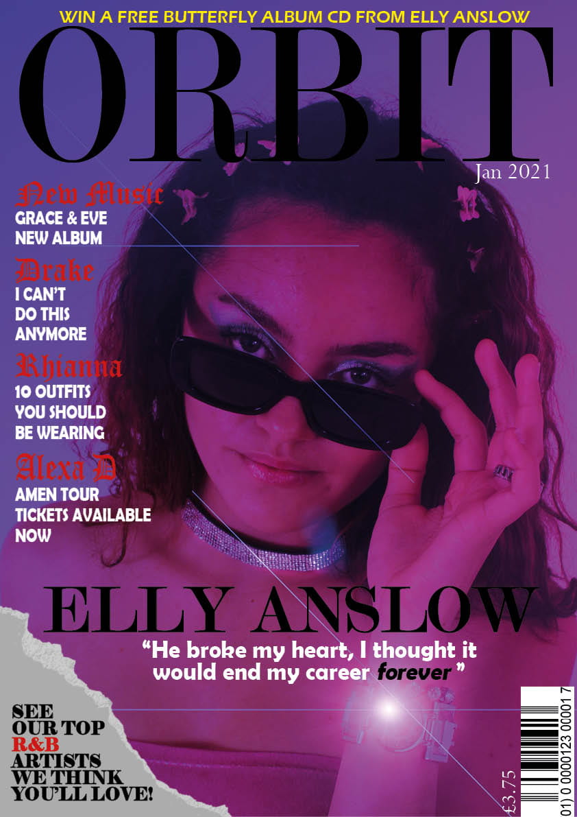
I have a made a few small changes to my front cover such as centring the main cover line, squeezing in another cover line while fitting them around the models hair and taking away the grainy filter as I wanted to show off the quality of the image.

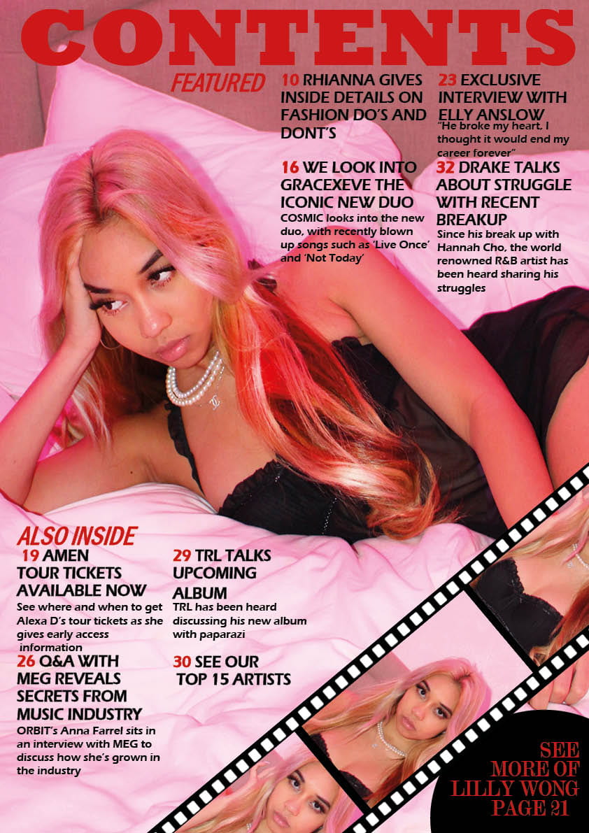
I made some changes to my contents page by moving the film closer to the pug so that my readers would understand that the two are linked. I also changed ‘On the Cover’ to ‘Featured’ as it sounds more professional and I sorted out the line spacing.

I made a few slight changes to my double page spread, like making my model larger and putting the intro before the main article and putting it in bold.

Adverts

These are my chosen adverts for my magazine. These will make my magazine look a lot more neater and presentable, as they will be put between pages to break things up a little.

I chose Fenty Beauty by Rihanna as my first advert. This was because the image my target audience appreciate this brand and the things it stands for, such as diversity. The advertisement also plays in with the demographics of my audience as the gen-z/millennials who read Orbit Magazine would more likely be big fans of Rihanna’s music and her brand.

This Juicy Couture advert was chosen as my second advertisement as the colours and display would fit in really well with my magazine and my target audience would be interested in this brand. From looking at social media, I have seen that lately the demographics of my readers, such as their age and online culture, would be big fans of this trendy brand.

Now that I have these adverts, I will be able to incorporate them into my magazine to make it more aesthetically and visually pleasing.

draft 3’s

Here are my third drafts of my magazine and as you can see, I have made more big changes. I have given the cover lines red regal typeface titles to make them look more dramatic and theatrical, as well as stretching the Orbit title out a bit more to make it look less squished and more like an important title.

I also made the plug yellow to add to the colour scheme and make it stand out more. I centred the main cover line to demonstrate its importance and how it links to the main cover star. I introduced my pug in the form of a torn page as I think that shows off my editing has improved and also fits the vibe of the magazine better than a simple plain circle.

With my contents page, I decided I did not need to have Orbit in as it took away from the fact it was the contents page. I decided to change the typeface of the contents coverlines and made them look more professional, giving each an introduction followed by a small description of what to expect on each page. I also decided to make a film reel and put my model in it to make it look more professionally edited and add some fun to my page. I added a small pug so that fans knew where to find this exciting-looking model. Finally, i just trimmed out the white wall above the models bed so that it fit better into the picture.

For my dps, I just added in my actual interview, colour scheming the questions and answers into black and red. I also switched all the words at the top. so that the artists name was at the right which is a lot more common in magazines. I also changed the colour of my fonts and made Q&A and Orbit the same size so that neither distracted more than the other.

Click on the link below to watch my teacher screencastify feedback.

From looking at my teachers feedback, I now understand that I have to make a few changes such as taking away the grain filter on my front cover to make the image look more high quality, and sort out the arrangements of my words as things like line spacing are a bit off.
Double page spread draft 2

Here is my second draft of my double page spread.  I have changed it up slightly by adding in coverlines and changing the layout.  I have put the cover star to left in a more classical magazine fashion, as the audience is usually drawn to the left.

The signature is to create an even more personal affect between Elly Anslow and her fans that can be created through the magazine. The title still remains above the article as I think it is important that the magazine’s brand stays strong and iconic. The quote no longer overlaps both pages as I didn’t want it to look strange when the page folds.

  • Bring the quote closer together line spacing
  • make sure columns end at the same place
  • is it her signature and if so, anchor it to a quote?
  • page numbers
  • byline and photography by – no need for same name twice?
  • paragraphs
  • unusual to have Orbit, name of magazine so prominent…make her the prominent headline with the Q and A
  • make her larger

contents page draft 2

Here is my second draft of my contents page. I have changed it up so that it fits the aesthetic of my magazine a lot better with the casually taken, yet sophisticated photo taken of my model and the pink lighting to make it look similar to the front cover of the magazine.

I’ve also changed some of the fonts and layouts of the text so that they fit more around my model and go better with the colour scheme of the page.

Targets for Next Draft

  • Other photos for the insets as overload of the lovely Lilly and add captions/page numbers to the insets
  • some white fonts in there?
  • unusual to have masthead on the contents page…make it smaller like a logo in the corner perhaps and make the Contents the main headline
  • look at line spacing of some of the colours lines
  • look at alignment of some of the coverlines
  • Find a way to make the photos at the bottom look more presentable
  • Perhaps find different font for numbered headlines
  • Crop out parts of the photo that don’t look right

Front cover draft 2

Here I have my second draft of my front cover and I have made quite a lot of changes.

For starters, I have changed my colour scheme to purples, pinks, and blues to match that dreamy and romantic aesthetic I initially wanted. It also shows that I am paying attention to the colour palette I created earlier on. I have also used photoshop to add a lens flare on the jewellery which I think is very affective. That on top of the grain filter makes the piece look more vintage and 90’s which is what I was trying to achieve since R&B music can often be see as old-school.

I have also added in a price, date and changed the colours and fonts and how they are laid out. While the colours of the lighting in the photo are fun, I wanted there to be a hint of class and tidiness, which I could do through my fonts. The masthead and main cover line are in a sort of vogue styled font which conveys the importance of both. In a smaller and more round font are my main cover lines and a quote from my double page spread, both in white to highlight their importance. The plug at the top is written in a white slim font making it look individual and is above everything else to attract the reader into finding out more.

  • maybe try no grain filter
  • alter the fonts with the coverlines to create some visual rhythm perhaps use the font at the top?
  • watch the line spacing particularly on the main cover line
  • perhaps add another colour in the white coverlines

Article Development

Here is my article that I intend to put into my double page spread. I have decided to write in a Q&A style, after each question putting a name and address to make the questions more personal.

Draft Article


  • Draft 1 Type your article here.  
  • Get someone or yourself to read Draft 1  out loud and record it on an MP3 and embed in your blog.
  • Make appropriate changes.
  • Submit the amended, updated Draft 2, article to your teacher for feedback before inclusion in indesign.


HEADLINE


Standfirst (more detail on the headline to hook in the reader to want to read on)


Article (including quotes?)


Byline (who has written it)


In this issue…

We have an exclusive Q&A with Elly Anslow, a Diamond Heart award winner and 2020 best seller. We talk about boys, the upcoming album, and drama on tour! 

Born in London, 2001, Elly knew she was destined for fame. She would sing outside in her garden at only 10 years old, giving concerts for her stuffed animals. After many talent shows and performances throughout her teenage years, Elly Anslow, aged 16, finally blew up on YouTube, drawing in 34 million views within the first week with her cover of ‘Love Galore’ by SZA. SZA even spoke up publicly about the video saying it was ‘angelic and ethereal’ and that ‘no words could do it justice’. After a year of releasing covers of other popular R&B artists, Elly Anslow finally released her own album at just 17. Now, she is a multi-award winner and best selling artist of 2020. In this issue, Cosmic Magazine is blessed to have Elly Anslow answering your juicy questions. 


Elly, what brings you the greatest joy from your newfound fame? 

  • Montana, Essex

Well, I can’t say it was easy at first. In the beginning I was only young, and I could just not wrap my head around how much I had blown up. I found it really hard to deal with all the criticisms but as of lately, and as a more grown and developed woman, I have discovered the love of my fans is what matters and providing them with something they can listen to and bond and communicate over is what brings me most joy.

What brings you the most satisfaction in the music industry?

  • Jordan, Texas

I think seeing the albums I have worked so, so hard on coming together, and knowing that people like my music enough to nominate my album ‘Blue Hills’ for a Diamond Heart award brings me so much satisfaction ‘cause that tells me that whatever I’m doing is good enough!

What is the best advice you’ve been given?

  • Joel, London

When I first started off in this industry, I actually met Rihanna for the first time at her movie premiere. She told me a way to deal with setbacks was through prayer and understanding that there is a reason for everything, even if you can’t see it at times. You’d be surprised how much that helped me at the time and how I still follow that to this day. 

How has your love life been? 

  • Anne, Surrey

Well, it’s kind of hard to talk about, but my fans deserve to know what’s going on in my life. As a lot of people may know, me and Harry [Styles] recently ended things. It was kinda mutual, but in reality, he broke my heart and I honestly thought my career was over for a while. The pain was too hard to deal with and the fact I have songs about him that fans love and want me to perform on tour is just a lot sometimes. However, I have grown and learnt since the break up and my recovery from it has inspired many of my new songs in Butterfly”. I may have something to reveal next time you guys interview me, but I am not confirming nor denying there’s any man in my life. 

Was there ever any drama on Tour?

  • Michael, New York

[Elly laughs] Yes! Just as you would expect, a bunch of intense personalities all crammed into a few buses is not always the most relaxing thing. Don’t get me wrong though, I love my team more than anything. This tour has brought us closer together than ever before and I am so thankful for everything that we have been blessed with. But of course there had to be some drama. Some was intense and some was just sad. Harry and I broke up on that tour while I was in L.A. and I had to perform in front of a massive stadium which did not go very well [take a look at our issue from Feb 23 to see more on Elly’s heartbreaking on-stage meltdown] Apart from that, the drama was really just us all getting moody and tired of each other. But still, performing really brought us all together and I could not be more thankful for the experience it has given me and the amount of support I got from the fans.

Elly, what are your current plans for the future?

  • Elio, Italy

“After my album [Butterfly] releases later on January 29th, I’ll be working on a few fun and exciting things. 

 Obviously the Butterfly Tour will be happening and I’ve been told I can confirm there will be something happening with Netflix very soon. Oh! My gorgeous sister, Beth, is getting married in summer this year and I am very excited for that too!”

Here is my voice thread for the Interview

Double Page spread draft 1

Here is my double page spread that I have made which will contain the Q&A I have created speaking to the ‘fan favourite’ Elly Anslow.

I have inserted the title of the magazine at the top left of the page and put ‘Q&A’ in red writing so that people know what they are looking at. The picture is focused to the right hand side of the page, but I have used Photoshop and Indesign to create the effect of the background going on to the next page, however I think I need to work on it a little bit longer. A quote from the interview is spread slightly across both pages that is dramatic and intense and will attract the reader into reading the Q&A. The actual article itself is spread about in three columns of small writing to give a neat and tidy presentation.

5 Targets for Next Draft

  • Change picture (this one is used on my new front cover)
  • Liven it up a bit, make it less plain
  • Get actual article into the page
  • Have more detail in the article section, (different colours, font size)
  • Brighten up eyes and jewellery in photo

Feedback

  • manipulate the photo, brighter, bigger
  • paragraphs
  • drop capital
  • standfirst
  • reposition the quote?
  • add some graphics…lines….shapes to frame the article/photo?


LOCATION SHOOT – CONTACT SHEETS

Here are is my contact sheet with all the photos I took at Castle Cornet:

Out of all the photos I took, these are some of my favorite. I find these have the best angles, lighting and backgrounds as well as my models looking their most R&B – esque.

I find these photos have the best colours and angles in them that fits perfectly with my theme. The models poses are also really good as they convey that image of coolness that you can often see in R&B artists.

Separate shoot photos

Although I really like the photos I took at castle cornet, I also took pictures of my friend, Lilly, which I thought would fit with a contents page better. Here is an example of some photos I might use.

I think these photos look more professional and more visually pleasing for a contents page. The camera we used was better quality and had better lighting. We had pink lights in the background which allowed me to capture a nice dreamy vibe similar to the front cover.

Production Meeting Agenda For 2nd Photo Shoot and Risk Assessment

So that I can go and take my photos for my contents page, I need a plan to help me and my models and to guarantee there will be no stress or unorginisation.

I hope that with the setting we are in, I can get lots of images with the bright blue sky and fluffy white clouds. There are also spectacular views from castle cornet which would provide me with a topic to talk about for a headline.