The camera talks

Taking a photo provides you with the chance to tell a story. The positioning of the model or object and the camera and angle all lead to captivating a story.

For example:

Dorcas Coppin on Instagram: “MELANCHOLIA 💔 part. II @nicholas.fols 🖤”

This close up of a woman’s head and shoulders shows her crying, her make up now running down her face. The facial expression and her dark makeup coneys an idea of great melancholy. Her once perfect makeup is now ruined by her sadness. Perhaps she was having a good night before disaster struck? Her shoulders being bare presents an idea of vulnerability and that the woman may feel emotional and completely open.

09_Port_17 | Flickr - Photo Sharing!

This extreme longshot of two people holding hands on the beach surrounded by fog conveys the idea of isolation and that all they have is each other. Perhaps this couple is going through something rough together, making their vision distorted and foggy, their lives messy and in ruins. It could also mean that perhaps the two people are a troublesome duo, who together create chaos, the world around them is invisible and all they think about is themselves.

As you can see, photos can mean many different things and it is up to the eyes of the beholder on how you determine it. However the photographers skills in angles, distances and composition can effect how u see anything.

Camera Angles

Pin on tipi kadrov

#ExtremeLongShot #TravellerBeforeTheMountains #AdventuresCanBeScary

How to Frame a Medium Shot Like a Master Cinematographer

#MediumLongShot #CriminalStandingInfrontOfBurningBuilding #LifeOfCrimeIsDangerous

Wide Shots: How The Best Directors Shoot Wide Angles

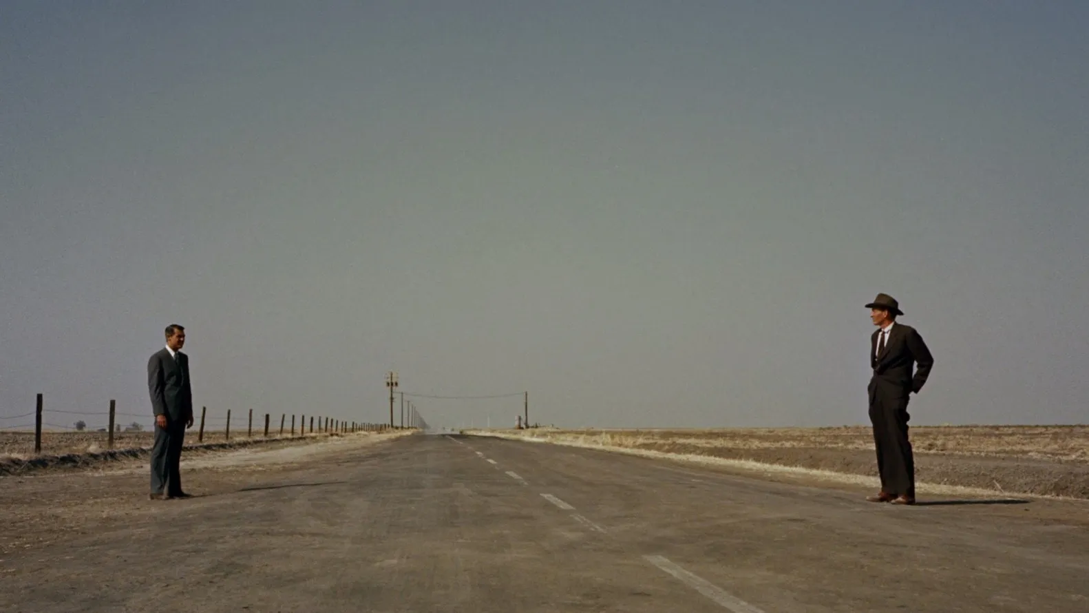
#LongShot #TwoMenInTheRoad #RoadOfSeperation

Medium Shots: Creative Examples of Camera Movements & Angles

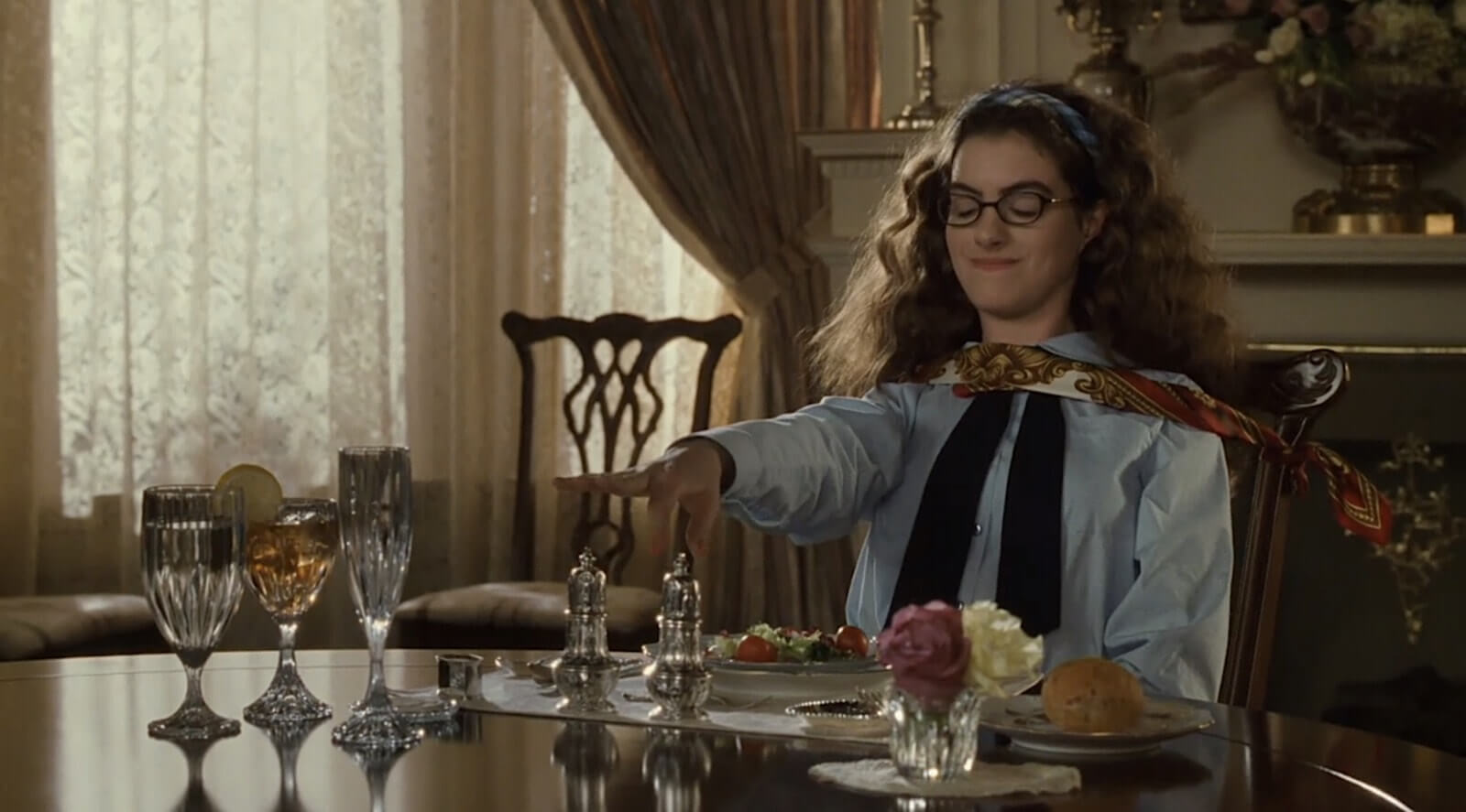
#MidShot #GirlPlayingChess #ForcedPolitness

What is the Close-Up Shot? Examples of Camera Angle & Movement

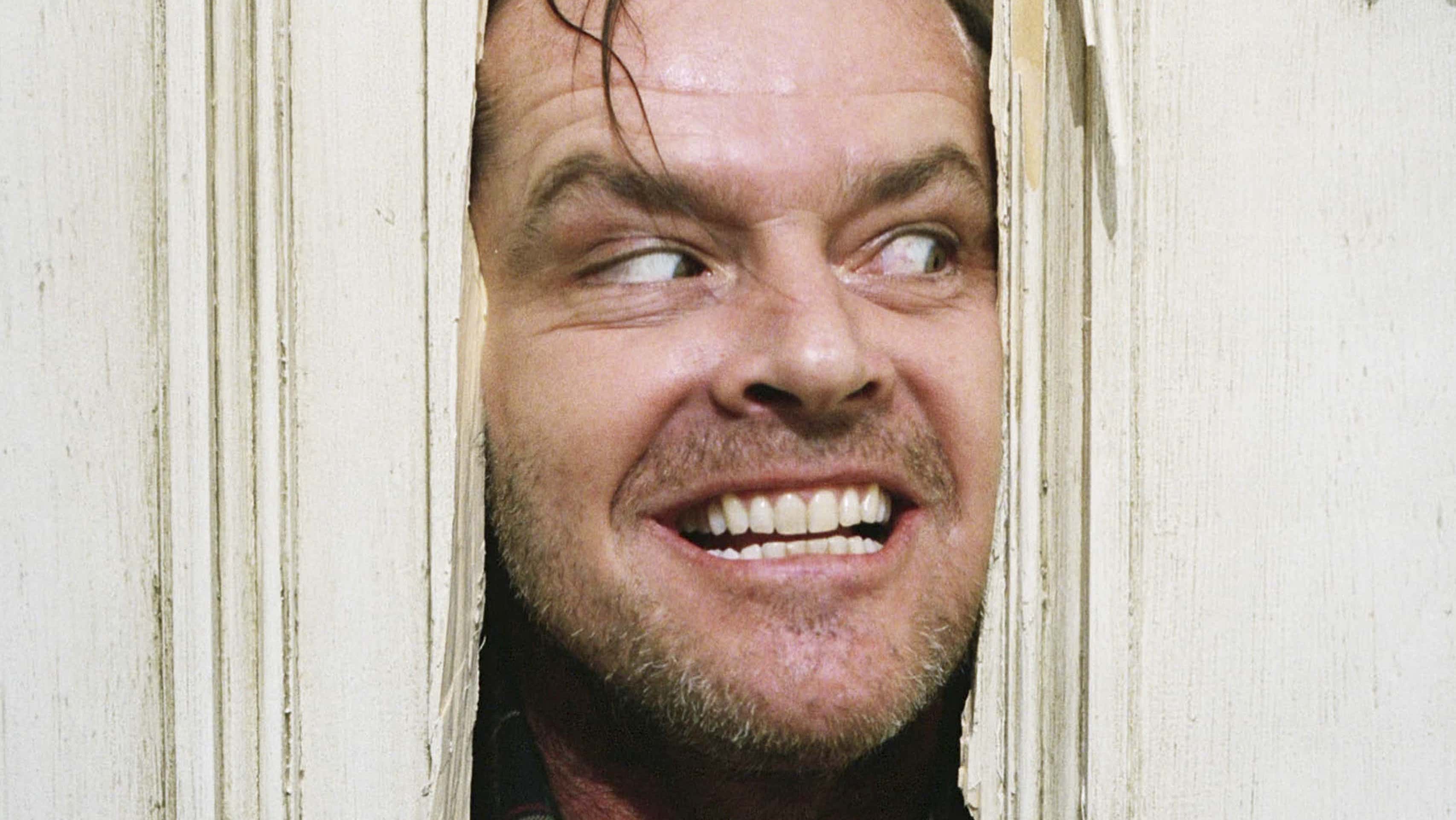
#CloseUp #ManiacBreaksThroughDoor #NothingStopsHim

Filmmaking 101: Camera Shot Types | B&H Explora

#MidCloseUp #GirlCrying #EmotionallyDamaged

Pin by Satu Suomalainen on Emotions and Moods | Crying eyes, Eye photography, Crying photography

#ExtremeCloseUp #CryingEye #Overwhelmed

Point of View Shot: Creative Camera Movements & Angles

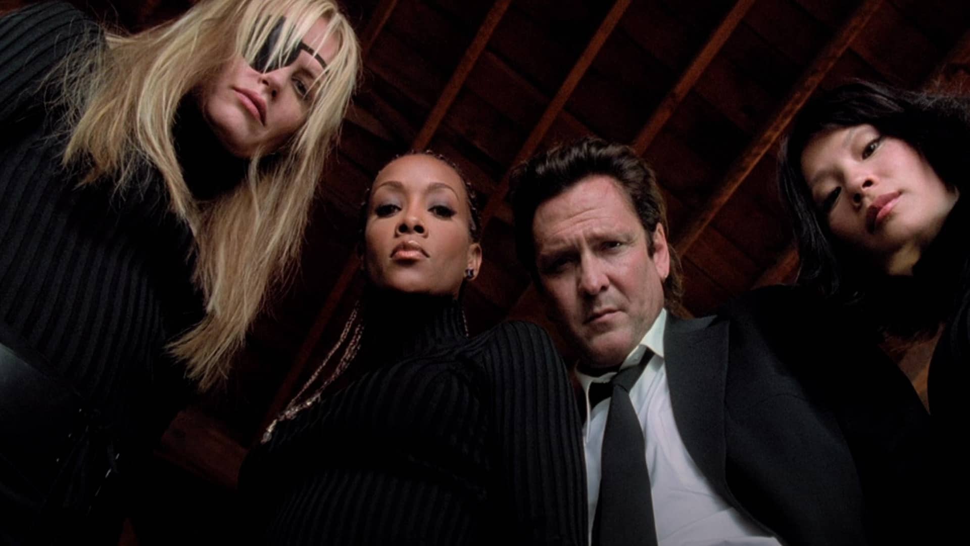
#LowAngle #CriminalsLookingIntoCamera #TheyAreInControl

High Angle Shots: When You Should Use Them | Titanic, High angle shot, High angle

#HighAngle #GirlAboutToJumpFromShip #ImpactfulAndEmotional

Moving on, I now can use this information when taking my own photos and videos for my personal media. The photos have clear denotations and connotations which I can use when making my media. This post has given me an understanding of how a shot/angle can tell a story or assert dominance in certain characters as well as give each photo a narrative. For Example, a low angle shot presents the feeling that the person being filmed is in control and is more dominant. When making a tour poster or magazine a mid shot/close up  of the model would be useful as it shows they are the main star and asserts their fame and dominance as the main focus of the piece of media.


My Tour Poster

By looking at these different hip hop tour posters, I can see black and other dark colours is a very popular theme as well as very warm colours such as red and orange. Almost all the font is white or a light colour that stands out against the dark backgrounds. A lot of the writing is also in a very fancy or classical and sharp writing, however some is also blocky and modern.I like the idea of black and white but also with bold colours like red and yellow to make the poster stand out.

My Magazine Front Page Swede

Here is my mock-up front page of the NME magazine, with the main cover star ‘LCD Soundsystem’.

please click on the image to see the PDF

To make this, I used Indesign. I learnt the basics of how to create a poster template, place photos and add text to create my own version of the magazine cover below. I now know how to create the conentional design features needed to create my own music magazine. For example I know how to include a main cover line and a main cover star, a barcode, cover lines and mastheads.

Three ways I succeeded in this post:

  • Fonts and colours
  • Same photo
  • All the same details

Three things I could improve on:

  • The positioning of the main cover star
  • spacing and layout of the writing
  • size of the main post (mine appears more long whereas the original is cropped and shorter)

I think I did well in general and managed to recreate it quite well, however I will need to work on proportions and layout of the photo and text. Now that I know how to make my own music cover and use indesign, I will be able to make my own tour poster using photoshop and indesign.

Some youtube videos that are beneficial and teach me a little bit more about indesign and making a magazine cover:


Print Media that Communicates Meaning – A Tour Poster

By deconstructing this music tour poster, it has helped me to understand the basics of how to make a piece of media more attractive and have more significant meaning. For example, I now know colour has a big impact on how you may see the poster. Dua Lipa’s poster is red which represents her as flirty and domineering. However if it had been a bright yellow or a pale blue, the way the viewer perceives the tour would feel completely different. The way the text is presented is important as it connotes to you an image and an idea of who the main star is and what the details are while making sure the viewer can differentiate the texts. Now that I know these things, I will be able to use them when creating my own media and make it attractive while still getting the right information through.