Below I have inserted 4 panes of my digipak which have been reviewed through Screencastify. I considered the various conventions that are suitable for an Indie Rock digipak, I had to consider whether to challenge the blueprint or follow the typical elements of a digipak for this genre. I had to identify suitable typefaces, colour palettes and conventional composition.
These are 4 panes of my digipak album cover.


A Screencastify was completed by my teacher and I have received and will use the feedback given to complete an even better piece for draft 3.
Targets for improvement:
- Alignment of the Paper Towns title (offset the letters).
- Take the town boxes back into photoshop and keep the newspaper print.
- Add floor design to the town.
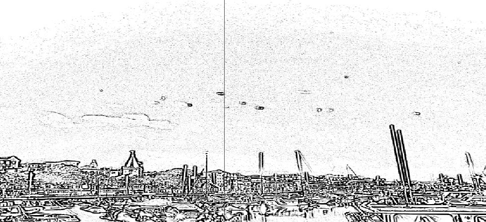
- Add a background of clouds, change colour and or the opacity.
- Include the same image from the front to the back with a low opacity or make little buildings and spread them over the page.
- ‘MaX’ enlarged.
- Get rid of the sellotape sections to make them less obvious.
- Add some red font to the back – red opacity background.
- Juxtapose the front and back images so the panes relate to each other and the title illustrate the image.
Leave a comment