For this task I had to analyze a social media page to find its technical conventions, Marketing and promotion and how it appeals to the target demographic.
Here is the analysis.
This is the analysis of a band in the indie rock genres social media page. This task was useful as it has enabled me to identify the features which are conventional in this genre, this post has allowed me to structure and plan what we want to do for our social media page and how we can make it consistent yet interesting and engaging at the same time.
Below is the final draft of our Digipak. We bared in mind the criticisms we received from our teacher and peers and used them to enhance our final product. We believe our product is representative of the genre and it illustrates its themes and ideas accurately. We found our audience had a mostly preferred reading already but with the tweaks we added I am happy with the product that resulted.
We have made good progress from our previous draft and we have made some good changes to our digipak. Our group is working smoothly and efficiently and there are only a few more things which need to be done to make our product final.
Click on the first Image to see them all.
Some of the changes we have made include:
Made side designs of the album name
Minor adjustments to the size of inside page images
Added effects to the band name
Moved the band name to the middle of the page.
Teacher feedback
What was good?
Solid Concept
Good use of depth of field
Mise En Scene used well, mainly props
Well shot and framed photos
What can be improved?
Make the band logo bigger and more in the middle
Improve visibility of the track list
Add a frame around the front cover photo
Add spines
better framing on inside covers
Add the barcode and copyright information
Alter the coloration of the band name
Reflection
We are very happy with how our Digipak is going, we have adjusted the graphics and colour palette o make our digipak more conventional and appealing and we have made good progress in becoming more desirable to our target demographic and being more conventional. We have developed our star image and brand well and with the feedback we have received I am optimistic for Draft 3.
For this task we drafted up our Digipak. We think it went very well and have a really solid vision for our product. We decided to use a more detailed image for our front cover and used a blur filter around the outsides in order to create a depth of field effect. We created a logo using a warp effect which gave it a wave effect which synergies with the name turning tides. I like where we are so far and think we are well on track.
Here is Our first draft of our Digipak. Click on first image to see all.
Self Assessment
After the first draft was complete we where tasked to do a self assessment. Here is my self assessment slideshow.
Some improvements for next draft:
On the inside covers make sure they are similar sizes so they are align and one side doesn’t look jarringly bigger than the other.
Adjust the positioning of the band name as it could stand out more.
Add more effects on the band name to make it work better with the front cover as it can look a little bit out of place.
Create side panels and spine.
Add bar codes, copyright information and Record label logo.
Overall I am really liking how our Digipak is shaping up. It combines lots of the elements we where hoping to use and ,at its current stage in draft 1, is much better than any other products we’ve made at such an early stage. I am really liking how all our covers fit together and have a clear theme whilst still being different. I am happy we used a more creative approach as opposed to a digital one as it means there is less time spent using indesign and photoshop to design things. Saying this, I really like the creative/graphics stuff we have done so far as it really compliments our Digipak. I believe this product to be easily marketable to our target audience and when its combined with our music video and social media page it will really create a good brand and star image and integrated advertising. I am ware there are improvements to be made but we are making steady progress and know what we have to do so I’m look
Our most recent shoot was for our digipak, this shoot was admittedly far more meticulously planned than any of our other shoots. In this shoot we knew exactly what we wanted to gain from it and we managed to obtain all the shots we wanted as well as a variety of angles, distances and use of depth of field. This means that we have a very broad range of shots to choose from when designing our digipak and we have a good variety of elements to utilize to remain relevant to our genre.
Here are my favorite shots from the shoot!
This is our back cover, it looks good and the focus of the image is fairly clear, we think in post we may blur the background to give a depth of field effect to highlight the focus even more on the center of the image.this shot was a different perspective of one of our shots but I feel that the depth of field looks very nice and visually appealing and the lay out stills conveys what we wanted it to just a bit better.This shot was originally not our intention but after taking the shot we originally wanted we decided that this could be more innovative and creative and it tells more of a story. This shot is more edgy and conveys our genre better than the original plan.This is our front cover, it tells a story but isn’t too flashy or over the top, the minimalist design is conventional of other indie front covers and portrays our genre nicely.
In conclusion my group and I fully believe this to be one of our most successful shoots which has made our digipak process far easier to go through than any other shoots. This shoot was planned well, organized properly and overall communicated very well between our group. I think it is evident now that our previous mindset of planning a bit but winging some of it was not the way to go and this shoot has really taught me the most streamlined and effective way to go about this work. Our next step is to edit our photos, we intend to use some depth of field ideas so we can make our shots more diverse, we will create a band logo to go on the cover and we will most likely color correct and add more detail or less to the images overall.
We have moved on from the phase of designing our Digipak and we now are planning the shoot and we made this Production meeting agenda in order to aid us in knowing exactly what we need to bring and who is responsible, normally we would have done a risk assessment but this time we where in school with nothing at all risky so we decided not to.
Digipak PMA. Click for link to full document.
In conclusion I find Production meeting agendas to be vital as they truly aid us in knowing what to do and make the process of preparing for a shoot as easy and quick as possible in an easy to understand format.
. I really enjoyed the range of shot distances used
. I like the tension that was built up through the video
. The drums, guitar and lip syncing went with the music
Cons –
. I’m not sure about the black and white filter in the performance section. Possibly, instead you could use a filter with a dark concentration on it.
. The shot of the baby becoming blurred is slightly shaky and I think it may need to be replaced.
. I think you need more of a variety of shots whilst lip syncing.
Overall, it is really great and looks very professional.
I am glad to see that some of the things we edited have been noted in our peers reflection. Some of the things we changed from draft 2 to 3 are.
Got rid of some of the grainy shots as they are only used once in the video and it is not consistent.
Made some continuity edits, mainly singing.
Improved syncing in general.
We pushed back some scenes to establish the boy and girl better.
The feedback we have received has further improved our outlook and has given us more suggestions and ideas for our final draft. Our feedback indicates that we have a solid video which could be improved with a few more tweaks which is good because it means our work so far has been improving with every draft.
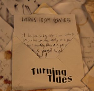
For this task we had to draft a Digipak and decide what we wanted it to look like and how we can make it conventional and unique at the same time. We had many different ideas so it was difficult for us to decide on what we wanted but because we had so many ideas that meant there where many good options to choose and develop.
Here is the design we chose for our Digipak. It has a theme of letters and has a link to the album name ‘Letters from nowhere’.
Overall I am very pleased with how this came out, I like our theme of letters and how the song names are in the letters and the letters content actually reflects the songs. This creates a real narrative for our album overall and creates a good star image for our band. The conventional ideas within our genre is either minimalist or retro look, our design breaks those conventions a little bit but I think it is still faithful and it’s deeper meanings are a staple of the indie rock genre.