Here is my Critical Reflection Essay.
Click on first image


Preliminary video tasks
Music video
Digipak
Social media page
Creative critical reflection 3
Shown above is our teachers feedback on our social media page draft, this advice we will take on board to further improve our product in preparation for our final draft.
Overall this was a very useful task as by having our teacher telling us what should be improved it has enabled us to set goals to further improve our product, by doing this task we also have another unbiased opinion on our work and this helps to keep us levelled and going in a straight line.
The other day we made our social media page, we have implemented elements from our digipak and music video into it so that we can tease and advertise using things related to the band which ties into our brand image. We created a new logo and have other things we are waiting to post in the works and these link in to our brand image and recognition as we want people to be able to identify us through logo alone. We have researched other social media pages in our genre and some common features are stories featuring merchandise, albums and singles. We also found they all had a color scheme which matches their whole theme.


Here is a link to our instagram page:
https://www.instagram.com/turning.tides.official/
After the creation of our social media page we needed to see whether or not we where using or breaking conventions and how well our social media page fared against bands in the same genre.
Overall this task was very useful as it has helped me further consider what needs to be done to develop our bands brand and star image. It is important that we include a repertoire of elements in order to engage and entertain our audience, this post has helped me to see what further progress is needed and how our current work can be improved.
To truly understand our genre we researched other bands within it to see how they portrayed themselves. Most notably, we observed Catfish and the bottlemen as the original artist of our music video. We noted the features they used to create a comprehesive and engaging social media page and created a screencastify to explain further the key conventions used. This task has helped a lot with the creation of our own social media page as it has enlightened me on how to create a successful one in the particular genre we have chosen.

We had a look at other bands in our genres social media posts and by analysing these we have coordinated a plan of our own for the promotion of an new upcoming album for our social media page. In order to be successful we had to consider some media theories such as the uses and gratifications theory, by implementing this theory we can appeal to our audience and give them many reasons why they would engage with our social media page. We where also conscious of the paradox of the star in which the star must be shown as both ordinary and extraordinary, we considered this and decided we should try and show our artists doing day to day things in order to make our audience feel included and gives a sense of relatability. As fans of the band the audience want to know more than just band related things so a dive into their real lives creates a far more engaging experience for the consumer.

We could use the Biffy Clyro example as a good marketing strategy that we could use as a lot of it was based around instagram.The subtle releasing of different parts of an image to creat a whole image is a great suspense building idea, we can use a similar idea but based around letters as that is the theme of our album.
Overall this post was handy as it has helped me to visualise some ways in which we can execute our social media page and now we have a rough guideline of what our plan is for the weeks to come.
We managed to get all the images we need within one shoot, we used flash photography and tried to experiment with different lightings which led us to concluding that ambient lighting fit our genre and themes the best. We used the black studio and we got a variety of shots such as mid shot, long shot and experimented with different depths of fields.
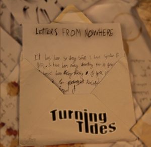
We had a very creative process for our shoot which involved staining paper with teabags and writing many letters and scrunching them and I think it turned out really well and the Mise En Scene was effective.
Overall this task was very useful as by reflecting on the shoot we know what can be done differently or better next time. It also helps me to see where we lost time or where inefficient and it shows us how well we planned.
For this task I had to analyze a social media page to find its technical conventions, Marketing and promotion and how it appeals to the target demographic.
This is the analysis of a band in the indie rock genres social media page. This task was useful as it has enabled me to identify the features which are conventional in this genre, this post has allowed me to structure and plan what we want to do for our social media page and how we can make it consistent yet interesting and engaging at the same time.
Below is the final draft of our Digipak. We bared in mind the criticisms we received from our teacher and peers and used them to enhance our final product. We believe our product is representative of the genre and it illustrates its themes and ideas accurately. We found our audience had a mostly preferred reading already but with the tweaks we added I am happy with the product that resulted.

We have made good progress from our previous draft and we have made some good changes to our digipak. Our group is working smoothly and efficiently and there are only a few more things which need to be done to make our product final.
Click on the first Image to see them all.


Some of the changes we have made include:
Teacher feedback
What was good?
What can be improved?
Reflection
We are very happy with how our Digipak is going, we have adjusted the graphics and colour palette o make our digipak more conventional and appealing and we have made good progress in becoming more desirable to our target demographic and being more conventional. We have developed our star image and brand well and with the feedback we have received I am optimistic for Draft 3.


After the first draft was complete we where tasked to do a self assessment. Here is my self assessment slideshow.
Overall I am really liking how our Digipak is shaping up. It combines lots of the elements we where hoping to use and ,at its current stage in draft 1, is much better than any other products we’ve made at such an early stage. I am really liking how all our covers fit together and have a clear theme whilst still being different. I am happy we used a more creative approach as opposed to a digital one as it means there is less time spent using indesign and photoshop to design things. Saying this, I really like the creative/graphics stuff we have done so far as it really compliments our Digipak. I believe this product to be easily marketable to our target audience and when its combined with our music video and social media page it will really create a good brand and star image and integrated advertising. I am ware there are improvements to be made but we are making steady progress and know what we have to do so I’m look
ing forward to seeing the big final package.