Below are the second drafts of our digipak and advert:

Below are the second drafts of our digipak and advert:
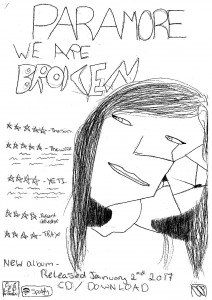
After finishing the first draft of our advert we have done voice recordings of the feedback.
Summary of feedback:
Now that we have finished our music video and digipak have made the first draft of our advert. In order to keep with continuity across the products we’ve used the same image as on the front cover of our digipak. It’s also important to show the star image as this is expected in the contract with the audience in order to make it recognizable to fans. We will get feedback from this draft and improve it for the final advert.
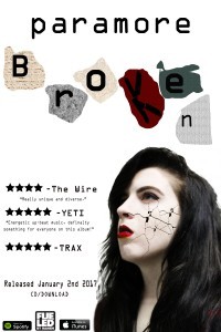
Now that we have finished our digipak we have begun to design our advert. We have drawn a mock-up of our advert. When we researched into print ads we noticed that they all contain the star image. We decided to use the same image as the digipak to keep continuity across the products. Conventional features of adverts include reviews, album title, production company and places where the album is available.
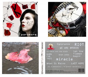
We are now creating a print ad for our album. I have taken two adverts for Paramore (our band) and analysed conventional features.

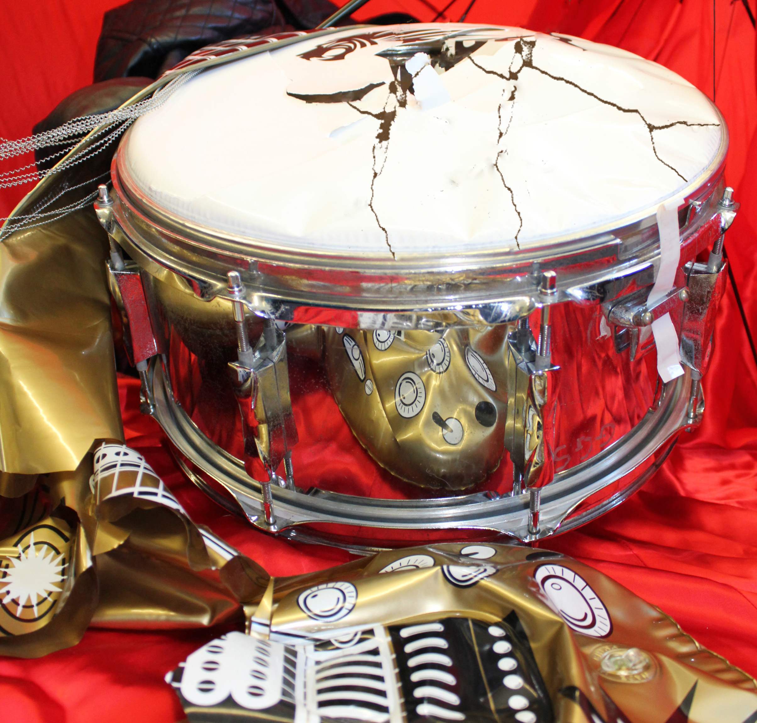
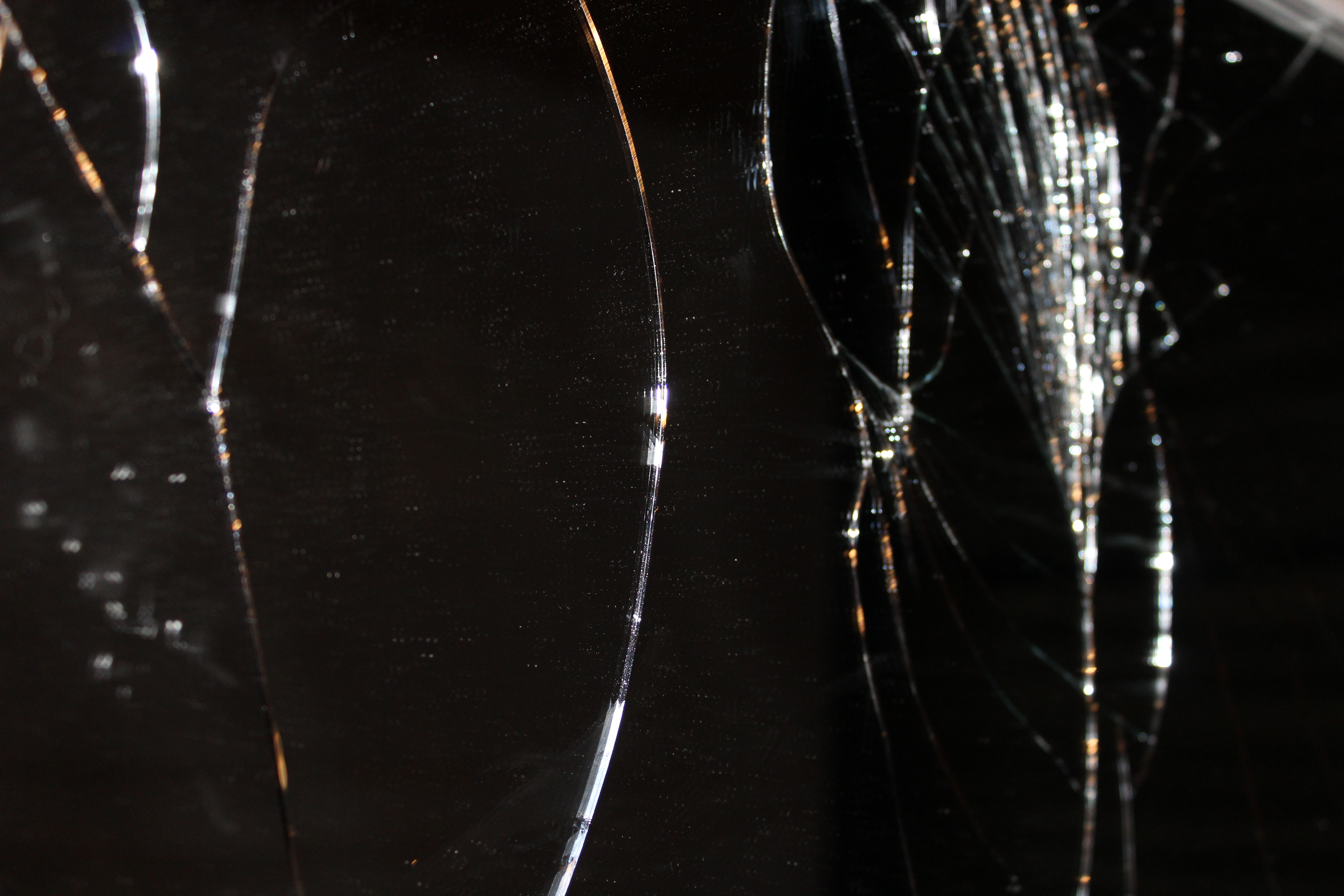
After evaluating our feedback we have created a second draft of our digipak. We have changed one of the covers after the feedback said it didn’t fit with the other covers as it didn’t follow the red colour scheme. We decided on a red leaf in water to symbolize her isolation and passion.
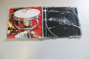
Below is the whole digipak:
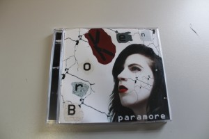
Below is the front cover:

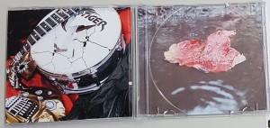
Below are the middle covers:
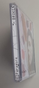
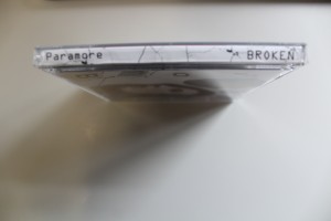
Below is the spine:
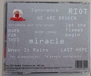
Below is the back cover:
We have created a draft 1 of our digipak, we have now gone out and got feedback from this draft.
Summary of feedback:
Below are images of the first draft of our digipak for our album Broken.


![]()
We went out on various shoots for our digipak as we wanted to make sure all the images fit well together and effectively conveyed the themes. Our first shoot was for our front cover which is the most vital as it is the first cover seen, for this reason it was important to display an image of the star. We decided that since the narrative of the music video focuses on her, she should be the image on the front cover. We organised to shoot with Emma during a shared morning independent study session. However on turning up to the shoot we realised Emma was not feeling well, although she was happy to continue in reflection I think the shoot would’ve been more effective if we’d reorganized the shoot.
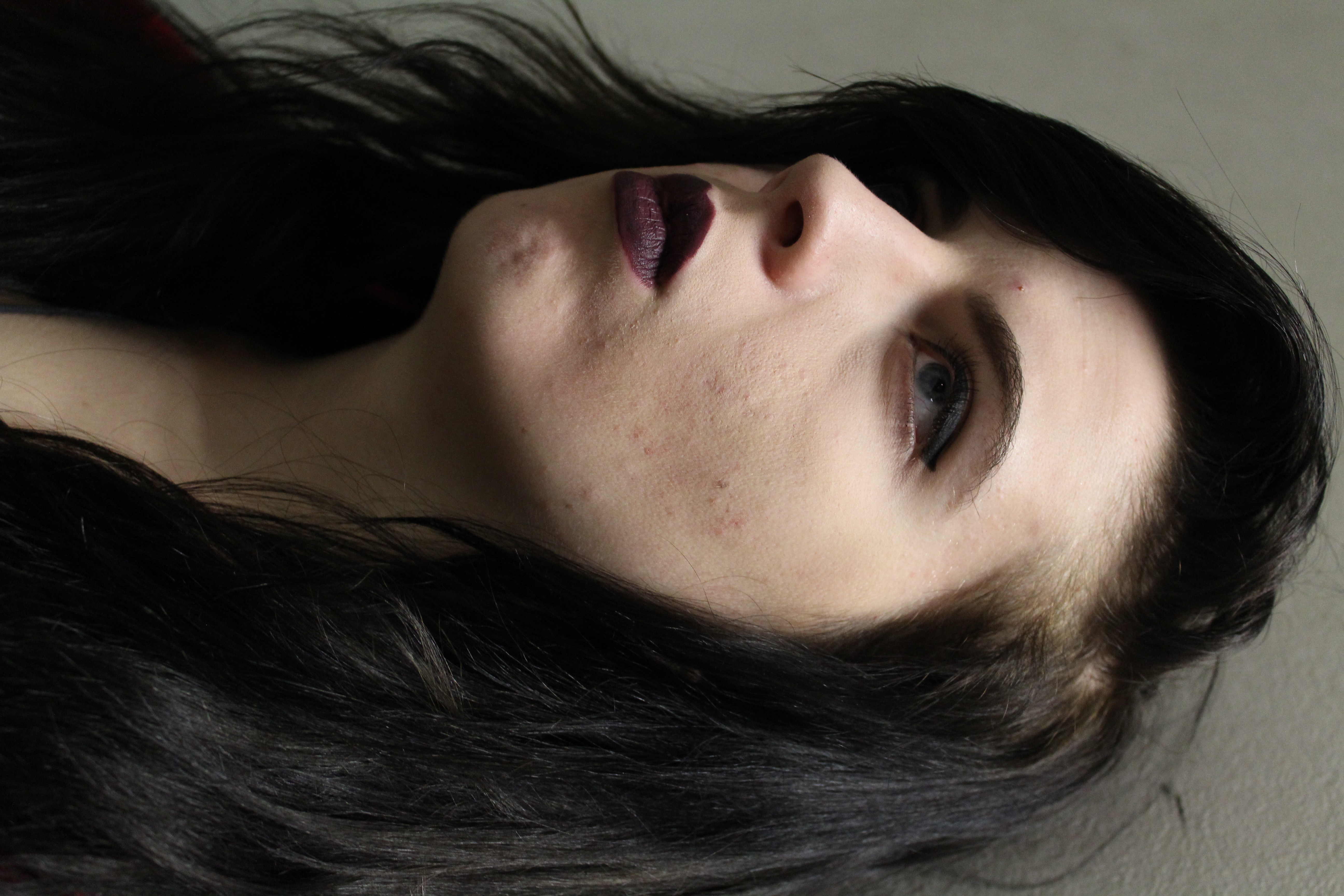
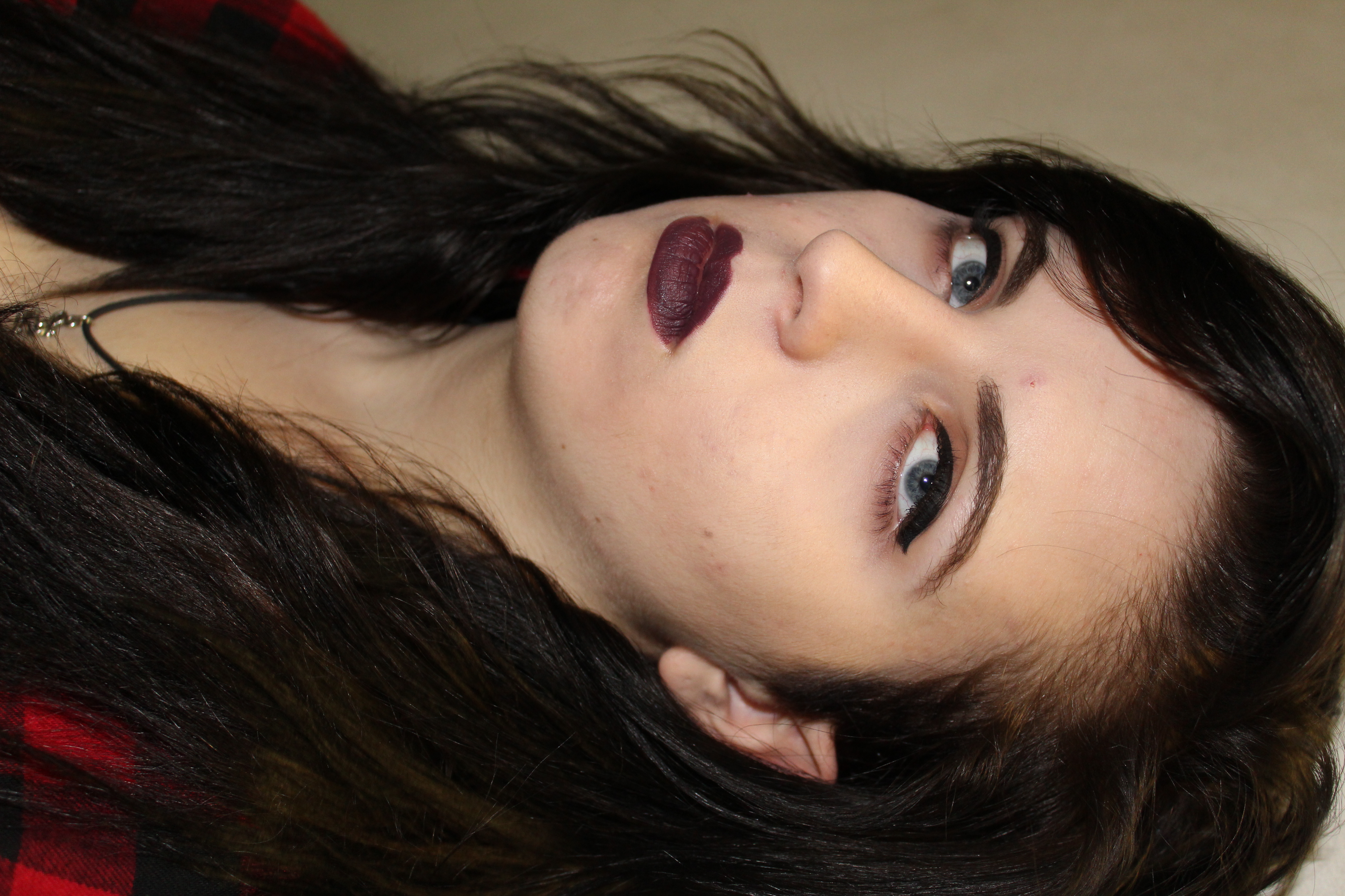
Below are three of the images I think would be effective for the front cover of our digipak:

Middle covers:

Back cover:

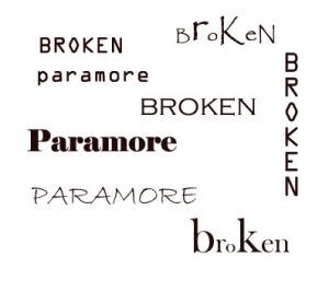
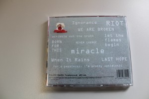
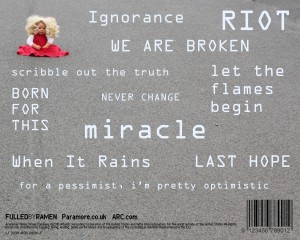
For our digipak we need to decide which font to use for the band name and the album name. Influenced by one of paramores digipaks I liked the idea of using lyrics from the songs in the album. I adapted this to suggest we used these lyrics to spell the album name. I also liked the idea of using different sized letters to spell it out.


Below are some of the fonts we tested out on photoshop, we will evaluate these and then we’ll choose the fonts for the album title: Broken and band name: Paramore.