Contact Sheet

We have done photo shoots for our digipak and advert and I made a contact sheet containing all the photos we took. We went out on various shoots so that we have a collection of photos to choose between. Our most successful shots were of the broken instruments, the red leaf, a photo of Emma as a star and the doll on the road.

Click on the image below to see these:

contact-sheet-corrected-page-001

Risk Assessment

It is vital we have a risk assessment for every shoot that we do to make sure that us and our actors are safe. We have assessed the risks of the shoot for our digipak and have prepared for filming with these in mind to ensure maximum safety for Leonie, Emma and I.

risk-assessment-page-001-1

Production Meeting Agenda

Before going out on our shoot for our digipak Leonie and I have created a production meeting Agenda to ensure we get all of the shots needed and we have everything with us that we need, this way our shoot is as efficient as possible. To keep with the star image only Emma will be needed as an actress for the shoot.

productionmeetingagenda-digipak

Feedback and Targets

After making our photo mock-up of our digipak we got feedback from our peers by showing them the mock-up and discussing the readings they got from it, we made this in a tally table for the questions we asked them. We now know what works and doesn’t work to get the preferred reading.

Here is a summary of the feedback:

  • The broken instruments fit with the genre and clearly revealed the broken themes
  • The cracks across the girls face were effective
  • The red colour palette used throughout the products appealed to them
  • It would be interesting to explore some more themes as well as brokenness
  • The symbolism of the doll was lost, we will make this clearer by designing it to resemble the star.

Photo Mock-up

We have found photos similar to what we aim to create with our digipak in order to create a photo mock-up. This will allow us to get feedback on the themes and the readings they gain, before we edit the actual product.

Our front cover of the digipak will be like this:

digipakphotomockup

Our inside covers will look like this:

digipakphotomockup2

Our back cover of the digipak will look like this:

digipakphotomockup3

Mock-up

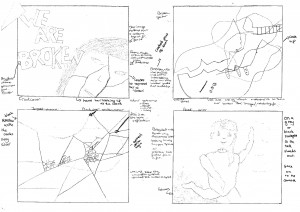
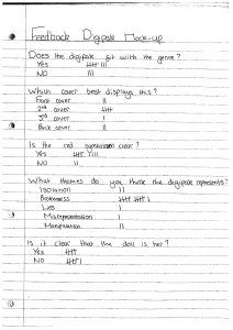
As part of our planning for our digipak we have drawn and annotated a mock-up for our digipak, this will help us when we are taking the pictures as we will know exactly what we are going for. However we understand that these may change because of the way the pictures are taken.

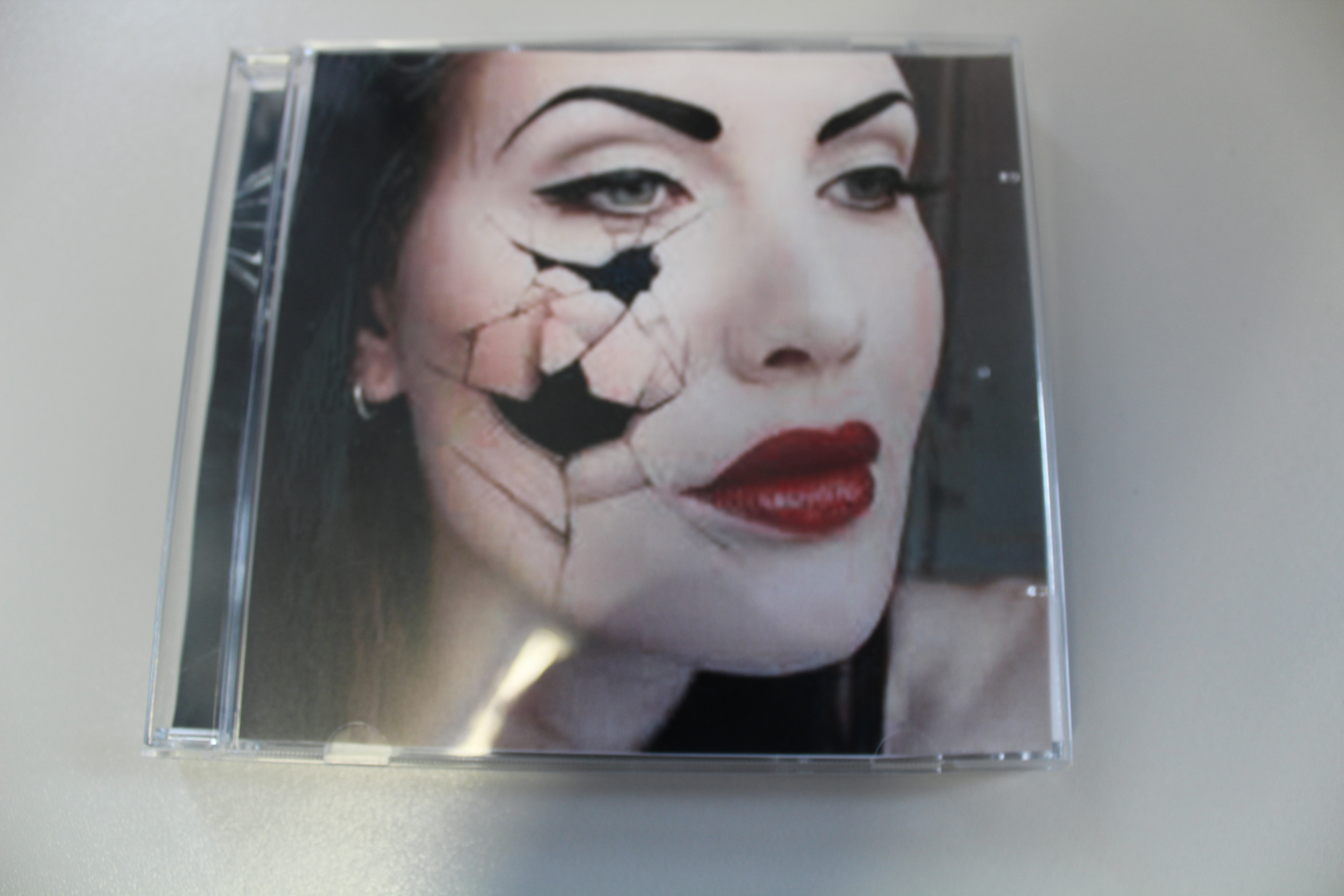
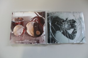
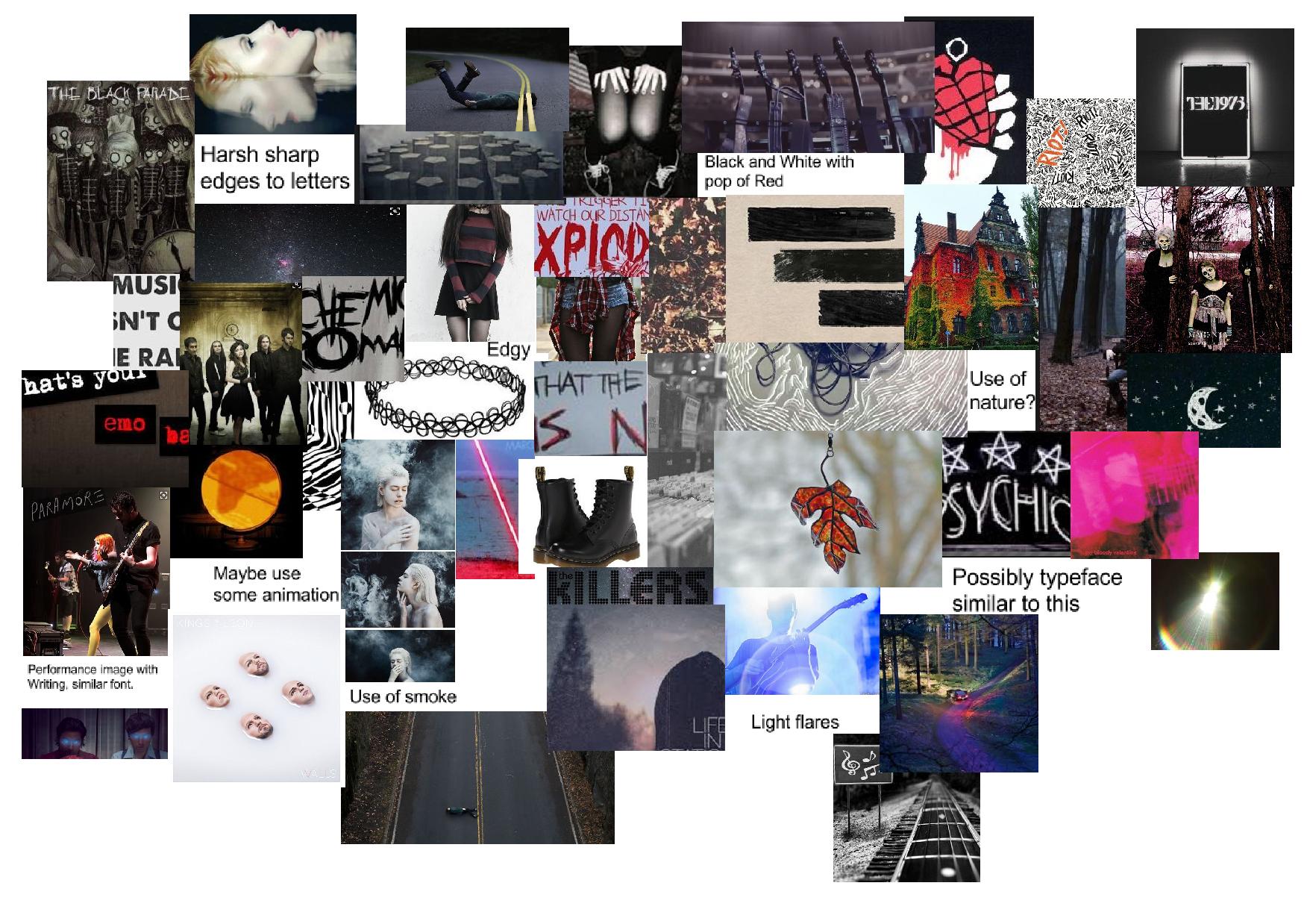
We have decided to use edgy metaphorical images in order to keep with the genre of Alternative Rock. We have also chosen the album name ‘We are broken’ which is after another song in the album, we felt this most represented the themes of the whole album. This is an example of media language as the name encodes a deeper meaning that is heard in their music. The preferred reading for our digipak is that the covers encode isolation and the theme of being broken, this is the metanarrative we have created for the star image. We chose these designs because they reflect the themes in Paramore’s music. We liked the idea of keeping with dark colours with splashes of red in across all of our products, with the red encoding passion and danger common themes in our genre, therefore this adds to the star image for the band.

These illustrations are shown below.

digipak-drawn-draft-page-001

Moodboard

Leonie and I are now creating a digipak for the album that contains the song we used for our music video. As I did when planning for the music video I have created a moodboard of my ideas for the digipak.

My Moodboard

moodboard-2-page-001

After looking at previous students work and digipaks of the Alternative Rock genre, I particularly liked the idea of using lyrics from the songs in the album shaped in an interesting pattern. To keep with the star image I suggest we use red in the digiak as it would correlate with the other products we made. An interesting theme to use across the digipak would be one of brokenness. I’ve suggested a broken mirror as it reflects a similar theme to the music video of breaking out of misrepresentation.

Leonie’s Moodboard

Leonie’s moodboard suggests we use low-key lighting and she has agreed with me aabout the red colour sceme however suggests adding a dark colour sceme as well. She’s suggested some animation work would be visually interesting. She also thinks that a sharp edged lettering would be reflective of the genre. She explained how she thinks the focus should be on the lead singer and the themes surrounding her image.


Digipak Conventions Analysis

I looked at the way media language is used, through digipaks, to create meaning for it’s target audience. This will help when creating our digipak as we will know which features to include.

The conventional and technical features of digipaks are:

  • Album title
  • Name of the band
  • Typeface
  • Colour scheme
  • Copyright
  • Logo
  • Barcode
  • Song list
  • Bonus tracks
  • Record label
  • Parental advisory

I found a digipak for an alternative rock band and analysed the way it was used to communicate meaning. This has helped me to know the conventional features of a digipak for same genre as ours.

digipak-page-001

Music Video – Draft 4 Feedback and Targets

We filmed feedback from our draft 4 of our music video. We will make improvements on our video after this feedback.

The main points of success were:

  • Fast paced edit
  • Energetic performance and edit
  • Actors are engaging

The points for improvements were:

  • Shot of singer laughing seems out of place
  • Check for shot focuses and brightness
  • Faster pace edit in the middle
  • Vary close ups more – of other band members
  • Check for unsteady shots