Mock-up

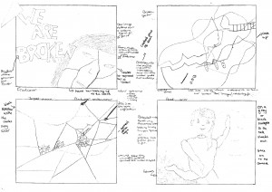
As part of our planning for our digipak we have drawn and annotated a mock-up for our digipak, this will help us when we are taking the pictures as we will know exactly what we are going for. However we understand that these may change because of the way the pictures are taken.

We have decided to use edgy metaphorical images in order to keep with the genre of Alternative Rock. We have also chosen the album name ‘We are broken’ which is after another song in the album, we felt this most represented the themes of the whole album. This is an example of media language as the name encodes a deeper meaning that is heard in their music. The preferred reading for our digipak is that the covers encode isolation and the theme of being broken, this is the metanarrative we have created for the star image. We chose these designs because they reflect the themes in Paramore’s music. We liked the idea of keeping with dark colours with splashes of red in across all of our products, with the red encoding passion and danger common themes in our genre, therefore this adds to the star image for the band.

These illustrations are shown below.
digipak-drawn-draft-page-001

Moodboard

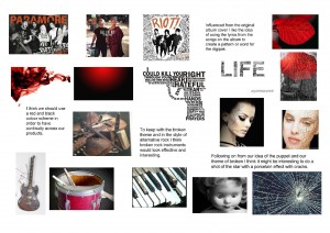
Leonie and I are now creating a digipak for the album that contains the song we used for our music video. As I did when planning for the music video I have created a moodboard of my ideas for the digipak.

My Moodboard

moodboard-2-page-001

After looking at previous students work and digipaks of the Alternative Rock genre, I particularly liked the idea of using lyrics from the songs in the album shaped in an interesting pattern. To keep with the star image I suggest we use red in the digiak as it would correlate with the other products we made. An interesting theme to use across the digipak would be one of brokenness. I’ve suggested a broken mirror as it reflects a similar theme to the music video of breaking out of misrepresentation.

Leonie’s Moodboard

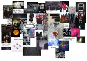
Leonie’s moodboard suggests we use low-key lighting and she has agreed with me aabout the red colour sceme however suggests adding a dark colour sceme as well. She’s suggested some animation work would be visually interesting. She also thinks that a sharp edged lettering would be reflective of the genre. She explained how she thinks the focus should be on the lead singer and the themes surrounding her image.


Digipak Conventions Analysis

I looked at the way media language is used, through digipaks, to create meaning for it’s target audience. This will help when creating our digipak as we will know which features to include.

The conventional and technical features of digipaks are:

  • Album title
  • Name of the band
  • Typeface
  • Colour scheme
  • Copyright
  • Logo
  • Barcode
  • Song list
  • Bonus tracks
  • Record label
  • Parental advisory

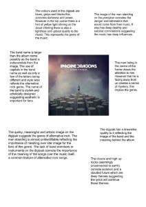
I found a digipak for an alternative rock band and analysed the way it was used to communicate meaning. This has helped me to know the conventional features of a digipak for same genre as ours.

digipak-page-001