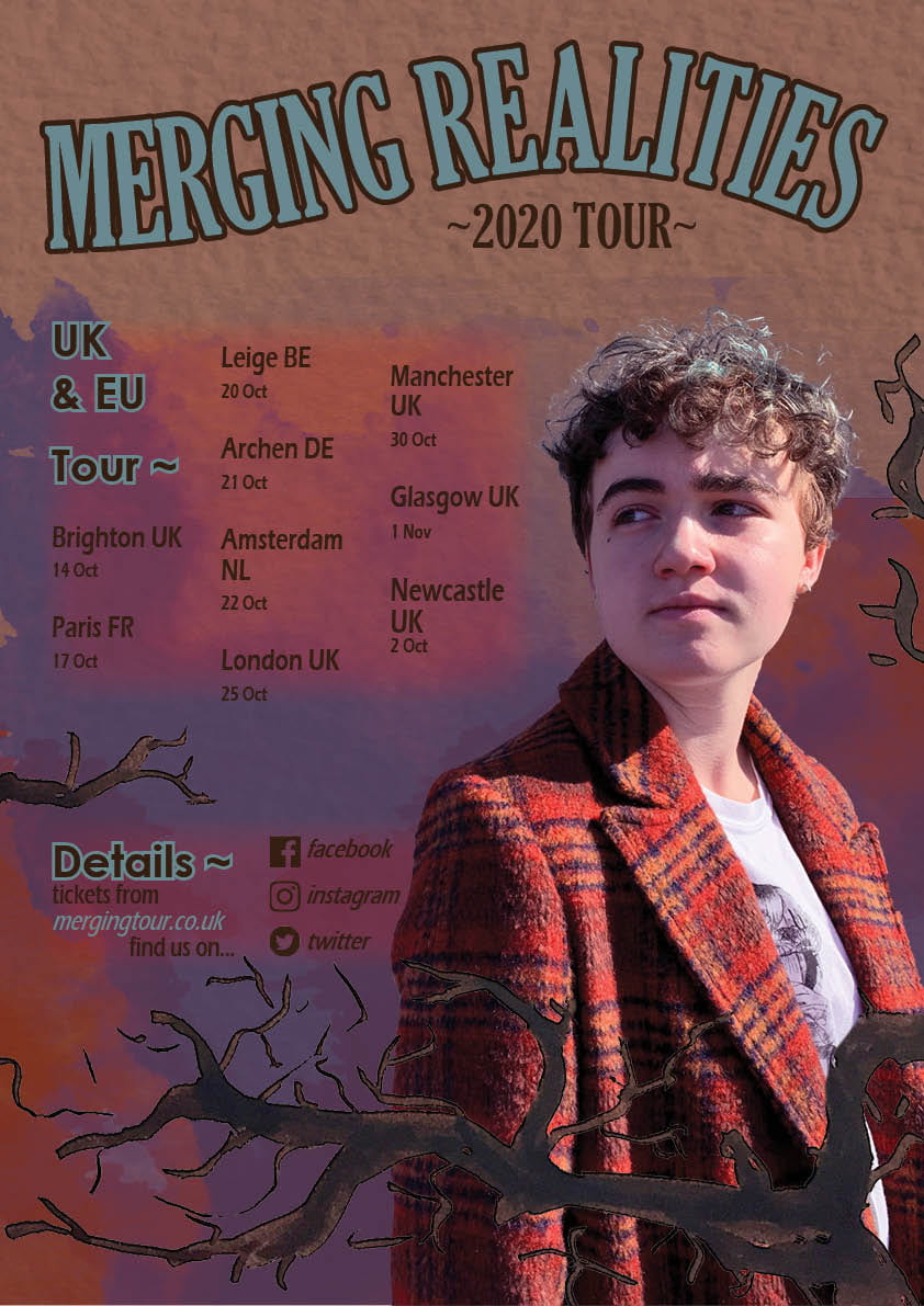
To properly prepare myself for creating a magazine cover and to further familarise myself with the Adobe tools, I worked to create a music tour poster based on the allocated theme and photoshoot done previously, my genre being indie music. To achieve this I compiled a moodboard of other indie album covers and tour posters, taking notes on the genre conventions. As listed in the slides below, this genre often includes faded colour palettes, often featruring subject matter revolving around nature and natural forms, accompanied with surreal concepts and art styles.
I then proceeded to create multiple drafts and concept designs for my poster, also included in the slides, trying out different mediums, styles and colours. I finally settled on a design including some hand-drawn tree branches (nature) and using water-colour paint textures (ilustrative, homemade aesthetic) with my photograph looking inwards, facing the text and cosequently drawing the reader’s attention to the information as they follow the eyes.
Reflection:
Feedback on the Brief
|
Your comment:
My tour poster successfully displays;
|
Feedback on colours:
|
Your comment:
My poster is set to a basic and consistent colour scheme consisting of primarily dark, earthy reds and pale blues, linking to the typicalities of the genre and it’s links with warm, natural forms and colours. |
Feedback on typeface:
|
Your comment:
Overall I made sure to keep the text readable, using only two different fonts, and clear against the background, especially as a gradient is used behind it I made sure to sustain readability behind it with the colours. |
Feedback on integration of image and graphics
|
Your comment:
I made sure to utilise the text wrap tool in Indesign to fit the image, and chose the image due to it’s facing into the text to draw the concentration of the reader. |
Feedback on image
|
Your comment:
As mentioned before in my photoshoot plan, the costume and posture of the model are designed to fit the Indie theme, and I believe that this is captured well in my poster. |
Feedback on copy
|
Your comment:
The title of the tour itself is one that I chose because of the sense of mystery, it implies that there is a new world to be explored by participating in the tour and the action, prompting the interaction. |
Feedback on connotations
|
Your comment:
The general message of my poster is the idea of “transcending the limits of realities”, an idea aligning with the Indie ideas of the supernatural mixed with nature and real life which I feel I conveyed well with the uses of branches (natural forms) and the title of the poster |
