Now I’ve begun to create and design a cover it’s important that I reflect on my work as I produce it, these two designs are my first two drafts of the cover, and whilst neither is fully complete they clearly show my ideas about layout and formatting.
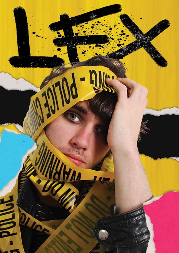
The first draft draws a lot from the yellow police tape used, reflecting this in the background I created and creating a very yellow/black/white colour scheme. Whilst this is successfully eyecatching, it can flatten the image as a whole and doesn’t do much to draw attention further than the initial glance. However I do like the use of torn-paper tabs as part of the design, as this is a feature I carry forward to my second draft.
The second draft immediately makes a stronger impression, as the background is contrasting the photo rather than matching it my star stands out a lot more on the page. I also decided against the use of a light blue tab as this colour doesn’t reflect the rebellious, outrageous and punky aesthetic. For this second draft I also designed a new masthead, using a grungy, all-caps font and overlaying the full title over the initial in a clear, bold and contrasting style to reflect the genre.
I then asked for the opinions of some peers, who also preferred the second draft, reasoning “The font [of the masthead] fits better and the overlapping text in different colours adds interest and layers, and I like the pink because it stands out against the yellow tape so it’s more noticeable. I also like like his name overlayed over it so that viewers know who he is”. I also received the criticism “I don’t know about that white text, it looks slightly unbalanced against the vivid background […] plus I really like the ‘Larson Effect’ black-white effect but again, I’m not sure it works against such a busy background”.
Overall I feel that over these two drafts I have better developed my skills and have gained a better grasp on what ir eally want to acheive with my magazine. To continue from this, I plan to look at how I plan to include more information such as plugs and pugs on the cover, as well as making the masthead smaller and including the price and barcode.