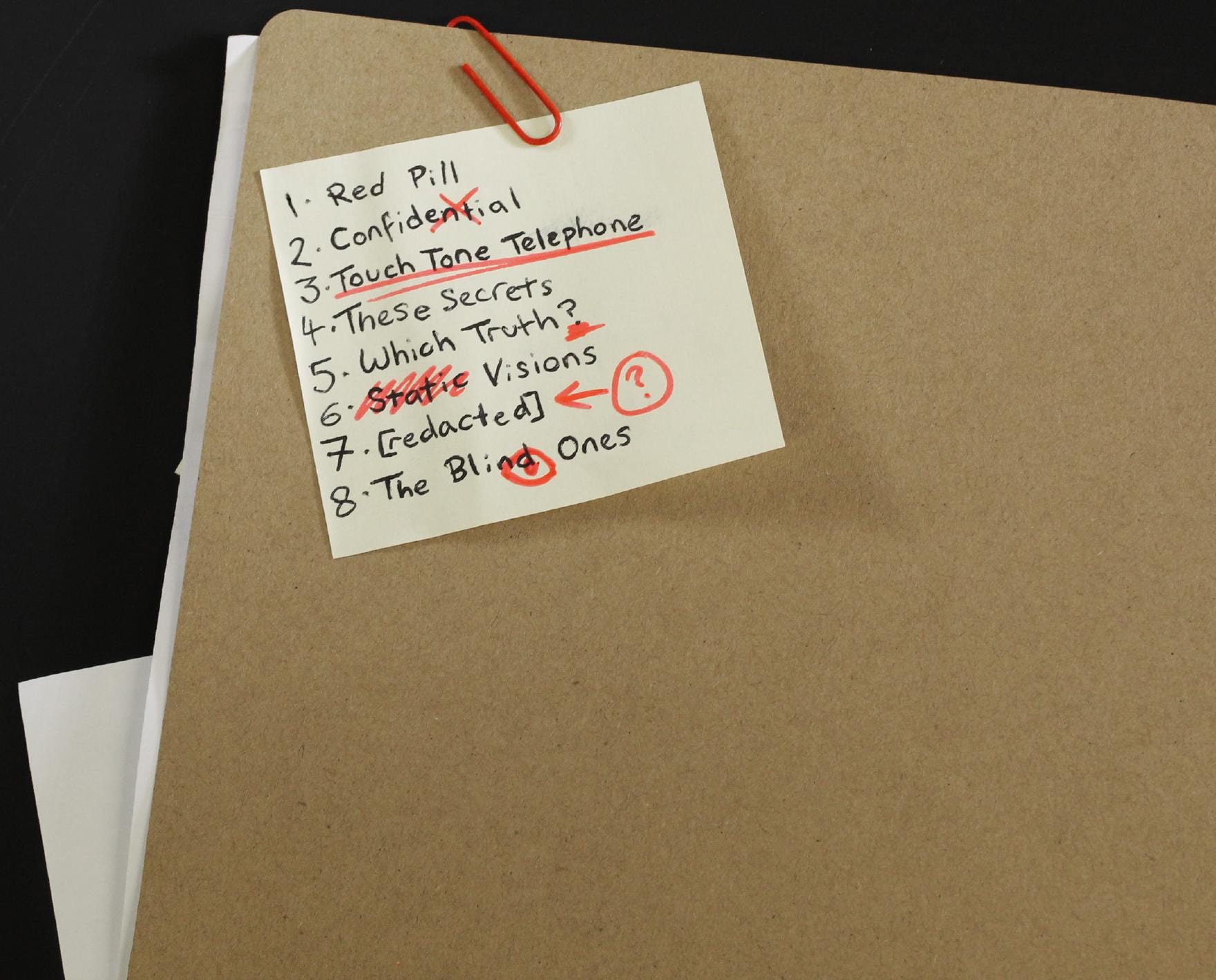
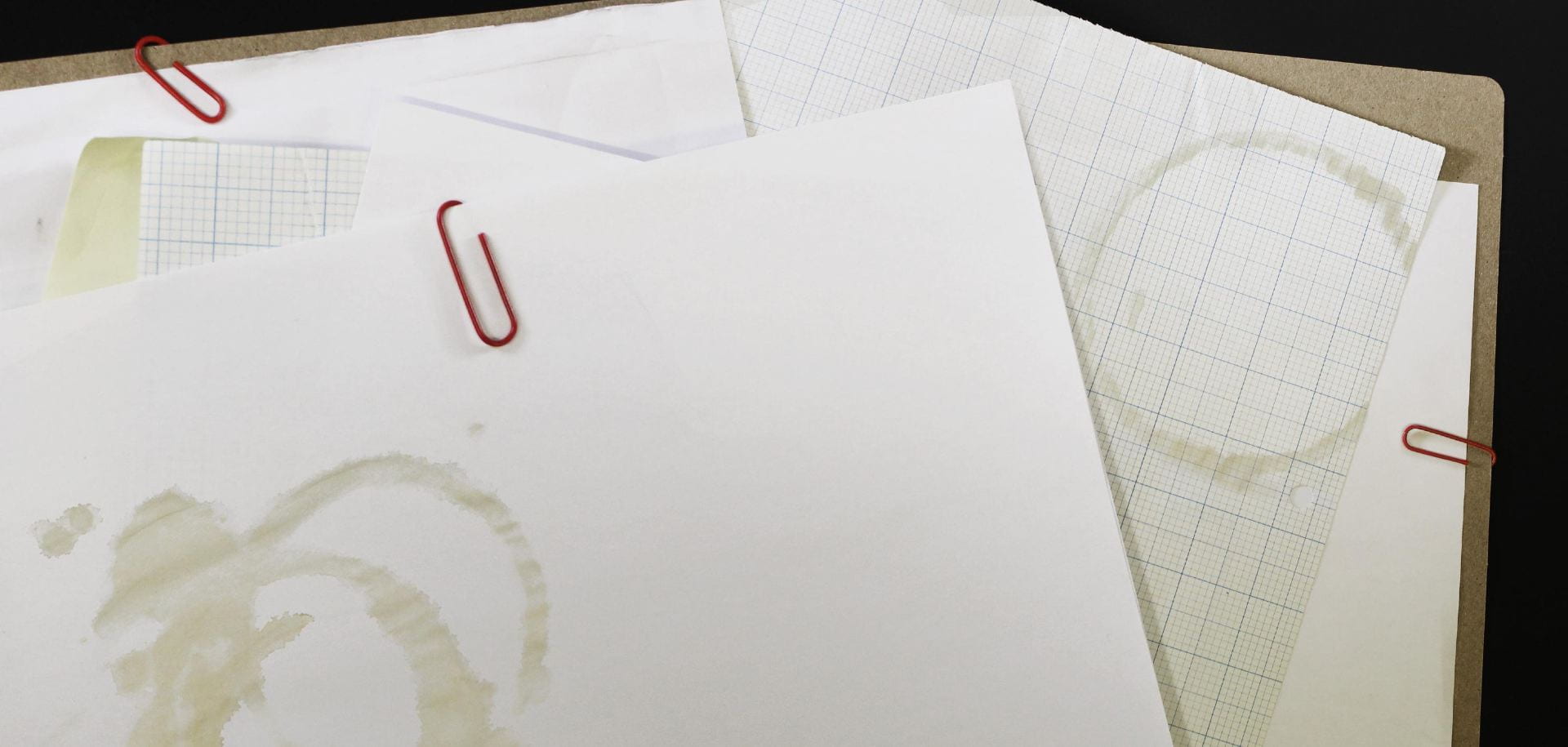
Here is our next draft of the digipak, having now incorporated the coffee stains we aimed to include from the shoot;
This really adds to the grungy, dirty and disorganized look we’re aiming for.

From this, I compared the work so far with previous student’s work, following the same assessment objectives as them;
The use of camera and Photoshop to take & manipulate engaging images and use a variety of shot distances.
The camera use here is pretty basic, but serves it’s purpose as intended and is adequately lit, however the exposure and balance needed to be adjusted slightly with some photos in order to get them to match.
The selection of mise en scene in the photos and the meaning it communicates.
The mise en scene and visual theming works well an consistently together with the motif of conspiracy theory, with a messy, chaotic collection of notes and theories, communicating the meaning illustrated in our mission statement; reflecting this sense of unkempt obsession and fascination with these theories.
The creative use of DTP to integrate images and text and use colour / typefaces.
I like how I achieved a stamp-like effect with the title with a combination of texture overlays and the smudge tool around the edges. This also worked well alongside the handwritten font, created by physically writing out and scanning out the words that I’d written by hand. The colour scheming is consistent and fitting to the theming, with a bright vibrant red working as a good accent against the more faded paper and brown folder.