
Category Archives: Component 1
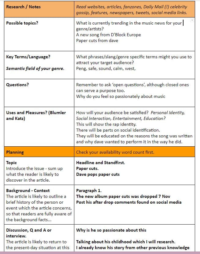
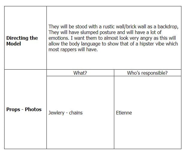
Production Meeting Agenda For 2nd Photo Shoot and Risk Assessment


Language Analysis
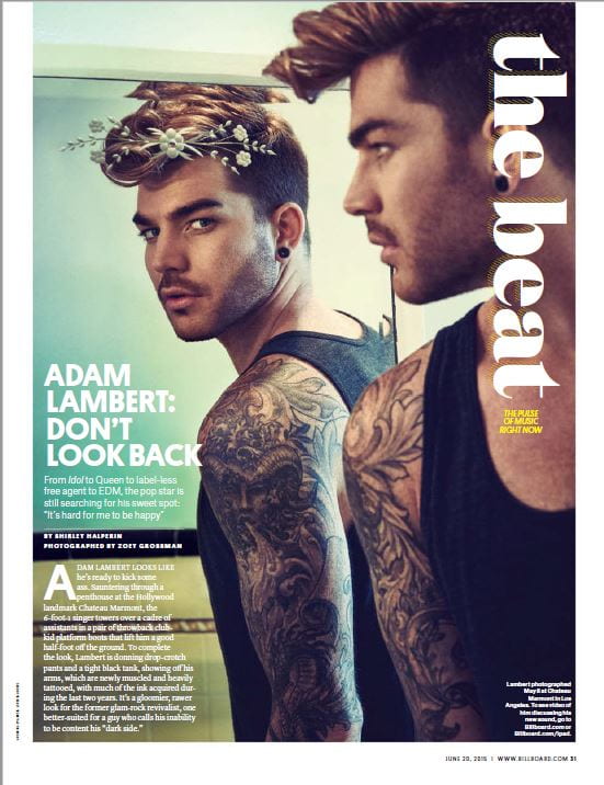
Today I will be analyzing the language of an article which I can take some notes on what to add to my double page spread in my magazine. The Beat is the magazine I will be investigating. It was published from June 20th 2015. The writer Shirley Halperin wrote an article on the pop singer, Adam Lambert. Adam Lambert: Don’t look back was the name of the article.
The article is an interview with this famous pop singer. We are aware of the presence of journalist by the first line, “Adam Lambert looks like he’s ready to kick some ass”. We know this as it speaks from the 3rd person or the writer’s point of view. This shows someone else is telling the story from the words of the artist or what they might have been told. It is written in the third person. This impacts us as we do not get the real story from the start himself. The mode of address is clear in this piece as we are aware of the journalist’s presence. There is a clear long introduction which then merges into the story, but closer to the end the story does close itself.
The story starts with us being told where the star is born, which is in San Diego, so this starts to give us a nice sense of location where the story began. It does not delve into his childhood, it does state his mothers (interior designer) and fathers (software professional) profession, so this gives us a rough idea of what class Adam grew up in. We then start the piece with some amazing adjectives which were ‘sexually ambiguous rocker’ this is an amazing three words to start with. They give us the impression that he was a bit of a more die-hard rock fan inside a pop singers body, and that he is open to others opinions. This is very fitting for the genre of music as shown by the big photo as he is at a concert dressed in rock looking leather with nails painted black. There are other uses of metaphors that relate to the rock style of pop. This quote “flair for operatic shrieks” shows that the artist performs as if he was a rock or heavy metal star. Two of his most famous songs “if I had you”, and “whatya want from me” Shows that he is missing a loved one which is why the word “sexually” was used to describe the star as a normal human who has experienced a loving relationship. When you finish the article you get a view of the personality and the journey the artist has overcome to become famous.
To conclude this, I am going to look at how the journalist represent the star through their writing. We see from that language used the character is described very well, we are told the story from the third person which really helps us to pull his life together and experience what he has.

A New Improved Front Page
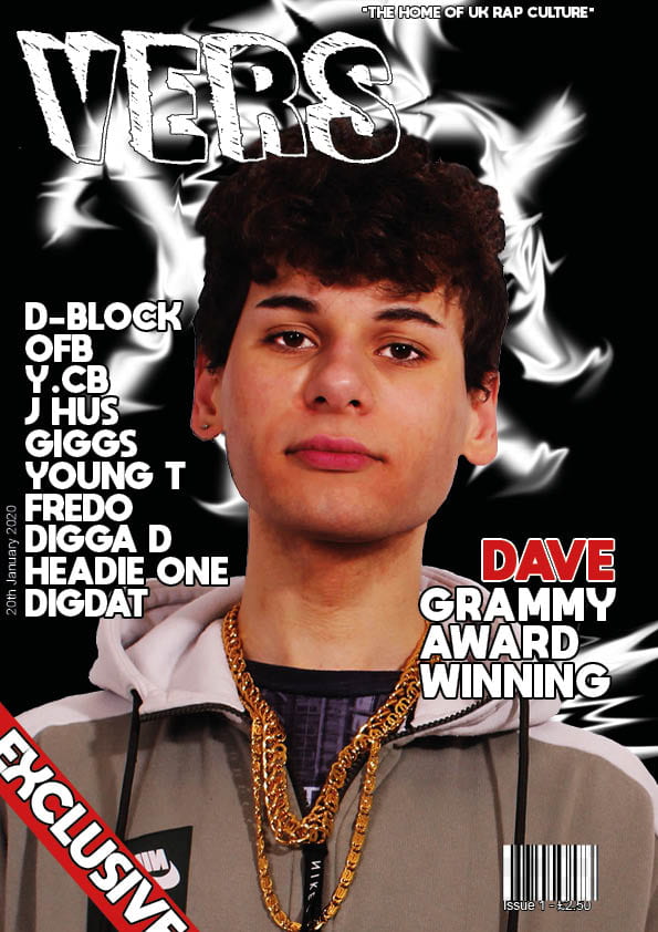
This is my new and current front cover for my magazine.
Will set me some improvements on my first draft to improve, the one I have picked is ‘Put more information/words on the front page.’ I feel I have achieved my goal as I have also added a lot I did not have in my front cover on the first draft. I think seeing a exclusive rap magazine will lure some rap and drill enthusiasts out of hiding to buy this amazing magazine .
My new additions are;
- Exclusive banner
- Bar-code
- Cost
- Date
- Title and artists name
I think my magazine cover looks very good, I may still come to change bits of it before I submit the final copy as by then I may have learnt more skills that I can use to make it better!
Next up for my magazine I will be looking at a two page spread of an example I would like to recreate with a different star.
My up coming targets are:
- Investigate Interviews
- Research some news on rappers
- Check social media to find out what the celebrities are up too.
I can use some information gathered from my research to create a draft of my own article.
Draft of Front Page

Will – “I like the title font it is very unique.”
Will – “I love the colours of the model and how the chains stand out.”
Will – “It has a unique name”
Target
Background – Make it stand out more
More cover lines – Put more information/words on the front page
Hair – Clone stamp the hair to get rid of white
Will knew from the Image, on his first look that this was a magazine to do with the rap genre. He said the mise en sene represented the genre as the chains and laid back style.
My target what will come next? That is:
A barcode,
Plug,
Issue,
Price
Date
Exclusive banner.
Second Shoot Contact Sheet(s)


 I like this photo as it is very basic and he has some emotion in the face showing anger.

I like this photo because his face isn’t shown as much as this is a big thing used within rap music.

I liked this photo as his body language has changed and this shows a completely different vibe then any of the others, this is because he is low and using his hand for a gesture.
Production Meeting Agenda for 2nd Photo Shoot
This is the agenda for our second photo shoot!
This is focusing on Dave.
The first objective of this shoot is to get comfortable taking the images and to get a few nice images I could use for my cover photo.
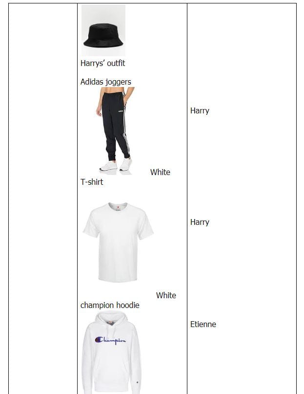
For photos of what we will be wearing please go to the Prezi
This is my second shoot, the first shoot I completed gathering about 100 photos for my front page but they were not all focused so in this shoot I want to make sure I have 100+ photos and allow it to be focused.


So what am I up against?
This is a presentation with voice coverage of me talking about some key points I need to keep in mind when I make my magazine.
First Shoot Contact Sheet(s)


My images of Dave had correct mise-en-sene but the camera was not focused for most of the shots and I could have shot more photos with his balaclava off too. This was the first time I have used the flash photography and its safe to say I’ve learnt somethings I didn’t know. This will be changed in my next shoot as I will now focus my photos and make sure they are all clear before I leave the studio
Mast Head Designs

These are my first few fonts I have picked which I would use for my front cover. There is different fonts including some serif and son serif fonts, one has a little design to the left and right of it. I have to admit I like the top 3 the best out of the fonts I chose as they are different and they have the rap/old school vibes about them.