


When creating our digipak we ensured that we used and followed our mission statement in order to create the best representation for our star image and genre. Making our digipak conventional allows our audience to engage with our product and ensures they don’t reject our media text. From research we learnt that we needed to make our front cover appealing and engaging to meet our audiences needs and wants, to do this we used photo manipulation to create a clear, crisp image of our model looking directly into the camera so that she can instantly connect with her target audience, this also shows the representation of female empowerment. We ensured all technical conventions were used including a barcode and copyright declaration, this allows our product to be viewed professionally.
Final Draft of ‘THINKING LOVE’ by Mia Elise


In conclusion, my group and I worked well together to create and complete our digipak, we have used peer and teacher assessment feedback from previous drafts to involve new ideas into our product and maximise it’s potential. Our digipak covers all grounds relating to the music industry and pop genre, which therefore allows it to be appropriately and successfully fitting with our music video and social media page.
Below is our final draft of my group and I’s music video, ‘THE BEST YOU HAD’. We have used the reflection from our previous draft to improve on our music video from various feedback from peers and our teacher. There are a few big changes within this video, for example half way through editing we realised we didn’t have enough shots of the couples together, this meant we had to change and reshoot our model to ensure we are portraying the narrative and our star correctly, and in a way that is clearly understood by our audience. Throughout our music video, are star is presented as an ordinary (Dyer) character who is heartbroken after her relationship comes to an end, this is a relatable aspect of our music video and helps the audience understand how the star is really feeling. Her extraordinary side does appear appear, as Dyer states this is crucial in the creation of a successful music video. Each shot captured and included in our music video consisted of the technical conventions and a blueprint (Altman) to ensure our genre is recognisable.
As a group, we are really happy with the outcome despite the last minute changes we had to make, however this proves that we can work efficiently under pressure. As a whole we feel we have best portrayed our star and narrative whilst keeping to a running, coherent theme of the pearl necklace throughout our products. The only element we are disappointed with is the black and white jump cut as from feedback we found that it was difficult to determine between the two girls. We managed to work around this and ensured it was edited as well as we could to the best of our ability.
To review and understand our current progress of our social media page, our teacher gave us feedback by creating a screencastify and giving her input on what works well, what we can add and what we can improve. This was really helpful to us as it gave us an insight into what others view and take from our digipak from someone who hasn’t seen or associated with it before.
Targets for improvement:
This feedback was really helpful as it ensured we have the right content on our social media page, as well as the correct generic conventions in relation to font, typeface, colour palette, interesting and informative posts with a suffient ratio of personal life and pop star content, also known as her ordinary vs extraordinary life.
As part of the process in creating and building up our social media page we completed an assessment sheet on the content and timeline on events we have successfully posted. By completing this assessment my group and I can reflect on what we have included and what needs to be added for our next draft.
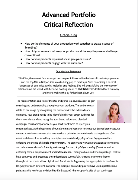
As a whole our page consists of the narrative of a real life, female artist with a down to earth, friendly personality. We have been updating our page regularly including a series of teasers, listed events, release of merch and casual images of day to day life occurrences from the artists- this allows our audience to catch an insight into her life as an artists and and individual as well as keeping them engaged and informed on her journey. As well as this, we have created multiple stories containing Q&A’s, relevant updates on personal life, reminders on upcoming dates and inclusive behind the scenes for interaction purposes. From this we take with us the knowledge and statistics on what content was the most successful and allowed us to the correct her message and impression across to the audience.


Screenshot to summarise our page:
@miaeliseoffical
https://www.instagram.com/miaeliseoffical/
This assessment has highlighted the elements that are included in a single post and relating to artist engagement and the blueprint that fulfils the criteria for a successful profile, brand image, reputation and social media page.
As a result of our final feedback we received from the screencastify, as a group we have been working on and ensuring our digipak has improved from previous draft and best displays our star image and genre of pop.
As a whole, we have completely changed the design and album name of our digipak since draft two. This is because we felt the theme and layout wasn’t cooperating effectively with each other, so we decided to experiment to see what would work best with our mission statement and model whilst keeping it fully conventional. Firstly, our album name is now called ‘Thinking Love’ as opposed to ‘Seasonal Love’ as we found trying to carry the theme of seasons would be too difficult in relation to our images and previous work we had completed. We have changed the images across all four panes as they now each flow coherently across our digipak, for example it is conventional to have the model looking directly into the camera on the front page of a digipak, so we changed this to make it more engaging with our audiences. Other elements we have altered include the font, colour palette and text size to allow the significance to soley be on the model.

We printed our draft three of our digipak and placed it in a plastic CD cover, this allowed us to view our product together and understand the visually pleasing elements and what works well, it also gave us an insight in seeing how it would look as a real, professional digipak.
Draft 3 in CD case:


Feedback from peers;

Finally, we completed a survey where we made a sheet containing seven genres and we asked our peers to mark the genre they thought or digipak relates to best. The majority of people guessed correctly, this highlights that our branding works effectively and conveys our genre successfully,
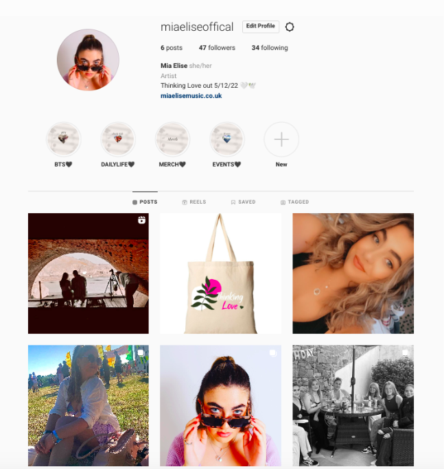
When it came to creating our digipak, we realised we didn’t have enough images that were engaging and personal. Most of our images contained our model with sunglasses on, as a result of this we took the opportunity to do a reshoot where we would also include the pearl necklace, as this is a key element of our music video and is important to keep the theme coherent throughout our products.
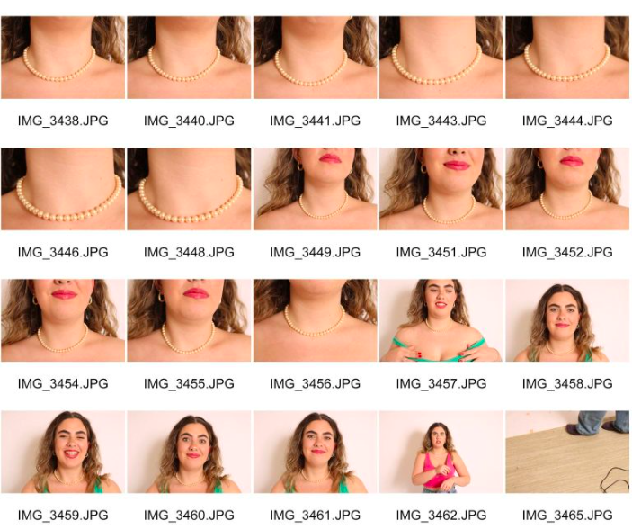


We found that these images also fitted better with our genre of pop, as from our research we learnt that models looking directly into the camera was a conventional feature.
Below is draft two of our digipak. This includes both inside panes as well as the front and backcover. As a whole, we have changed and included elements such as images, typeface, positioning of the text and colour palette. We have altered this to gauge different ideas and opinions on our digipak to understand which layout will connote and represent our star image and genre proficiently.


Screencastify from our teacher:
Above is a screencastify relating to my teachers feedback on draft two of our digipak. Recieiving feedback and advice relating to our digipak is helpful as it gives ideas on our work and how others view and perceive it as a package brand and product.
What went well:
Improvments for Draft Three:
This screencastify has allowed my group and I to identify what needs improving and how to change these elements to ensure our digipak is created to the best of our ability, making sure that all aspects of mise en scene are coherent throughout and all technical conventions are included to support the representation and importance of our star image and the genre.
Timing is essential when it comes down to a marketing campaign. A well planned, chronological structured marketing campaign includes teasers, published launch dates, sneak peaks, upcoming events, building a climax of excitement and relevant information regarding the star. In order to build a professional platform and target audience for our star we carried out market research within the music industry to get an insight into how pop celebrities use instagram to promote their products and excite their audience on a social media page through a single post.
Below I have inserted our marketing campaign that includes 12 posts and relevant stories. We have decided to use the platform instagram, as the majority of popstars within this genre use it daily because it attracts a wider audience. Within these posts we ensured that we will be using guerilla marketing, synergy, social interaction, cross media convergence and personal identities. The content we will be creating will include these elements through marketing advertisements, tour poster, music video, album teasers, Q&A’s, branded merch and events. this all supports in creating awareness for our star as well as other brands whilst giving the audience a representation of our star image and her personality.

By creating this timeline we were able to think about the content we want to create and how we would incorporate the technical conventions of a social media page. This allows my group and I to understand how media is represented digitally and how successful it is. Each post we create aligns with upcoming teasers and information allowing it to flow coherently keeping our target audience engaging and intrigued.
This is the first draft of our Digipak. I have included an enlarged image of both the frontcover and backcover. below I have analysed and decoded the technical conventions and mise en scene elements used to overall grade our digipak and understand what we can improve working towards our next draft.


What we can improve on: