
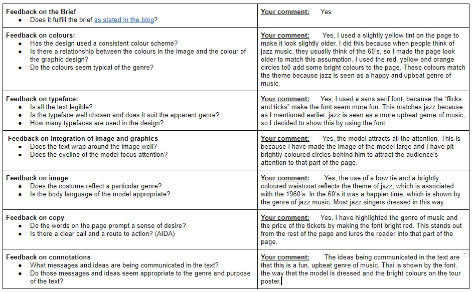
All tour posters show the audience something about the genre of music. Whether this is through the colour swatches or the fact that it says the genre on the poster. These things can tell us whether the music is upbeat and happy, or whether it is angry and loud. It does this throught the use of mise en scene. The specific conventions that are used by jazz magazines are:
– Use of bright colours, which often include yellow and red.
– The musician in the centre of the page.
– The instrument is shown pretty much all of the time.
This is what made me choose many of the features for my own tour poster. For example, I used the same colour swatches that are associated with jazz music which include colours like reds, oranges and yellows. The musician is not in the cnetre of the page on my tour poster but to compensate for this, I have made the image of the musician much larger. This way, it still attracts the readers attention but the musician does not always have to be in the centre of the page. In my tour poaster, I have also copied what I have seen on many other jazz tour posters, The musician is holding the instrument. While he may not be using it, the trumpet is still visible to the viewer so they can have some kind of idea to what the music could sound like.
In my opinion, my tour poster went well. There are a few things that I could have improved on, like for example making the dates of the events bigger so that people knew when they were.