How do the elements of your production work together to create a sense of ‘branding’?
How did your research inform your products and the way they use or challenge conventions?
How do your products represent social groups or issues?
How do your products engage with the audience?
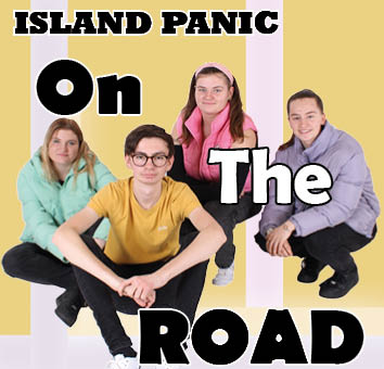
To make a brand easily recognisable to an audience, the producer needs to work hard to make sure that the products are blended together and all tie in with each other. Our mission statement describes our band as energetic and full of life, so our products needed to be designed to reflect this. I believe that our products have reflected this by using some conventional features. For example, we have used bright colours on our products and bright colours usually connote happiness and liveliness. The digipak also included a blocky font which stood out from the background and it also fits with our genre. We also reflected the tone of the group in our music video. The ways in which we did this include choosing an upbeat song, using a faster paced edit and having an even split of narrative and performance in the video. The music video also includes a filter on some of the narrative shots to make the video seem more childish/playful. This makes the video fit in with the younger audience and it also makes the video fit in with the genre of indie pop. These are examples of how the products have worked together to create a sense of branding.
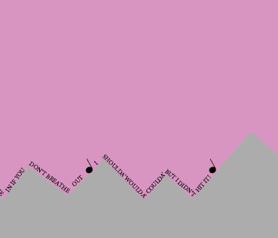
For our music video, the first thing we had to do is research what features were conventional on other music videos from our genre. We soon realised that the conventional features for our genre are: a relatively equal split between performance and narrative, the shots are usually happy and include light hearted narratives and performances. We also included the usual overarching conventions involved with the music video such as editing to the beat, lip syncing and selling the star. We had to make sure that we were able to shoot this without just making a montage of fun moments otherwise it wouldn’t work. This is why we made a storyboard and shot list, we did this to make sure that the shots weren’t too repetitive. This is how we worked out what our narrative was going to be. In our video we chose to add a narrative to align with the conventions of our genre. This better matched our genre than a purely performance based video. Our narrative was about some animals who live in a forest that is about to get demolished by some builders because somebody has bought the land and wants to build a big hotel on it. However the woman’s daughter meets the animals and convinces her not to build the hotel. We felt that this narrative would fit with the upbeat, happy nature of our song.
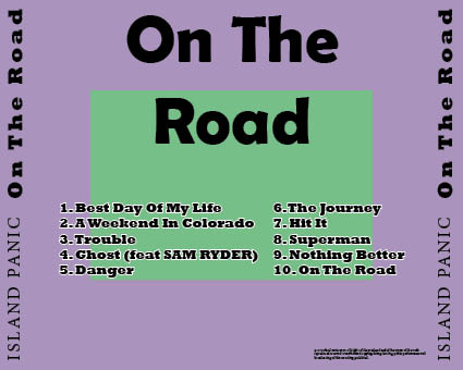
For our digipak, we first had to analyse some other digipak from artists in our genre. Our genre is indie pop so the conventions for our genre include bright colours and happier images. We wanted to represent the genre as well as the artist by using the media language of font, colours, images etc in our digipak. The digipak is about conveying the star in a positive way. We did this by using bright colours which connote happiness. We also used media language to represent the artist in this way. This included the use of sans serif fonts which are usually associated with our genre. This makes these fonts conventional so we had to use sans serif fonts for our digipak. We used pastel colours as they are bright and seen as connoting happiness, without having the harshness of a non-pastel colour. An example of when we used media language to represent the star in a good way is on the front cover. For the name of the album, we used a large, blocky, sans serif font. This is because it was a way that we could make the album stand out but also whilst staying conventional to our genre which typically uses sans serif fonts. This meant that the front cover of the digipak would attract people’s attention as the colour of the font also contrasts with the background which makes it stand out even more. This font also fitted with our target audience. Our band has a younger demographic so the blocky font would suit them more. Our younger audience would respond positively to our young, contemporary vibe. They also would be able to relate to the sense of immaturity that the cartoon effect in our video gives off.
Similarly to the other two products (Music Video and Digipak), our first step was to analyse the conventional features of a social media page before we started our own. When researching other social media pages, we found out that the conventions of a typical social media page are the posts and stories, which are both used so that the artist can promote or share something with their fans. Most of the things that the artist promotes are details about any tours they may be going on or song/album releases. To decide what we were going to add on our social media page, we made a timeline. This told us what order we were going to post things in and what the posts were going to contain. Our target audience is quite young, so we aimed the social media page at them. One way of us doing this was by making the stories on social media interactive by asking the audience questions which they can answer and we can respond to. Another way for us to attract a younger audience was using brighter colours and interesting patterns on the posters which we included on our social media page, such as the swirly pattern on the tour poster. Our social media page also interacts with our audience as it allows them to comment on our posts and we can respond to the comments. This is a way for the audience to feel closer to the artist. We needed to maximise the engagement in our products by making them entertaining and informative. This means that the audience will keep engaging with the social media page and the other products and we will captivate our audience.