Teacher Feedback on Digipak

This is my teachers feedback to the second draft of my digipak. In this video, some of the key feedback to take onboard is:

  • Add a shadow to models to make them pop
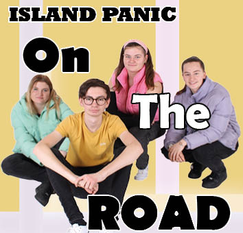
  • Change the ‘Island Panic’ font
  • Change one strip to green to break up the colours on the front cover
  • Swap right pane as goes down the other way
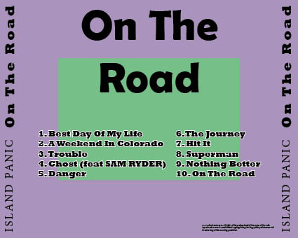
  • Change the font of the track list
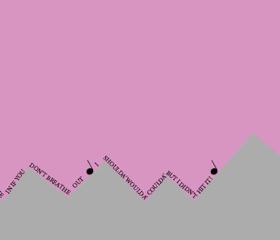
  • Finish list of lyrics on the double page
  • Change the colours inside the digipak as they are too flat
  • Make the inside more interesting
  • More noise on back
  • Chevrons on the back

What we aim to do first:

  • Add shadows
  • Change font
  • Finish 2 middle panes

Digipak – Draft 2

This is the second draft of our digipak. For this draft, We decided to make some of the colours more visible, for example, the home page background. On the back pane, we also changes the purple to be a border around the greeen rather than lines down the page. On the double page, we decided to make some shapes that look like mountains with a pink background, we also decided to add some song lyrics from our band as we thought that the double page looked too empty without it. For draft 3, I think we will change the background on the double page and make the grey squares look more like mountains.

Digipak – Draft 1

This iws the first draft of our digipak. These are the front and back covers for the digipak and I feel like they went well for a first attempt, but I feel like there are plenty of improvements to be made. One of these is making sure that on the back cover, the copyright information doesn’t ovberlap with the band name down the side of the page. I also dont’s like the lines on the back pane as I don’t feel like it fits our theme. We also need to add the two middle panes as well as adding a drop shadow to the people on the front cover. I also think the colours could stand out a little bit more, so I will try brightening the colours in the next draft.

Shoot evaluation

For our digipak shoot, I feel like we could have improved a a few different areas while we were doing the shoot. One of these areas was organisation. We needed to have an idea of what sort of shots we wanted to get before entering the studio, this is where it would be useful to have a shot list to refer back to when taking the photos. Organisation is crucial to doing well in anything, this is why some of our photos didn’t gop to plan. On the other hand, although the photos we got were not planned, they were almost all in focus and are perfectly useable for our digipak. Originally, our shoot was meant to take place outside using a car as a prop, however due to the weather and some other issues, we had to settle for a studio shoot instead. For a backup plan the shopot in the studio went well, it just would have been nice to be a bit mroe organised. This is something that I will take forward and remember for any future shoots.

Digipak Shoot Contact Sheet

These are our contact sheets for our digipak shoot. This is an easy way to quickly look through all of our photos as it lays them out neatly for us to see more clearly. This shoot went well however, some of the images came out black, this was because the photo was taken too fast for the flash to work. This happened if a short burst of photos was accidentally taken. To improve this shoot if we were to do it again, I think we would need to be more organised with the type of shots we were looking to take. This was an area that we struggled with when it came to doing the shoot. We needed to make a shot list to refer back to when we were taking the photos.