Category: Component 1

CCR Question 2 – How does your product engage with audiences and how would it be distributed as a real media text?
CCR Question 3 – How did your production skills develop throughout this project?
Here is an mp3 recording of the letter:
CCR Question 4 – How did you integrate technologies (software, hardware and online) in this project?
Complete Magazine Draft 4
Front Cover:
Contents Page:

Double Page Spread:

Flipsnack:
Chosen Adverts
Every magazine needs adverts, this is a way for the magazine to make money. But the Magazine needs to match the audiences demographics and psychographics. For my audience, I think they are mostly between the ages of 20 and 30. The audience for my genre like parties and pringles are a party food, so I thought that would be a suitable advert to put in my magazine. On the pringles advert, pop is the largest word and that is the genre of music that I am basing my magazine on so I thought this was another good reason to use this advert.

For the second advert, I thought that I should include something musical, as it is a music magazine. My genre is pop so it would make sense to add a pop artist. So I looked at some pop music adverts and tghe one that stood out to me is the Orla Gartland advert, this is because it uses bright colours, the pink and the green contrast each other really well and I like how the colours are slightly see-through so that we can still see the artist behind. I think this advert would appeal to people because it mentions that she is one of the artists of the year on spotify in 2019, this would appeal to the younger audience because online music streaming is becoming more popular.

Complete Magazine Draft 3

What’s new?
– I have changed the font colours so that the cover isn’t too repetitive.
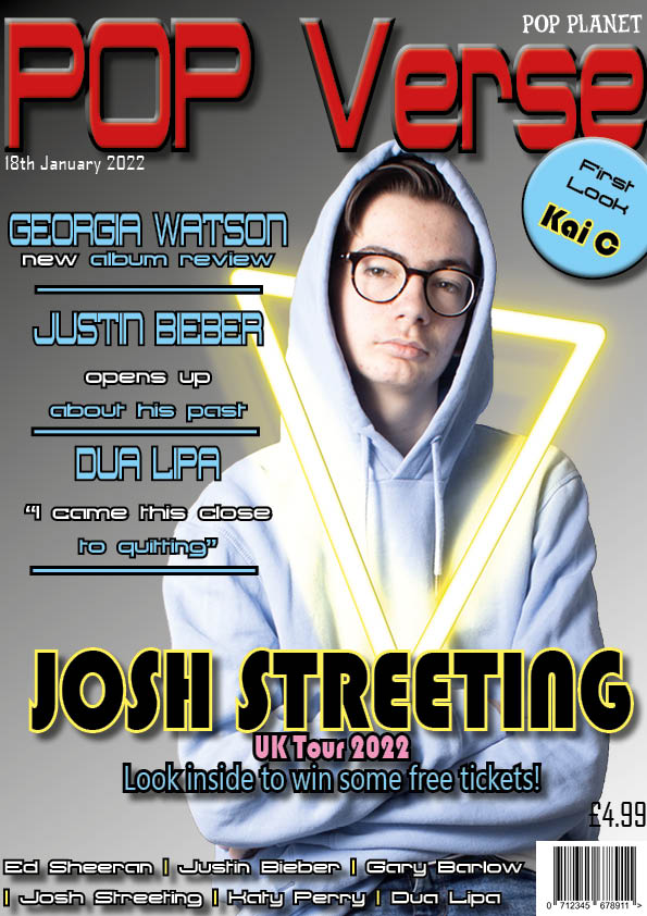
– I have changed the font of some key features and made it bigger, for example, the Josh Streeting is now in a bigger font and a different colour to make it stand out.
– I have changed the background image and added a special effect to make the magazine stand out to people.
– I have made the title bigger and made the word POP all capitals.
– I have changed the text in the plug and I have added a pug.
– In the headlines, I have made the key words a different colour to make people interested in the headline.
– I have filled up the gaps in the page that existed before.

What’s new?
– I have re-introduced the lightnng bolt but this time I have made it look neon to fit in with the pop theme.
– I have used a plain black background so that there aren’t too many colours.
– I have added a CD in the top right of the page which shows what page the album review is on.
– I have made the artists names in the headlines a different colour and all capital letters to make it stand out.
– I have used a different image of the model for this draft.

What’s New?
– I moved the name of the album to the left page and put a green strike around it.
– I put the word ‘new’ in its own text box, chnaged the colour of it and made it all capitals to make it stand out
– I have added my article instead of using placeholder text.
What I need to improve:
– Centre the text in the PUG on the front cover
– Change colour of ‘Kai C’ on front cover to gold
– Decrease size of barcode
– Make slashes between names yellow
– Re-allign the justin bieber headline
– Add another photo to contents page
– Remove full stop on headline in contents page
– Add a quote on the double page spread under the name of the album
– Try justifying standfirst to left or right
Doule Page Spread – Draft 2
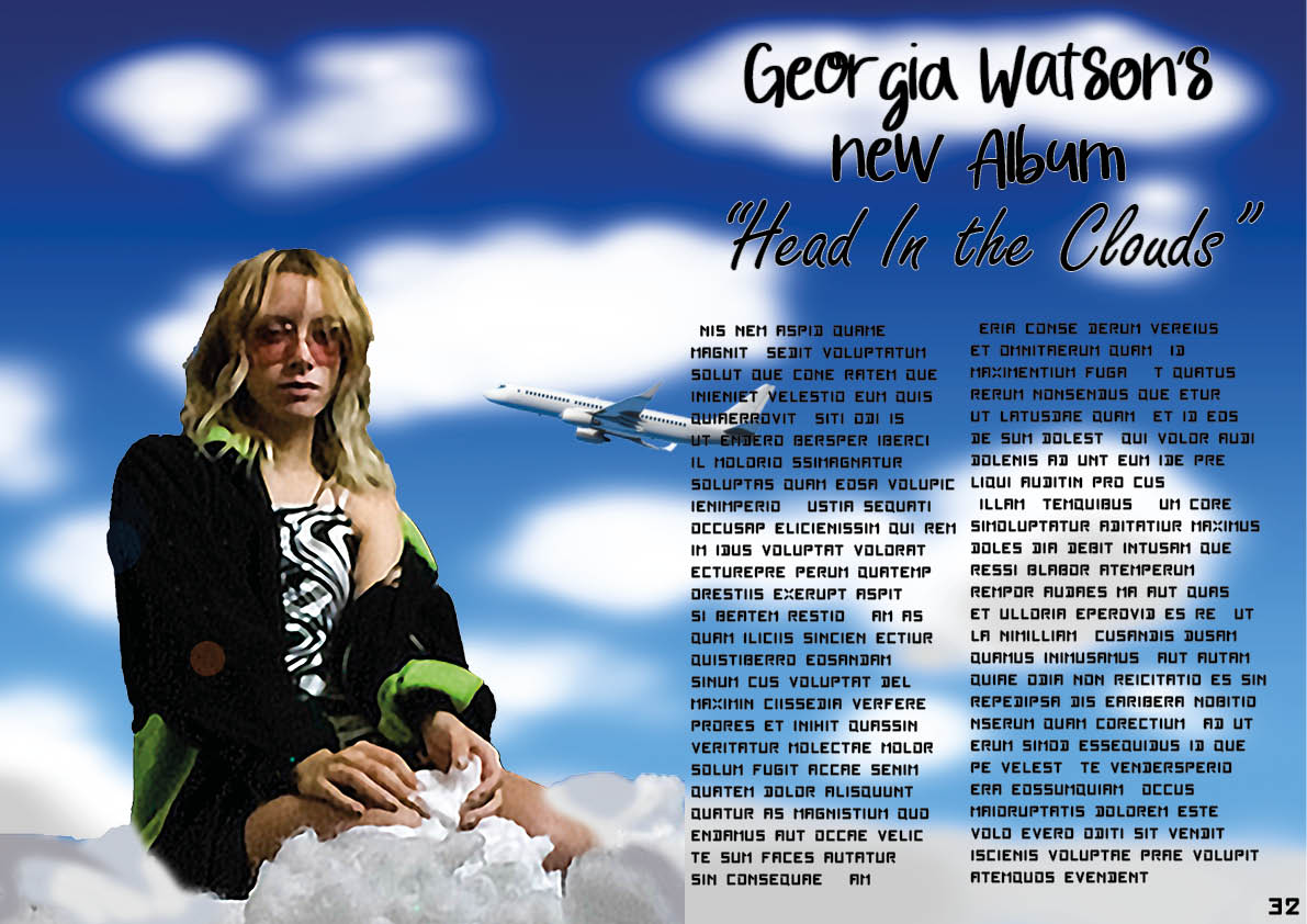
I really liked my first draft of my double page spread, so I used the same design but changed a few features which were quite subtle. For example, instead of using a photo of the sky in the background, I used photoshop to paint a seen that looked like the sky. This worked and it also made the background seem blurred which makes the artist stand out from the background. I also added the name of her album in a different font on the right page. Another feature I added was the plane, I did this to make it look more like the sky. At first, the plane was just there to see what it would look like, but I decided to keep it. This may not make the final draft but I just wanted to experiment and see what it looked like.
For the final draft:
– I think that I will keep the same design but I need to try and smooth out some of the sharp edges from the cotton wool in photoshop. At the moment, it looks like the cotton wool has a black outline around it and that does not match the background so I need to fix that in my next draft.
– In my next draft, I also need to add my article into the paragraphs instead of just using placeholder text.
– I have tried to remove the blur from the photo of the model, but I need to try and see if there is another good photo from the shoot. The blur makes the page less nice to look at.
Contents Page – Draft 2

For this draft of my contents page, I tried simplifying everything to see what it looked like because I think that the first draft had too much stuff on the page. In the first draft, I used a lightning bolt down the middle of the page to put the contents on but this, combined with all of the bubbles that I added, and the background colours, it was difficult to focus on one thing. So this time, I removed all of these factors, which may have been a bit far.
For my third draft:
– I think I should keep the same layout as the second draft but add something back to make the page seem more interesting.
– I will make the background a more intersting colour again, maybe by using the gradient tool again as one solid colour looks uninteresting.
– I will make sure to fill any empty gaps in the page.
Front Cover – Draft 2

With my first front cover design, I think that the design was too busy, there were too many colours which made it harder to focus on one part of the cover in particular. So for this design, I decided to make the background black and white as they are more plain colours so it isn’t too busy. It is for this same reason that I made all of the text the same colour on this draft. I chose a light pink colour to go with the light blue from the hoodie in the photo of the model.
When I make my third and final draft:
– I should use some features from both of my first two drafts. For example, I dont want the cover to seem too busy so I will probably keep the black and white background but I may also use more than one colour for the text. One colour for all of the text makes it seem boring and repetitive. If there is something that I want people to be able to notice more easily, then I will make that text a different colour.
– I need to fill up the empty space because otherwise the magazine cover seems empty.
– I need to cut out the photo of the model better because in this second draft, it is easy to see some imperfections in the image.