Every magazine needs to have at least one double page spread. These double pages are not always done in one attempt though. The magzine creators will need to do one, two, or even three drafts before they find a design that they like. I have designed my first draft which I have included below. Currently, the paragraphs are filled with placeholder text as I have not yet written my article.
For my double page spread, there are some parts that I like and some parts that I don’t like.
What I like:
– The style of the image fits the genre of pop well because it is happy and fun.
– I like how I have added lens flare in photoshop so it looks more like the model is sat in the clouds.
What I don’t like:
– The image of the model is blurry and it is very hard to remove this blur on photoshop.
– the image of the model does not match the image in the background on the bottom of the double page spread
Targets:
– If I was to re-shoot this image, I would make sure that the model was ion focus before taking the photo.
– In my next draft, I will make sure that the image of the model matches the image in the background better.
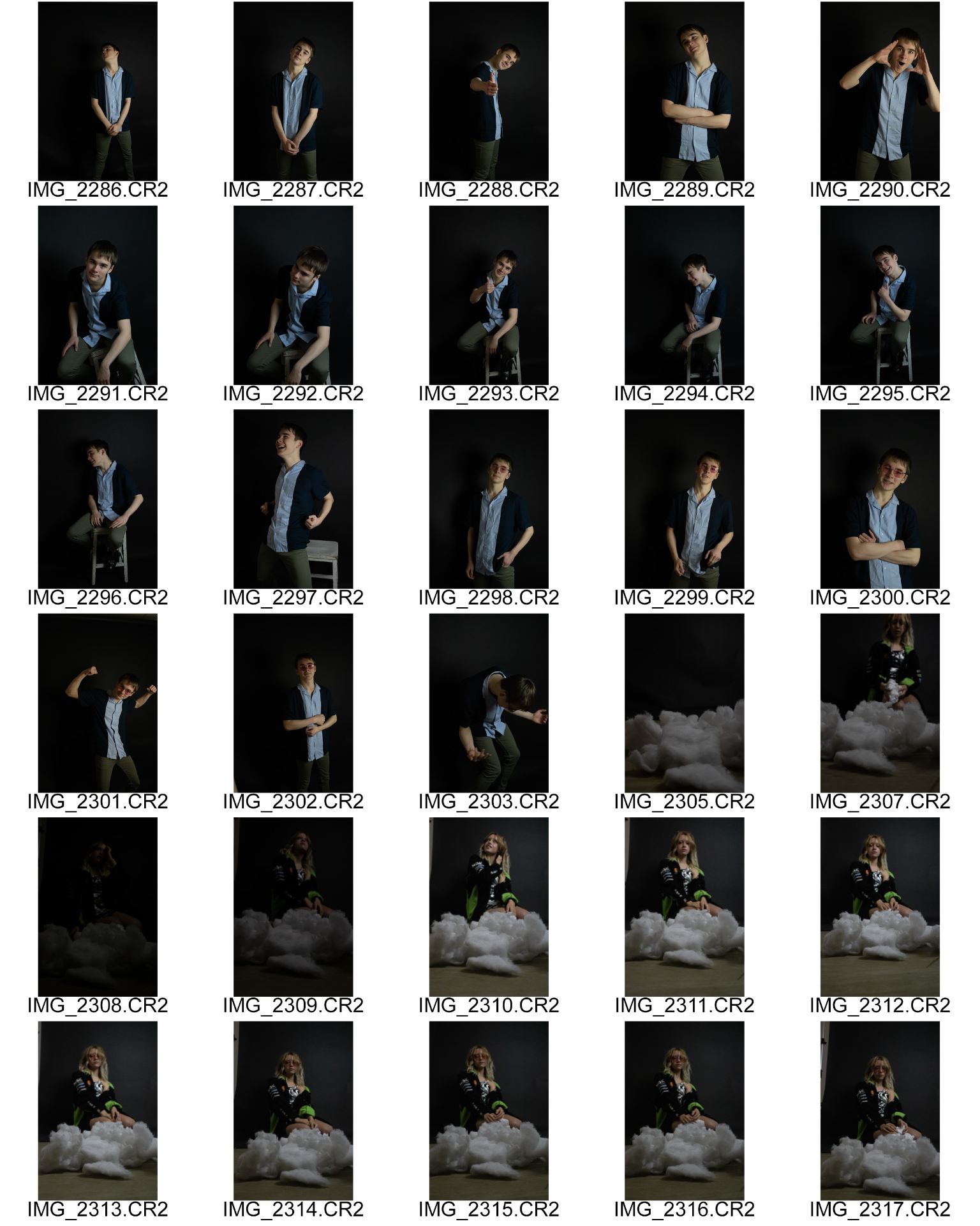
Here are my contact sheets from my second shoot. These are the photos that I am going to be using for my double page spread. For this soot, I had to get some normal photos and I also had to get a ‘phunky photo’. So for this, I used two seperate models. My idea for the phunky photo came from a video that I saw on the internet that gave me a bunch of photography ideas. For this photo, I put a lump of cotton wool in front of the camera lens sot hat it looked like a cloud. I then took the photo and editied it in photoshop. The image was a bit blurry at first so I had to play around and experiment with the settings in photoshop to get rid of the blur. I then had to cut my model out and change the background to a picture of the sky, This made it look like my model was sat in the clouds. If it was a sunnier day, I would have taken this photo outside so it would have looked more realistic with the lighting. If I did this photo outside, Then it may have already looked like my model was sat in the clouds and I wouldn’t have had to do so much work in photoshop.
Before I could do my photo shoot for my double page spread, I had to fill out a productioon meeting agenda sheet. This is so that I know what I am going to do when it comes to the shoot. Every photographer needs to be prepared for a shoot so that they don’t waste peoples time by not knowing what they are going to do. This sheet includes things such as what costume the model is going to be wearing, if they need to use any props and what equipment they will be using. As well as being organised, we use this sheet to let people know what props we would like to use as we do not want to clash with someone who wants to use the same props.
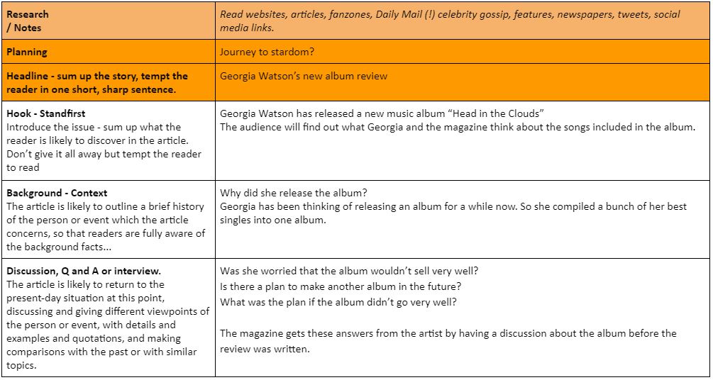
Georgia Watson has released a new album “Head in the clouds” and I am going to review it in this article. Considering that this is her first album, Georgia has made a great start. I have had a conversation with her about the album and I will be including quotes from that, as well as some of my own opinions on the album.
I was wondering why Georgia had made the sudden decision to release her first album so I asked her in the interview and she said ‘Releasing an album is something that I have wanted to do since I started singing when I was only young. Now that I have made a few successful songs, I thought it would be the perfect time to fulfill this lifelong dream.’ This seems like a perfectly good reason to want to release an album, but some people may think that this album is a bit rushed because Georgia wanted to fulfill her ambition. Maybe she should have made a few new songs to add to the album first to make it better for people to listen to.
I was wondering if there was any doubt about how well the album would sell, so I asked Georgia if she was ever worried and she responded with ‘There were some points when I wondered if I was making a mistake, had I left it too late? Had people already heard all of these songs and if so, would that make the album pointless? These were all questions that I asked myself when I was thinking of releasing the album.’ So it seems that she had a few doubts, but by the looks of the sales over the first couple of days, there was nothing to be worried about. Georgia did mention that if this album goes well, then she would start working towards making another one in the future. But as of yet, we have not heard if there is a plan, or what this plan is if the album doesn’t go very well. I am guessing that if it doesn’t go to plan, then she won’t release another album for a long time, if ever.
Overall, this is a great album, bringing together some of Georgia’s biggest hits. Lets just hope that her fans all share that same opinion. At the moment, it is looking like they are because the sales of this album have skyrocketed over just the first few days, leaving it sold out in many shops. If the album keeps selling as well as it is now, then it might not be long before we are making another album review about Georgia Watson.
To improve this article, I think one of the main problems that needs resolving is that I have used too many large words. A magazine article needs to be easy to read so that you don’t get lost in the article. To solve this issue, I need to simplify some of the article in order to make it nicer for the reader. I also need to include more breaks in the sentences so that the reader does not get out of breath when reading the article like I did at some points. Another thing which I need to do is add a break in the article after each bit of speech from the artist to make it more easy to distinguish between the narrator and the artists speech. I could tell this was an issue because when I was recording, it sounded like it was all one big sentence, but there should have been a gap in the text to seperate the speech between the narrator and artist.
Second Draft:
Georgia Watson has released a new album “Head in the clouds” and I am going to review it in this article. To say that this is her first album, Georgia has made a great start. I have had a conversation with her about the album and I will be including quotes from that, as well as some of my own opinions on the album.
I was wondering why Georgia had made the sudden decision to release her first album, so I asked her in the interview and she said ‘Releasing an album is something that I have wanted to do since I started singing when I was only young. Now that I have made a few successful songs, I thought it would be the perfect time to complete this lifelong dream.’ This seems like a good reason to want to release an album, but some people may think that this album is a bit rushed because Georgia wanted to achieve her dream. Maybe she should have made a few new songs to add to the album first, as this would give people new songs to listen to.
I was wondering if there was any doubt about how well the album would sell, so I asked Georgia if she was ever worried. She responded with ‘There were some points when I wondered if I was making a mistake, had I left it too late? Had people already heard all of these songs and if so, would that make the album pointless? These were all questions that I asked myself when I was thinking of releasing the album.’ So it seems that she had a few doubts, but by the looks of the sales over the first couple of days, there was nothing to be worried about. Georgia did say that if this album goes well, then she would start making another for the future. But as of yet, we do not know what the plan is if the album doesn’t go very well. I am guessing that if it doesn’t go to plan, then she won’t release another album for a long time, if ever.
Overall, this is a great album, bringing together some of Georgia’s biggest hits. Lets just hope that her fans all share that same opinion. At the moment, it is looking like they are because the sales of this album have gone sky high over just the first few days, which is ironic because of the album’s name. Many shops have completely sold out of this album. If the album keeps selling as well as it is now, then it might not be long before we are making another album review about Georgia Watson.
I have made a few subtle changes to the article between the first and second draft. While the changes may be subtle, I feel that they make the album easier to read. This is because I have ammended some of the issues which I mentioned before. I have removed some of the harder words to read and understand and I have added more breaks in the sentences to make it easier for the reader. I think that this article is now ready for my magazine.
Final Draft:
Georgia Watson has released a new album “Head in the Clouds” and Pop Verse are going to review it. To say that this is her first album, Georgia has made a great first impression on her fans and on record producers far and wide.
I was wondering why Georgia had made the sudden decision to release her first album, and her response was illuminating, ‘Releasing an album is something that I have wanted to do since I started singing when I was only young. Now that I have made a few successful songs, I thought it would be the perfect time to complete this lifelong dream.’ This seems like a good enough reason to want to release an album, but some people have been saying that this album is a bit rushed because Georgia wanted to achieve her dream. Maybe she should have made a few new songs to add to the album first, as this would give people new material to listen to.
So was there any doubt about how well the album would sell, and was Georgia ever worried. She responded with, ‘There were some points when I wondered if I was making a mistake, had I left it too late? Had people already heard all of these songs and if so, would that make the album pointless? These were all questions that I asked myself when I was thinking of releasing the album.’ So it seems that she had a few doubts, but by the looks of the sales over the first couple of days, there was nothing to be worried about. Georgia did say that if this album goes well, then she would start making another for the future. But as of yet, we do not know what the plan is if the album doesn’t go very well. We are guessing that if it doesn’t go to plan, then she won’t release another album for a long time, if ever.
Overall, this is a great album, bringing together some of Georgia’s biggest hits. Lets just hope that her fans all share that same opinion. At the moment, it is looking like they are because the sales of this album have gone sky high over just the first few days, which is ironic because of the album’s name. Many shops have completely sold out of this album and the online streaming has gone off the scale. If the album keeps selling as well as it is now, then it might not be long before we are making another album review about Georgia Watson.
A person who is designing a magazine needs to be able to understand the language that other magazines have used. They need to be able to understand what techniques have been used in the article. They do this by analysing an article that is similar to the type of article that they would like to produce. I have also analysed an article which I have included below.
This is my analysis:
The article is about Hudson Mohawke’s new album. It tells us the magazine’s opinions on the new album which he has released. They grab the audience’s attention by using language which people who listen to that genre of music would be used to hearing. An example of this is “Bombastic synth-scapes”, these are unusual words that are mainly used by people from this genre of music. The article mentions some of the famous artists that will be featured in the album, as well as the genres of music which will be in the magazine. At some points, it mentions specific songs that are going to be in the album and they review them individually. But at other points, they refer to the album more generally by reviewing all of the songs in one go. It is a short read so that the reader won’t get bored when reading the article. It is written in the first person by someone who has listened to the album so it makes the audience seem like they can trust the interviewer’s opinion more. The star is made to come across as someone who moves around a lot. He doesn’t like to stay in one place for too long, we are told this in the last sentence. Other than the last sentence, we are not told anything about the artists personality.
Like every other feature of a magazine, there is more than one draft before it is released. This is becsuse the producer wants to make sure that every feature is as perfect as it can be before the magazine gets sold to the public. The contents page is one of these key components that is needed in every magazine. In this task, I have come up with a design for the contents page. This design will change over time, but this is my first draft. I used the same colours for the background as I did on the front cover, but this time, I added some circles that are meant to look like bubbles. I added these because it could tell the audience more about the genre of music because pop musis is fun and exciting. Sometimes, people link bubbles with fun. I have been peer assessed for this task, and I have included this peer assessment below.
CONTENTS PAGE PEER ASSESSMENT
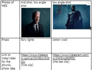
What type of shots have been used to create a variety of shot distances and how has the camera been used to communicate meaning?
You have taken the mid/long shot as all the body is in the photo, so you can see what they are wearing which links into the pop genre. You could add some more photos to show the readers what else will be included but smaller so they don’t overpower the main star.
What choice of Mise en scene is appropriate for the star image and genre?
The outfit was appropriate to the genre as it is casual but effective of how the pop star would be seen in everyday life. The colours match as they are light which shows an uplifting feeling towards this genre although they could be slightly darker to make the contents page more realistic.
How far is the font used readable and reflects the genre?
Your choice of font is simple and easy to read with the word ‘contents’ which makes it easier for the target audience to read from a distance. The font for what’s in the magazine (headlines) is the same as the rest of the contents page which is very simple and a bit unclear to read so it may be hard for the reader to see at a glance. This could be changed for your final contents page in order for the information telling us what the magazine is about to be eye-catching. I feel like you also need to include a masthead/ coverline to entice the reader in.
What technical conventions of a Contents page are present and used effectively?
You have included your star image followed by contents page numbers with info which fits the requirements. You have also included a lightning bolt which links in with the pop genre, this also goes with the background colour with added bubbles which creates effectiveness.
How has Indesign been used to layout the page to convey a brand?
InDesign has been used in the right way to layout the conventions to make a contents page. This is shown because your ‘contents’ is displayed on the side which makes it seem like how a real magazine is layed out. The way you have included your star across the page is bold which is striking to the audience for them to know who is in the magazine. This also relates to how a real magazine would be shown.
How well have the text and visuals been integrated together?
The text and images have been integrated together in order to link the cover lines/ info about the bold star that has been featured in the contents page and who else is included in the magazine. This is how a magazine would be portrayed in the real world for people to feel intrigued to read it and have a desire to buy it if they want to read about the specific stars and their gossip.
Where has photoshop been used to manipulate the photos to enhance the star image or genre?
Photoshop has only been used to cut out the star image in order for him to layer the backgrounds, this would have been done to enhance the star image so it’s more stand out without the original background colour of white.
How is the language used appropriate for the genre and target audience?
The language is appropriate for the genre as it has imperatives and hyperboles to attract the reader e.g. exclusive, giveaway details and a day in the life of Ed Sheeran. This is very casual which links to the pop genre and how people act within this genre. This is a good way to encourage the readers in.
From this peer assessment, I have found five areas where I could improve. These five areas are: Using a different font for different features, using a main coverline to entice the reader in, Use slightly darker clothing on my model and add some more photos to the page
For somebody who is creating a magazine, a contents page is essential. Before they start work on this contents page however, they need to have an idea of what they want it to look like. What will normally happen is the magazine creator will look at some other magazines for some designs that tey like the look of. They may not even like the colours, but they can change them to suit their own theme. I also had to look at other contents pages to see which layout I liked the most. I also drew up some of my own ideas for designs of contents page layouts. Out of these ideas, the person creating the magazine will need to choose their favourite design. For my contents page, I have chosen to attempt the lightn ing bolt layout from my drawn up designs. I feel like this will be interesting to try and I can see what it looks like. If I don’t like it, then this is only the first draft.
For this task I also had to c ome up with 5 catchy headlines, which are:
When somebody iscreating the cover for a music magazine, they will not just use the first version that they create. They will create multiple drafts and choose which one they like the most. While I may like this draft right now, I might come up with a better idea for a magazine cover in the future.
For my magazine, I have used plenty of features that should give away the genre of music that I am working with. These feature include things such as the colour swatches and the font of the headlines. I have used bright colours to insinuate that the music is happy and fun, which are adjectives that are usually associated with pop music. The font is bolder and more fun than a formal font which would usually be used when typing an important letter. The bevel and emboss makes it stand out to the reader and the font itself stands out more than a traditional font because of its less formal appearance.
Every magagazine creator has to have taken inspiration from somewhere. They usually get this inspiration from another magazine that thy have seen in the past. They need to know what they, and their target audience like the look of before they go creating their own magazine. It is helpful to create a sort of moodbard for the front pages of magazines that you like so that you know what features you will want to use on your own magazine.
From doing this, I have worked out that I like magazines which have a basic masthead, in a simple, plain colour so that it doesnt make the front cover too busy. I also like magazines which have a nice image on the front cover. In my opinion, the cover image can make or break the magazine. I probably prefer this look because when people look at magzines, they are more drawn in by the image that is on the front cover than what the masthead or cover lines say. The image is what usually catches the audiences eye first, followed by the cover lines. I have provided some examples of the magazines that I like the look of in the google slide below. Personally, I don’t like magazines with too much writing on the front cover. When people look at a magazine, they might want to see a few headlines, but there is no need to go overboard on the amount of writing that you use on the front cover.
On the “Hot Bike” magazine, the masthead stands out to me because it is in italics and it is made a much brighter, bolder colour than the rest of the text on the page. The rest of the text is black, whereas, the main masthead, is bright red in a bold font to make it attract the audiences attention.
When somebody creates a magazine, they obviously need a front cover, for a music magazine, this cover usually involves a model who takes up the background of the page. The photographer may not know exactly they want the model to be doing on the cover, so they will make the model do a photo shoot and choose their favourite photos from the shoot. This is what I have done with my model. I have chosen my two favourite photos from this shoot. The first photo I have chosen, is IMG_2258.CR2, I have chiosen thios image because I think that it looks cool with the camera shot aiming up at my model from a low angle, this is because it makes them look more poweful and confident. While the background may be harder to cut out for this photo because it wasn’t facing the studio background, I still think it would be an interesting front cover.
The second photo I have chosen is IMG_2225.CR2, I chose this image because I think the pose makes the model look more like a pop star. This photo will also make it a bit easier to cut out because it is taken in front of the plain black studio background. Currently, I prefer this second image to the first one.


 When somebody creates a magazine, they obviously need a front cover, for a music magazine, this cover usually involves a model who takes up the background of the page. The photographer may not know exactly they want the model to be doing on the cover, so they will make the model do a photo shoot and choose their favourite photos from the shoot. This is what I have done with my model. I have chosen my two favourite photos from this shoot. The first photo I have chosen, is IMG_2258.CR2, I have chiosen thios image because I think that it looks cool with the camera shot aiming up at my model from a low angle, this is because it makes them look more poweful and confident. While the background may be harder to cut out for this photo because it wasn’t facing the studio background, I still think it would be an interesting front cover.
 The second photo I have chosen is IMG_2225.CR2, I chose this image because I think the pose makes the model look more like a pop star. This photo will also make it a bit easier to cut out because it is taken in front of the plain black studio background. Currently, I prefer this second image to the first one.