Mast Heads

Before deciding what certain features of the magazine will look like, writers and editors will need to experiment with different looks or styles before they choose a final idea. This is what I have done with my mast head design, I had to look at some different fonts to see which one stood out as a font that showed people that my genre is pop. In my opinion, the third font on the list is the best one, I think this because it looks fun and bold, much like pop music itself.

Preparing for my cover shoot

Every photographer needs to be prepared for a shoot. This is why I had to prepare before I went into the studio to take my front cover shoot. The sheet above shows how I prepared for the shoot in the studio. I had to mention the basic things like who my model was, what they were going to wear and where the shoot was going to be. The main reason that I needed to be this prepared is to make sure that the times didn’t clash. For example, if I was using some props in the black studio and somebody wanted to use them in the white studio, they wouldn’t be able to because there would only be one of that prop.

Star Image, Theirs and mine

Before doing a photo shoot, a photographer will need to know exactly what they want their model to look like. To do this, they need to have an image in mind, usually this image will come from a star that they already know. Then what they do is they research the star to see what sort of mood they need the model to portray and also what sort of costume they would ideally be wearing. For my star, I chose Justin bieber because he is very well known by most people. I did some research and took some screenshots of some headlines that I found on the internet. This gave me the impression that my model needed to portray a look of someone who doesn’t really care what the media thinks of them. The models mood needed to look arrogant and ignorant.

Audience Profile

To make a good music magazine, the editor must know their target audience. To do this, they  must research the artists that they plan to interview. They have to find out the key information such as age and gender. I have researched my target audience for my magazine on the website ‘yougov’. This website shows you the age, gender and political profile of the audience. I took 3 screenshots of the information for people who typically listen to pop artists.

I have also made a dating profile for the type of person who I think would typically listen to the pop genre. This dating profile shows some of the demographic and psychographics of a typical pop music listener. This task has helped me in getting to know what type of people listen to the pop genre. This will help when it comes to creating my magazine because I will know what to include on the front cover.

The screenshots show that my target audience covers all ages. There are more millenials that listen to pop music when compared to older generations according to the survey. My target audience is relatively equal, but pop music is targeted slightly more towards women. The final screenshot, shows Michael Jackson, a pop artist and it also shows how many people have heard of him. It also shows who likes and dislikes him as an artist.

So what am I up against? The Competition

All media producers and magazine editors have to checkout the competition. They have to do this so that they can find out who their rivals in business are, they also need to work out how they are going to combat the competition. They need to know how to understand their market for the magazine.

I chose pop music as my genre, so I had to research other pop magazines to find out what sort of audience I am looking at. When I saw a good idea that another magazine had done, I considered why and how that would work and attract the audience to the magazine. For example, a giveaway would make people want to read more, this could get people to subscribe to the magazine because they may want to see if there are any other giveaways in the future.

If the audience is really interested in one artist, then an interview with that artist could draw in a larger audience.

All of the things that I had to do for this task made me realise how much the editors for magazines really need to research before their magazine is published. I will need to consider all of this for every future task because I need to think whether the audience will be drawn in or not.

Branding and Mission Statement

For my magazine, I have chosen the genre of pop music. I have chosen this because it is the type of music that I listen to and I think it will be interesting to work with. For the name of my magazine, I have chosen “Pop Verse”, This is name for my magazine because I used a name genrator and put in the word Pop. This is one of the names that came up and I thought that it was relevant because there are verses in a song and I thought it could be a play on words.

Then I created a word cloud on my topic. The word cloud contains words that are are associated or connoted with the pop genre.

Pop Verse is the hottest pop magazine out right now. We aim to show our audience just how brilliant the pop genre really is. We include detailed interviews with some of the most popular artists in the world. If you subscribe to our amazing magazine, we do a monthly giveaway where you can win tour tickets from some of the amzing pop artists that we work with. We do all of these things to engage our audience and because we think that pop music is the best genre of music out there.

My Tour Poster

Made with Padlet
Please click on the image to see the PDF

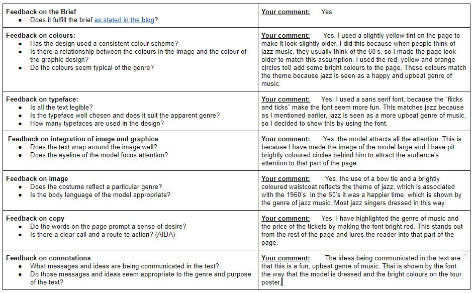
All tour posters show the audience something about the genre of music. Whether this is through the colour swatches or the fact that it says the genre on the poster. These things can tell us whether the music is upbeat and happy, or whether it is angry and loud. It does this throught the use of mise en scene. The specific conventions that are used by jazz magazines are:

 – Use of bright colours, which often include yellow and red.

– The musician in the centre of the page.

– The instrument is shown pretty much all of the time.

This is what made me choose many of the features for my own tour poster. For example, I used the same colour swatches that are associated with jazz music which include colours like reds, oranges and yellows. The musician is not in the cnetre of the page on my tour poster but to compensate for this, I have made the image of the musician much larger. This way, it still attracts the readers attention but the musician does not always have to be in the centre of the page. In my tour poaster, I have also copied what I have seen on many other jazz tour posters, The musician is holding the instrument. While he may not be using it, the trumpet is still visible to the viewer so they can have some kind of idea to what the music could sound like.

In my opinion, my tour poster went well. There are a few things that I could have improved on, like for example making the dates of the events bigger so that people knew when they were.

An Introduction to InDesign and My Magazine ‘Swede’

Please click on the image to see the PDF.

To produce a music magazine, you need to know your way around computer aided design (CAD). In this task, I was using Adobe InDesign to experiment with the varuious features that it offers. This is because InDesign is the program that we will eventually use to create our music magazine. To experiment with InDesign’s features, I was given a music magazine to try and recreate, to try and undersdtand what each feture does. I had to try and find the best fonts and typefaces to match with the original magazine and I also had to make sure that I sized the image correctly with the right proportions. We were given an image for the background of the cover (in this case, it was the persons face) and then we had to add all of the other elements on top of it.

There were some aspects of designing the magazine were more difficult than the others. For example, one of the more challenging things to do was trying to find the right font to match the cover of the real magazine. The pugs were also challenging, because the circles have a spiky pattern around the outside of them on the actual magazine. The closest I could get was the “white diamond” border pattern. This made the spiky pattern around the outside, but the spikes were not filled in with this pattern, whereas they were on the original. In future, I need to mkae sure that text that is all in a column is line up. In the magazine cover that I have done, the text does not line up down the right hand side of the page.

I enjoyed this task and it has made mne realise how muchwork goes into creating a magazine cover. will need to use and develop these skills on InDesign in order to create my own magazine cover.

Here are some Youtube tutorials on things that would have helped me when I was creating the magazine cover. These tutorials would have helped me because these are things that i really struggled with when creating the magazine. Distrivbuting the shapes tutorial would have helped me with the spiky border problem for the pugs.

A Front Cover, Attracting ‘That’ Audience

Each of the conventions in media say something about the magazine. For this task, I analysed a magazine cover and identified the different convetions and why they were used. I also had to work out what they were trying to show by using certain conventions.

When somebody makes a magazine, they usually have a target audience in mind. these target audiences have demographics and psychographics. The demographic is sometyhing that cannot technically be changed, such as age, gender, income, education and ocupation of the person. The psychographic is a group of people that the magazine is targeted at. For example, the Mojo magazine that I studied is targeted at people who like rock music. We had to research demographics and psychographics before we analysed the magazine cover to work out who the target audioence were. This magazine is quite traditional in terms of design, there are not really any fancy fonts on the page. From this, we can assume that the magazine is aimied more at traditionalists.

When I come to make my magazine cover, I will need to take into account things like Demographics, psychographics, colour pallette and the font.

Conventional design features of a magazine

All magazines, music or not, have certain features that they share with many other magazines. These features are mostly used to gain the readers attention. This may be by using bright colours or by using a large font. These features are called conventions. We analysed a magazine cover that we were given and had to identify the different convetnions that were on the magazine. Some of the conventions were missing from the cover, but the magazine still catches the audiences eyes.

The mast head is the first convention that I am going to explain. The mast head is the large piece of text across the top of the cover. The mast head is normally in a very larger, bold font in a bright colour to get the attention of the audience. Sometimes, the colour and font can match the theme. In the magazine cover that we analysed, the mast head wast orange, as were the cover lines (little bits of text on the sides of the magazine). This matches the theme of the magazine, which is jazz, because jazz is known for being a happy, upbeat genre of music. Many of these things can be said about the colour orange as well.

The main cover star is the main focus point on the cover of the magazine. All magazines should have a main cover star. On our magazine, it was the man playing the trumpet who was the main cover star. one of the conventions that was missing from our magazine was captions. Captions are the pieces of text underneath a photo, but as our magazine had no extra photos on the cover, there was no need to add captions. There are also many other conventions that I havent mentioned, these are: Main cover line, insets, pugs, plugs, issue date, price and barcodes.

I will need to consider all of these conventions when I come to making my magazine as well.