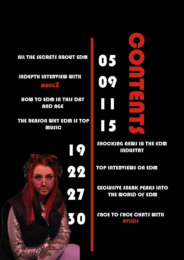
Above is my first draft of my contents page, I am pleased with it but there are a few details I definitely want to change now I have looked into it with more detail.I enjoy the colour scheme as I goes with the front cover.
PEER ASSESMENT
What type of shots have been used to create a variety of shot distances and how has the camera been used to communicate meaning?
Lani chose to take a mid shot in order to capture both the position of the model as well as the chosen costume to convey its relation to the edm genre. This demonstrates an understanding of positioning and lighting which results in an image that is conventional to her chosen genre.
What choice of Mise en scene is appropriate for the star image and genre?
The outfit worn by the star is bright and bold but is ultimately appropriate for the genre. The usage of the dark shooting room has enabled a mysterious look which fits well with the genre. The headphones are a great feature which convey the genre well.
How far is the font used readable and reflects the genre
The bold, sans serif font is clearly legible and generates an aspect of volume representative of the music found within the genre however lacks variety as the same font is used both for headlines and body text which leads to a lack of variety in graphic design.
What technical conventions of a Contents page are present and used effectively?
Lani has laid it out in two columns with the numbers being bigger and bolder demonstrating the importance. All of the conventions of a contents page have been highlighted due to the contrasting colours of the background and text colours.
How has Indesign been used to layout the page to convey a brand
The layout of the page leaves a generous yet appropriate amount of space for headlines and body text and the space available has been maximised in order to create a product that is fulfilling but not overcrowded which could drive the reader away.
How well have the text and visuals been integrated together?
The colour palette of the images and text parallel nicely with contrasting tones and there is an appropriate amount of space consumed by the text however it seems to overpower the image. To fill the empty space near the top you could enlarge the cover model bringing the text upwards to fill the space.
Where has photoshop been used to manipulate the photos to enhance the star image or genre?
Photoshop has been used to cut out the cover star and brighten different features such as the skin and hair.
How is the language used appropriate for the genre and target audience?
The language used is appropriate for the genre and the target audience will be able to identify it with the repetition of the genre.
Strong, clear, good, conventional
Low B grade
5 TARGETS I WOULD LIKE TO CHANGE:
- Change the font as it is overused making it boring to look at
- Change the number colours to add extra effect and interest to the eye(silver?)
- Move everything up to fill the space and make the model bigger
- Add a page number (3)
FOCUS FORWARD
In conclusion I need to add more detail into my cover lines to further emphasis the AIDA(Attention, Interest ,Desrire, A call to Action) to help draw attention to my target audience.
