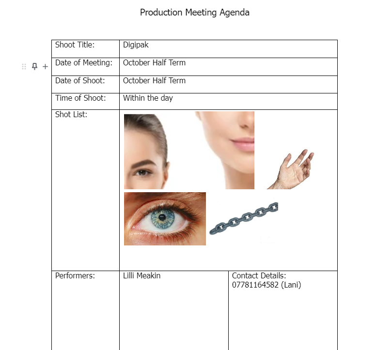
Final Digipak

REFLECTION

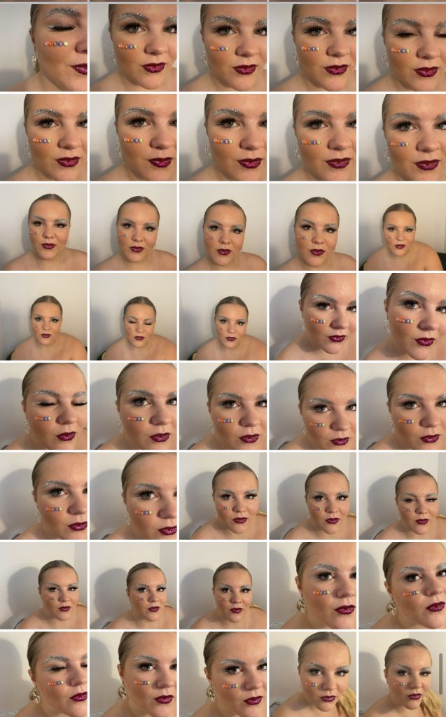
Throughout the drafts of my Digipak I made sure to consistently represent my star brand image and include elements that are conventional to the genre EDM. To make the front cover stand out I manipulated the photo during post production to make the surreal graphics to stand out and allow it to be conventional to the genre. By getting my star to look straight into the camera it gives the audience a straight connection therefore giving the empathetic side to my star.  Adding the neon effects helps associate it with the genre EDM as well as making my front cover stand out to the audience. I enhanced the sharpness of the beads on her face so that the artists name was clear enough to the eye. A dark cloudy background with a pink overlay is used on all my covers to help blend the images within the Digipak and reduces the harshness.

The media language within the fonts I used help with the illustrations of an edgy effect typically seen in the genre EDM. I used a slightly different font on the back page to give a bit of variety within my Digipak. White font is used to make it stand out more to the background and the black line effects used on the front title gives it a bit of depth and adds to the attractiveness. The colour palette utilised supports the neon effects I wanted to show and is conventional to the genre.


Digipak Draft Three

Below is a printed version of my Digipak, by printing it off it has allowed me to visually see the actual product and whether it fit my genre or not.

WHAT I IMPROVED;

  • Changed the writing position on the spines to read properly and inserted the artists name
  • Aligned the songs on the back
  • Remove the echoed faces as its confusing to the audience
  • Made Lilsy more clearer on the front page
  • Added an image with one of the faces eyes open on the back page
  • Added a trance effect on the inside right to go with the inside left
  • Changed the black background on the front, inside right and back page to a cloud effect to make it less harsh

Having it printed allowed me to see the conventional aspects and how alluring my Digipak includes. The neon lights are conventional to the EDM genre therefore the representation of the lights makes it evident its this genre. I have realised that the template of my Digipak isn’t accurate as the printed version of my Digipak doesn’t fit in correctly, so this will be something to improve on.

Then I created a survey amongst 30 people asking them what genre they think it is within 7 genre options. This gave me critical feedback so I can see wether my Digipak addresses the correct target audience I want it to reach.  With the feedback received the majority of votes voted for my genre, EDM therefore it reached the preferred reading needed.

FOCUS FORWARD

By seeing a physical version of my Digipak, it allowed me to identify the appealing factors it includes and what needs to be improved. Gathering data from peers on what genre they think it is helps me understand if my branding correctly conveys my genre.

Digipak Draft Two

Below is draft two of my Digipak.

SCREEN CASTIFY:

REFLECTION

Above is a screen castify of my teacher’s feedback on my draft two. I have included more EDM photo manipulations and graphics so that it connotes the star image strongly. I made sure to utilise the neon colour palette throughout the Digipak and edgy fonts to illustrate the brand I am trying to portray through the genre EDM.

WHAT WENT WELL;

  • Font I used is effective
  • Included the correct conventions (Barcode and Copyright)
  • The way the artists name is presented is unique

WHAT I COULD IMPROVE ON;

  • Spine on back page needs to read upwards on the left side and downwards on the right- Include artists name as well (In the bead effect)
  • Realign the text on the back page to its all lined up
  • Remove the echoed faces as its confusing to the audience
  • Increase the size of the top right face so that the artist name is clearer
  • Remove the right foot in the inside right page
  • Make the model bigger so more of her dress is shown in the inside right page
  • Add a trance effect on the inside right to go with the inside left
  • Change the black background on the front and back page into a gradient to make it less harsh
  • Feather/blend the model’s face on the front cover
  • Make the hand bigger to remove the cut off line on the back page
  • Possibly add an image with one of the faces eyes open on the back page to give it a more surreal effect

FOCUS FORWARD

By receiving critical feedback it has allowed me to develop more conventional ideas on improving my Digipak for it to successfully fit into my target audience.

Digipak Draft One

Below is the reflection of my draft one of my Digipak, I assessed it in relation to the assessment criteria and awarded the Grade I think it has received at the moment.

TARGETS/GOALS (WHAT I WANT TO ADD);

  • Add more neon effects onto of the stars face (neon triangles)
  • Insert the media conglomerate (who it is signed by)
  • Add more effects to the back page to make it more surreal
  • Fill the black background more so that it is eye catching
  • Add another effect onto the main title to make it really stand out more (drop shadow, satin effect?)


Contact Sheet And Shoot Reflection


REFLECTION

Above are the contact sheets for my digipak photoshoot. I chose my location to be in a white room so that in post production I can clearly cut out my models face. Having a white background allowed the natural light to portray every detail and successfully reflected the glitter on my models face, helping with the mise-en-scene for my genre.  During the photoshoot I added different details to what I had planned, for example the beads spelling out my artists name. I thought this looked very effective and fits the criteria of the EDM genre as they are neon colours. I decided to change the neon paint that was in my original idea to glitter so that the shine effect was there, and I can add neon strobe lights in post production if needed.I made sure my model was alway looking into the camera so that on my digipak the audience can feel connected. I believe I achieved successful clear images that portrays the genre EDM therefore I have numerous choses of different images to include on my digipak.

Below are some of favourites from the shoot.

DP Mockup

REFLECTION

To start the creation of my digipak I drew a few ideas out and I think this one if the most effective for my genre. On the front it includes a few quarter shots of my star image. This gives the audience a little hint, which will draw them in more making them want to know more. To get these shots I will take a photoshoot and then encode it into InDesign to further edit the neon effects. I chose the album name ‘TRANCE’ to decode the preferred reading of hallucination more which supports the theme of the digipak and the track names. It is an unconventional factor to link up all the tracks to the album name but this will be my Unique Selling Point (USP) for my digipak making it the same but different to the rest of the EDM digipaks. On the back of my digipak, the tracks are in the middle which is unconventional as they typically start on the left hand side. Conventionally, I am using the typical colours seen in EDM digipaks, neon pink and blue, this is to further attract an audience with bright colours. The repertoire of elements within the EDM genre are mainly the colours and fonts, and I am looking to stick with the same conventions the rest of the digipaks use, so that my genre can be clearly recognized.

My digipak’s colour palette

FOCUS FORWARD

I now know that by dissecting my own digipak I develop the knowledge of what is conventional and what isn’t, which will help me successfully sell my product and attract a large audience. It is important for all the conventions tell a narrative so that the audience are intrigued.


Digipak Conventions Analysis

REFLECTION

Digipak’s consists of technical conventions, which should always be included for legal reasons. For example;

  • Barcodes- to be able to sell the product
  • Copy right information- used so that nothing can be claimed against the artist/no one can steal their work

Other elements are seen within an album cover and these are called conventional elements which are used to attract an audience. The elements used for the genre EDM are usually;

  • A digital/surreal image in the middle of the cover
  • Album name
  • Artists name
  • Tracks found on the back (on the left side)


Throughout this digipak, blueprint is constantly seen therefore creating a repertoire of elements. The main denotations of the digipak is the colorful dreamy effect within the artists figure which represents who the star image is. The almost cloudy dreamy pattern that the colour are in are the connotations that could convey hallucinations and portray a soothing feeling for the audience. The colours are then seen cohesively on the outside of the frame which is on the back as well. The edgy, obscure font infers the design behind it is the most important however it is unconventional for the digipak cover to be fairly hard to read and in this one the white cap hides the letter ‘T’.

Key descriptors that match ‘My Look Book’

  • Abnormal effects
  • Pink and blue neon tones
  • Uses a dark background so that the bright aluminous colours can stand out
  • Surrealism
  • Use of art

FOCUS FORWARD

I now know how effective it is to identify the conventional and unconventional aspects my genre conveys. By deconstructing an existing digipak for the genre EDM I have learnt the denotations and connotations I could include.

My Look Book

Made with Padlet

REFLECTION

I used Padlet to represent a repertoire of elements that can create a blueprint for my artist and genre. I gathered research to help represent the genre EDM which included EDM magazines, artists, album covers and more information associated with the genre EDM. To round it up I identified key descriptors that represented the genre as a whole.

By creating a moodboard it shows the integrated advertising that comes within a genre.This has helped me develop an understanding on the style and brand I can use to portray a band. I also now recognise the inspiration I will need to look into to inspire my target audience.

FOCUS FORWARD

I now understand that it is important to research and identify descriptors that are important for the preferred reading of the audience. Surrealism is the repitoire of elements throughout the EDM genre and therefore I now know this is an important aspect to include in my digipak.

Our Mission Statement – The Package Brand

REFLECTION

Above is my marketing strategy and mission statement for my digipak. It provides information on my brand which will help promote my album to an audience. Lilsy would be featured in integrated marketing with a unique selling point (USP) to gain a larger target audience, by gathering this audience it will mean the continuity of Lilsy will increase. The demographics consist of a younger generation mainly the teenager years (13-19) so I want the artist to be known as approachable so that the target audience can connect and relate with the star. To receive sufficient sales I will need to make sure that the continuity of promotion is well thought through so that people are desperate to buy my product. Creating a mission statement gives a hint of what to expect and a call to action for the audience. Developing my marketing strategies and mission statement will result in a package that will influence the coherency of my music video as a whole.

MISSION STATEMENT

‘Trance” is UK’s next rising EDM album for all teenagers across the world. Featuring ‘Low Down’ which includes an unforgettable, empathetic beat as well as embracing a touching narrative. This upcoming hit aspires to influence children who are struggling at home and prove that they are not alone. Lilsy offers an empathetic tone in her lyrics to satisfy all listeners. Stay tuned for Low Down.. Soon to be in the top charts!”

FOCUS FORWARD

By researching and developing ideas for my marketing strategy it allowed me to understand the meaning of my star image and how I want the audience to view my album as if they don’t understand everything they may reject the text.