My Tour Poster


REFLECTION

Making media consists of a lot of processing, and one of the most important aspects of making media is research. Researching a genre is important because you begin to understand all the conventions of the genre you are studying.

When looking into posters AIDA is important.It is important to make sure your poster is;

  • ATTRACTIVE– so that the audience is drawn to your poster.
  • INTERESTING– so that it makes the audience want to be like the singer or be at their concert.
  • DESIRE– so that the audience are wanting to go and can’t stop thinking about it.
  • A CALL TO ACTION– so that they know where to buy tour tickets.

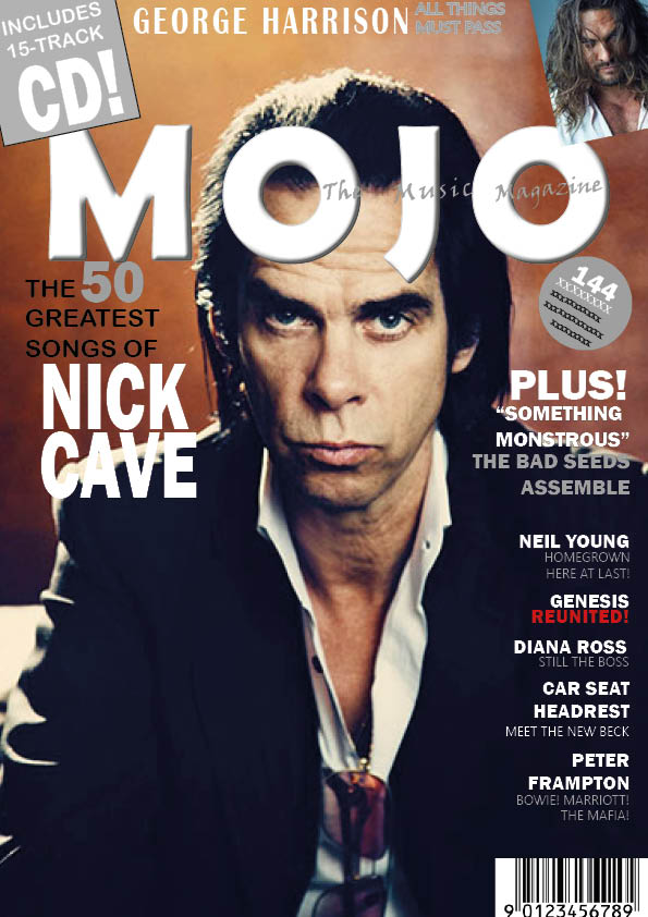
When researching my genre of pop, I made sure to focus on fonts, colour palettes,images,typograophy and layout as all these will help me design my magazine cover.

Whilst researching pop tour posters, I noticed the colour palettes on most of them were contrasting colours so that the writing on the poster can be seen clearly. Most of the fonts were bold and big which will lure the audience in but it all depends on the style of the artist.

FOCUS FORWARD

I now know that for my music magazine to be successful I need it to be bold and bright to attract the audience and have all the information on it so that they are fully inform.

Please click on the image to see pdf

Please click on the image to see self assessment

REFLECTION

Within my tour poster I had to make sure that it included fonts, images, colours and layouts that related to the genre pop and attracted the audiences eyes. I used the app Photoshop to cut the background out of the image that I took a few weeks ago during a photoshoot and then added a slight shade of pink to her lips. I also used the app InDesign, once I placed the photoshop image in I used the InDesign app to finish the poster off by adding a grey background and all the text around the model.

What went well;

  • The title is unique and bold to other posters.
  • All the information that is needed is there for the audience and any additional information can be found on the websites.

What I could do better;

  • I could of spend a bit more time of cutting around my model as there are bits of green around the edges of her.
  • During the photoshoot I could of positioned her in a more pop star pose.

FOCUS FORWARD

I have now realized how much time goes into making a poster and how everything has to be precise and bold for everything to stand out individually on the poster. I will now make sure my poster is bold and unique from other posters so that it attracts the audience.


My Magazine Front Cover Swede

Please click on the image to see the PDF


REFLECTION

Me and a partner were dedicated a magazine cover, in this case I has to copy MOJO’s Nick Cave magazine. We had to recreate a magazine cover, we used the app Adobe InDesign to do this task. I had to find a photo of Nick that was as similar as the original to represent the main cover star. I then had to find an inset that is similar and insert it into the right hand corner. In the original his skin is a lot more smooth and the lighting is bright so that his eyes stand out, whereas in the one I recreated the image is dark and gloomy. His skin in the recreated image shows his wrinkles, which proves that the original is photoshopped.

THINGS I HAD TO CHANGE

  • I had to get a different main cover photo because the original wasn’t locatable.
  • I had to change the color font of ‘SOMETHING MONSTROUS’ this is because if I had kept it in black the font wouldn’t be visible as it would blend in with his jacket.
  • I had to replace the font with ‘x’ in the grey sticker as it wasn’t readable from the original image.

I found specific tasks easier than others, for example;

  • I found it simple to insert an image as all I had to do was draw a box with the rectangle tool and then go to file, place and pick the image and insert.
  • I found it straight forward to add text and adjust its size and color, because I knew exactly where the icons were.
  • I found it easy to re size all my headings/captions and images so that the layout is the same.

I found specific tasks harder than others, for example;

  • I struggled to find the exact fonts that matched up with the original, I tried to get as similar as possible but there are some that aren’t exact.
  • I found it hard to get all my captions all right aligned and all exactly below one another, this task took me the longest.
  • I found it difficult to get the text ‘The Music Magazine’ visible in front of the mast head.

FOCUS FORWARD

I now know my way around InDesign so know now how to navigate around to make my magazine the best it can be. I’ve also realized how everything needs to be accurate for my magazine to catch peoples eyes. I also have now realized that the positioning of text and images is so important.

The Camera Talks

MOODBOARD

Every photo you take is affected by the angle. The use of camera angles, distance, framing and your body language and facial expressions can affect both denotations and connotations of the photo.

We went around the school and started off with an image and an idea and proceeded to illustrate the image with 3 hashtags, one for the denotation of the image and two for connotation.This task has made me realised that the angles and positions of a photo so that it can represent a narrative.The composition, how the elements of a photo are arranged, can change peoples perspective of a photo. It can either make a viewer more of less interested to the photo.Camera work and MES link together as  costumes, make-up, props, facial expressions etc all will be bold to the eye all depending on how the camera is angled.

FOCUS FORWARD

I now have realised how important angles and positions convey a photo, and I can ow use this information to help me construct my magazine.


My Image that uses Mise En Scene to make meaning


Made with Padlet

MOODBOARD

Everyone was allocated a genre and my group was pop. As a group of three we made a pallet and inserted images of costumes, makeup,hairstyles,lighting and setting all relating to the genre pop. A pop star usually stands out because they were very bold bright costumes and have funky hairstyles and very well detailed makeup, this is because most of pop songs are upbeat so they have to support their songs with a bold appearance to engage their audience.

POST IT NOTES

I did a bit of audience research and they came ack with connotations that the genre pop star is very energetic. ‘Young’ was repeated a few times suggesting that pop is targeted at a younger population. Another post it said ‘fun’ which is how we as a group overviewed the genre pop. This is why we have used bold colors and fun poses into our photoshoots, so that we gain a wide target audience.


I presented my model to be in a pop star pose, where Lucy is singing into the microphone with a smile on her face, allowing her to engage with the audience. In this shoot we focused on props and lighting, we used the natural sunlight because it was nice and bright reflecting off Lucy’s face like she is on stage with stage lighting. How Lucy is posing is the typical pop star pose where they are putting everything into singing into the microphone or opening up their body towards their audience. The aluminous pink jacket reflects on the boldness Lucy is trying to project whilst performing and the sunglasses represent a trendy vibe that popstars carry.

FOCUS FORWARD

I now understand that there is a great amount of detail that is important  to execute a photoshoot. In the future when I undertake a photoshoot I will know to focus on the setting, costume, lighting angle and accessory. Focusing on these aspects that relate to a genre will be distributed to the correct target audience and sell successfully.

A Textual Analysis of a Tour Poster

TOUR POSTER

This is a deconstruction of tour poster that connotes how Harry  Styles is attracting his audience. I’ve deconstructed the poster by looking at the font, colour,body language and costumes. There are many denotations within a poster that have connotations.

By deconstructing a poster it has made me realise how many hidden meanings there are and how every little detail makes such an impact on how people view and interpret the poster.It indicates that colour has a massive impact on attracting the audience. And that how you pose is a good way to welcome people, and make them feel comfortable so that they will support you.The font helps convey a narrative by drawing in attention and making this poster stand out from the rest.

FOCUS FORWARD

When I do my magazine I will now know that I need to focus on every little detail, like colour, language, facial expressions, costumes and fonts I would need to make sure my magazine is the most eye-catching magazine there is.