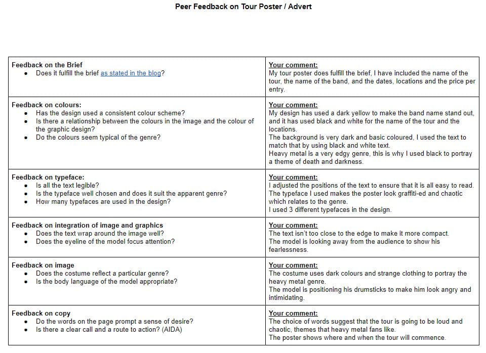
November 5

Masthead Designs

Today we were planning what fonts and colors we could use for our mastheads. I researched fonts online using  ‘what the font’ and ‘dafont’. I tried to find a few fonts on indesign to save me the trouble of downloading them online.

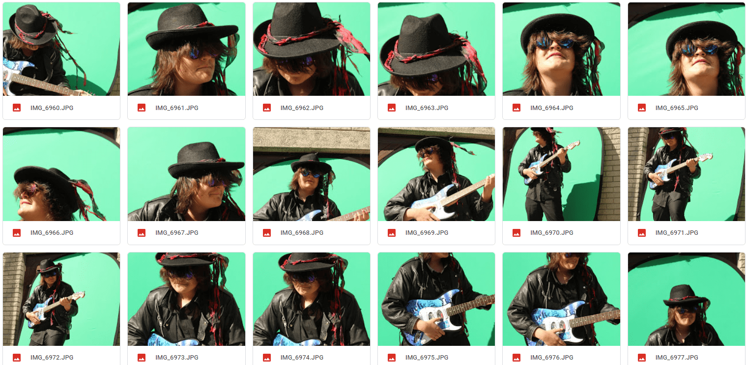
I tried using a range of colors to see which would suit my front cover best, based on the outfit I have in mind for my model.

The font on the top is very graffiti-like, I like this font as it gives a lot of meaning, however I do not think this will suit my genre, and I don’t think it is what my audience will decode.

I really like the second font, it has the modern texture and it is very bold and presentable. Based on other dance magazine covers, it is and ideal font to use as it is what my audience will be attracted to,  it gives that modern vibe to the magazine which is what my audience will be looking for and will most likely sell the product.

The next font for me is very bland and basic, it is more of a font that you would see on a comic book, I won’t be using this font as it is not very wild or energetic like my audience.

For the next font I tried using different colors to change the mood of it but it is simply too boring for what I want to create.

This next font I thought was very unique and flashy, but the only problem with this font is that some letters can be quite difficult to decipher.

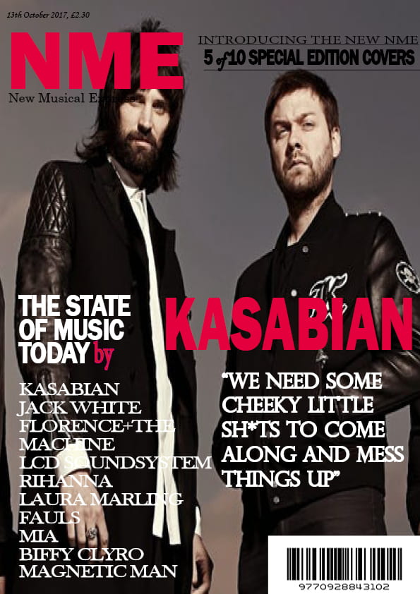
For this final font I looked back at the NME magazine which I recreated, I thought this font would represent my model as above everyone else, however this could give an arrogant impression, suggesting my model has some sort of god complex.


October 23

Brand Moodboard and Star Image

I have created a moodboard on Pinterest as a source of inspiration for if I ever hit a dead end when creating my magazine. I’ve filled it with photos of music stars, color palletes, different fonts of text and different outfit ideas for my model.

Please click to be redirected to Pinterest

I used images which I feel represent my genre and my brand best. This will help me with my magazine as I now have a resource which I can use to determine which denotations I should be including (e.g. Bright colors, a modern and bold font, a flashy outfit for my cover star). I plan to use this moodboard to design my front cover, and if I encode the product well, my audience will understand and decode it the way I want them to.

Now I need to research a Dance music artist’s lifestyle, their dress sense, their social life, and how they are represented to the public. This will give me ideas on how to make my main cover star look appealing to my audience.

This will help when making my front cover for my magazine because I now have a general idea on how to dress my model to make them look ordinary, yet extraordinary.

October 22

My Audience Profile and Research

To help me understand my target audience I used ‘yougov’ to research music artist’s audience, what their gender is? What apps and social media accounts they follow?

This information will give me a general idea of what Dance music fans are like as people.


Researching these Dance music artists has helped me to understand my target audience for my magazine. The gender distribution is relatively even, they seem to use a lot of social media platforms, and they seem to dress really flashy based off of the clothing brands they follow.

I will now use this information to create a dating profile based around a dance music fan.

By creating this dating profile, I now know who my audience are. I know what they like and don’t like. I now know what to include in my magazine to make it attractive towards them. I need to encode it by making it flashy and make it stand out by using bright and exciting colors and using bold and modern fonts. Doing this will ensure that they will decode it, so that my audience will not reject my magazine.

October 20

Branding Ideas and Mission Statement

  • I have decided to choose Dance Music as my genre of music for my magazine, I want to create a magazine with a club or concert vibe, a magazine aimed at young people which appear as energetic and flashy.
  • I wanted to have a name that was short, snappy and catchy to the branding I have in mind, so i decided to choose the name Mix Mic. It uses alliteration to make it sound catchy.
  • I used the word Mix because it is a skill that DJ’s need to learn to become successful.
  • I also used the word Mic because sometimes there can be live performances from singers or rappers.

This word cloud contains adjectives which I would use to describe the Dance genre, and a few features which my magazine will actually contain. This is a source which I can fall back on if I am ever unsure on what to do next with my magazine. These words will provide me with the right ideas on how to make my magazine proved the uses and gratifications theory, meaning that entertainment, information, social identity and social interaction are all accounted for, so my final piece has a unique selling point, and will satisfy my audience.

Mission Statement

For all

MixMic will fill your mind with the music we all know and love, our product will include the dates, times, and locations for different concerts around the UK. We believe that the life of a party comes from the music, and that’s exactly what our magazine is about, creating an atmosphere. You can keep up to date with music stars in the Dance genre, and you can also view different sound system products from our offers page!’

October 13

My Tour Poster

Researching Heavy Metal tour posters has allowed me to have more of an understanding on the colour palettes, fonts, and conventional features used to address the target audience.

These features which I wish to add to my poster include big bold writing with a particularly messy font to make the poster look more edgy.

I would like the picture of the band/performer to look as angry or as intimidating as possible, I am going to include a dark background to add a theme of death, since that’s what the heavy metal genre is all about.

Click to see PDF file

This is my heavy metal tour poster. Using my research I discovered that Heavy Metal posters have a very dark and basic theme to them, I used these emotions to select my background of an abandoned town at night to add an edgy theme to it.

I made this poster unique by using a variety of colour schemes, the name of the band is in bright yellow so the audience know who is performing. I also used very messy fonts to make it look as though the poster had been graffiti-ed.

I included the dates and locations so the audience knows where the tour is taking place, I named the tour ‘Northern Carnage’ and based it in the Northern area of the UK.

The action in this poster relates back to AIDA. The main cover star is alone in this dark and lonely town, he is holding drum sticks to show that he is a band member, and his dark and edgy clothing shows that he is a heavy metal artist.

I like how this poster portrays a chaotic theme using the messy fonts and the angles of the text. One criticism I have for this poster is the lighting on the cover star, I wish I could’ve made the left side of his face darker like the background.

This task  will help when designing my music magazine as I have improved my skills in Indesign and Photoshop, I have learned how to use different colours and fonts to portray a theme, and I have also identified how to use conventional features to make a tour poster more attractive.

October 9

My Magazine Front Page Swede


This is my own recreation of my allocated NME magazine cover, created using Adobe Indesign. Bellow is the original cover.

Re-creating this magazine cover has allowed me to expand my skills on using Indesign. I have also learnt how conventional features of a magazine cover are used to display a general theme of a magazine, the main cover star uses body language and facial expressions to tell a story to the audience. The colours and fonts that are used will portray emotions. The cover lines on the right hand side of the magazine give an overall impression on the demographic of this magazine, which is young and energetic character, and in some sense rough.

When using Indesign, I found it really easy to adjust the positioning of text and other photos. It was really easy to add more text boxes, and to change the size, width and height of the text.

However I did struggle with certain aspects, changing the colour of the text to the exact shade I needed was difficult, finding the correct font to use was very time consuming, and finding a high quality image to use for the cover was hard, hence why the photo I used is slightly lower in quality.

This well help when creating my magazine as I now know how to add conventional features to it, I now know how to use the basics of Indesign which I will use when making my own products.

I have attached three different tutorial videos for Indesign which I found on YouTube. I believe these videos will cover the areas where I need to improve on when using Indesign.

October 2

A front cover analysed

This task helped me to understand the definition of audience demographic and audience Psychographic. I have learnt how to identify the audience demographic and audience Psychographic by analyzing the conventional features used. This will help me when designing my magazine because I will know how to identify the audience demographic of my allocated genre, and how to use conventional features to make it look attractive to the target demographic.

September 28

Conventional design features of a magazine

Today we were looking at different styles of music magazine covers, and learning the basic terminology of them.

The main conventional features of a magazine include:

  • Masthead – The name of the magazine.
  • Main cover star – The main photograph on the front cover.
  • Main cover line –  The main feature in the magazine.
  • Cover line – Sub-headlines of what or who is in the magazine.
  • Pugs – ‘The ears of the magazine’,  can be the price of the magazine, the logo or an advertisement.
  • Plugs – The selling point in a magazine cover, often explains what it actually is.
  • Inset – A small photo which tells more about the contents of the magazine.
  • Bar code – How a magazine is scanned at a till in a shop.
  • Price – How much the magazine costs, this helps the company keep track of sales and when to decrease prices.
  • Issue Date – shows when the magazine was published, this helps the shops selling them to keep track of when they were set.

Knowing this information is important because when designing our magazines we need to know which features are conventional for all magazines, and what effect they have on the audience. Knowing the basic conventional features of a magazine cover is important to know what makes a magazine look like a magazine. When designing my magazine I will need to know how to make it look and feel authentic, and this task has taught me how to do so.

September 25

The Camera Talks

This task has helped me to learn the different effects of different camera angles and photo techniques. The body language used in the photo will help the audience understand what is actually happening, the body language tells the actual story of the photo. Combining the facial expressions, body language and the camera angle
We chose to use different camera angles based on the emotion that we wanted to portray. We took long shots when we wanted the location to represent a theme, and we chose close ups when it was the facial expressions and body language to tell the story.
This knowledge will help when designing my magazine as I will know which camera angle to use for which emotions I am trying to portray, and what story I will want to tell.
September 24

My Image Uses Mise-En-Scene To Communicate Meaning

Made with Padlet


I have chosen this as my final photo as I believe it portrays the story the best out of all of our photos.

The costuming we used makes the model come across as very dark and discrete about his personality. The hat and glasses cover up most of his face, adding a sense of secrecy in his appearance.

The facial expression of the model portrays the theme of anger and intimidation. He isn’t facing the camera which shows how he’s not focused on his audience, but only on the music he plays.

His body language gives an edgy impression of him, the way he’s slightly crouched adds a dramatic affect to his stance.

The props we used shows exactly what he is, a leading guitarist in a heavy rock band.

In conclusion, Mise-En-Scene is used in a lot of photos to portray a story or to add meaning. In media, the emotions of a text is what makes it attractive to certain audiences with different beliefs.

This will help with my magazine production as now I know how to use costumes, props and body language to tell a story in a photo.