A New and Improved DPS

My Double Page Spread Before:

My Improved Double Page Spread:

Improvements I made:

  • Added in my Pull Quote in.
  • Added a red boarder around my text in the top right.
  • Made the numbers for each tip stand out much more with drop capitals and strokes.
  • Added my article.
  • Added my page numbers and plug at the top.
  • Added my photo and article crediting.
  • Added in my Stand first.

Draft of the Double Page Spread

My Double Page Spread first draft:

Improvements to make:

  • Move pull quote.
  • Can’t have black text on the railing.
  • Center text.
  • Space out the colour, so I have bits of red all over the DPS.

My Double Page Spread after making some changes:

  • I’ve added the red bar at the bottom to spread out the colour a little bit more because it was all clumped into one area.
  • I’ve moved my black text away from the railing that it was on before, when the text was on the railing it was barely readable.
  • I’ve moved my pull quote down to beneath the first columns, I have done this because where the pull quote was before it made the quote look like a title instead.


Second Shoot Contact Sheet

These 5 photos are what I believe to be my 5 strongest photos from our photo shoot. One of these photos will be chosen to be the photo in my double page spread.


All of these photos taken are from my location shoot, these contact sheets are only the photos from the shoot that are usable. All of the photos that were unusable (e.g. too dark to use) have been taken out of the contact sheet. I met the criteria from my production meeting agenda (PMA) by using the same equipment, costumes, locations etc that I said we would be using in my PMA, a part of the shoot that wasn’t in my PMA was the cigar as the prop but someone else on the shoot had the cigar and allowed us to use it.


Design Skills 1

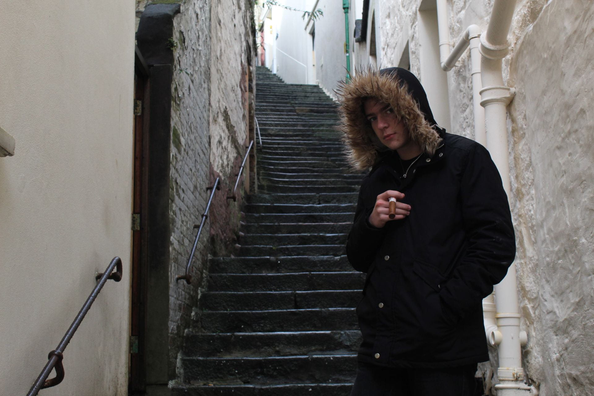
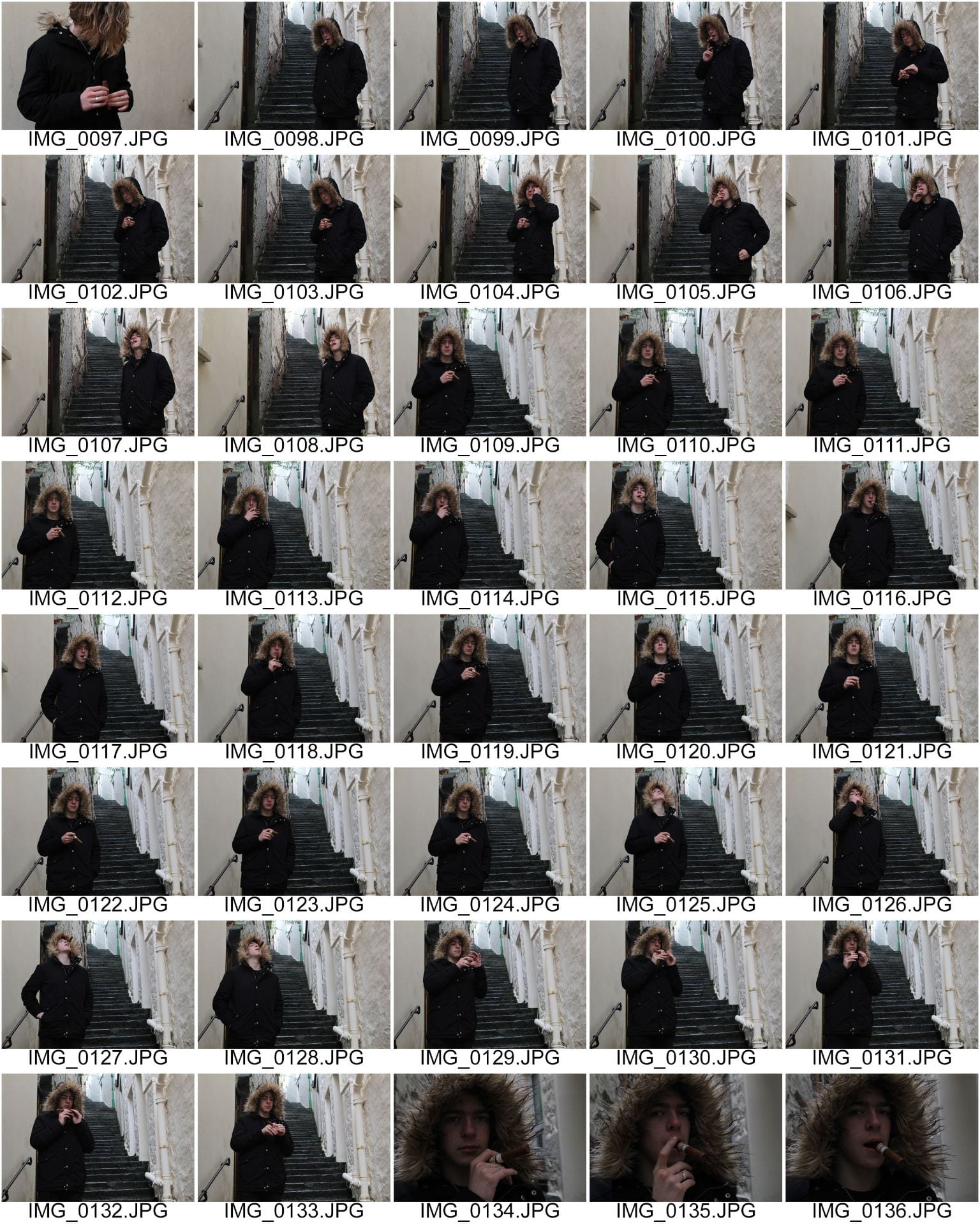
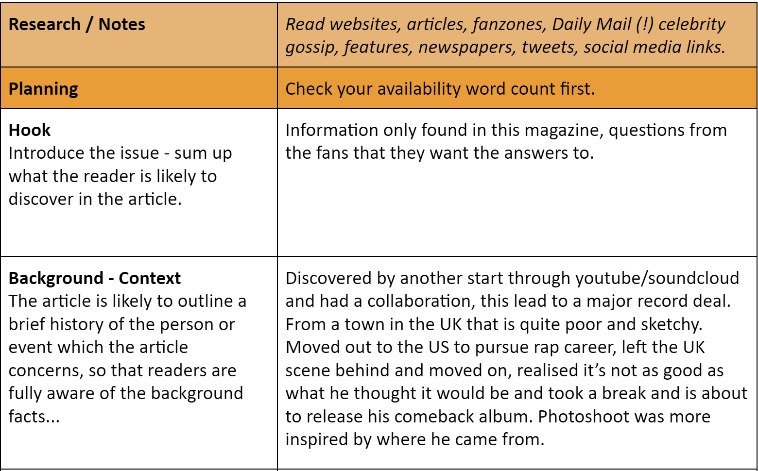
In the Design and Production of our magazines we have learnt how to use the programs ‘InDesign and Photoshop.’ Learning how to use these programs can allow us to make changes to our images to make them look how we want. These design features can completely change the quality and message of an image. Without using these design programs our images wouldn’t be able to be altered and simple things such as cut the star out from the image wouldn’t be possible and we would have the entire background with the image too. There are many tools on these programs that can help us change our image or our design around the images we have taken, the effects tab has multiple effects that can be applied and manipulated to text and images. There are many other aspects of our design process that wasn’t just using the tools built into the programs. Such as our layout design was just up to how we wanted things things to be arranged we didn’t need to use special tools for that unless you were trying to add certain effects to give your page a unique feel to it.

These are the different effects that are built into InDesign, these effects can be applied to images and text. These effects have many ways they can be manipulated such as the spread, noise and opacity, etc.

These are the effects that can be used to to manipulate your text, you change the size, typeface/style, stretch/squish, capitalize, space out, change the colours and strokes, italicize, widen/thin your text. There is still more you can do with these effects and you can combine them to get the look you really want for your text.


A New Improved Front Page

These are my first drafts of my cover page, the cover page with the grey background was my original before any changes were made. The cover page with the black background is after making the changes given by a peer. These changes are:

  • Changing the background colour from grey.
  • Change the size of the barcode.
  • Move website links etc to the top and move the image down to where the url was.
  • I am going to change my font used so it is different from the masthead.
  • Changed masthead font.
  • Slightly changed the yellow to be more vibrant.

I hope the changes made can make the top of the magazine feel a little less empty and the black background will be stronger than the grey. I hope that more attention will be drawn to the relevant areas instead of the irrelevant areas such as the barcode.

Original Version:

New and improved version:


Draft of Front Page

My first draft of my front page before any feedback or changes have been made.

Changes I’m going to make:

  • Changing the background colour from grey.
  • Change the size of the barcode.
  • Move website links etc to the top and move the image down to where the url was.
  • I am going to change my font used so it is different from the masthead.
  • Change masthead font.
  • Slightly changed the yellow.

I am making these changes based on peer feedback that was given to me.

First Shoot Contact Sheet

In this shoot we used the production meeting agenda (PMA), to try and take the perfect photos for my music magazine. I have followed my PMA by using the correct equipment such as the flash kit and studio room. I have also used the correct clothing, props and directions.


This is my first contact sheet from my first photo shoot in the studio:

These are my 6 favourite photo’s from the shoot: I think these are my strongest photos because they best represent my chosen genre and what I want my magazine to be.