My Magazine Front Page Swede


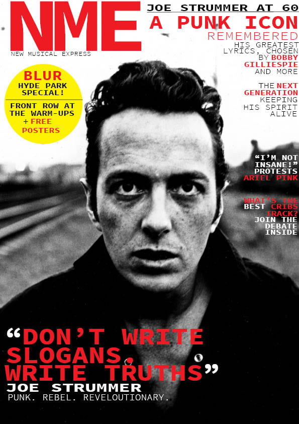
In this task we copied a magazine front cover as best as we could, we used indesign to create this front cover. This was our first task using indesign and I had never used it before. All of the skills used in this piece were learnt in our introductory lesson to indesign, from youtube videos or during the task.

My Copy of the Magazine Cover

The Original

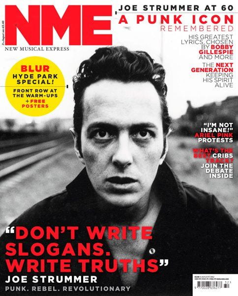
During the task we chose an NME magazine cover and tried to re-create is using Indesign. This being our first task on indesign we learnt how to use the program as we created our copy.

We had to re-create all the features of the magazine such as the masthead, pug, main cover star, etc. We used multiple different tools to achieve these features such as word manipulation, picture manipulation and shaping tools.

The part of the task that I struggled with the most was all of the text in the top right of the magazine, getting the text to fit and align with the other text just how the original was the issue. I solved this by using the many tools that can be used to manipulate text such as being able to stretch text horizontally or vertically and being able to slant the text. These tools greatly helped with this problem, using multiple text boxes also helped with some of the alignment issues. Using multiple text boxes means I could easily arrange each line of text to look the same as the original.

The Camera Talks


  1. Medium/long shot through a window.  Alone in a room/locked in. Isolation.
  2. Medium/long shot from behind. Playing the piano in a dark room. Solitude and peace.
  3. Medium through a door. Looking through the door potentially spying on someone. A range of different emotions and feelings could be given off from this image.
  4. Medium high angle shot. Stood at the bottom of the stairs looking away from the camera, could be waiting for someone.
  5. Wide angle long shot. Stood in the middle of the hall. Lonely
  6. Medium/long extreme high angle shot. Walking down the stairs. Vulnerable.
  7.  Long shot slightly high angle. Crouching in the middle of a hallway, possibly just received bad news.
  8. Medium/long of model sitting. Looking out of the window. Contemplating.
  9. Close extreme high angle down stairs. Vulnerable.

Cameras can be used in many different ways to give off a meaning in a picture or video, such as using many of the different settings or angles. These meanings/feelings can be emphasised by the different camera angles, settings or mise-en-scene.

Technical Camera Terms

When taking our pictures in our photo shoot we had to take various features into account such as the distance, angle and composition. The distance of the image can show the setting around the model, if the image is from far away you can see everything around the model but if it is a close-up you know the main focus is on the model. The angle of the photo can give off different feeling from the model. If an image is taken from low down looking up at the model it shows they have authority and power, but if the image is taken from above them it can make the model seem vulnerable. The settings of the camera can completely change the image, you must have the right amount of exposure in the image so that you can see the image clearly. You also need the right depth of field, if it is completely off the whole image can be a blur, you can use the the depth of field to focus on the model.

My image that uses mise-en-scene to communicate meaning.

Mise-en-scene.

  • Costume
  • Lighting
  • Acting and Proxemics
  • Make-up and Hair
  • Props
  • Setting

Our group did our photo shoot based on the rap genre. We took around 40-50 pictures to try and catch a photo that showed off what a rap photo that could be used on an album cover or magazine looks like.

This was the photo that I have chosen to use as my final photo.

This is a photo we took but decided to not use. The ‘flexing’ of the ring, bracelet and watch is a big part of rap, it shows off how much money you have which almost all rappers do. But I believe that without facial expression and with it being in a bright place it doesn’t quite show off rap as much as some of the other images.


Made with Padlet

Print Media that Communicates Meaning

Overall the design of this tour poster give of a grungy/punk rock look but is also very bright and in your face to draw your attention. It also put extra information on the poster to draw you in more such as the ‘special guest’ line. The poster also makes the information that isn’t going to grab your attention smaller such as the time & place of the concert.