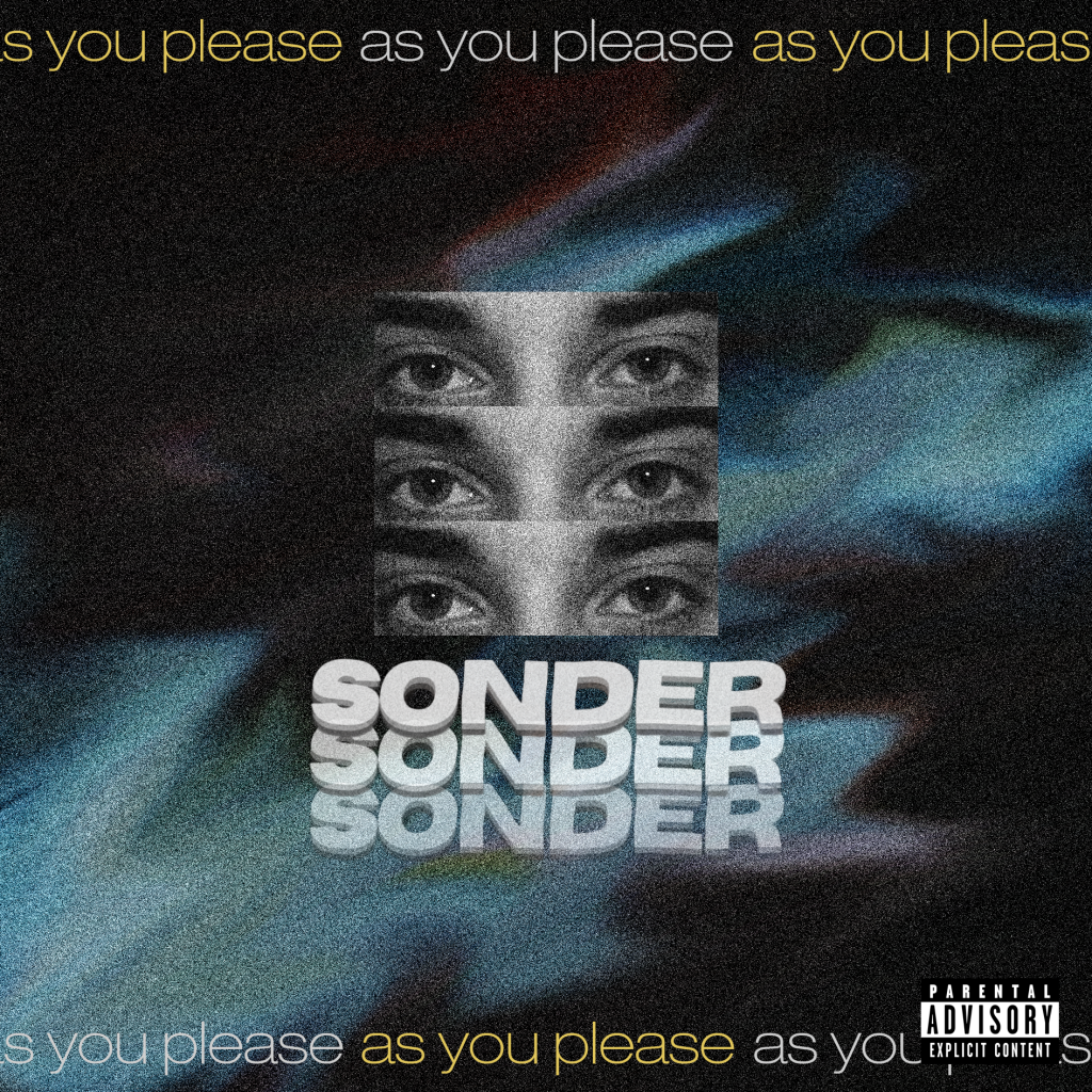
When creating our first draft, we kept most of the repertoire of elements (Hall) from our mock-up as we felt they were acceptable for the genre. We have made changes to the centre image and text, making them more graphically sound. Multiple changes are still needed, one of which is a change in the front cover, as we had difficulties using the same file from the mock-up.

In this draft, the use of software to create the necessary grunge aesthetic has been well executed already, this draft already contains all necessary conventions for a CD except from the middle panes and the spines which are required for the next draft. The text used for this draft is quite minimalistic, which is conventional, and stands out. In addition, the colour palette used for the text is suitable as it fits with the genre, and colours were taken from the background, which makes it appear more visually pleasing.
There is a lack of mise en scene because of the lack of overall embellishment, which may decrease the number of denotations but it is completely conventional for the genre. Instead, the digipak is up to interpretation and it is up to the audience to recognize the reasons for the implementation of certain elements from the extraordinary artist (Dyer).
With regards to the graphics, we as a group do not intend to further alter the background as it does already appear quite psychedelic. Tweaks are necessary for the image to blend in more and to add more depth however, we are already nearly happy with the result.
Targets for next draft:
- Make middle panes and spines
- Alter centre image so it blends in more
- Make tracklist more full
