My Tour Poster

Before making my tour poster, I researched and evaluated my theme, in this case it was country music, in order to understand the conventions such as; the layout, colour scheme, fonts and other key aspects and information and AIDA. In these country posters shown above, they include a combination of two or three bold and earthy colours such as brown, orange and red with some type of effect to show an old theme relating to the country genre itself. With my own tour poster, I am going to include these features and conventions but create a more unique and modern look. I should also consider the typography I have to use and the type of images I use to convey the country genre.

Click on image for PDF

Using both Photoshop and InDesign, I have produced an accurate representation of a country genre tour poster using a contemporary design whilst using the same conventions as a typical country poster. I find that taking a modern approach to this tour poster generates an eccentric and eye-catching appearance.


My Magazine Front Page Swede

Click on image to see PDF


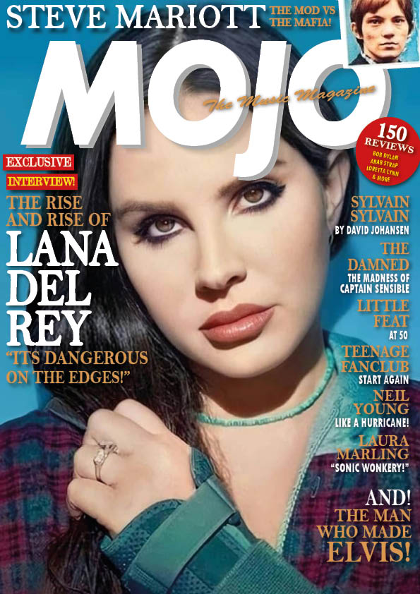
I have been given an introduction to Adobe InDesign and given the basic knowledge of the tools in order to be able to create a magazine cover. Subsequently, I had been given the task to replicate a MOJO music magazine cover which challenged me to be able to use what I had previously learned in the introduction in order to create an accurate replication of the original magazine. My replication of the magazine is shown above and a comparison of the initial and replicated magazine will be shown below.

During the processes of replication, having to use a range of tools in order to create a similar cover has bettered my knowledge in addition to the introduction and I now feel as if I am now fully capable of creating a music magazine cover in the future. In my opinion, I have created a fairly accurate replication of the original music magazine and have used the right colour scheme, layout and fonts to create the same aura and bring out the same vibe. I have also included a sufficient amount of magazine conventions such as:

  • The masthead
  • The main cover star
  • The main cover line
  • Pugs
  • Cover lines
  • Insets
  • Captions

Whilst using InDesign, I had found the sizing tools, inserting images and inserting text relatively easy and it is my strong point using InDesign. However I found using proportions, finding the right font and the size of text quite hard and that is what I would need to work on before creating my music magazine. In addition to my strengths and weaknesses using InDesign, I also need to consider what else I haven’t used while recreating a music magazine cover which could aid me in making my own music magazine. In my opinion, I need to learn more of the effects for texts and images as I feel as if these would heavily help me to make my music magazine stand out.

Using my newfound knowledge from both the introduction to InDesign and using it for myself, I can transfer my skills into the creation of my music magazine. I now know what makes the magazine stands out and also what is deemed to be acceptable and not acceptable.

I can also use these following YouTube videos in order to improve on my weaknesses using InDesign and for overall use on my music magazine:


The Camera Talks

When using a camera, the angles in which you take photos from incredibly assists you to be able to create a large meaning and narrative. There are many angles which a photographer can capture photos from and each angle has a different meaning. The different angles include:

  • Low angle – suggests superiority of a subject
  • High angle – suggests inferiority of a subject
  • Two-shot – hints the relationship between subjects
  • Close up – expresses emotion and shows clues
  • Extreme close up – expresses certain features of a subject which is important
  • Canted – connotes disorientation
  • Mid shot – in the middle of a close distance and a long distance, used to show a moderate amount of background
  • Long shot – used as an establishing shot, also includes the overall setting
  • Point of view – shows the perspective of someone/something – puts you in their view
  • Framing shot – uses a certain frame, can convey claustrophobia or tightness, it can also highlight a certain subject or even introduce a subject

While taking different photos using these different angles, my group and I had to heavily anticipate how the specific angle would portray a certain meaning and using different settings to add on to the connotations from the denotation.

Using my newfound knowledge, I can now use different camera techniques and use the positioning of the camera in addition to mise-en-scene in order to emphasize the meaning behind my upcoming music magazine as they change the connotations of the photo.


My Image That Uses Mise-En-Scene To Communicate Meaning

Made with Padlet

In this task we made a mood board for an assigned genre of music. In this case, my group was assigned country music. I have done research into country music and discovered the different elements of mise-en-scene, considering the different types of costumes, proxemics, settings and props in which country singers would wear/use. I have also found out that country originated in the late 1800’s so everything was very natural and rural. This knowledge enabled me to recognize what the model for the tour poster should wear in order for the audience to read the connotations easily to know that the poster is about country music.

Our photos:

Using our knowledge, my group did a photo shoot, using me as a model wearing clothing items which a cowboy would wear, including certain props in order to create more connotations for the audience to decipher. Throughout this photo shoot, we considered when and when not to include props, the lighting, the angles in which the photos were taken from, facial expression and the setting to portray country music for our final image(s).

In order to determine which of our photos were applicable to portray our theme, we asked peers to log connotations which came to mind when they saw the costume. These connotations included:

  • Relaxed
  • Farmer
  • Chilled

These connotations let us producers to reflect on our work and determine which were the best photos to be decoded in order to allow the audience to know what theme the poster is about.

Our Chosen Photos:


I have chosen these photos as my final photos as they give the clearest representation of country music to display to the audience. Having been the model, I feel as if I have created good representation for the connotations of country and western in these photos compared to our others photos we took. These photos protrude compared to the others because the lighting was better, the setting, but also how I, as a model, portrayed the role of a cowboy accurately and struck the right poses in order to create valid connotations.
By now having chosen all aspects of mise-en-scene and used the aspects to produce photos for a tour poster, I can acknowledge the significance of the different categories of MES in order to display meaning and both denotations and connotations. Using my new knowledge, I can now use the MES in my music magazine in order to create deep meaning and tell a story in my cover. It will also allow me to include more meaning which will intrigue my audience and make it clear to them what genre the music magazine is about.

A Textual Analysis of a Tour poster

Posters used to represent an upcoming event often come to be more bold and unique in order to create an eye-catching look which will intrigue the audience and for it to be easy to recognize. The poster which I analysed, in this case being a drake poster, did not include a specific theme to aid the audience to perceive the genre of music which would be played subsequent to the creation of the poster. Instead, Drake incorporates more of a mysterious theme which could possibly confuse the audience. However, the dark denotation could connote that the music will be empowering and meaningful. All of the contents of the poster is associated with the audience which Drake is trying to attract even though it may not seem clear.

Through this textual analysis of this poster, I have expanded my knowledge and have realized that the composition of denotations creates an adjustable theme to a media text and every visible feature can signify and convey a specific meaning. I can use this newfound knowledge in order to be able to deconstruct my music magazine into separate denotations to suggest different connotations and I will need to use the CLAMP format (Costume, Lighting, Acting & Proxemics, Makeup & Hair, Props, Setting) to be able to convey my theme.

Skip to toolbar