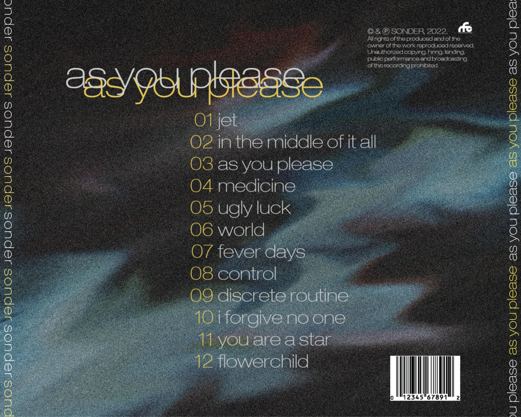


For our second draft of the digipak, we added symmetrical middle panes with a psychedelic appearance and spines that complete the elements compulsory for a cd cover. In addition, an appropriate filter for the colour pallet was placed on the eyes and numbers for the tracklist were included to further inform the audience. So far, we have already created a product which exemplifies the band’s artistic nature, but there are more things that we can fix and add.
This is feedback from our teacher:
Summary of feedback:
- Rearrange text on the spine as it will allow consumers to read the text easily on a shelf
- To discuss adding effects on the eyes to emphasise their dominance
- Potentially add a border to the frames of inside panes to add more colour as the pallette is quite dark