February
12

February
12
Question 3: So… How did your production skills develop throughout this project?
February
12
Question 2: So… How does your product engage with audiences and how would it bedistributed as a real media text?
January
23
Question 1: So… How does your product use or challenge conventionsand how does it represent social groups or issues?

January
22
Adverts
I also needed to contain 2 adverts in my magazine, that would be suitable for the genre of my magazine and appealing to my target audience. I chose these two adverts because I think that they would be suitable for my target audience, and also eye catching for them.
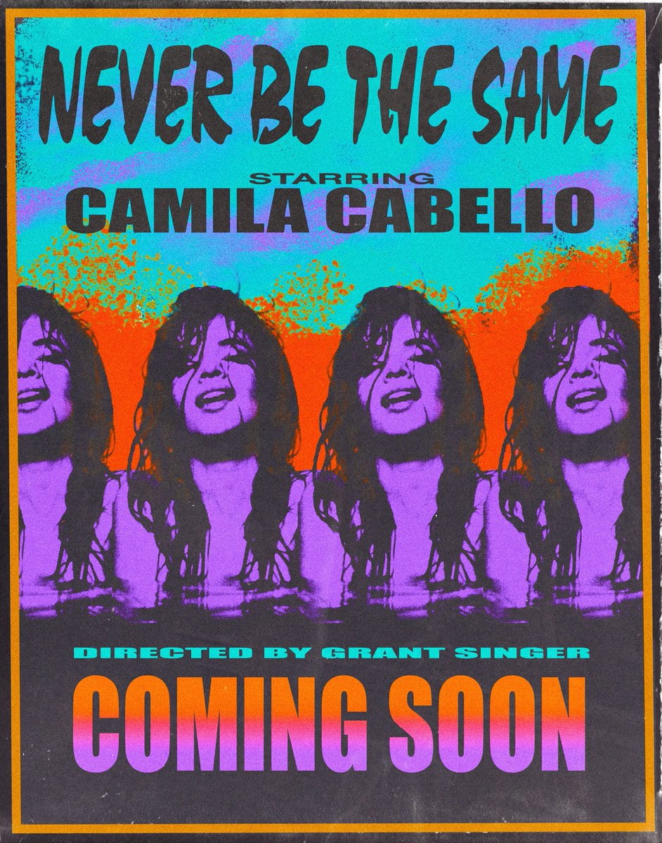
I think that the first advert would appeal to my target audience, as Camilla Cabello is a very famous figure in the Latino genre music. Her target audience is also very similar to mine,. Therefore I included the poster for her most recent tour. The colours are also very eye catching, and I think that they would attract the audiences attention.
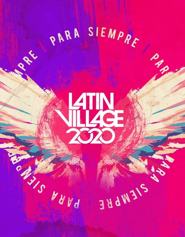
The second advert that I chose was for Latin Village Festival 2020, I chose this advert as it is a very big Latin music festival, I chose this magazine as I thought that it would capture my audience’s attention due to the bright colours a sit would attract their attention. It also doesn’t overload them with information, this will maker them intrigued and want to know more.
Overall, I think that both of these adverts will be suitable for my magazine, as they both are relevant and will attract the attention of my target audience, that enjoy Latin music, enjoy festivals and listening to the Latin music genre.
January
21
A New Improved Complete Magazine Draft

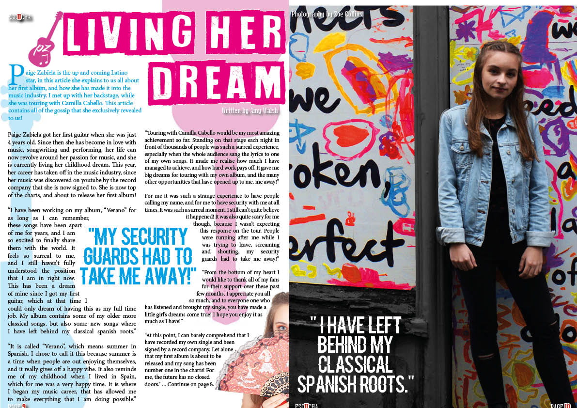
Here is the new draft of my full magazine. In this draft I have made lots of changes to the contents page, and some additional minor changes to the front cover and double page spread.
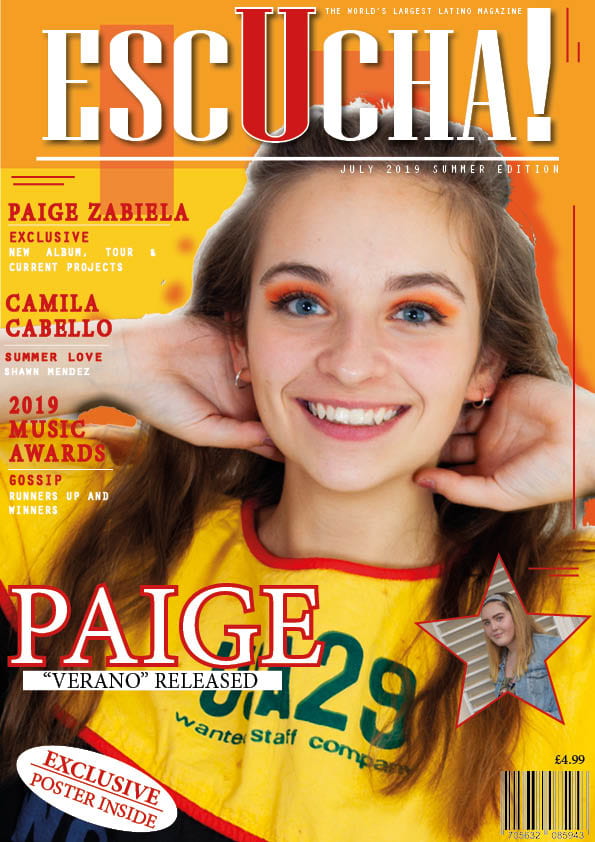
On the front cover I:
- Changed the Pug, I made it into a star shape to continue my theme of stars, and also to make it stand out further.
- I also changed the position of my secondary image, I moved it slightly further to the left so that it stands out more
- Added more of the small stars to continue the theme
- Changed the wording from largest to newest
- Added more stroke on the white lines
- Added additional artists at the bottom
- Twisted my image to the right
- Re-edited my main image, to adjust the cut out of the hair
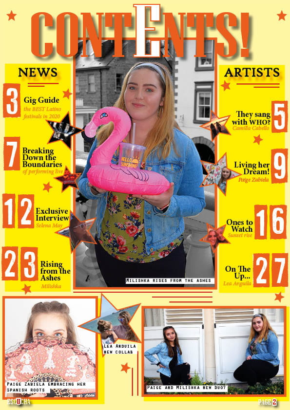
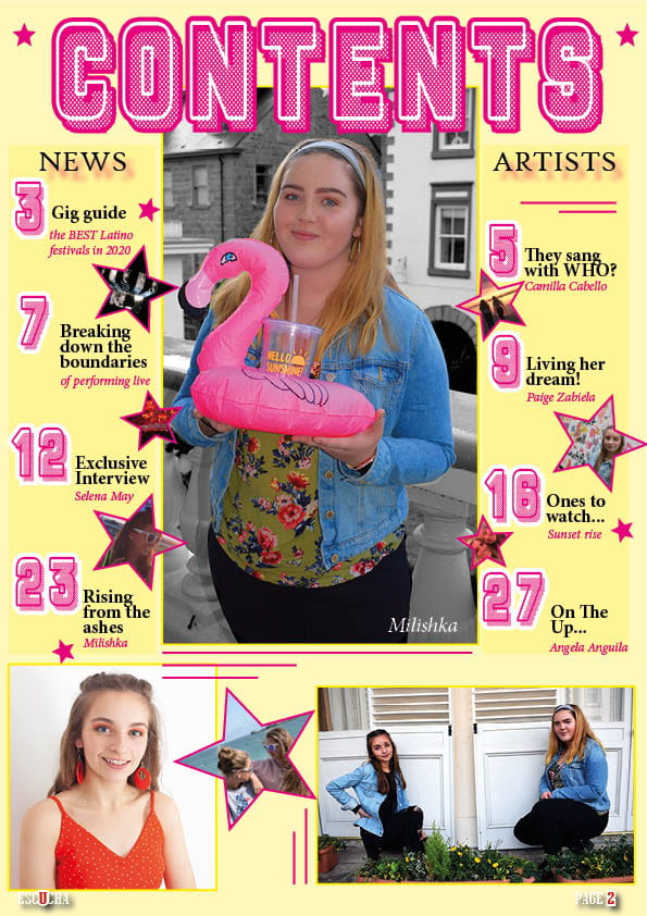
From my first full draft of my magazine, I have changed my contents page a lot from the feedback that I was given. I have:
- Changed the colour scheme, I have brought out more Latino colours continuing the red, orange and yellows.
- I have changed some of the fonts to make it make it tie in further with the front cover
- Added captions to my images to give context
- Changes the lettering to make it stand out more
- Added borders to the images
- Added stroke to some of the text
- Changed some of the positioning and placing
- Changed the imagery of Paige to a more suitable image
- Moved the star imagery so they are more directly noticeable
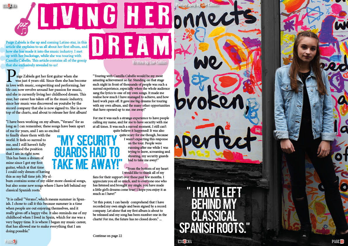
Double Page Spread changes:
- I changed the drop capital from the stand-first to the actual beginning of the article
- I changed the page numbers to the correct number to continue reading
- I raised the page numbers slightly so that they were not cut off
- I removed the additional photo, as I don’t think that it went that well and didn’t suit it
- Changed the wrapping of the text of the quote
Overall I am really happy with my final draft of my magazine, I think that it reflects the Latino genre well, and is engaging for the reader. I also think that the bright colours, whilst reflecting he genre, also catch peoples attention and draws them towards it. I think that theme is continued and consistent and it all works well together.
January
17
A New and Improved Contents Page
After the feedback from my full magazine draft, I decided to change my Contents Page in particularly as I feel that there are different ways in which I can demonstrate my genre better and make it more interesting for the audience. Here is my new draft of my contents page.

I have changed the colour scheme mainly, this is because I think that the yellows and oranges show the Latin Genre better, and it also helps it to tie into the front cover more. I also changed the fonts, this helped it to tie in with the front cover further and also the double page spread. Overall I think that this draft is better, as it is more eye catching and the genre is more obvious. To further improve, I think that I can make the words News and Artists stand out more, this will be more interesting for the reader and stop it from blending in. Overall I am happy with this draft and the chnages that I have made, I think that it will benefit my magazine as a whole and it makes it look more unified.
January
16
Design Skills 2
What new design skills or production techniques have you learnt? What went well and even better if…screen shots of InDesign and Photoshop and commentary – specific impact on the product in terms of star image, genre, narrative etc
As I continue to develop my magazine and keep improving on it, my techniques and skills in the software programmes are also improving. Inarticularly I feel that my InDesign skills have significantly improved as I have made the finer details and touches to my magazine.
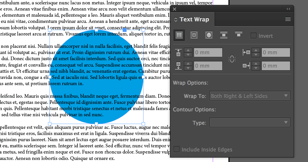
Firstly, when making my double page spread, I learnt how to wrap text around an object or shape. I used this when placing a quote in the centre of a block of text. It made the page more exciting and removed the block text, this break it up for the reader and also engages them as they want to know what this specific quote is about.
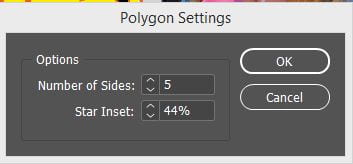
I also discovered how to make different shapes to place an image in, I used this on both my front cover and my contents page. I made a star to place my images in. This made from inserts more exciting and gave the page more interesting features. I could change the number of sides of the shape but also how far in the inset would be for the star. This meant I could change it to suit the specific image.
I also learnt how to manipulate an image in InDesign, I could change the angle of the image, rotate it, or flip it vertically or horizontally. This was very useful to me when I was adding in my smaller images from my phone into the stars, as I could angle them to fit and also flip them if necessary.

So far I am really happy with the progress that I have made with my music magazine. I think that it coming together well and resembles the Latino music genre and style, which is bright, fresh, hot and young like my design for my magazine. This is reflected in the star image from my photo shoots and the colour scheme that I have used.
January
16
So… How is it going?
What new transferable skills have you learnt? What went well and even better if…
Reflecting on the work that I have created so far, made me think about the skills that I have developed that I can transfer to my other work and in many other aspects to my work. Transferable skills are qualities that can be transferred from one job to another.
An example of some of these skills that I have developed in the process of making my work so far are:
- Communication- communicating my ideas to my audience, this can be through writing my article to the captions that I made for my contents page.
- Teamwork- discussing my work with others and completing group projects.
- Organisation- being organised to order my work and also to complete it at the right time.
- Adaptability- adapting my work and skills into different programs and for different tasks.
- Technology- working with technology and overcoming the problems that occur with them
January
15
Complete Magazine Draft
Here is the feedback from my teacher telling me the positives but also improvements that I can make to my draft of my full magazine. My main feedback given was:
- Colour Scheme- bring out more Latin covers to tie in with the front cover and conventions of music genre.
- Fonts- don’t use too many different fonts
- Contents- make the contents page tie in more with front cover
- Captions- add information/captions to photos
- Capital Letters- use capitals on captions