October 9

My Tour Poster

To help my research, I began to research Rap Tour Posters. I now know that to make my poster successful I must consider the following elements of AIDA:

  • Attention
  • Interest
  • Desire
  • Action

Addressing these will help to make my tour poster successful and suit the target audience. It also must be unique so that it stands out, while fitting in the conventional style.

I have learnt that Rap Tour Posters often:

  • have a Black Background
  • contain imagery of the star
  • imagery often in black and white
  • have bold text
  • contain splashes of colour (often red, blue or yellow)
  • have a simple layout

After knowing these conventions, I began to deign my own poster. I chose to use a black and white theme, I then used red and yellow colours for the titles and information, against the black, this stands out, and makes it very eye catching. It also shows the information clearly to the viewer, this would encourage them to be interested in the event. It meets the comnventional designs of a rap tour poster with the black and white theme, and colour added. It also contains imagery of the cover star, and bold text, which all suits the theme. However I think that my poster is unique due to the layout I used and the fonts. I used a simple layout, as majority of the posters do, but used different angles to make it slightly more interesting.

My poster also addresses AIDA as it draws attention due to the bright colours and large imagery. It generates interest due to the lack of information about what the tour is, this makes people interested as they want to know more about the tour. It creates desire, as the audience want to be like the cover star and also not miss out on the event. Finally, it has information at the bottom for the stars website and where they can buy tickets, this makes it easy for the audience to take action on what they are seeing.

I think that the colour scheme and imagery both work well together, however I think that the white outline around the star really distracts from the poster, and to improve I could get rid of this line.

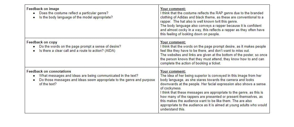
Here is my self assessment sheet for my poster:

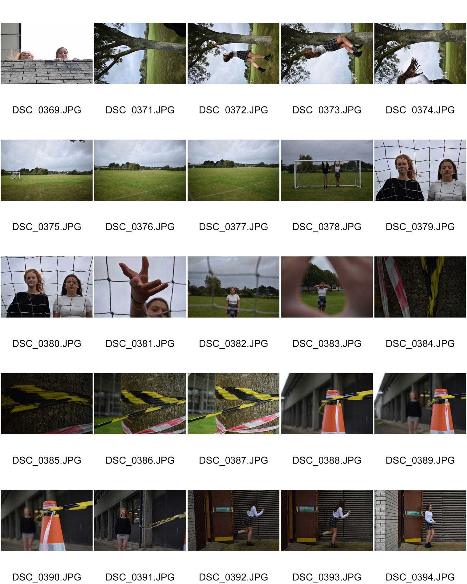
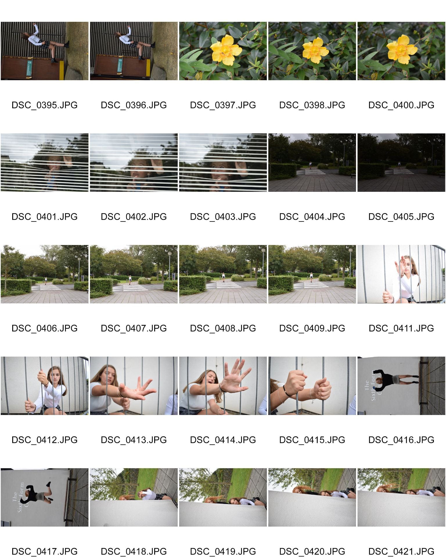
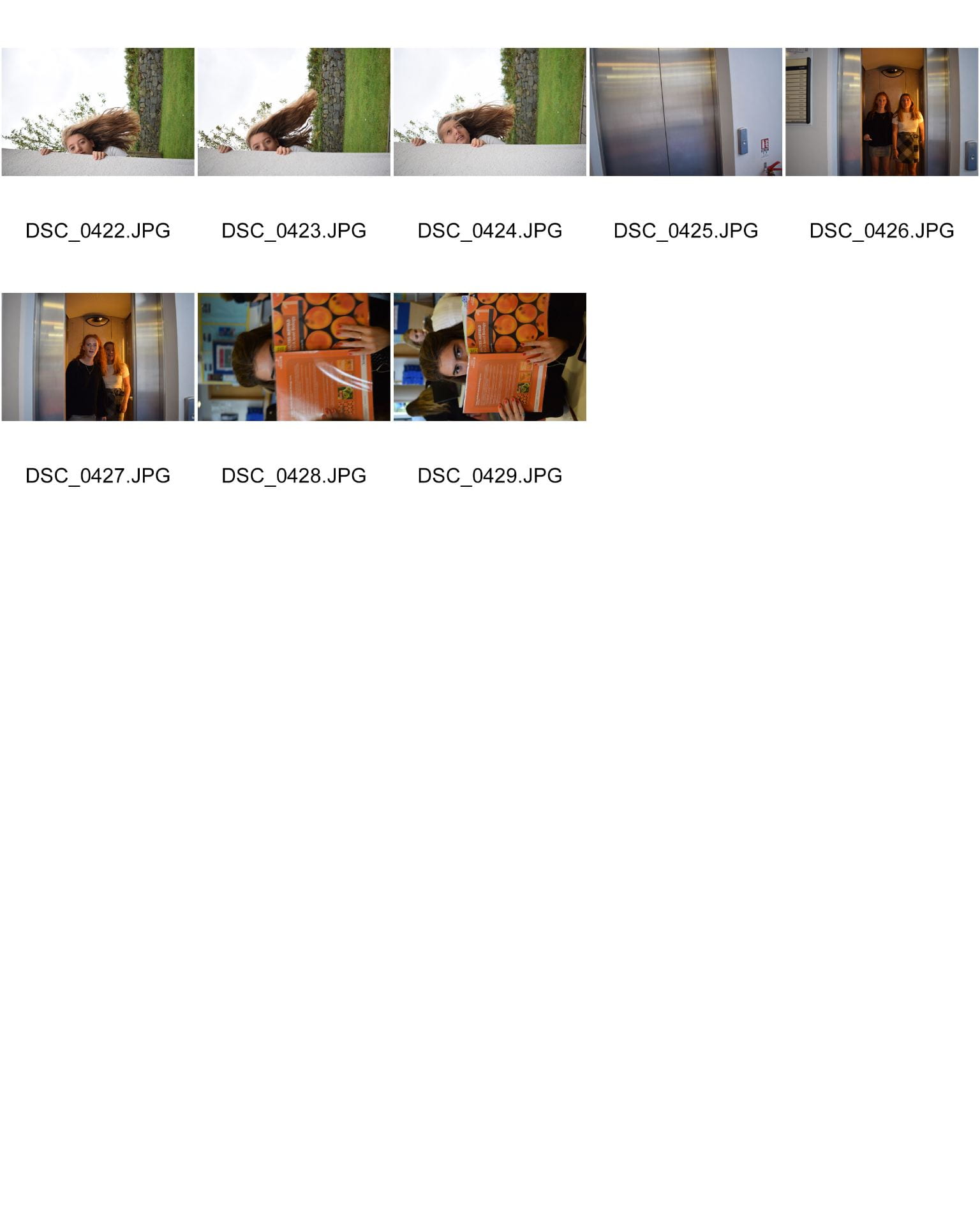
Please click on the link to see the full attachment


October 8

My Magazine Front Page Swede


My copy… Please click on the link to see the PDF

Real magazine cover


To help me learn to understand InDesign, I tried to make a replica of the front cover of a professional magazine. I chose the NME edition with the cover star Joe Strummer. I found the image that was used on the actual front cover on Google, and then uploaded it into InDesign. I could now begin to insert text into the style of the professional cover.

In my design I think that this went successfully:

  1. I think that most of the fonts that I used replicate the ones in the original
  2. I think that I have placed and correctly laid out the parts of my magazine.
  3. I think that the Pug that I inserted looks like the original, and I have included lots of detail.

To improve my magazine cover I could

  1. Edited the original photo that I used, and reduce the contrast between black and white, as this would make it look more like the professional cover.
  2. Used a different font on “REMEMBERED” as it is too thick and does not look like the font used on the professional cover.
  3. Used a lighter shade of red as mine is slightly too dark in comparison.

In this activity I have learnt the Basics of InDesign, and also have learnt the length of time and detail that is put into making a magazine. Also this will help me with making my own magazine cover, as I now know the basics and how yo use InDesign.

YouTube Tutorial Links:

These links will help me in the future with areas that I struggled with:

September 28

The Camera Talks

Here is a mood board that I created of my final 9 images. I used hashtags to show:

  • The camera technique
  • The denotation
  • The connotation

For example the photograph in the centre uses a shallow depth of field to draw focus to the hand and confusion. The model reaching through the bars and darker lighting suggest that she is trapped. Also the model is not smiling showing her unhappiness and fear.

My favourite photo would be the one of the girl looking through the window. This is because the audience does not know what she is looking at or waiting for. This adds a feeling of suspense and fear, and makes the viewer inquisitive as to what she is looking at. I also like the fear on her face and the focus on the blinds, as you have to look at the image carefully to understand whats going on.

I think that I achieved my aim as the narrative of the photographs narrative can be understood by the Mise-En-Scene, camera techniques and angles. I also think that this will help me with my future work, as I can use and demonstrate the camera techniques I have used, and the narrative that I am also trying to convey. It also helped me to understand what makes a good photo, and which ones will stand out the most.

September 26

Technical Camera Terms

In preparation for our music magazines, we began to look at photography and how to work a DSLR. I learnt that there are 3 very important factors to taking a photo:

  • ISO (controls the cameras sensitivity to light and grain)
  • Aperture (controls the size of the hole and therefore how much light comes in)
  • Shutter Speed (the length of time the shutter is open for)

We then went to practice taking some photos and using these settings. Our aim was to use different:

  • Camera angles
  • Framing
  • Composition
  • Distance

But also to capture a narrative in our photographs!

My group got on well and we manage to master the settings of a camera! Here are the images we took below.

In our images, you can see where we have changed the camera settings, for example some were too bright so we lowered the ISO to reduce the light.

We tried to convey a narrative in our photos, as this was our main task, some worked betters than others. We also included the following in our photographs:

  • High vantage points (photographer stood above the subject)
  • Low vantage points (photographer stood below the subject)
  • Close ups (shot was framed and focused very close to subject)
  • Long shots (shot was framed far from main subject)
  • Long depth of field (all of subject and background in focus, aperture of f11 and above)
  • Shallow depth of field (only main subject in focus and background not in focus, aperture of f5.6 and below)

To convey the narrative we used facial expressions, gestures and lighting. For example we used a darker lighting in the image to create a more sombre mood, and the hand gesture of reaching through the bars to show that she was trapped and could not get out.

We also used the camera to help to show a narrative, using camera angles, distance and composition:

CAMERA ANGLES: this is the position that you are taking the photo from, and is very important to demonstrate a narrative. If the subject of the photograph is positioned below the camera (e.g. at the bottom of the stairs and the camera is at the top) it presents a sense of vulnerability about the subject. It also gives a sense of power to the camera.

DISTANCE: this is the position of the camera to the subject, this is mostly demonstrated through a extreme long shot, long shot, middle shot or close up. A extreme long shot/long shot can be used to present a sense of abandonment and loneliness. A close up can also be used to show a significant small detail, which would not be noticed in a longer shot such as something held in the hand/ a facial expression.

COMPOSITION: this is a very important factor in telling a narrative. A few examples are the rule of thirds, depth of field and lead space. The rule of thirds is a guideline applied to film and photography. It divides the photograph into 3 columns and rows and helps to draw ficus to the important factors and stop confusion. The depth of field also draws focus as you can blur the background to draw focus to the main subject, or allows focus to the whole scene/photograph, this is achieved by changing the aperture. Finally lead space allows somewhere for the narrative to go sand continue, it intrigues the reader instead of cutting the narrative of. For example somebody walking would be placed left of the frame to allow them to have space to walk into.


I think that our shoot went very well! We managed to capture some good, and varying images demonstrating the different compositions of a photograph. We also learnt a lot and how to use the camera settings to out advantage!

September 19

My image that uses mise-en-scene to communicate meaning

We were allocated our genre to research, by choosing out of a hat. My group chose the music genre of Rap. We began to research rap and find words and images that related to them. We discovered that most women rappers wear/look/act:

  • A gold chain
  • Sunglasses
  • Cap
  • Baggy Trousers
  • Jackets (Labelled)
  • Vests
  • Gold Rings
  • Tattoos
  • Slouched Body Language
  • Hair down


Made with Padlet

Please click on the image to see all the other images

I chose the image above as my final image as I think that it most represents the style of music rap. I think that the rapper is represented as wealthy, rebellious and arrogant. This is demonstrated through the excessive jewelry and ‘bling’and the confident position the rapper is positioned in.

I think that this image works better than the others, as I think that the light and shade on her face adds highlights and different natural lighting. I also prefer it as you can see the face more without the glasses.

Post it note activity

This image shows the post it notes made by my class, giving adjectives to describe the model for our shoot. They interpreted our character correctly describing them as:

  • Confident
  • Expensive
  • Rebellious
  • Uninterested

We used MES to portray our character in this way with:

  • COSTUME: the hat, glasses and jacket all fit the style of a rapper.
  • LIGHTING: the harsh light that appears on the face demonstrates their love for fame.
  • ACTING: the body language and facial expression demonstrates confidence.
  • MAKE UP: plain make up shows their confidence to wear any
  • PROPS: the microphone shows their role and love for rapping, and the jewelry shows their wealth
  • SETTING: plain background


Overall MES is very important to covey meaning and an idea/character. This has taught me that when I make my music magazine that I need to fully research and understand the message I want to convey.


September 18

Print Media that Communicates Meaning

Here is an image of Clean Bandit’s ‘I miss you’ tour, I have analysed and reflected the features of the poster as I have decoded the poster.

From this I have learnt that you must use Mise-En-Scene to help to communicate an idea to my target audience. Mise-En-Scene includes:

  • Costume
  • Lighting
  • Acting
  • Make-up
  • Props
  • Setting

This will help me with the making of my music magazine, as I now know what I need to think about to make mine appropriate and appeal to the target audience. This will help me to make my music magazine successful!