November 4

Digipak Draft 3 and Final Draft

Here is mine and Paige’s third and final draft of our Digipak.

In this draft we have changed:

  • Added a drop shadow behind Betrayal.
  • Draw out some of the reds, as we did on the inside right, on the front cover
  • Rotated the bar code on the back to face the same way as the text.
  • Made the font on the hand a darker red so it matches.
  • Slightly changed the font by making it smaller and shorter on the hand.
  • Added more red highlights on the inside right page.

Overall we are really happy with what we have achieved, and we think that it reflects our artist and music genre well.

Audience tally of genre

We asked our audience what music genre they thought our digipak cover was from, this is what we received and have collated into a graph.

Making it into a cover

We then printed our digipak off, and placed it inside a plastic case. This is what it would look like as a hard copy of the case.

Category: Digipak | LEAVE A COMMENT
October 22

Digipack Draft 2

Here is the second draft of mine and Paige’s music video. We have made some changes since are first draft.

Changes we have made:
  • We have added in the copyright to the right.
  • We moved the record company logo to above the copyright.
  • We centered the lyrics on the hand and changed the names around to form more of a circle.
  • We adjusted the red in the Photoshop edit of the newspaper collage, we made this brighter.
  • We removed the redness from the lips in our collage, as we felt that this was too overpowering as we made the red brighter.
  • We changed the font of the artists name on the front to a more handwritten font.
  • We made the album title larger on the front.
Teacher Feedback:

We then asked our teacher for feedback on our second draft, to see what improvements he suggested and his overall thoughts on our piece.

Our targets for improvement include:
  • Try different fonts for the word Betrayal as there could be a better one
  • Draw out some of the reds as we did on the inside right on the front cover
  • Rotate the bar code on the back to face the same way as the text.
  • Make the font on the hand a brighter red so it matches.
Category: Digipak | LEAVE A COMMENT
October 19

Digipack Draft 1

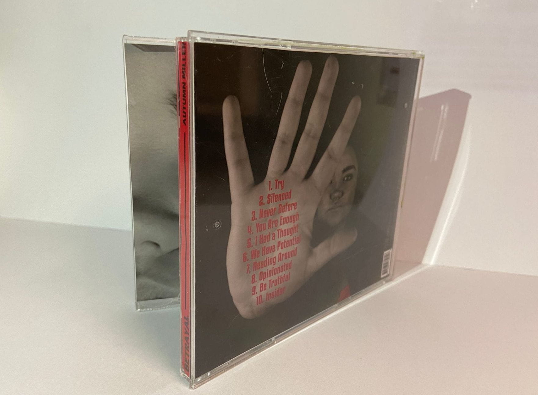
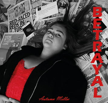
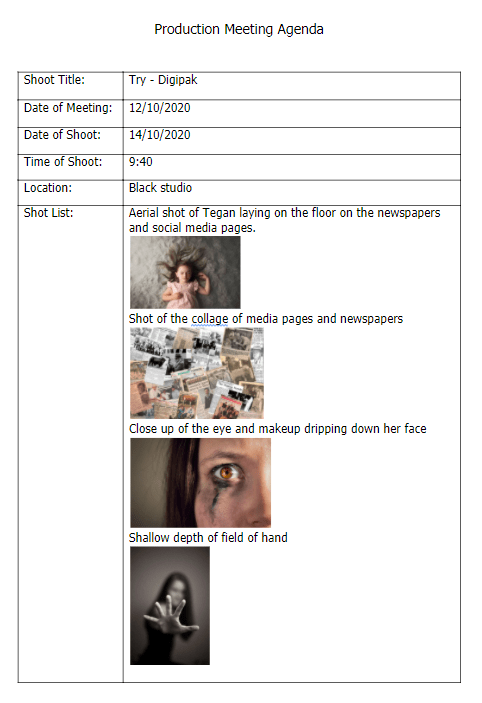
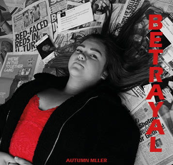
Here is the first draft of our Digipack. Me and Paige are really happy with how it has developed so far. We think that we have got a clear message behind it, and it also has a connection the our music video to express one overall message.

What went well?

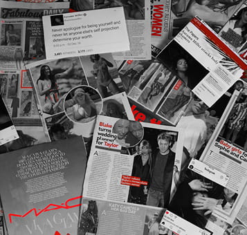
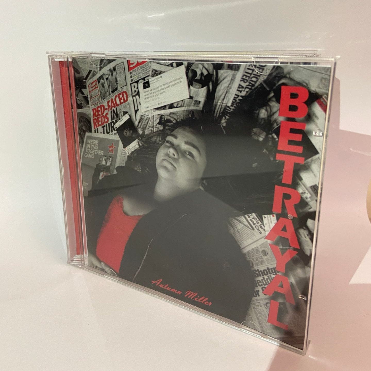
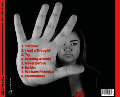
  • I really like the black, white and red colour theme. I think that this works really well and brings continuity to the digipack as a whole.
  • I also think that the font for the album title works well and stand out on the front.
  • I think that our editing demonstrates this concept of the star and also follows many conventions of our genre.
  • I think that the attack towards the media stands out and makes it unique.
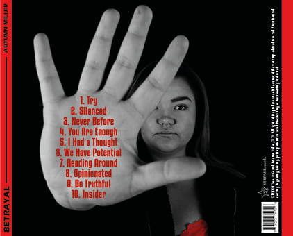
  • The positioning of the camera works really well.

What can be improved?

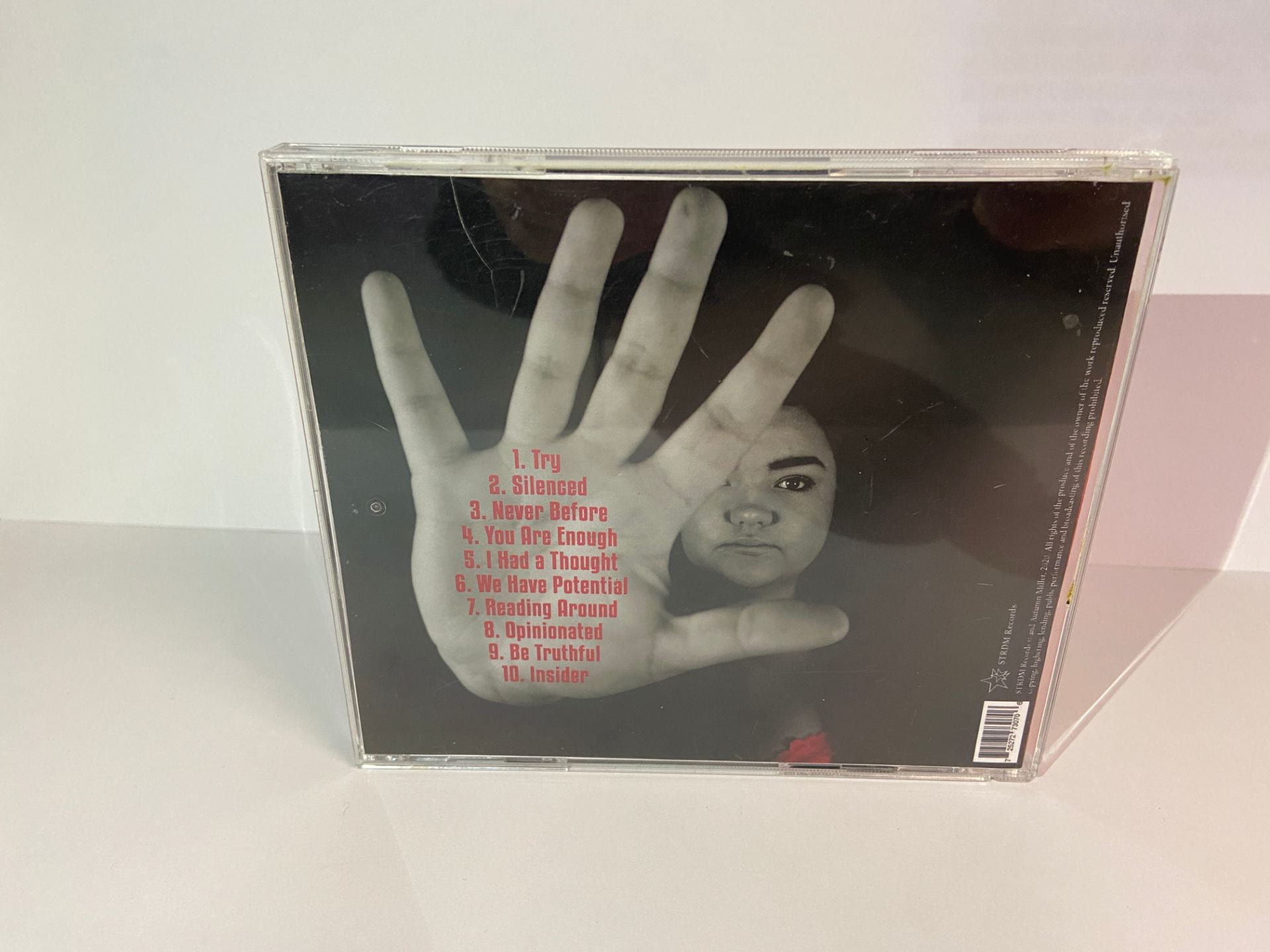
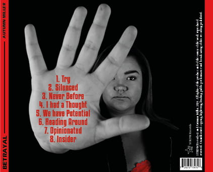
  • We need to add the copyright onto the back cover.
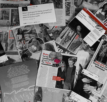
  • There are a lot of black areas on the back which are empty, I think that we need to fill these with something.
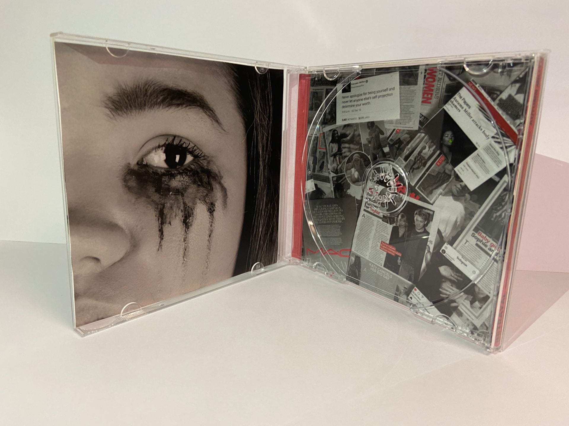
  • I think that the left hand side on the inside needs some red in it somewhere.
  • I think we could add more red on the inside right.
  • I think we should move the location of the record company.
  • The colour red needs to be more fluent- less variety.
  • The font on the hand is not the best it could be, I think we can change this.
  • Do we want the artists name and the album title in the same font? Is this conventional?

 Assessing its appropriateness and level of production skill

Use of camera and Photoshop to take & manipulate engaging images.

I think that our use of camera and photoshop has been very successful in making our digipack. We used camera successfully, we managed to get a lot of angles and compositions to use in our piece. We experimented with different ways of placing the camera and our model. Our artist is well framed and we have a variety of shots and shot distances including extreme close ups and long shots. We have used photoshop to colour correct our work and to reduce and add colour i different elements. I think that this worked well. I think to improve this, whilst we have the continuity of the red, the exact type of red needs to be more fluent as we have a variety of reds in our colour palette. I think that if we reduce this in our imagery using photoshop our digipack will be much more fluid.

Selection of mise-en-scene in the photos and the meaning it communicates.

I  think that our mise-en-scene is also very strong and demonstrates exactly how we wanted to present our artist. Her outfit, make up and hair presents this idea of glamour and that she is a star. We used an over sized jacket to suggest that she is surrounded and trying to hide. I also think that our collage for the background works really well and demonstrates the message behind our work. This creates a strong setting for our shoot. Also our direction of our model worked well, we asked our model to lie down and we shot her from above. In this we were trying to demonstrate how she has been overpowered by the media and struck down. This is reinforced by her begin surrounded by it as it develops the idea that she is overpowered and surrounded by negativity and publicity. We also placed the hand in the foreground on the back cover to suggest the idea of her pushing them away and demonstrating power. Finally we use makeup on the inside left colour, to demonstrate her sadness and the emotional impact that the media is having on her.

Creative use of DTP to integrate images and text and use colour / typefaces

We used In Design to compose our digipack, at the moment I feel that our DTP is the area that we can improve on most. I think that our use of fonts and colour can be improved. We started off by adding our images into the panels and positioning them how we wanted them. We then began to add in text, the text for our title, I think works really well. I think it is bold, powerful and makes a statement. We used the same font for the artists name, but I think that we can experiment with different fonts to see what we prefer. On the back, I think that we can improve the font on the hand which is the son titles from the whole album. Originally we used the same font as our front cover and increased the letter height. However I do not feel that this is the best font to be used, I think that using a different one could be better, so we will experiment with that. I also think that we need to put some more thought into the colours that we use. I really like our use of black, white and red and I think that it works well. However, the colour red is not all the same, there are a variety of different colours in the palette used. I think that we need to reduce this palette to make it more effective and fluid through the piece, we can do this by picking a specific colour to use throughout.

Overall we are really happy with what we have produced so far, and we think that our photo shoot was successful to gain us the exact imagery that we wanted. We also think that our editing has worked well and we are happy with the direction that it is going, and we know the changes we want to make.

Category: Digipak | LEAVE A COMMENT
October 14

Digipak Photoshoot

Here are the contact sheets from our photo shoot. Overall our photo shoot went really well, and me and Paige were really happy with what we got out of the shoot. We think that we have achieved an image for each part of our digipak which we feel will work well and be successful. We were able to attain all of the different types of shots we needed and more, we had additional photos in case any of our previous ones did not work how we wanted them to. We felt that the newspaper collage background that we made worked really well and was effective in conveying our narrative.

Category: Digipak | LEAVE A COMMENT
October 12

Photoshoot / Design Production Meeting and Risk Assessment

Here is the production meeting agenda for our shoot for our music video. We planned out the shots that we needed, the mise en scene, equipment and props. This helped us to ensure that we had everything ready on the day.

Here is the risk assessment that we have filled out to ensure that ourselves and models are safe.

What are our aims for the shoot?

  • To gain good imagery to use in our digipack.
  • To explain our narrative through our branding.
  • To express the artist and what she believes in through the digipack.
  • To make the images striking and eye catching to draw the audience in.
  • To express emotion through our photography.
  • To make the photography relatable for the audience.
Category: Digipak | LEAVE A COMMENT
October 9

Hand drawn mockup

Here is a hand drawn mock up that we have made for the plan for our digipack. We thought carefully about the ideas that we had collated on our Padlet board, and had a discussion as a group about what we wanted to achieve. We sketched out some ideas, and then made our final design. Here is the design that we have made.

Reflection:

We wanted to continue the themes from our music video into our Digipack, we wanted our message to stay the same and present a strong idea about what our artist stands for. We chose to feature our artist on the front  surrounded by media texts to demonstrate how she is always in the light and feels constantly attacked by them. On the back we then had her with her hand raised this was to demonstrate that she was fed up and she had had enough. We chose to have media articles and posts written about her behind the CD. And then a picture with her makeup running to the left, this is ti demonstrate how the media is drowning her and she is being broken down, her own message and ask for help will be written in her tears digitally.

Overall I think that we demonstrate our message clearly in our Digipack plan. I think that we have emphasized not only the impact that the media can have, but how artist are unwilling to stand for it anymore. Paige and I are really happy with our design, and we feel confident that it will work well and demonstrate our message.

Category: Digipak | LEAVE A COMMENT
October 7

Branding Moodboard

Here is a Padlet that me and Paige have made to collate our ideas for the Digipack. Before we began to design our own design, we wanted to collate our ideas together, we included copy, typefaces, photography, album covers and lighting ideas. This helped us to get some more ideas on the way that we could make our digipack and also different elements of photography and editing that could help us make a really cool design for our Digipack. We wanted to continue our idea of critizing the media and social media, and the concept of star image. We wanted our album to break the conventions to demonstrate that people can break societies expectations of them and be their own unique self. We felt that we needed a strong element and focus on typography and the photographic element to our Digipack. We found some denotations that represent, connote and encode not only the music genre that we have chosen but also the star and her message.

Made with Padlet
Category: Digipak | LEAVE A COMMENT
October 7

Digipak Conventions Analysis

Here is a slideshow that I have created where I have analysed the album “Reputation” by Taylor Swift. I chose to evaluate this album because Taylor Swift is in a similar genre to our chose artist. This album was also known for the way that it criticizes the media and the press not only in the album art and design but also her music as well. Overall, I really liked the style and layout of this album, especially the use of the black and white. I think that it works really well to not only demonstrate her message but to represent the artist and what she stands for as a whole. I also looked into the presses response to the album release and also the response from the audience on how they reacted to it.

Category: Digipak | LEAVE A COMMENT
October 5

Our Mission Statement – The Package Brand

Here is a slideshow that I have made with Paige, on our mission statement and the branding of our digipack and artist. We revisited our audience and the importance that they will have on our digipack design. We also wrote a call to action, their USP and looked at the competition of our star. We also looked at our mission statement for our digipack.

Category: Digipak | LEAVE A COMMENT