DIGI-PACK PLANNING

SIMILAR IDEAS

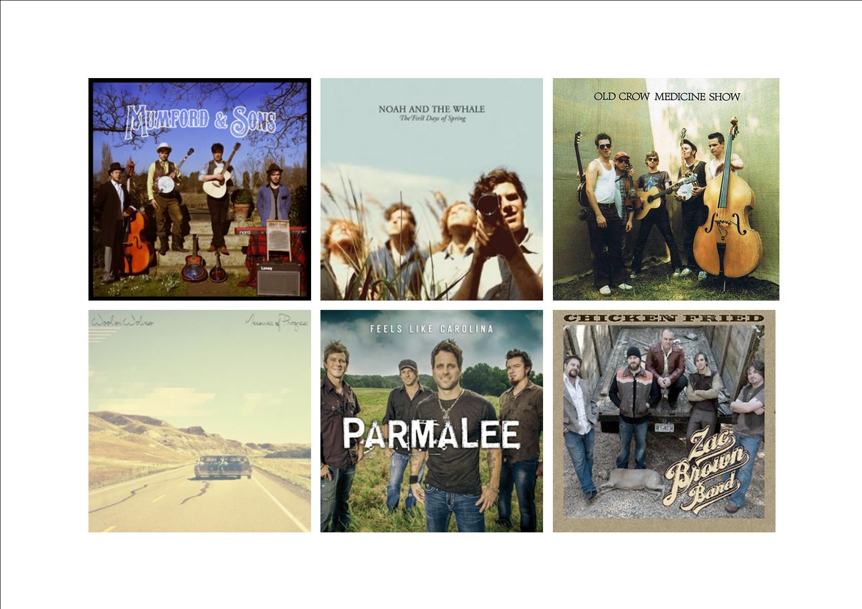
Here, we have found several digi-packs from professional folk bands, which we would like to work from. We’ve looked for conventional fonts, colours, and mise-en-scene, and will use these in our album art. These will serve a references, as to what our digipack should look like.

DIGI PACK PLANS SIMILAR

MOODBOARD
To make a digi-pack plan even clearer, we decided to create a moodboard of all the things we wanted to include. This featured things like, folk mise-en-scene, folk instruments, desert sunset sky, dirty, sandy colour scheme, and more. We also experimented with some fonts that we may use in the first draft. Click the image to view the PDF.
DIGI-PACK MOODBAORD

MOCK UP
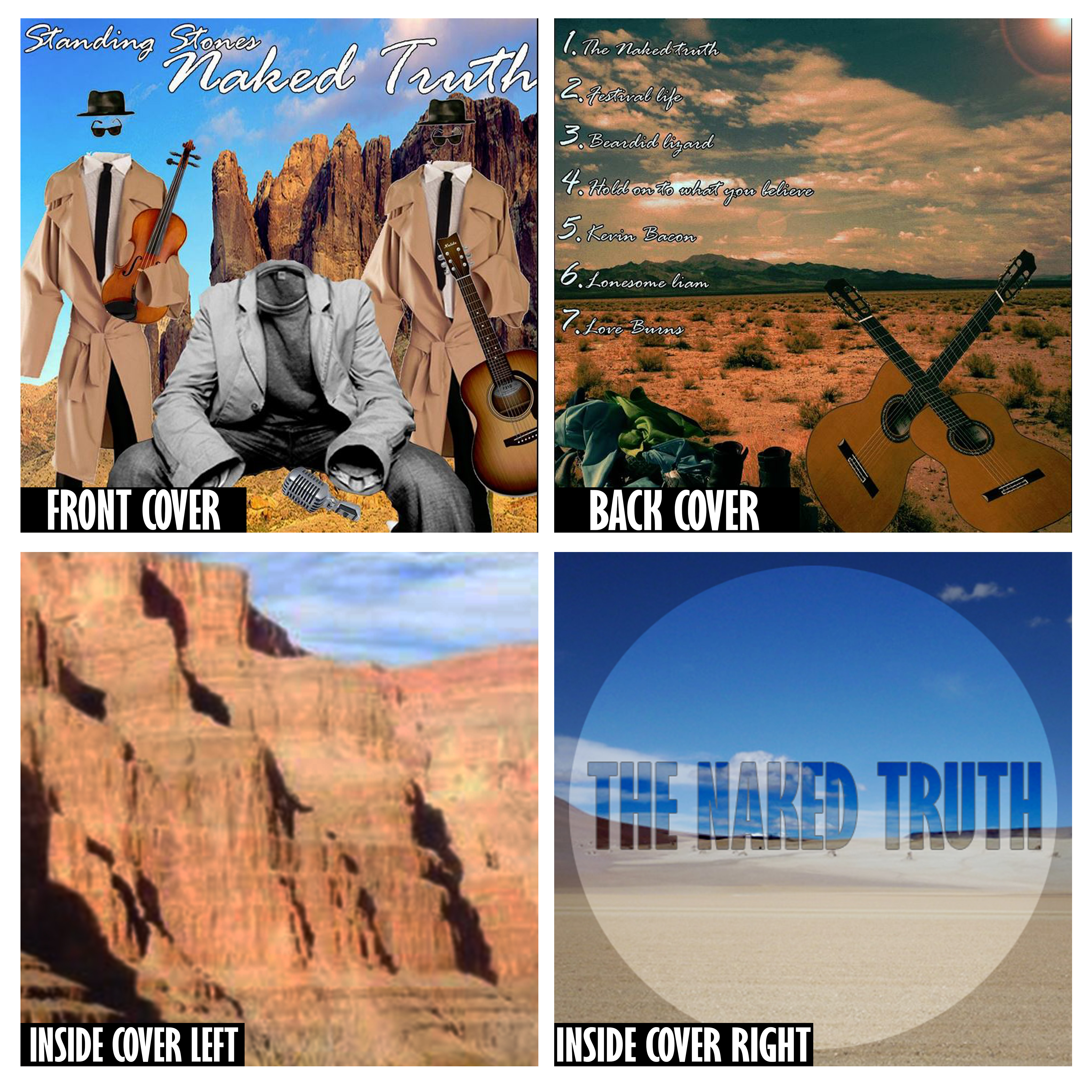
Here we created a mock-up of our digi-pack plan on Photoshop, using images from Google and other sites. We did this so we could have a clearer view on what our digi-pack would look like, and weather we liked it or not.

Feedback on our Mock-up: Not many people were fond of the font we used on the front cover, so we will aim not to use this one on our first draft. Also alot of people asked “Why do the band have no heads?”, so we will aim to make the reason for this idea clearer. We have also received feedback that stated that the album name, and the bad name, were not clearly distinguished. So will perhaps choose a different font, or colour for each one.
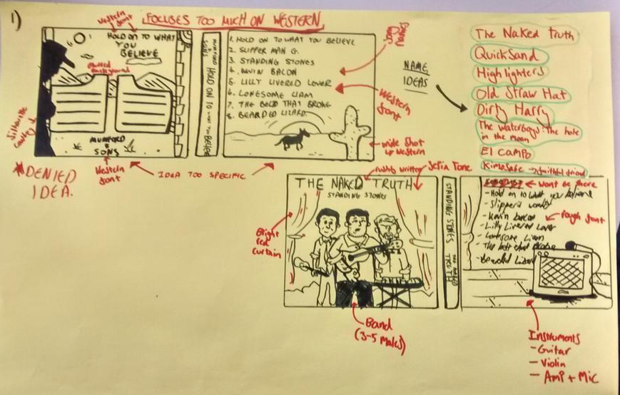
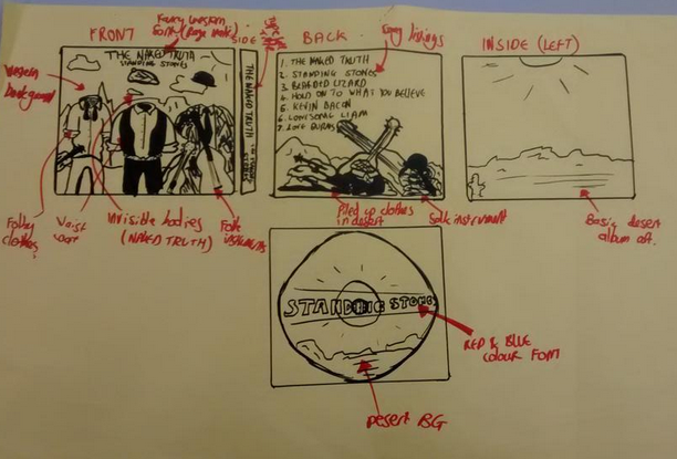
MEDIA MOCKUP


INITIAL PLANNING

Here, Max and I have drew up a few ideas for our digi-pack. We have thought hard about the folk genre, the mise-en-scene and micro techniques of the photo, the conventional fonts, folk style song titles, and additional album art. We have decided to go with the plan from Plan 2. This will be a photo of our band, standing in a folk style setting, holding their instruments, without heads, or arms. This idea is taken from the album title ‘The Naked Truth’, and it suggests the band are infact naked, somewhere other than where their clothes are. ‘Plan 1’ features two digi-pack ideas, that we were not fond of, because we were being too conventional of western’s and country. ‘Plan 2’ is the design we will go for. Click either ‘Plan 1’, or ‘Plan 2’ to view them.
DIGI-PACK-IDEAS-1-yrvvk4
DIGI-PACK-IDEA-2-1pjezwx


THE IDEA – PITCH

Here, Max and I created a prezi pitch, to showcase our idea for our music video. We thought about the folk genre as a whole, synesthesia of the song, possible locations for filming, a digi-pack moodboard, creating the performance, production techniques, and our target audience. We presented this to the class, and explained our ideas, with the prezi as a visual aid.


FEEDBACK
The feedback on our Prezi pitch was positive. Everybody was impressed by the amount of reference material we had, and the amount of research we put into the folk genre and its conventions. A few people weren’t clear on our narrative, but we clarified our ideas when questions were asked.

Here is the song that we are using for our music video.

GENRE ANALYSIS

FOLK GENRE

We have created a genre analysis sheet, displaying all the conventions of a folk genre music video. We looked at features like the conventional costumes, settings, camera shots, acting style, narrative, performance, editing and props. We now see it’s clear that for example, the folk style genre has a specific camera style i.e wide shots of the bands and the environment they are in, which is usually natural, and atmospheric. We looked at the repertoire of elements of the folk genre and added them to our story board, especially iconography. We also considered Rick Altman’s theory that each genre has a set ‘recipe’, and set of ingredients that make it individual.

Click the image to view our mind map of folk genre conventions.

STAR IMAGE – BRANDING

Untitled-1 copy
CLICK TO VIEW PINTEREST

Here we have created a Pinterest board to showcase our chosen band’s (Mumford and sons) star image. We’ve thought about things like their meta-narrative’, how they promote themselves, what a key themes to their image, what subject often features in their songs, and artists similar to them. We summarised the band with adjectives such as: ‘Folky, young, authentic, and talented.


AUDIENCE IDEOLOGIES

CLICK TO VIEW AUDIENCE IDEOLOGIES

Here, we have created a mind map of who we think our audience would  be, what they like, their marital status, age, occupation, media they consume, fashion tastes, all the things that define them as an audience group that would enjoy our music video. We came to the conclusion that our audience would obviously be folk people, who enjoy engaging with the outdoors. Friendly people, educated, aged 30+, traditional people, and also budding musicians themselves.

PERFECT PRODUCTION TEAM

Bw_1EcvCYAIWD-v

Max, Liam and I created a poster which displayed the perfect production team. We needed to think about all the necessary team components to make a high quality and professinal music video. We needed a team with initiative, and cooperation. We decided on an authoritive, creative Director, an artistic editor, location manager, organised producer, A creative visual D.P, a talented, confident star/performer, artistic, imaginative cinematographer, and artisitic costume designer.