Communicating my Brand

For this task, we had to create a board and go in search of picture, words, designs as well Photoshop & Indesign techniques  you think might suit your magazine. To gather my images together I used Pinterest, to create my board of inspiration for my own music magazine. I found photos, designs, images from any manner of sources that I was inspired by and could use as inspiration for my own magazine. The moodboard will be a reference that I will use as I design my magazine.

To link to my pinterest board click here


My Audience Profile

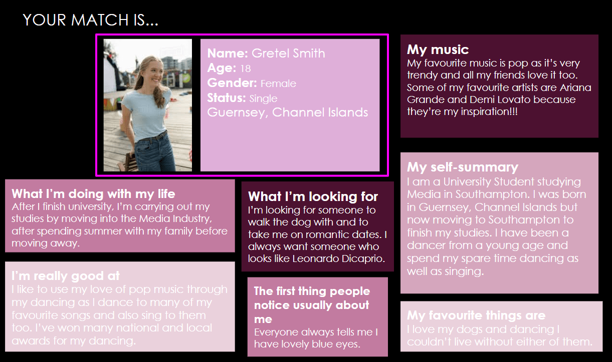
For this task, we had to give our ideal audience an image, name, gender, relationship status, groups, status, likes, dislikes and portray it through a dating profile.

I researched into my audience the:

  • Demographic- Who you are
  • Pyschographic- Your personal ideologies (values, opinions and beliefs)
  • Situated Culture- How and where you consume the text
  • Cultural Experiences- Your previous cultural understanding and experiences

Here’s my dating profile I created for an example of my audience profile:

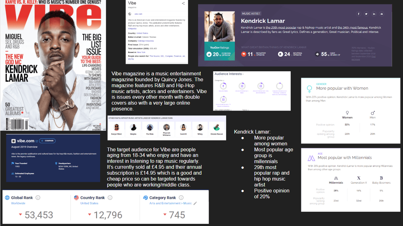
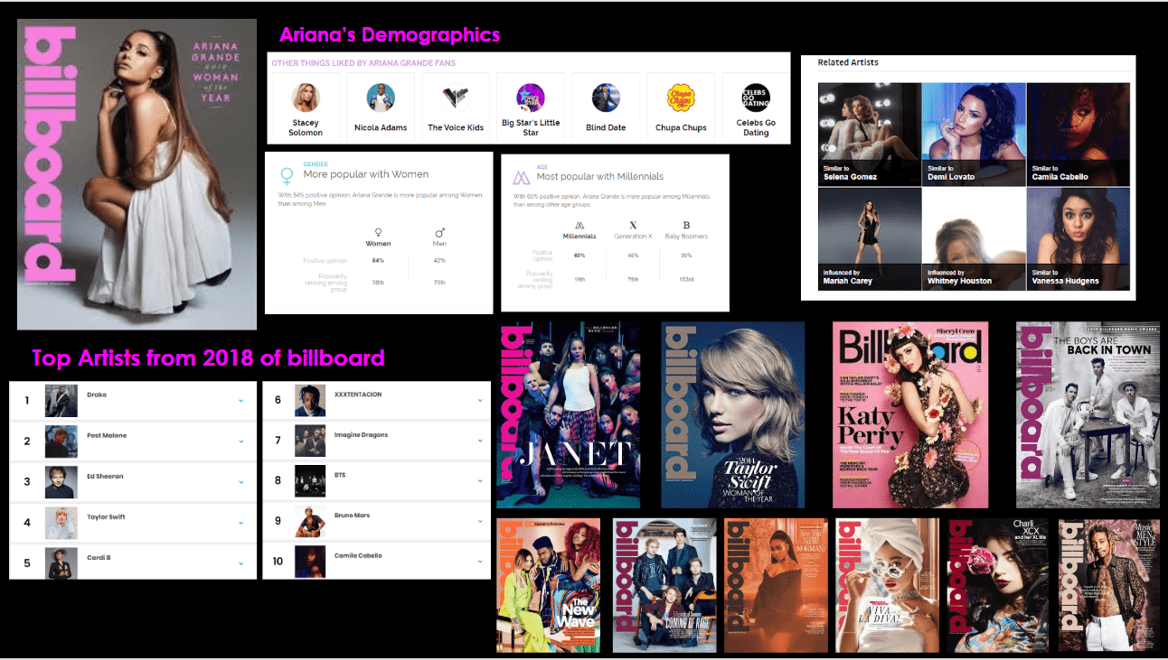
In this task, I looked at a number of back issues of Billboard and used YouGov for artists that appeared on those front pages. It has helped me in the production of making my own music magazine because I have discovered what my audience will enjoy seeing and how they will be drawn to the magazine.

A couple of theorists who considered the reasons why an audience would purchase the magazine were Blumler & Katz, who suggested that there were four reasons collectively known as Uses and Gratification. Their theory describes an active audience and suggested four reasons for people to actively seek out and consume media

The Reception Theory is written by Stuart Hall and describes where ideologies meet, meaning is made:

  • Producers Ideology (encodes)
  • Audience’s (decodes)

Music which is:

  • Preferred- audience accepts the values
  • Negotiated- audience accepts some of the values
  • Oppositional- the audience rejects the values

When focusing on preferred reading in my own magazine I will encode all the elements my audience wants to see on the cover as they will then decode it in order to make my magazine perfect for the target audience and not be the opposite to what they are looking for, therefore not being successful.

After completing these tasks I’ve learnt that it’s important to focus on the target audience in particular because the magazine needs to attract the age group along with the trends that come with them. Also I’ve learnt to focus on the demographics that describe the audience:

  • Gender
  • Age
  • Education
  • Occupation
  • Marital status
  • Cultural background
  • What ‘communities’ do they belong to?
  • Where do they live, work and play?

Other elements that I have now learnt to think about is their values, attitudes and beliefs they hold about what’s important in their lives and the world around them. This is important to think about for the target to attract the audience as much as possible.

Branding Ideas + Mission Statement

For my music magazine, I decided to choose the genre pop and call it Simply Pop. This is because I enjoy this music and feel though I can create a successful magazine based on this genre as I listen to this music in my everyday life. Some genres of music have very specific conventions and provide with much more scope for design decisions and copy style so I thought pop was a good genre for me to choose.

This is a word cloud that I made based on my research of the genre and the connotations behind it. The words are based on are linked to the genre pop and what might be included in the magazine.

Mission Statement

‘Simply Pop is one of the top magazines for those who have a love of pop music. It’s a fresh and interesting magazine written for teenage girls that see everything to do with pop as a part of their life. We provide our readers with the chance to keep up to date with all the chart music and artists that interest them. This magazine will recognise the great success of pop artists, and celebrate the fact that pop music is one of the most popular music genres today. Our big objective is to engage our audience with the magazine and include the artists that they love and recognise to ensure our audience has a sense of belonging and interest.

So… I’m ready to make some media!

From researching and looking into ideas regarding camera, mise-en-scene, layout, typography, AIDA, Bulmler and Katz, I know that including all these elements will create a successful music magazine for me in the future.  Also through practicing using different software such as InDesign and Photoshop which I can now successfully use and create many different types of designs from. Another element, I have learnt is the process behind producing the magazine and how each component links to make the magazine effective, for example the use of targeting a specific audience and creating the magazine around that audience.

The components I need to think about when making my own music magazine are:

  • Mise En Scene is an essential element of how meaning is made in Media.  Every costume, hair style, lighting state, location, prop, accessory, posture, gesture, facial expression is there for a reason – to tell a story, convey an idea and an image. The essential components for Mis-en-scene are:
    • Costume
    • Lighting
    • Acting
    • Make up/Hair
    • Props
    • Setting
  • Image composition and page layout think about composition and how the eye moves around the page, also how does the image integrate with the design elements on the page?
  • Typography there are basic typography rules that you will need to know and basic colour combinations too – red on green?  too many fonts not from the same family? serif or san serif?
  • AIDA– attract the audience, engage their interest, create desire, call to action


My Tour Poster

For this task, we made a mood board to present many examples of albums and tour poster covers from our allocated genre.

After creating this moodboard it has inspired me for when I make my own tour poster. From researching, I found that the colour palette used was very bright on each cover as well as lots of illustrations and cartoon-like pictures. The fonts are described as quite funky and unique as well as being big and bold. So when making my own psychedelic themed tour poster I’m going to include all these elements and making them different in order to be ‘conventional but unique’ so that your audience not disappointed.

The scenario for this task is:

A client has come to you with an image of themselves as a performer. Their style of music will belong to a particular genre. They want you to design a poster for an A4 page in a magazine, advertising and promoting their forthcoming tour. You must include the following:

  • Name of artist
  • Name of the Tour
  • Dates and Venues
  • Other information like: where the album can be bought/downloaded, tickets available from and prices etc.

Self assessment sheet

Feedback on the Brief

Your comment: 

My tour poster fulfills the brief as I have included: 

  • Name of artist
  • Name of the Tour
  • Dates and Venues
  • Other information like: where the album can be bought/downloaded, tickets available from and prices etc.
Feedback on colours:

  • Has the design used a consistent colour scheme?
  • Is there a relationship between the colours in the image and the colour of the graphic design?
  • Do the colours seem typical of the genre?
Your comment: 

In my design I used a set colour scheme of green/blue shades, I used these colours because the image I used included these colours and from my research in psychedelic rock tour posters colour schemes were an important element. These colours are typical of the genre because they are common colours used but I used them in a different way to a typical poster.  

Feedback on typeface:

  • Is all the text legible? 
  • Is the typeface well chosen and does it suit the apparent genre?
  • How many typefaces are used in the design?
Your comment: 

From looking at the poster all the text is easy to read and stands out to the audience. The typeface is suitable as it’s seen as quirky and unique that is common for the genre. I used the same typeface throughout the poster but used tools to make each letter look different through making it taller, wider and more space between each.

Feedback on integration of image and graphics

  • Does the text wrap around the image well?
  • Does the eyeline of the model focus attention?
Your comment: 

The overall design is quite simple but effective as the text is well seen on the image and the eyeline focuses on the yellow text used to indicate that there is an “exclusive debut new single” that is caught by the eye when glancing at the poster. 

Feedback on image

  • Does the costume reflect a particular genre?
  • Is the body language of the model appropriate?
Your comment: 

The costumes worn reflect the genre of psychedelic rock because for our costumes we wore psychedelic inspired outfits wearing patterned shirts, round glasses, baggy patterned trousers, long jackets and scarves in our hair. This picture itself shows a good representation of each element to our costumes along with our facial expression which makes us look chilled which we saw from our research is a key part of the look.

Feedback on copy

  • Do the words on the page prompt a sense of desire?
  • Is there a clear call and a route to action? (AIDA)
Your comment: 

The use of the yellow text draws the reader’s attention, particularly if they are a fan of the band because they will want to be there to hear this so can spread the word to other fans. There is a clear call because it is included in the typical place where you would expect the extra information to be placed.

Feedback on connotations

  • What messages and ideas are being communicated in the text?
  • Do those messages and ideas seem appropriate to the genre and purpose of the text?
Your comment: 

The information included is the information you would be expected to be seen on a tour poster. As well as, drawing the reader in by extra information included.

This task has helped me for making my own music magazine in the future because I have learnt:

  • To put in all my technical skills with Indesign together to make a successful magazine.
  • Knowledge and understanding of how font, colour, images and language can help communicate a story
  • Finding a target audience and basing the magazine around fitting and attracting that audience


My Magazine Front Page Swede

For this task, I was allocated a specific edition of the iconic music magazine, NME (New Musical Express). The aim is to recreate the layout and to recap on the main conventional design features of a magazine cover. Using Indesign – recreate/copy the cover you have been allocated, we used the program Indesign to edit these magazines and get the most accurate magazine cover in comparison to the original. This task was set to have some fun with Indesign and experiment with the different features for future use. The idea was to find the right fonts, play with the sizing, learning try our best to lay out the cover with a conventional layout. I decided to choose this magazine from NME magazine because it is quite simple and easy for me to achieve an accurate copy as well as allowing me to use the different tools and techniques.


For this task, I had to recreate one of the magazine covers that were given to us as a class. I chose this magazine from NME magazine because it is quite simple and easy for me to achieve an accurate copy. From creating this magazine, I discovered my strengths using Indesign were:

  • Finding fonts that were similar to the ones used on the real magazine, as well as using various tools, such as making the letters taller and wider, to achieve the most accurate representation as possible.
  • Positioning the texts in the right places as I think it looks accurate in comparison to the professional magazine
  • Sizing of the letters and using the tools to achieve the most similar size/height

Some of my common weaknesses were:

  • The image I used, as it was more zoomed in than the original image which also made it seem blurry and not high quality. This made it harder to position the text and find the right sizes but I tried my best to make it precise. Although I did not need to find the exact photo – any one with a similar grouping of performers I still would of preferred the exact picture so it would of looked more accurate.

This task has been useful because I have learnt how to use many of the basic features of Indesign and know my way around the program a lot more. I have found the skills I need to work on and I know my strengths. From experimenting on this program it will help me when making my own music magazine in the future.

Here are some videos that will help me when making my own music magazine in further lessons:

A Front Cover Analysed

This task was to complete a thorough textual analysis of a music magazine that we researched as class. Our aim was to analyse the target audience and see how the different features link to what audience the magazine is aimed at.


For the magazine I chose, the target audience was aimed at millennials from both genders. As I looked further into detail, I discovered that typically people who enjoy rock would read this magazine as the band member from the band “The 1975” is featured as the main star on the cover.

From completing this task, it has helped me understand how each component and feature on the cover of any magazine cover contributes to how it appeals to the audience it is targeted at. This has also been helpful for when I’m making my own music magazine. This is because I will think about how every aspect links to the target audience and do so successfully.

Audience Profiling

As a task, we were allocated a music magazine cover from the slide show given to us and had the challenge of researching our cover and looking into the intended target audience. We looked into this because it is always essential when creating any media product that you have a clear idea of who your audience are and what they expect to read, listen, watch in your product. Media marketing experts will always carry out audience research to ensure they are providing their audiences with the ingredients they want (repertoire of elements) and also ensure they know how and where to find them so that they can maximize their sales, circulation or readership. The audience is an essential role to think about in the production of a magazine as well as all other media. This is because the audience itself has many roles, as they consume the text but also inform the producers of current trends and give positive or negative feedback.


In this Vibe magazine, we see that the main cover star shown is Kendrick Lamar. Kendrick Lamar Duckworth is an American rapper, songwriter, and record producer. He is regarded as one of the most skillful and successful hip hop artists of his generation. He is most popular among women and millennial’s and is the 29th most popular rap and hip hop music artist. He also receives a 20% of positive opinion which conveys he is popular in the rap and hip hop industry. Kendrick is included in this magazine as the main star because it will attract the audience and especially his fans from many classes as it is a cheap magazine so anyone can afford it.

The magazine itself uses many typicalities such as masthead, name, colours, design, articles, and images.


Conventional design features of a magazine

In the lesson, we were put in pairs to analyse the main design elements labelled on the magazine. We looked at many examples of magazines and analysed the colours, images and expectations and how they reflect the emotion and purpose of the magazine. Also we studied the similarities of the magazines by the prices and choice of words they use to intrigue the audience. Most of these elements are typicalities of any music magazine such as the plug, main cover star, main cover line, caption, inset, pug, masthead, issue, date, price, bar code and cover lines. I labelled each of these technical conventions on the magazine below:


So… How can an image communicate meaning?

Since studying the different elements of media so far I’ve seen how camera framing and mise-en-scene can represent individuals, groups, events or places. We studied two videos and looked into both the camera framing and the use of mise-en- scene which were combined for representing the elements. We looked at a scene from Downton Abbey to see the different uses of Mise-en-scene and created an essay to analyse each element which helped develop our understanding and consideration for how important these aspects are.

Mise En Scene is an essential element of how meaning is made in Media.  Every costume, hair style, lighting state, location, prop, accessory, posture, gesture, facial expression is there for a reason – to tell a story, convey an idea and an image. The essential components for Mis-en-scene are:

  • Costume
  • Lighting
  • Acting
  • Make up/Hair
  • Props
  • Setting

I discovered how important these elements were when portraying the individuals, groups, events or places because without them the emotion and story would be hard to follow and unclear to the audience. Each of these aspects work together to portray the intended narrative, such as if the character was smiling and in bright clothing it would have the connotations of a happy individual. However if the character was dressed in dull clothing and within a dark environment, as an audience we would assume the character is sad. From studying this and seeing how effective mise-en-scene is, I’ve seen how they all link to create a successful story and represent the characters as well as conveying the setting and place.

The camera framing is also essential when representing the individuals and event to convey the intended narrative of the scene. Examples of these angles, distances along with their roles are:

  • an extreme close up of a tear stained eyes could underline a character’s sadness and vulnerability.
  • an extreme long shot of a man standing alone on a deserted beach might portray his isolation and solitude.
  • a two shot of a two people, with one in the foreground looking away from the camera and the other slightly out of focus in the background could add an enigmatic, mysterious feel to the scene as well

These elements portray that it is important to plan and keep in mind different angles and distances because it helps to represent different meanings to the audience. This also clearly shows the denotations as well as the connotations to the audience from the camera framing to portray a clear story and narrative to the audience.


Skip to toolbar